Dentalfloss
Legendary member
- Messages
- 63,404
- Likes
- 3,726
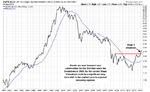
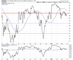
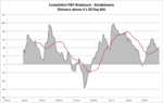
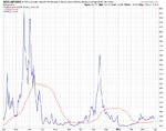
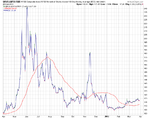
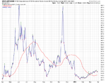
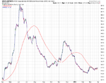
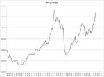
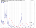
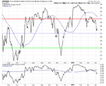
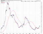
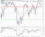
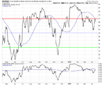
http://leavittbrothers.com/blog/index.php/2013/03/27/video-cat-a-canary-in-a-coal-mine/
Jason Levitt worried that cat not following the market....a possible warning sign
Jason Levitt worried that cat not following the market....a possible warning sign