isatrader
Senior member
- Messages
- 2,965
- Likes
- 136
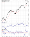
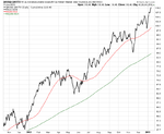
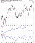
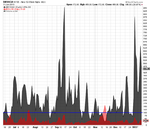
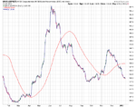
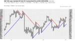
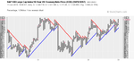
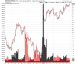
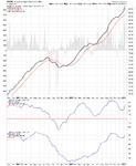
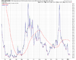
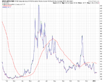
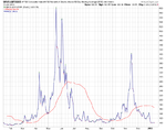
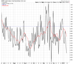
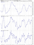
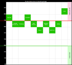
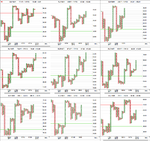
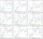
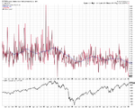
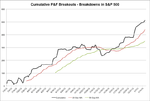
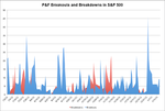
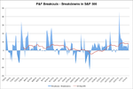
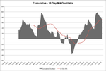
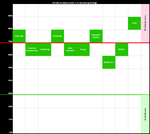
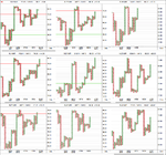
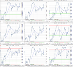
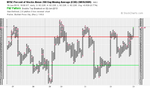
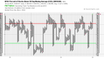
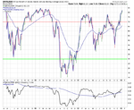
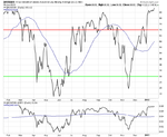
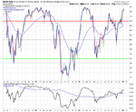
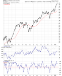
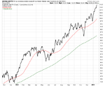
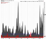
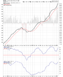
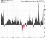
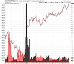
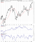
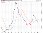
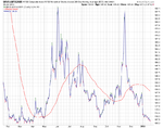
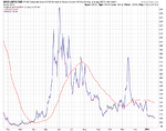
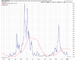
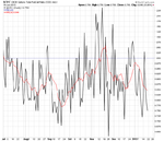
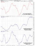
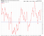
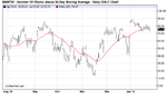
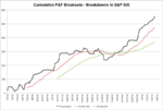
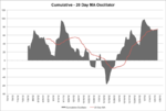
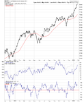
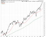
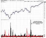
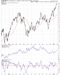
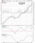
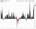
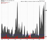
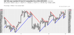
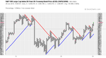
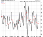
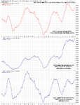
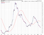
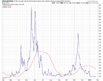
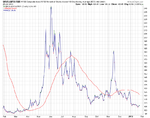
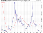
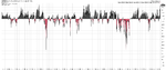
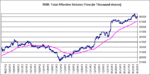
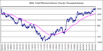
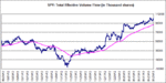
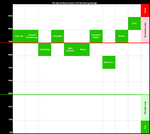
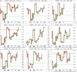
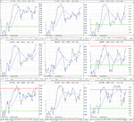
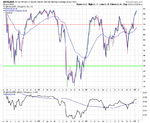
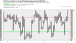
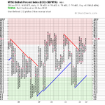
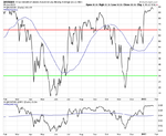
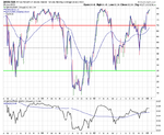
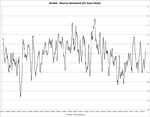
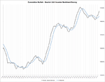
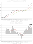
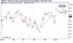
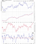
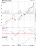
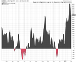
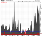
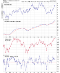
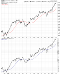
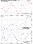
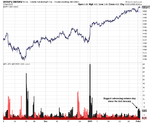
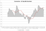
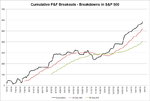
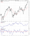
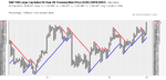
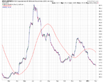
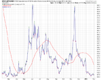
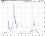
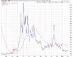
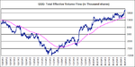
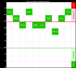
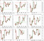
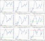
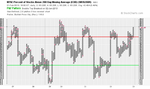
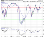
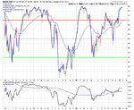
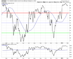
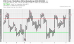
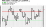
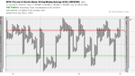
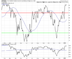
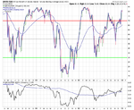
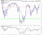
Attached is the updated major NYSE Bullish Percent and Moving Average Breadth charts plus the data table. It's still fairly green across the board this week, except for the short term moving average chart for the DOW which reversed back to a column of Os on the 7th. All of the Moving Average Breadth charts are still near the tops of their normal ranges and so risk continues to increase.


Attachments
-
 $BPNYA_11-1-13.png18.3 KB · Views: 295
 -
 NYA200R_11-1-13.png19.1 KB · Views: 272
 -
 NYA150R_11-1-13.png17.9 KB · Views: 263
 -
 NYA50R_11-1-13.png16.8 KB · Views: 291
 -
 market-breadth-table_11-1-13.png10.2 KB · Views: 866
 -
 NYA50R_line_11-1-13.png35.1 KB · Views: 862
 -
 NYA150R_line_11-1-13.png40.6 KB · Views: 312
 -
 NYA200R_line_11-1-13.png37.4 KB · Views: 258
 -
 ST_MA-breadth-table_11-1-13.png12.1 KB · Views: 867