Best Thread Market Breadth

isatrader

Senior member
Messages
2,963
Likes
135
I'm starting this thread on Market Breadth charts as I think they give a clearer picture to what is really going on the market.

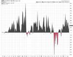
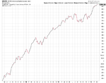
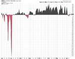
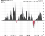
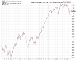
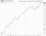
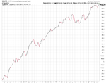
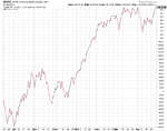
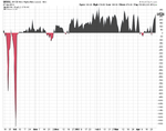
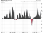
Feel free to posts your breadth charts in here, but I focus on the NYSE Bullish Percent Index ($BPNYA), NYSE Percent of Stocks Above 200 Day Moving Average ($NYA200R), NYSE Percent of Stocks Above 150 Day Moving Average ($NYA150R), NYSE Percent of Stocks Above 50 Day Moving Average ($NYA50R), NYSE A-D Line ($NYAD), and NYSE Highs-Lows ($NYHL) mainly. But I also look at the sector bullish percents regularly.

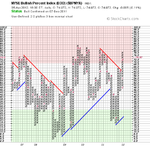
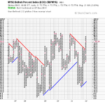
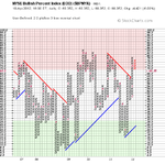
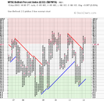
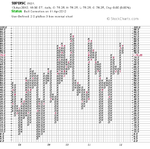
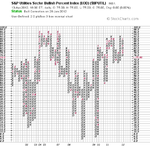
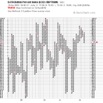
Attached is the current charts. The NYSE Percent of Stocks Above their 50 Day Moving Average ($NYA50R) has continued to fall away during March and is now on a sell signal after making a double bottom breakdown. It has also made a number of lower highs and moved below the key 70% level suggesting a short term correction is occurring in the broader market, as around 28% less stocks are now above their 50 day moving average than they were in February. This has taken the short term risk down though, as the $NYA50R was near record high levels of close to 90% in early February, but is now a much more reasonable 61.3%

The longer term indicators such as the NYSE Bullish Percent Index ($BPNYA), NYSE Percent of Stocks Above 200 Day Moving Average ($NYA200R), and NYSE Percent of Stocks Above 150 Day Moving Average ($NYA150R) all remain above the 70% level and are still on buy signals, although the risk level is increased. Research by Dorsey Wright suggests that the NYSE Bullish Percent Index stays above the 70% level for an average of 96 days. It's more than 50 days since it broke above the 70% level now, so the research suggests on average we should have another month before it turns down again. But as it's an average it could also turn down much soon or much later, as there's no guarantees with anything, but the short term $NYA50R will lead, so I will look for the early warning signs there and the other shorter term indicators.
 

Attachments

  • $BPNYA_30-3-12.png
    $BPNYA_30-3-12.png
    18.1 KB · Views: 840
  • NYA200R_30-3-12.png
    NYA200R_30-3-12.png
    19.2 KB · Views: 729
  • NYA150R_30-3-12.png
    NYA150R_30-3-12.png
    17.9 KB · Views: 727
  • NYA50R_30-3-12.png
    NYA50R_30-3-12.png
    16.6 KB · Views: 664
  • sc.png
    sc.png
    33.3 KB · Views: 715
  • sc-1.png
    sc-1.png
    17.8 KB · Views: 802
Last edited:
For those people that don't normally use market breadth charts or don't know where to find them. You can find them on Stockcharts for free. Here's the link to the summary page: Market Summary - Free Charts - StockCharts.com Most of them can be found at the bottom of the page. Or if you want to see the percentage above their moving average charts you can do a search for the $ symbol and this will give you a large list where you can find all of them.
 
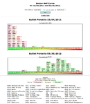
One thing I find really useful is the Dorsey Sector's Bell Curve, as it shows the distribution of all of their 40 sectors on a bell curve. Currently the average for this is at 62.66%, so it is in a normal bull phase. Unfortunately it's not a free resource as you need to have a subscription to their site, but if you are industrious you can make your own version for free using the stockcharts bullish percent chart readings.

Attached is the Dorsey Sector Bell Curve with a comparison to how it looked at the October lows and my rough version using the free charts from Stockcharts, which is very weighted to the top of the scale, highlighting the increased risk in the market.
 

Attachments

  • Sector-Bell-Curve_30-3-12.png
    Sector-Bell-Curve_30-3-12.png
    44 KB · Views: 886
  • SC_Sector-Bell-Curve1.png
    SC_Sector-Bell-Curve1.png
    25.9 KB · Views: 762
Last edited:
attachment.php


There were a few changes this week on the short and medium term market breadth charts of the NYSE Percent of Stocks Above 50 Day Moving Average ($NYA50R) and the NYSE Percent of Stocks Above 150 Day Moving Average ($NYA150R). The $NYA50R moved to bear confirmed status and has moved down to 50%. So only 50% of stocks in the NYSE are now above their 50 day moving average. The $NYA150R also moved to Os but has yet to give a sell signal as it would need to move one box lower - so it is now on bear alert status in a high risk field position with 77.27% of stocks now above their 150 day moving average.

The longer term breadth charts of the NYSE Bullish Percent Index ($BPNYA) and NYSE Percent of Stocks Above 200 Day Moving Average ($NYA200R) are still on Bull confirmed status and in a column of Xs. So the longer term picture is still good although short term the breadth charts are showing weakness as 39% less stocks are above their 50 day moving average than in early February now.

attachment.php

attachment.php

attachment.php

attachment.php
 

Attachments

  • NYA50R_5-4-12.png
    NYA50R_5-4-12.png
    17.3 KB · Views: 4,931
  • NYA150R_5-4-12.png
    NYA150R_5-4-12.png
    18.1 KB · Views: 4,901
  • NYA200R_5-4-12.png
    NYA200R_5-4-12.png
    19.3 KB · Views: 4,918
  • $BPNYA_5-4-12.png
    $BPNYA_5-4-12.png
    18.1 KB · Views: 5,033
  • market-breadth-table_5-4-12.png
    market-breadth-table_5-4-12.png
    13.7 KB · Views: 5,199
Attached is the New High New Lows Daily and Weekly charts and also the daily and weekly cumulative Advance Decline charts.
 

Attachments

  • $NYHL_weekly_5-4-12.png
    $NYHL_weekly_5-4-12.png
    33.6 KB · Views: 646
  • $NYHL_daily_5-4-12.png
    $NYHL_daily_5-4-12.png
    24.9 KB · Views: 577
  • $NYAD_weekly_5-4-12.png
    $NYAD_weekly_5-4-12.png
    17.8 KB · Views: 542
  • $NYAD_daily_5-4-12.png
    $NYAD_daily_5-4-12.png
    27 KB · Views: 666
attachment.php


Some changes in the mid to long term breadth charts yesterday with the $NYA200R reversing to Os and approaching the 70% level. The $NYA150R (30 week) also gave a P&F sell signal with a double bottom breakdown, however at 74.87% it's still above the 70% level so it is considered a Bull Correction currently.

The shorter term $NYA50R (10 week) dropped further, with 39.55% of stocks in the NYSE now above their 50 day moving averages. So the short term risk is decreasing as the overbought state from February and March has come off significantly and if it's just a correction in Bull run then it should find a base fairly soon if you compare to the historical charts.

Attached is the charts
 

Attachments

  • NYA50R_9-4-12.png
    NYA50R_9-4-12.png
    28.7 KB · Views: 536
  • NYA150R_9-4-12.png
    NYA150R_9-4-12.png
    32.3 KB · Views: 570
  • NYA200R_9-4-12.png
    NYA200R_9-4-12.png
    31.6 KB · Views: 515
  • $BPNYA_9-4-12.png
    $BPNYA_9-4-12.png
    33.3 KB · Views: 635
  • market-breadth-table_9-4-12.png
    market-breadth-table_9-4-12.png
    10.8 KB · Views: 5,106
Last edited:
Market Breadth Update

attachment.php


All four of the breadth indicators listed above are now in a column of Os with an additional sell signal in the NYSE Percent of Stocks above their 200 day moving average ($NYA200R) as it dropped below the key 70% level.

The NYSE Bullish Percent Index ($BPNYA) has now changed to Bear Alert status as it reversed to a column of Os and dropped below 70%. However, the short term breadth chart of the NYSE Percent of Stocks above their 50 day moving average ($NYA50R) has fallen to it's lowest level since the November bottom and has now entered the low risk area below 30%. So almost everyone who wants to sell in the short term has already sold, but that doesn't mean the market can't drop further as you need to wait for demand to come back in and a reversal on the chart back above the 30% level. So I'm going to be watching closely for a new short term buy signal on the $NYA50R chart, but if the down move is more serious then it can linger at the lower levels for a while.

Below are the breadth charts:

NYSE Bullish Percent Index ($BPNYA) - this is a compilation of the percent of stocks that trade on the NYSE that are on Point and Figure buy signals and tells you whether to be offensive or defensive with your strategy.

  • Xs = offense
  • Os = defense
  • 30% and 70% are the oversold and overbought areas where risk is highest
  • All stocks have an equal vote

attachment.php


NYSE Percent of Stocks above their 200 day moving average ($NYA200R)
- this is a measure of the percent of stocks on the NYSE that are trading above their 200 day moving average

attachment.php


NYSE Percent of Stocks above their 150 day moving average ($NYA150R)
- this is a measure of the percent of stocks on the NYSE that are trading above their 150 day (30 week) moving average

attachment.php


NYSE Percent of Stocks above their 50 day moving average ($NYA50R) - this is a measure of the percent of stocks on the NYSE that are trading above their 50 day (10 week) moving average

attachment.php
 

Attachments

  • market-breadth-table_10-4-12.png
    market-breadth-table_10-4-12.png
    10.3 KB · Views: 5,086
  • NYA50R_10-4-12.png
    NYA50R_10-4-12.png
    17.1 KB · Views: 4,838
  • NYA150R_10-4-12.png
    NYA150R_10-4-12.png
    19.3 KB · Views: 4,897
  • NYA200R_10-4-12.png
    NYA200R_10-4-12.png
    19.2 KB · Views: 4,849
  • $BPNYA_10-4-12.png
    $BPNYA_10-4-12.png
    17.6 KB · Views: 4,906
Last edited:
attachment.php


We've had more activity in the last week than we've had in months with the status changing sides very rapidly. Today's changes (12th April) were positive once again with the short term NYSE Percent of Stocks Above 50 Day Moving Average ($NYA50R) bouncing from Tuesday's very oversold condition to go onto Bull Alert status with it's move to Xs back above the key 30% lower level. 43.14% of stocks in the NYSE are now above their 50 day moving average.

The NYSE Percent of Stocks Above 150 Day Moving Average ($NYA150R) and the NYSE Percent of Stocks Above 200 Day Moving Average ($NYA200R) also reversed back to Xs above 70% once more, although they are still on P&F sell signals. So both have moved to Bear Correction status and strategy for medium to long term positions should now become that of wealth preservation.
 

Attachments

  • $BPNYA_12-4-12.png
    $BPNYA_12-4-12.png
    17.5 KB · Views: 691
  • NYA200R_12-4-12.png
    NYA200R_12-4-12.png
    18.6 KB · Views: 501
  • NYA150R_12-4-12.png
    NYA150R_12-4-12.png
    18.7 KB · Views: 582
  • NYA50R_12-4-12.png
    NYA50R_12-4-12.png
    16.6 KB · Views: 665
  • market-breadth-table_12-4-12.png
    market-breadth-table_12-4-12.png
    10.7 KB · Views: 4,746
Last edited:
Major Sectors Bell Curve

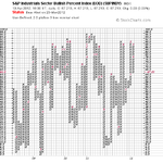
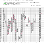
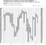
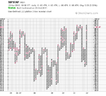
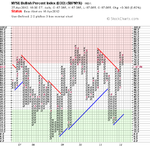
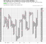
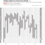
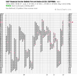
I've updated the bell curve of the major sector bullish percent charts that you can get for free on Stockcharts and I've also attached the 12 individual bullish percent charts so that you can see how they relate on the bell curve.

When I last did the bell curve on the 2nd April here: http://www.trade2win.com/boards/technical-analysis/147476-market-breadth.html#post1822960 it showed a very overbought market with a median distribution of 83.86%; the price action since then has brought the median distribution down to 75% with a number of sectors turning negative or giving bear alerts. The Gold miners have continued to be very weak dropping to extremely oversold levels of just 10.71% of gold miners on P&F buy signals currently.

Risk continues to be very high in the majority of sectors, so caution is needed.

Below is the table and sector bell curve

attachment.php


attachment.php
 

Attachments

  • SharpChartv05-8.png
    SharpChartv05-8.png
    28.3 KB · Views: 431
  • SharpChartv05-7.png
    SharpChartv05-7.png
    25 KB · Views: 507
  • SharpChartv05-6.png
    SharpChartv05-6.png
    25.8 KB · Views: 469
  • SharpChartv05-5.png
    SharpChartv05-5.png
    25.6 KB · Views: 614
  • SharpChartv05-4.png
    SharpChartv05-4.png
    25.4 KB · Views: 587
  • SharpChartv05-9.png
    SharpChartv05-9.png
    26.1 KB · Views: 439
  • SharpChartv05-10.png
    SharpChartv05-10.png
    28.6 KB · Views: 446
  • SharpChartv05-11.png
    SharpChartv05-11.png
    25 KB · Views: 457
  • SharpChartv05-12.png
    SharpChartv05-12.png
    25.7 KB · Views: 469
  • SharpChartv05-13.png
    SharpChartv05-13.png
    24.2 KB · Views: 469
  • SharpChartv05-15.png
    SharpChartv05-15.png
    29.9 KB · Views: 426
  • SharpChartv05-14.png
    SharpChartv05-14.png
    25.6 KB · Views: 432
  • SC_Sector-Bell-Curve_13-4-12.png
    SC_Sector-Bell-Curve_13-4-12.png
    9.9 KB · Views: 2,228
  • SC_Sector-Bell-Curve_List_13-4-12.png
    SC_Sector-Bell-Curve_List_13-4-12.png
    19.1 KB · Views: 2,009
Last edited:
Market Breadth Update

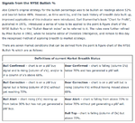
There was only one change in status to note today (13th April) and that was on the short term NYSE Percent of Stocks Above 50 Day Moving Average ($NYA50R), which is also know as the % Above 10. The status moved to Bear Confirmed after a brief Bull Alert on Wednesday and Thursday. So the table is looking a lot more negative again with the short term indicator on Bear Confirmed status; the medium term indicator on Bear Correction status and the long term indicator on Bear Correction status. The head coach of the team is the NYSE Bullish Percent Index though, which is still currently only on Bear Alert status suggesting that we should have our defensive strategy in play as the market currently has the ball and is attempting to score against us.

Here's the updated table and NYSE Percent of Stocks Above 50 Day Moving Average ($NYA50R) chart:

attachment.php


attachment.php
 

Attachments

  • market-breadth-table_13-4-12.png
    market-breadth-table_13-4-12.png
    11.1 KB · Views: 1,760
  • NYA50R_13-4-12.png
    NYA50R_13-4-12.png
    16.6 KB · Views: 1,740
hey isa..some nice charts there
the plot from what i can see on the last chart is box size 2% by 3 reversal.there is only one data point per day..so it is a close
to make this chart go really ballistic and tell a more important story
1.go down to 1 box reversal
2.start at 1% box size and go up in increments of 0.1%
3.look for trends by drawing a trendline according to 1 box rules
now at some point,you will find a good trend..save that chart settings
then you can base trades accordingly..you will have found the true short term trend,and you will be able to judge trend reversals more accurately
chartcraft display bullish percent as a line chart..what you will be doing is displaying a good idea of the true trend
better still use s&p 500...imho..nyse might have too many small caps
takes a little longer...but you will identify the best trend and be able to establish reversals more quickly.3 box reversals are too clumsy in a volatile market..imho
the charts will be much wider,but who cares.it is the short term trend that you want and then correlate that with the bigger picture
 
forgot to add
you will see more consolidations..but you will be able to assess the breakouts more clearly
remember..a break of trendline is a possible signal to close positions and not to anticipate a reversal on 1 box
 
hey isa..some nice charts there
the plot from what i can see on the last chart is box size 2% by 3 reversal.there is only one data point per day..so it is a close
to make this chart go really ballistic and tell a more important story
1.go down to 1 box reversal
2.start at 1% box size and go up in increments of 0.1%
3.look for trends by drawing a trendline according to 1 box rules
now at some point,you will find a good trend..save that chart settings
then you can base trades accordingly..you will have found the true short term trend,and you will be able to judge trend reversals more accurately
chartcraft display bullish percent as a line chart..what you will be doing is displaying a good idea of the true trend
better still use s&p 500...imho..nyse might have too many small caps
takes a little longer...but you will identify the best trend and be able to establish reversals more quickly.3 box reversals are too clumsy in a volatile market..imho
the charts will be much wider,but who cares.it is the short term trend that you want and then correlate that with the bigger picture

Hi dentist, you are correct that the box size on the Bullish Percent charts is close data with a 2% box size and a 3 box reversal, so that column changes are only made if 6% of stocks move from P&F buy signals to sell signals or vice versa. As the Bullish Percent chart is used to measure risk in the market and not meant to be a market timing tool. I've seen a lot of discussion on Dorsey's P&F message board by the professional money managers who are P&F craftsmen and they always tell people to use it as intended as a gauge of risk in the market.

It was developed by Abe Cohen who founded Investors Intelligence in 1955 and was refined over the years as the data built up by Earl Blumenthal in 1975, and the rules were further refined by Mike Burke in 1982, when he became editor of Investors Intelligence, and remain to this day the recognised method of applying breadth to market strategy.

Attached is the signals from the Investor Intelligence site and the link to the page: Investors Intelligence Global - Breadth Indicators

attachment.php


The alternative measurements of breadth of the percentage of stocks above their 50, 150 and 200 day moving averages can be used for market timing as well as gauging risk. So the 1% percent 1 box reversal method you favour could be used on those. Although my personal goal is to try to become an expert user of the classic method that the P&F experts have refined since 1955, as it has kept me on the right side of the market over the last year or so, as it caused me to exit stocks in May last year and not come back in until October. The current signals from all four are starting favour the bear side again, but the BPNYA is only on Bear Alert status currently and tends to make another reversal to the upside before giving a major sell signal, although there is a few exceptions to this. So currently although my position is to be defensive, the major trend is still on the bull side.

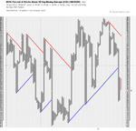
Below I've attached the percentage of stocks above their 50 day moving averages chart with a 1% box size, 1 box reversal and major trend lines. My observations of this is that because of the way the chart is set up on a scale of 0-100%, that the trend lines are too slow for short term moves and double top or double bottom breakouts or breakdowns would be the way to play it imo.

attachment.php


The medium term percentage of stocks above their 150 day moving averages chart with a 1% box size, 1 box reversal and major trend lines looks more useful in terms of the trend line crosses as the trend changes on the chart were all very good times to buy for a medium term/swing trader since the 2009 low. As it crosses to the upside in March 2009, downside in February 2010, upside in March 2010, downside in May 2010, then the upside again in September 2010, then the downside in May 2011 and then back to the upside again in late November 2011. So over the last 3 years except for the whipsaw in February and March 2010 it would have kept you in good shape as far as market trend was concerned. I've attached my cobbled together chart of the three years data.
 

Attachments

  • market-breadth_signals.png
    market-breadth_signals.png
    37.7 KB · Views: 1,798
  • SharpChartv05-19.png
    SharpChartv05-19.png
    48.8 KB · Views: 1,785
  • NYA150R_since_2009.png
    NYA150R_since_2009.png
    64.5 KB · Views: 454
Last edited:
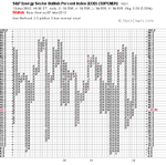
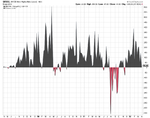
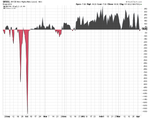
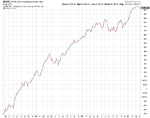
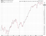
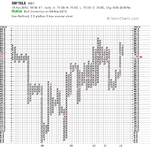
Attached is the latest weekly and daily New Highs New Lows charts and the cumulative weekly and daily Advance Decline charts.
 

Attachments

  • sc-6.png
    sc-6.png
    25 KB · Views: 437
  • sc-7.png
    sc-7.png
    33.8 KB · Views: 417
  • sc-4.png
    sc-4.png
    24.2 KB · Views: 454
  • sc-5.png
    sc-5.png
    18 KB · Views: 415
hey isa
i thought i would spend a few minutes yesterday seeing if bullish perecnt would give me some decent trends on 1% and 1 box reversal...no way...i wasted my time,luckily only a few minutes.the chart range is from 0-100...so no real trends .whereas stocks/index etc have no real defined range
so..keep up the good work
 
The NYSE Percent of Stocks Above 50 Day Moving Average ($NYA50R) has today reversed back up into a column of Xs with 47.01% of stocks in the New York Stock Exchange now above their 50 day moving averages. Last Tuesday, 10th April, this dropped to it's lowest level since the November low point to 24.68%.

So 22.33% of stocks in the entire NYSE have managed to get back above their 50 day moving averages since then, which today has given a new short term buy signal with a double top breakout after breaking below the 30% level.

Attached is the chart

attachment.php
 

Attachments

  • NYA50R_17-4-12.png
    NYA50R_17-4-12.png
    17.1 KB · Views: 1,526
Attached is the latest weekly and daily New Highs New Lows charts and the cumulative weekly and daily Advance Decline charts. Both of which are showing good confirmation of last weeks move higher.
 

Attachments

  • sc-14.png
    sc-14.png
    18 KB · Views: 354
  • sc-13.png
    sc-13.png
    24 KB · Views: 350
  • sc-12.png
    sc-12.png
    24.9 KB · Views: 401
  • sc-11.png
    sc-11.png
    34 KB · Views: 348
The market breadth signals continue to be short term positive rising to 58.78% of stocks now above their 50 day moving average, but with caution signals on the medium to long term measures. However, another X higher on the medium term measure of the NYSE Percent of Stocks Above 150 Day Moving Average ($NYA150R) will put that back to the bullish side again in the higher risk area. So it will still indicate a higher level of caution is necessary even if it does manage to turn bullish, so selective stock picking of stocks showing positive relative strength versus the market would seem wise imo.

Here's the updated market breadth table and the attached charts:

attachment.php
 

Attachments

  • market-breadth-table_27-4-12.png
    market-breadth-table_27-4-12.png
    11.3 KB · Views: 1,830
  • $BPNYA_27-4-12.png
    $BPNYA_27-4-12.png
    18 KB · Views: 400
  • NYA200R_27-4-12.png
    NYA200R_27-4-12.png
    19 KB · Views: 377
  • NYA150R_27-4-12.png
    NYA150R_27-4-12.png
    18.5 KB · Views: 343
  • NYA50R_27-4-12.png
    NYA50R_27-4-12.png
    17.1 KB · Views: 347
Top