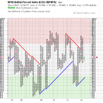
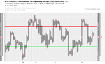
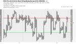
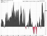
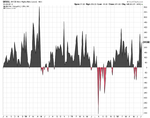
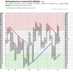
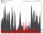
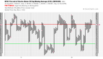
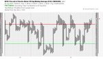
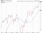
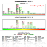
Attached is the updated P&F breadth charts.
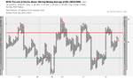
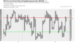
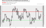
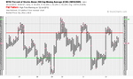
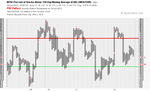
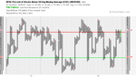
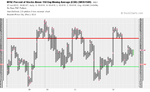
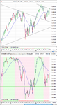
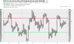
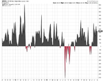
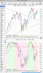
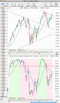
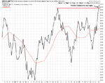
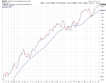
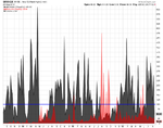
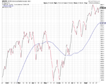
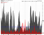
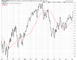
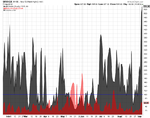
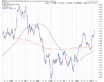
The longer and medium term breadth measures have continued to gain strength with the NYSE Percent of Stocks Above 200 Day Moving Average ($NYA200R) and the NYSE Percent of Stocks Above 150 Day Moving Average ($NYA150R) now in the upper higher risk zone for the first time since the breakdown in early May.
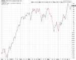
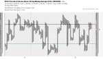
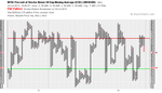
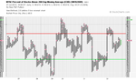
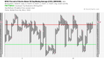
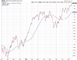
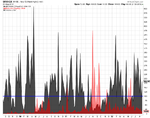
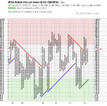
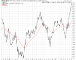
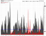
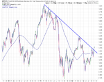
The shorter term NYSE Percent of Stocks Above 50 Day Moving Average ($NYA50R) breadth chart also gave a continuation move and is approaching the top of it's normal range as 80.81% of the 3095 stocks in the NYSE are above their 50 day moving averages. If you look back across the current chart for comparative periods, you'll see late Sept 2010, mid to late October 2011 and late January 2012. So all of those were early in the medium term breakouts, but in October 2011 it was close to a near term high.
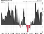
If we apply the same comparison across the other two medium to longer term NYSE Percent of Stocks charts then their levels were first reached in Oct06, Jul09, Oct10, Feb12 on the NYSE Percent of Stocks Above 200 Day Moving Average ($NYA200R) and May09, Oct10, Jan12 on the NYSE Percent of Stocks Above 150 Day Moving Average ($NYA150R). Promising signs maybe? As these were good times to buy.
So Bull Confirmed status again across the board, but with higher risk on 3 of the 4 charts now to be aware of.
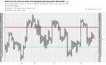
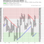
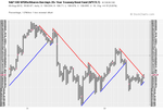
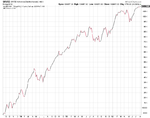
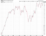
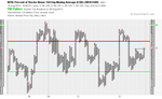
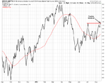
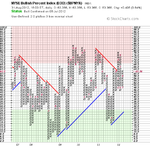
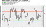
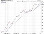
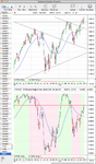
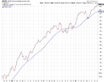
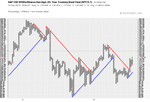
Attached are the P&F charts and the line chart of the NYSE Percent of Stocks Above 150 Day Moving Average ($NYA150R) for those that don't or can't read P&F charts.