Best Thread Market Breadth

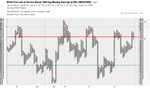
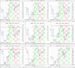
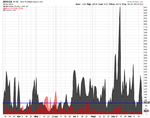
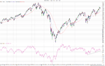
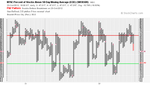
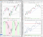
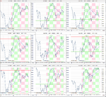
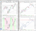
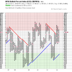
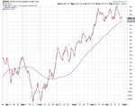
Attached is the updated market breadth charts. A few changes this week as the short term NYSE Percent of Stocks Above their 50 Day Moving Averages reversed to Xs on Tuesday as noted by bearsworth yesterday when he said about the low pole reversal, but Friday's negative price action negated the whole weeks gains in one day and it's now back on Bear Confirmed status.

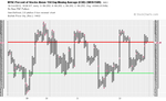
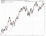
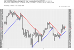
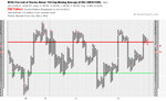
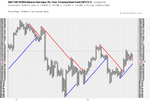
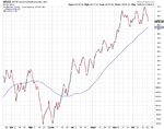
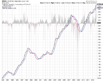
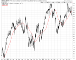
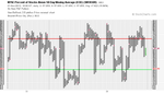
The medium term NYSE Percent of Stocks Above their 150 Day Moving Averages also changed this week back to Xs and so regained it's Bull Confirmed status and in doing so defined the break down level necessary to give a P&F sell signal if it breaches it. So if it falls below the 66% level then the medium term chart would give a sell signal as well and change to Bear Confirmed. Which it is very close to doing as Friday's price action dropped it back to 69.25%, so I'll be watching it closely next week.

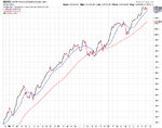
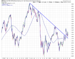
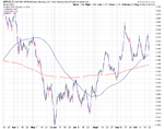
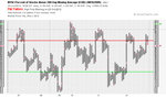
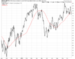
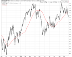
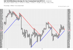
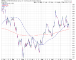
The line chart of the NYSE Percent of Stocks Above their 150 Day Moving Averages has a lower sell level though, as I use the 30 week weighted moving average for additional confirmation, which is currently at 61.02%. And so it would need to get below 61% for that to go to a sell as well.

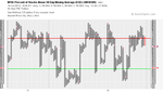
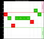
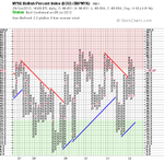
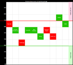
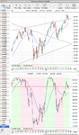
Below is the table and attached are the charts

attachment.php
 

Attachments

  • $BPNYA_19-10-12.png
    $BPNYA_19-10-12.png
    18.1 KB · Views: 280
  • NYA200R_19-10-12.png
    NYA200R_19-10-12.png
    18.7 KB · Views: 224
  • NYA150R_19-10-12.png
    NYA150R_19-10-12.png
    17.5 KB · Views: 244
  • NYA50R_19-10-12.png
    NYA50R_19-10-12.png
    16.6 KB · Views: 239
  • NYA150R_line_19-10-12.png
    NYA150R_line_19-10-12.png
    68.4 KB · Views: 258
  • market-breadth-table_19-10-12.png
    market-breadth-table_19-10-12.png
    10.4 KB · Views: 839
US Industry Sectors Breadth

I've also updated the US Industry Sectors Breadth charts that I've been working on inputting the data for. This week saw two more sectors give sell signals to join the Technology sector that gave a sell signal on the 12th. Financials and Health Care both crossed below their 30 week moving averages, although Financials was only just over. But these three sectors make up 51.6% of the stocks from my sample of 4975, so effectively although more sectors are on buy signals still than sells, the weighting tips it slightly in favour of the sell side currently.

Below is the data table for the Percent of Stocks Above 150 Day Moving Average in each sector which I've ordered by relative strength. For example 77.91% of stocks in the Utilities sector are above their 150 Day Moving Average, so that is the strongest sector by breadth and only 38.31% of stocks are above their 150 Day Moving Average in the Technology sector, so that is the weakest sector by breadth currently.

attachment.php


Attached is the charts of the 9 sectors and a visual diagram to show where the sectors are relative to each other and the NYSE Percent of Stocks Above 150 Day Moving Average.
 

Attachments

  • sector_breadth_19-10-12.png
    sector_breadth_19-10-12.png
    119.9 KB · Views: 272
  • sector-breadth-table_19-10-12.png
    sector-breadth-table_19-10-12.png
    13.5 KB · Views: 849
  • sector-breadth-image_19-10-12.png
    sector-breadth-image_19-10-12.png
    15.2 KB · Views: 269
Last edited:
Finally tonight, attached is the updated cumulative daily and weekly Advance Decline charts. The NYSE Advance Decline Cumulative Volume / NYSE Primary Market Total Volume ($NYUD:$NYTV) daily charts which measure the volume of the NYSE Advance Declines. And the daily and weekly New Highs New Lows charts.

The New Highs New Lows is hanging around the neutral level and this week saw the new lows start to pick up a little bit for the first time in a while, but they are still very low at only 30. But you need to watch for them breaking above the amount of new highs like they did in April and May as that is the signal to be defensive imo.

The cumulative daily Advance Decline line actually broke out to a new high this week, but pulled back again on Friday, so I'm watching to see if it holds above it's 50 day moving average as a break below would also signal a more defensive posture is necessary imo.

Also looking back through the longer term chart of the volume of the NYSE Advance Declines shows that it gives fairly good indications of market conditions and so I think a break below the swing low that occurred recently below the 50 day MA would be the breakdown point to watch for. But currently it's above a rising MA so is still positive for time being imo.
 

Attachments

  • sc-7.png
    sc-7.png
    35.1 KB · Views: 272
  • sc-6.png
    sc-6.png
    42 KB · Views: 272
  • sc-3.png
    sc-3.png
    29.8 KB · Views: 249
  • sc-4.png
    sc-4.png
    26.6 KB · Views: 260
  • sc-5.png
    sc-5.png
    35.8 KB · Views: 268
  • sc-8.png
    sc-8.png
    33.3 KB · Views: 267
Thank you and great job. I am also using a momentum index as well as the NYSE A/D line and a DJIA graph.Based on Stan's tools, it seems there will be a correction of some sort, but continue with the uptrend. However, gut feeling says something bad is happening in the next year, so I'll be watching your updates and updating my tools/graphs.

Finally tonight, attached is the updated cumulative daily and weekly Advance Decline charts. The NYSE Advance Decline Cumulative Volume / NYSE Primary Market Total Volume ($NYUD:$NYTV) daily charts which measure the volume of the NYSE Advance Declines. And the daily and weekly New Highs New Lows charts.

The New Highs New Lows is hanging around the neutral level and this week saw the new lows start to pick up a little bit for the first time in a while, but they are still very low at only 30. But you need to watch for them breaking above the amount of new highs like they did in April and May as that is the signal to be defensive imo.

The cumulative daily Advance Decline line actually broke out to a new high this week, but pulled back again on Friday, so I'm watching to see if it holds above it's 50 day moving average as a break below would also signal a more defensive posture is necessary imo.

Also looking back through the longer term chart of the volume of the NYSE Advance Declines shows that it gives fairly good indications of market conditions and so I think a break below the swing low that occurred recently below the 50 day MA would be the breakdown point to watch for. But currently it's above a rising MA so is still positive for time being imo.
 
google
the american dream might be over.... temporarily
$700 res on friday not taken out...market then tanked
aapl $600 supp to watch
dream stocks are the ones to watch for any supp to come in
also financials
sell off could have been triiggered by google
 
Momentum Index (MI)

Here's the short and a longer term view of the Momentum Index (MI) for those that don't have it. It is the 200 day moving average of the NYSE Advance Decline figures if you want to create it yourself.
 

Attachments

  • Momentum_Index_19-10-12.png
    Momentum_Index_19-10-12.png
    73.6 KB · Views: 269
  • NYAD_Momentum_Index_19-10-12.png
    NYAD_Momentum_Index_19-10-12.png
    132.6 KB · Views: 319
Re: Momentum Index (MI)

What charting website, tool , or software are you using to get those graphs?


Here's the short and a longer term view of the Momentum Index (MI) for those that don't have it. It is the 200 day moving average of the NYSE Advance Decline figures if you want to create it yourself.
 
Re: Momentum Index (MI)

What charting website, tool , or software are you using to get those graphs?

I download the Advance decline data from unicorn.us.com/advdec and copy and paste it into my charting software each weekend and then create the 200 day moving average of the advance decline line to get the momentum index.
 
Re: Momentum Index (MI)

I download the Advance decline data from unicorn.us.com/advdec and copy and paste it into my charting software each weekend and then create the 200 day moving average of the advance decline line to get the momentum index.

Thank you worked like a charm :D. I originally only had 2011, but now I can see even as back as 1965.
 
i put the chart on for declining issues...it could be a big selloff,sparked by goog
data is available from freestockcharts.com
financials and technology are diverging..both risk on sectors $xlf:$xlk
so..something is up
isa,,where do u get youre data from ? for futures ?
 
For Futures data I download it for free from two places. For the major charts, like Gold, Silver, Copper, Oil and especially 10 and 30 year Treasuries, I get it directly from the CME site each week and copy and paste it into my charting software. As each night they put up the days data for each, and they have up to five previous days of data available. So I spend half hour or so each weekend manually copying an pasting the data, which sounds like a slog, but I find it very useful as you get to know the data better like volumes and open interest levels etc. Here's the link to the gold settlement page on the CME site: Gold Futures

If you want to get historical futures data for free, going back as far as the 1950's, then I download it from Pi Trading here: Pi Trading - Free Market Data It has all the major futures continuous contracts and is updated weekly on a Saturday night at midnight. Attached is a example of the data they have for Natural Gas futures.
 

Attachments

  • NG.zip
    88.7 KB · Views: 159
Last edited:
SPY/TLT Ratio

Here's the SPY/TLT Ratio for last week. The 1 box P&F chart held out from breaking down last week and reversed to Xs for most of the week, but Friday's price action turned it back down into a column of Os and so currently the very short term favours the 30 Year Treasuries over equities. However the medium term trend is still positive and it's yet to make a double bottom breakdown, but a warning sign that the trend is weakening is that it has made a lower high. So a more defensive posture seems prudent for the time being. Below are the charts.

attachment.php
 

Attachments

  • SharpChartv05-8.png
    SharpChartv05-8.png
    41.8 KB · Views: 809
  • sc-10.png
    sc-10.png
    41.3 KB · Views: 245
  • sc-9.png
    sc-9.png
    33.8 KB · Views: 246
Attached is the updated market breadth charts. I don't normally do a mid week update, but there was notable changes today with the medium term NYSE Percent of Stocks Above their 150 Day Moving Averages reversing down to Bear Confirmed status. And the short term NYSE Percent of Stocks Above their 50 Day Moving Averages making a continuation move below the 50% level - which hasn't been seen on downside since April. So the short and medium term trends are now both down on the P&F charts. The line chart is a little slower as it needs to cross below it's 30 week WMA to confirm the bearish signal, and still would need another 4% of stocks in the NYSE to close below their 150 day moving average to turn bearish.

attachment.php
 

Attachments

  • market-breadth-table_23-10-12.png
    market-breadth-table_23-10-12.png
    10.4 KB · Views: 1,000
  • NYA50R_23-10-12.png
    NYA50R_23-10-12.png
    17.1 KB · Views: 279
  • NYA150R_23-10-12.png
    NYA150R_23-10-12.png
    18.6 KB · Views: 231
  • NYA200R_23-10-12.png
    NYA200R_23-10-12.png
    18.9 KB · Views: 257
  • $BPNYA_23-10-12.png
    $BPNYA_23-10-12.png
    18 KB · Views: 267
  • NYA150R_line_23-10-12.png
    NYA150R_line_23-10-12.png
    147.6 KB · Views: 289
Last edited:
Here is the secondary breadth charts. The New High New Lows briefly crossed into negative territory today but closely slightly positive. So it's completely neutral here and could go either way, but the new lows are picking up. The NYSE Advance Decline line volume closed right on the swing low level below it's 50 day MA, so is also at a precarious position. The NYSE Advance Decline line itself pulled back into it's recent range, but it is still above the lows of the range. Finally, the SPY/TLT ratio closed on the edge of a triple bottom breakdown level. Attached are the charts.
 

Attachments

  • SharpChartv05-18.png
    SharpChartv05-18.png
    41.8 KB · Views: 243
  • sc-11.png
    sc-11.png
    35.6 KB · Views: 239
  • sc-12.png
    sc-12.png
    35 KB · Views: 247
  • sc-13.png
    sc-13.png
    29.8 KB · Views: 232
Last edited:
Cumulative New Highs New Lows

Attached is a long term chart of the new high new lows. To give an alternative perspective to the standard chart I've overlaid the cumulative new high new lows and included a 30 week MA. This has been a fairly accurate timing tool over the last 10 years of the major trend, although if you go back further to the 1998-2002 period it wasn't as accurate for timing and instead had major divergences with the price action - which is also useful, but obviously harder to make use of. So that highlights why I think it's important to consider all of the major breadth charts together, and not just look at any individual chart in isolation. As all together they help to provide additional confirmation to what any single breath measure might be showing.

attachment.php
 

Attachments

  • Cumulative_NYHL.png
    Cumulative_NYHL.png
    35.2 KB · Views: 699
Re: US Industry Sectors Breadth

I've updated the US Industry Sectors Breadth charts. Eight of the nine sectors moved lower this week with Consumer Staples going to a sell signal by moving below it's 30 week MA.

Below is the data table for the Percent of Stocks Above 150 Day Moving Average in each sector which I've ordered by the percentage change since last week in each sector. For example Industrials was the strongest sector as it was the only gainer on the week, with an extra +0.74% of stocks above their 150 day moving averages now, and energy was the weakest sector with -8.20% of stocks in the sector falling below their 150 day moving averages.

attachment.php


Attached is the charts of the 9 sectors and a visual diagram to show where the sectors are relative to each other and the NYSE Percent of Stocks Above 150 Day Moving Average.
 

Attachments

  • sector_breadth_26-10-12.png
    sector_breadth_26-10-12.png
    120.5 KB · Views: 684
  • sector-breadth-image_26-10-12.png
    sector-breadth-image_26-10-12.png
    15.6 KB · Views: 609
  • sector-breadth-table_26-10-12.png
    sector-breadth-table_26-10-12.png
    14.9 KB · Views: 1,254
Last edited:
Attached is the updated market breadth charts for the NYSE. There was no status changes since my update on the 23rd, but the percentages continued to decline through the week. Currently the short and medium term percentage of stocks above their moving averages charts are on Bear Confirmed Status, and the longer term percentage of stocks above their 200 day moving average charts is on Bear Alert status.

The long term NYSE Bullish Percent chart is still in the column of Xs that it went to in July. However, it is getting closer to possible reversal and the more volatile S&P500 Bullish Percent chart reversed to Os this week on the 24th.

So the breadth indicators favour the bearish side of the market for the time being and we need to see at least the short term percentage of stocks above their 50 day moving average reverse direction before considering changing that view point imo.

attachment.php


To make the table easier to understand I've made some changes by adding the date the status changed and what time frame each are for. i.e long, medium or short term term.
 

Attachments

  • NYA150R_line_26-10-12.png
    NYA150R_line_26-10-12.png
    147.8 KB · Views: 257
  • NYA50R_26-10-12.png
    NYA50R_26-10-12.png
    17.1 KB · Views: 255
  • NYA150R_26-10-12.png
    NYA150R_26-10-12.png
    18.1 KB · Views: 219
  • NYA200R_26-10-12.png
    NYA200R_26-10-12.png
    18.9 KB · Views: 231
  • $BPNYA_26-10-12.png
    $BPNYA_26-10-12.png
    18 KB · Views: 239
  • market-breadth-table_26-10-12.png
    market-breadth-table_26-10-12.png
    11.3 KB · Views: 1,135
Last edited:
Attached is the secondary breadth charts. The NYSE Advance Decline line pulled back towards it's lows this week, but is still holding above it's 50 day MA. The New High New Lows continued to hover in the neutral zone, but the NYSE Advance Decline Line Volume broke below it's recent range and the 50 day MA. Finally the 1 box reversal SPY/TLT ratio tested it's lows again this week, and although it hasn't broken the triple bottom pattern yet, it is very close to the trend line. Attached are the charts.
 

Attachments

  • sc-18.png
    sc-18.png
    35.3 KB · Views: 314
  • sc-17.png
    sc-17.png
    41.8 KB · Views: 263
  • sc-16.png
    sc-16.png
    35.3 KB · Views: 256
  • sc-15.png
    sc-15.png
    26.7 KB · Views: 285
  • sc-14.png
    sc-14.png
    29.4 KB · Views: 291
  • sc-19.png
    sc-19.png
    40.1 KB · Views: 321
  • SharpChartv05-28.png
    SharpChartv05-28.png
    41.4 KB · Views: 296
  • sc-20.png
    sc-20.png
    41.1 KB · Views: 310
  • sc-21.png
    sc-21.png
    34.2 KB · Views: 304
The short term NYSE Percent of Stocks Above 150 Day Moving Average chart changed status today as it reversed back to a column of Xs with 12.27% of stocks now back above their 150 Day Moving Averages since Friday's close. This puts the short term status onto Bear Correction.

Below is the updated table of the four major breadth charts and the NYSE Percent of Stocks Above their 150 Day Moving Average chart.

attachment.php


attachment.php
 

Attachments

  • NYA50R_1-11-12.png
    NYA50R_1-11-12.png
    16.7 KB · Views: 902
  • market-breadth-table_1-11-12.png
    market-breadth-table_1-11-12.png
    12.1 KB · Views: 1,024
Top