isatrader
Senior member
- Messages
- 2,965
- Likes
- 136
US Industry Sectors Breadth
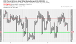
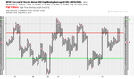
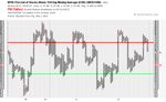
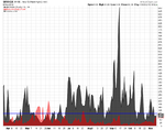
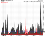
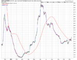
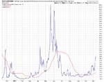
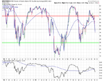
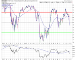
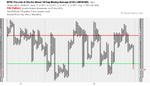
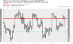
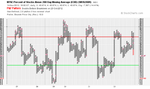
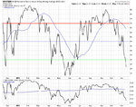
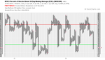
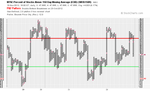
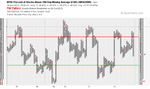
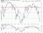
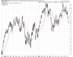
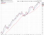
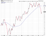
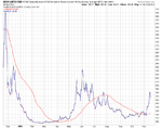
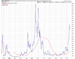
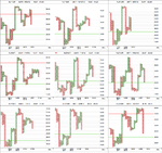
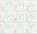
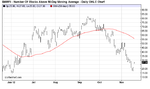
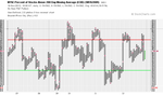
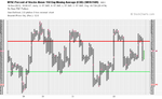
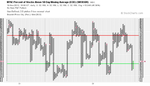
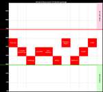
I've updated the US Industry Sectors Breadth charts. I've refined the signals a bit to be a break above or below a swing high or low instead of the 30 week MA as that was too slow for the sectors. So all of the nine sectors moved lower this week with Consumer Discretionary, Consumer Staples, Basic Materials and Industrials going to a sell signals by breaking below their swing lows.
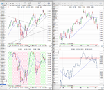
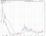
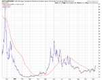
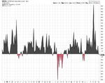
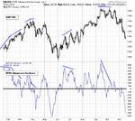
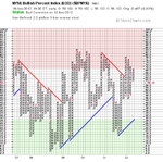
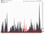
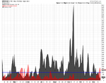
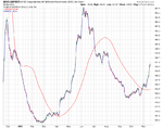
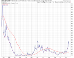
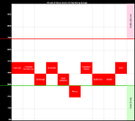
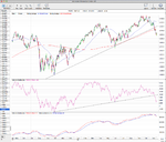
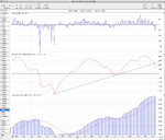
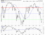
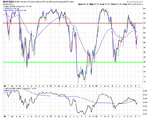
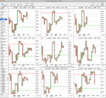
Below is the data table for the Percent of Stocks Above 150 Day Moving Average in each sector which I've ordered by the highest to the lowest percentage in each sector. Utilities was the weakest sector of the week and dropped a massive 24.01% followed by Financials which dropped 10.45%. Although the lowest sector overall, Technology was actually this weeks strongest by relative strength as only another 2.70% of stocks fell below their 150 day moving averages.
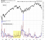
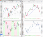
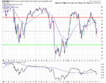
So you'll see on the table and visual diagram that the picture overall is now very negative and there's still the possibility of further downside as none of the sectors have dropped below the 30% level yet.

I've updated the US Industry Sectors Breadth charts. I've refined the signals a bit to be a break above or below a swing high or low instead of the 30 week MA as that was too slow for the sectors. So all of the nine sectors moved lower this week with Consumer Discretionary, Consumer Staples, Basic Materials and Industrials going to a sell signals by breaking below their swing lows.
Below is the data table for the Percent of Stocks Above 150 Day Moving Average in each sector which I've ordered by the highest to the lowest percentage in each sector. Utilities was the weakest sector of the week and dropped a massive 24.01% followed by Financials which dropped 10.45%. Although the lowest sector overall, Technology was actually this weeks strongest by relative strength as only another 2.70% of stocks fell below their 150 day moving averages.
So you'll see on the table and visual diagram that the picture overall is now very negative and there's still the possibility of further downside as none of the sectors have dropped below the 30% level yet.
Attachments
Last edited: