isatrader
Senior member
- Messages
- 2,965
- Likes
- 136
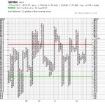
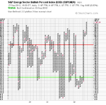
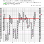
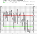
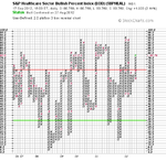
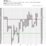
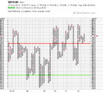
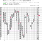
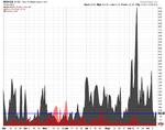
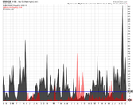
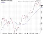
New Highs New Lows
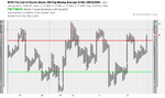
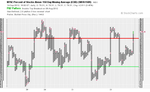
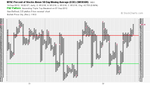
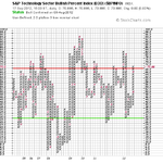
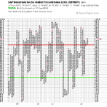
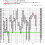
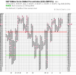
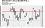
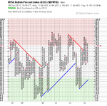
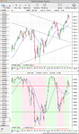
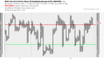
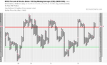
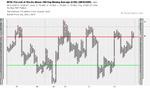
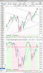
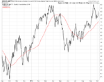
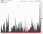
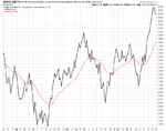
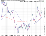
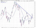
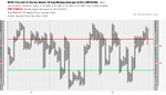
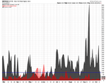
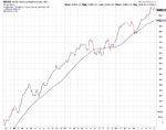
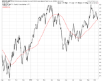
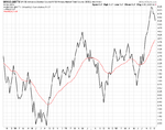
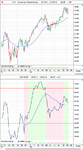
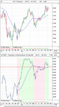
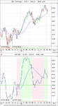
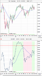
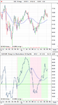
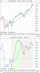
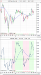
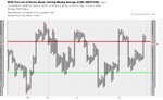
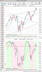
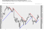
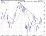
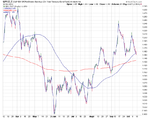
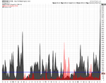
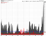
Attached is the updated daily and weekly New Highs New Lows charts. This weeks reading of 958 new highs was the highest reading that Stockcharts have on record, and their charts go back to 1990. So I've also attached the 22 year chart of the net new highs and new lows as well, which shows it in context over the years.
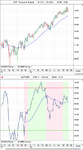
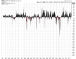
The Top 5 weekly New High - New Low readings since 1990


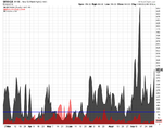
Attached is the updated daily and weekly New Highs New Lows charts. This weeks reading of 958 new highs was the highest reading that Stockcharts have on record, and their charts go back to 1990. So I've also attached the 22 year chart of the net new highs and new lows as well, which shows it in context over the years.
The Top 5 weekly New High - New Low readings since 1990
- 14/9/2012 = 878
- 29/9/1997 = 629
- 12/4/2010 = 579
- 2/6/2003 = 577
- 30/6/1997 = 548
Attachments
Last edited: