Dentalfloss
Legendary member
- Messages
- 63,404
- Likes
- 3,726
a bit from futures magazine that was published on facebook
Since the middle of April everyone, including their grandmother, seems to have been building a short position in the equities market. We know picking tops or bottoms fighting the major underlying trend is risky business, but most individuals cannot resist.
The rush you get trying to pick a major top or bottom is flat out exciting and that is what makes it so darn addicting and irresistible. If you have ever nailed a market top or bottom, then you know just how much money can be made. That one big win naturally draws you back to keep doing it much like how a casino works. The chemicals released in the brain during these extremely exciting times are strong
enough that even the most focused traders fall victim to breaking rules and trying
these type of trades.
So if are going to try to pick a top, you better be sure the charts and odds are leaning in your favor as much as possible before starting to build a position.
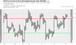
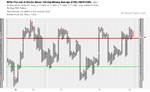
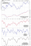
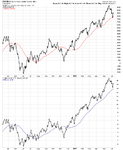
Below are a few charts with my analysis and thoughts overlaid showing you some of the things I look at when thinking about a counter trend trade like picking a top within a bull market.
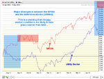
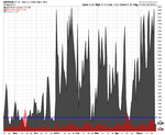
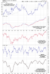
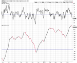
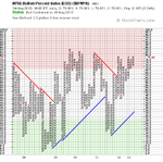
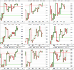
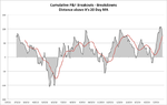
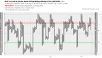
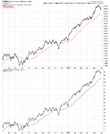
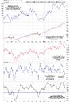
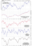
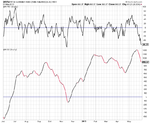
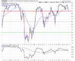
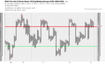
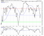
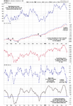
Utility Stocks vs. S&P 500 Index Daily Performance Chart:
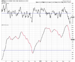
The SPY and XLU performance chart below clearly shows how the majority of traders move out of the slow moving defensive stocks (utilities – XLU) and starts to put their money into more risky stocks. This helps boost the broad market. I see the same thing in bonds and gold this month, which is a sign that a market top is nearing.
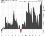
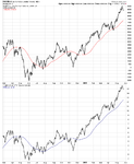
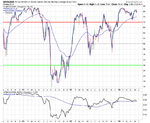
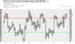
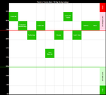
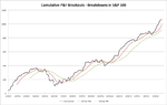
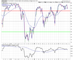
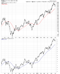
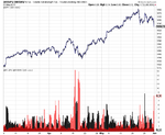
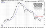
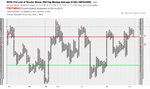
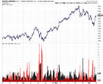
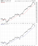
That being said when a market tops, it is generally a process that takes time. Most traders think tops are a one day event, but most of the times it takes weeks to unfold as the upward momentum slows and the big smart money players slowly hand off their long positions to the greedy emotion drove traders.
Look at the chart below and notice the first red box during September and October. As you can see it took nearly six weeks for that top to form before actually falling off. That same thing could easily happen again this time, though I do feel it will be more violent this time around.
Since the middle of April everyone, including their grandmother, seems to have been building a short position in the equities market. We know picking tops or bottoms fighting the major underlying trend is risky business, but most individuals cannot resist.
The rush you get trying to pick a major top or bottom is flat out exciting and that is what makes it so darn addicting and irresistible. If you have ever nailed a market top or bottom, then you know just how much money can be made. That one big win naturally draws you back to keep doing it much like how a casino works. The chemicals released in the brain during these extremely exciting times are strong
enough that even the most focused traders fall victim to breaking rules and trying
these type of trades.
So if are going to try to pick a top, you better be sure the charts and odds are leaning in your favor as much as possible before starting to build a position.
Below are a few charts with my analysis and thoughts overlaid showing you some of the things I look at when thinking about a counter trend trade like picking a top within a bull market.
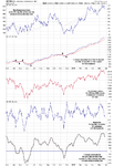
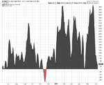
Utility Stocks vs. S&P 500 Index Daily Performance Chart:
The SPY and XLU performance chart below clearly shows how the majority of traders move out of the slow moving defensive stocks (utilities – XLU) and starts to put their money into more risky stocks. This helps boost the broad market. I see the same thing in bonds and gold this month, which is a sign that a market top is nearing.
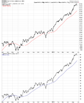
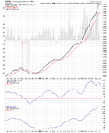
That being said when a market tops, it is generally a process that takes time. Most traders think tops are a one day event, but most of the times it takes weeks to unfold as the upward momentum slows and the big smart money players slowly hand off their long positions to the greedy emotion drove traders.
Look at the chart below and notice the first red box during September and October. As you can see it took nearly six weeks for that top to form before actually falling off. That same thing could easily happen again this time, though I do feel it will be more violent this time around.