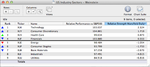
Re: DigitalGlobe (DGI)
http://www.trade2win.com/boards/technical-analysis/134944-stan-weinsteins-stage-analysis-69.html
Thanks for your views on this isatrader, and I still hold the position.
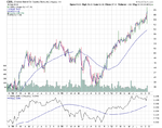
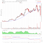
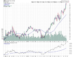
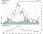
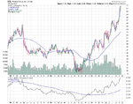
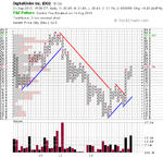
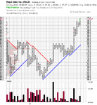
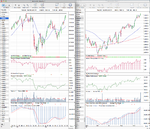
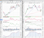
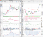
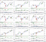
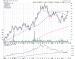
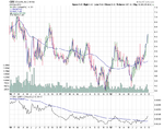
DGI stockcharts weekly
Have you noticed, though, that many picks have flattened off in relative strength to the SPX S&P500? I was looking down the list of my picks and found the typical outcome you get from several stock picking methods: one or two have done very well, several have gone up OK but quite slowly, several have stalled, and one or two have fallen badly. Overall, depending on exact entry point, the outcome since the start of August is approx 2%, I make it, but the SPX has risen approx 4%.
It always depends what you are in as the relative strength changes and so you need to re-balance the portfolio at regular intervals. Dorsey for example, does an ETF that focuses on the high relative strength stocks called the PDP, and I think they choose to re-balance that quarterly so that the stocks that fall down the RS table get trimmed and replaced with the new leaders.
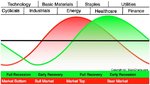
I had a similar problem at the start of the year when I was trading individual stocks mainly, as the stocks that I'd got into during November and December had outperformed, as they were mostly in the three defensive sectors, but then the sector rotation occurred in early January as more risk appetite came back, and my stock picks entered a consolidation phase and only made an extra few percent for the account during the first quarter, whereas the S&P 500 gained around 10% or so. So it made me focus a lot more on the relative strength movements as you might have noticed through the year in the thread with the various RS tables I post for the futures, sectors and indexes every week. As I think rotation is an important part of the method that isn't really talked about in the book, but obviously is dealt with in the monthly GTA report when Stan talks about whats going on. But as we don't have access to that as small investors, it's up to us to work it out for ourselves in order to stay ahead of the game.
...This suggests that while stock picking might be useful for hedging, it may be better (and a lot less time-consuming!) to look only for the breakouts on the main indices, just as you did with the nasdaq, not least because it saves you from the big failuring individual picks.
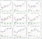
Thanks for another week of full commentary and chart analysis.
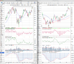
My CFD provider changed their charging structure for stocks. So I was forced out of the individual stock positions as you now have to pay a minimum charge of £9 plus the spread on each side of a stock trade. Whereas, on the indexes, currencies and commodities there's no min charge and you get paid dividends etc still. So as I like to see my cash position rise each day, instead be drained by fees - my focus has been on the indexes, currencies and commodities, as minimising fees is crucial imo, especially for someone trading a small account size.
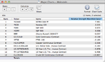
My current open positions
Longs
S&P 500 (SPX)
Nasdaq 100 (NDX)
Gold (GC_F)
Silver (SI_F)
Russell 2000 Small Caps (RUT)
GBP/USD
EUR/USD
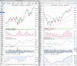
Buy Stop Order
Russell 2000 Small Caps (RUT)
I've got 15% of the account in cash currently as I recently took profits in the Silver and GBP/USD trades and closed the Soybean Meal trade as it hit my stop loss. Whereas, I also closed half my Nasdaq 100 trade as it's short term relative performance had dropped off and so I've now got 15% to put into the Russell 2000 Small Caps if it hits my buy stop order above last weeks highs.