Stan Weinstein's Stage Analysis

JSE Industry Charts & Ranking

Here is my first post on the JSE (Johannesburg Stock Exchange) industries. A big thanks to isatrader for guiding me along the way.

From what I see the best performing industry has been the Health Care. Basic Materials have been the worst performing, no surprise with that with all the uncertainty in the mining sector. I am now going to look into the top ranking industries on the weekly and see if I can find any Stage 2 Consolidations and post them soon.

RUTrading
 

Attachments

  • JSE_Industry_Ranking_Weekly.png
    JSE_Industry_Ranking_Weekly.png
    22 KB · Views: 218
  • JSE_Industry_Ranking_Daily.png
    JSE_Industry_Ranking_Daily.png
    22.8 KB · Views: 245
  • JSE_Industry_Weekly.png
    JSE_Industry_Weekly.png
    81.5 KB · Views: 271
  • JSE_Industry_Daily.png
    JSE_Industry_Daily.png
    80.4 KB · Views: 247
US Industry Sectors

Good to see some great hard work from RUtrading in the previous post, who has managed to get his charts set up in Metastock to use the method to analysis the JSE South African Market where he lives. So I look forward to his posts on the thread and some good discussions :smart:

US Industry Sectors

I've updated this weeks US Industry sector charts which shows the pullback across the board. Health Care (XLV) moved to the top of the table this week as it's pullback was less severe than the others. But Consumer Discretionary, Technology and Financials continue to hold above their zero lines.

If you zoom into the daily charts you'll notice that there's been some interesting developments during September. Although in larger stage 3 ranges, Energy and Basic Materials have both made new Stage 2 moves during September and this weeks pullback and bounce at the 2A breakout levels created the B entry points. They have been recovering in relative strength over the last few months, and so although they are not back above their zero lines and haven't broken out of the larger Stage 3 ranges. The more aggressive traders could find some opportunities, as they look to be recovering.

attachment.php
 

Attachments

  • US_Industry_Sectors_list_28_9_12.png
    US_Industry_Sectors_list_28_9_12.png
    21.2 KB · Views: 1,006
  • US_Industry_Sectors_D_28_9_12.png
    US_Industry_Sectors_D_28_9_12.png
    114.3 KB · Views: 256
  • US_Industry_Sectors_28_9_12.png
    US_Industry_Sectors_28_9_12.png
    119.3 KB · Views: 267
Re: Market Breadth

As we don't have access to Weinstein's proprietary S&P and Secondary Surveys (the percentage of stocks in those respective universes that are technically healthy - in Stages 1 & 2), which he considers to be the most important gauge when determining the market health. I instead use the market breadth indicators of the NYSE Bullish Percent Index ($BPNYA), and the NYSE Percent of Stocks Above their 200, 150 and 50 Day Moving Averages in it's place. . . .
I see Carl Swenlin uses a slightly different measure suggesting some caution, saying the overall scoring of SP500 stocks if you look within their 52 week ranges, although overall above 50 (out of 100) at 70, has not exceeded the April high (70), so does not confirm the SP500 break of the 1420 high
"Rel-to-52" Not Confirming S&P 500 Highs | Carl Swenlin | FINANCIAL SENSE
 
Re: Market Breadth

I see Carl Swenlin uses a slightly different measure suggesting some caution, saying the overall scoring of SP500 stocks if you look within their 52 week ranges, although overall above 50 (out of 100) at 70, has not exceeded the April high (70), so does not confirm the SP500 break of the 1420 high
"Rel-to-52" Not Confirming S&P 500 Highs | Carl Swenlin | FINANCIAL SENSE

It looks an interesting breadth measure and has very similar moves to Percentage of Stocks above their 150 day moving averages breadth chart. But I'm going to have to disagree with Carl Swenlin's interpretation of the chart, as he not taking into consideration that the Price relative to 52 Week Hi-Lo breadth chart is a relative measure, and so is locked to a baseline, much as the Mansfield RS indicator is to the 52 week MA (zero line), which means that only short term divergences have any relevance imo. Also it is a 0% to 100% chart and so has an upper an lower range that will always limit it, and the above 80% levels will only likely be reached when the market is incredibly bullish after a long up move or from a major recovery like in 2009/2010 when practically everything went up.

To get a fairer comparison I think you need to compare it to a relative measure of price, so that both charts are locked to a baseline - for which I use the percentage distance above or below the 30 week weighted moving average (see bottom of first chart attached below). This shows imo, that Swenlin's Price relative to 52 Week Hi-Lo breadth chart is actually showing a positive divergence to the price action, as the price line has yet to reach the levels it did early this year, whereas his Rel-to-52 breadth chart has (see bottom of second chart attached below).

So looking at from my perspective, it looks to have tracked the recent price moves very well. For example it made a higher high in August when the price did and made higher high in September when the price did. What would be a negative signal, would be if it started to make lower lows while the price is higher lows - which it hasn't yet. So there is no negative divergence imo, and it still looks in good shape and has room to the upside.
 

Attachments

  • Relative_to_30wkma_28_9_12.png
    Relative_to_30wkma_28_9_12.png
    43.6 KB · Views: 231
  • 6a0120a65d6eb8970b017ee3d6d602970d-pi.png
    6a0120a65d6eb8970b017ee3d6d602970d-pi.png
    30.6 KB · Views: 234
Last edited:
Attached are the major charts for analysis. I mentioned two weeks ago that the major charts were either approaching, or at some key resistance/support levels in the Commodities, Treasuries and Dollar index. And that we might get some churn for a bit around those levels before the markets decide whether they are going to continue on their current paths or not. This has played out and we are now at another inflection point as the major stock indexes have pulled back to their breakout levels, which are now support and had a small bounce on Thursday to give possible B pullback entry points.

Below is the Mansfield relative performance ranking table. Gold (GC) was the key mover this week as it crossed above it's zero line and moved up into second spot after pulling back and then rebounding strongly during the week.

Copper (HG) also pulled back to it's support at 3.7 and rebounded and now is setup for a Stage 2 breakout at a close above the 3.8395 high, so round it up to a close above 3.85 to be sure.

Crude Oil (CL) moved back below it's 50 day MA, but found support at 90 and rebounded at the end of the week and is trading in Stage 1. However, it's still currently the weakest in the relative performance table, so one to avoid for the time being, until it starts moving back up the table.

The Dollar Index (DX) found support two weeks ago at 79, but the bounce has been weak and particularly in the volume which can be seen in the cumulative volume at the bottom of the charts. This has gone sideways for two weeks now while the price has risen, so there isn't much conviction and gives weight to a possible continuation of the down move it's been in for the last few months.

US Treasuries have had a strong two weeks since bouncing off the 200 day MA, but the cumulative volume shows that's there's not a lot of conviction behind the moves, as the 10 year volume has gone sideways and the 30 year volume is lower than the August lows. Both are back above their 30 week WMAs, but that is to be expected in Stage 3 as price swings above and below the 30 week MA before either breaking down into Stage 4 or breaking out again into a Stage 2 continuation.

With Weinstein's method you want to see strong volume on the breakout moves and lighter volume on the pullbacks. Which appears to be the case with the majority of these charts currently, so I'm still leaning towards a further continuation move higher in equities in the coming weeks/months personally. But this is just my opinion and you might interpret them differently, but that's what makes a market at the end of the day.

attachment.php
 

Attachments

  • FTSE100_Weekly_28_9_12.png
    FTSE100_Weekly_28_9_12.png
    142.6 KB · Views: 291
  • DAX_Weekly_28_9_12.png
    DAX_Weekly_28_9_12.png
    136 KB · Views: 316
  • IWM_Weekly_28_9_12.png
    IWM_Weekly_28_9_12.png
    130.3 KB · Views: 270
  • NDX_Weekly_28_9_12.png
    NDX_Weekly_28_9_12.png
    136.3 KB · Views: 321
  • SPX_Weekly_28_9_12.png
    SPX_Weekly_28_9_12.png
    130 KB · Views: 277
  • GC_Weekly_28_9_12.png
    GC_Weekly_28_9_12.png
    130.4 KB · Views: 229
  • HG_Weekly_28_9_12.png
    HG_Weekly_28_9_12.png
    138.2 KB · Views: 320
  • CL_Weekly_28_9_12.png
    CL_Weekly_28_9_12.png
    131.7 KB · Views: 340
  • TY_10yr_Treasuries_28_9_12.png
    TY_10yr_Treasuries_28_9_12.png
    129.5 KB · Views: 298
  • US_30yr_Treasuries_28_9_12.png
    US_30yr_Treasuries_28_9_12.png
    130.1 KB · Views: 295
  • DX_Weekly_28_9_12.png
    DX_Weekly_28_9_12.png
    136 KB · Views: 307
  • Major_Charts_RS_list_28_9_12.png
    Major_Charts_RS_list_28_9_12.png
    24 KB · Views: 1,186
Last edited:
Futures Relative Performance

As it's the end of the quarter I thought I'd update the Futures relative performance table as well, as the last update was September 9th here: http://www.trade2win.com/boards/technical-analysis/134944-stan-weinsteins-stage-analysis-65.html#post1962696

A few interesting moves that I can see are firstly Natural Gas which has stormed up the table from 22nd into 3rd spot after making a Stage 2A breakout this week. The other is that Coffee has moved off the bottom and looks to be basing in Stage 1 finally after a year and half Stage 4 down move.

The precious metals have also all moved above their zero lines so there is now 10 of the 27 futures in the table outperforming the S&P 500, versus 7 three weeks ago, all of which are commodities, highlighting the continued improvement in that sector of the market, which has underperformed for so long.

Below is the Futures relative performance table and attached is the weekly charts in the same order.

attachment.php
 

Attachments

  • Futures_Weekly_1_28_9_12.png
    Futures_Weekly_1_28_9_12.png
    128.4 KB · Views: 314
  • Futures_Weekly_2_28_9_12.png
    Futures_Weekly_2_28_9_12.png
    130.9 KB · Views: 303
  • Futures_Weekly_3_28_9_12.png
    Futures_Weekly_3_28_9_12.png
    126.8 KB · Views: 367
  • Futures_Weekly_list_28_9_12.png
    Futures_Weekly_list_28_9_12.png
    48.9 KB · Views: 1,179
Last edited:
UK FTSE 350 Sectors

Here's the UK FTSE 350 Sectors as well. Interestingly 23 of the 36 are outperforming. i.e above their zero lines, but the FTSE is weighted by market capitalisation and so as the sectors with the biggest weightings are still mostly below their zero lines it's under performing overall. But clearly there's plenty of choice at the moment for stock pickers in the UK using the method, as the UK stocks are a lot healthier than the FTSE 100 chart is showing.

attachment.php
 

Attachments

  • UK_Sectors_list_28_9_12.png
    UK_Sectors_list_28_9_12.png
    50.7 KB · Views: 1,255
  • UK_Sectors_4_28_9_12.png
    UK_Sectors_4_28_9_12.png
    104.3 KB · Views: 391
  • UK_Sectors_3_28_9_12.png
    UK_Sectors_3_28_9_12.png
    107.3 KB · Views: 315
  • UK_Sectors_2_28_9_12.png
    UK_Sectors_2_28_9_12.png
    100.3 KB · Views: 314
  • UK_Sectors_1_28_9_12.png
    UK_Sectors_1_28_9_12.png
    102.3 KB · Views: 361
Re: US Industry Sectors

isatrader, is there a reason you do not include the Telecommunications sector (XTL) in your analysis?
 
Re: US Industry Sectors

isatrader, is there a reason you do not include the Telecommunications sector (XTL) in your analysis?

I chose to use the Sector SPDRs ETFs that divide the S&P 500 into nine sector index funds. As they are highly liquid and heavily traded and also because the amount of stocks in the Telecommunications sector in the S&P 500 are too small compared to the other Major Industry sectors - as there are only 10 telecoms stocks in the S&P 500. So you'll instead find the major telecoms stocks in the Technology Sector (XLK) of which for example AT&T is the fourth biggest holding at 7.17%, Verizon is sixth at 4.30%, CentryLink is nineteenth at 0.87% etc. To view the complete breakdowns go to: http://www.sectorspdr.com/spdr/composition/?symbol=XLK

If you want to view them on their own, then it's also covered by the Dow Jones U.S. Telecommunications Sector (^DJUSTL), which is traded via the iShares ETF (Ticker: IYZ) and has 28 holdings, which includes small cap stocks. And the XTL has 56 holdings.

I downloaded the XTL SPDR Fact Sheet and got the following quote from it:
"The Index represents the telecommunications sector of the S&P Total Market Index ("S&P TMI"). The Index is one of nineteen (19) S&P Select Industry Indices (the "Select Industry Indices"), each designed to measure the performance of a narrow sub-industry or group of sub-industries as defined by the Global Industry Classification Standards ("GICS")."

So as you can see the Telecommunications sector (XTL) is considered a narrow sub-industry.

Hope that helps explain.
 
Last edited:
We don't often look at currencies except for the Dollar Index on here, but I thought the EUR/USD chart was interesting today as it's moved into Stage 1B, after it's long Stage 4 over the last year or so. Price made swing high above the 200 day MA in September and has pulled back since then, and looks to be turning back towards that after making a short term low at the start of the month. The 50 day and 200 day MA have also crossed and it's relative strength versus the market is improving, and cumulative volume has got more positive over the last two months.

There is significant resistance between the 1.30 and 1.35 range though, from earlier in the year, so it might take time to work through that if it breaks out into Stage 2 above the 1.32 level. But it's an encouraging sign that it's improving technically for the stock market imo, as the European worries have been a drag on the markets for a long time. But it could also easily fall back into a larger Stage 1 base because of that near term resistance, so it is only suitable for the short term trader method currently until there's more confirmation.
 

Attachments

  • EURUSD_Weekly_4_10_12.png
    EURUSD_Weekly_4_10_12.png
    126.7 KB · Views: 354
Last edited:
Note the potential Stage 2 continuation moves in Gold and Silver. Gold (GC) has made a new high for the year today, and needs to close the day above 1792.70 to confirm the breakout. And for Silver (SI) you'd want to see a close above 35.50 imo.

[Update] Gold closed the day at 1796.5 and so made a confirmed daily Stage 2 continuation move. So hopefully we'll get a weekly confirmation as well. Attached is the chart.
 

Attachments

  • GC_Weekly_4_10_12.png
    GC_Weekly_4_10_12.png
    131.6 KB · Views: 348
Last edited:
I've been monitoring the effective volume closely over the last few weeks during this pullback and the divergence between what the large players are doing and what the small players are doing has been growing. So it looks to be a small player pullback with the large players stepping in to buy, especially in the Russell 2000 Small Caps and the S&P 500. For example, since the September high large player volume in the S&P 500 (SPY) has doubled, whereas smaller player volume has dropped into negative territory. The Nasdaq 100 (QQQ) hasn't seen the same effect as the large players have been selling there in line with the price action, but this could just be reallocation. So it appears to be an accumulation phase imo, if I'm interpreting it correctly.

The volume charts are below:

S&P 500 (SPY) Effective Volume

attachment.php


Nasdaq 100 (QQQ) Effective Volume

attachment.php


Russell 2000 Small Caps (IWM) Effective Volume

attachment.php
 

Attachments

  • IWM_Effective_Vol_4_10_12.png
    IWM_Effective_Vol_4_10_12.png
    13.7 KB · Views: 1,256
  • QQQ_Effective_Vol_4_10_12.png
    QQQ_Effective_Vol_4_10_12.png
    13.7 KB · Views: 1,250
  • SPY_Effective_Vol_4_10_12.png
    SPY_Effective_Vol_4_10_12.png
    13.6 KB · Views: 1,215
Last edited:
I last did a stage analysis on AIG on the 19th September here: http://www.trade2win.com/boards/technical-analysis/134944-stan-weinsteins-stage-analysis-68.html#post1969468 and since then it's pulled back with the market to it's 30 week WMA, and the 50 day MA, and this week has rebounded back to close to the breakout level that I highlighted on the previous write up. Relative performance is still good and notably, cumulative volume has broken out above it's May high in a positive divergence from the price action. This can also be clearly seen on the P&F volume bar which has continued to build to new highs since the June reversal to Xs.

So this is one to watch imo, for a Stage 2 continuation move and has a swing target of 42.92 if it breaks out and closes the week above 35.05

Attached is the charts
 

Attachments

  • AIG_Weekly_5_10_12.png
    AIG_Weekly_5_10_12.png
    120.5 KB · Views: 314
  • SharpChartv05.png
    SharpChartv05.png
    24.5 KB · Views: 286
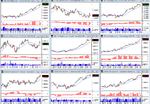
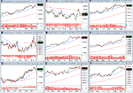
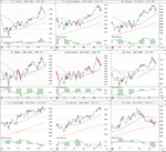
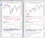
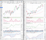
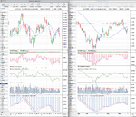
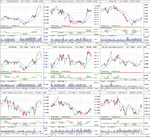
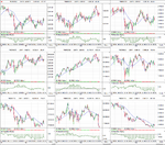
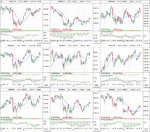
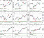
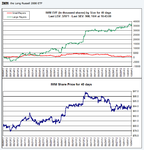
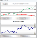
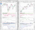
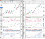
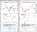
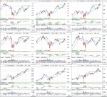
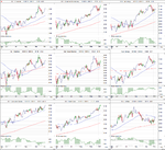
The possible B pullback entry points at the breakout support that I mentioned last week in the equity charts worked out, and stocks have had a good move higher this week, back up close to the September highs. However, it wasn't all positive though, as Friday's price action in the S&P 500 spiked up towards the highs early in the session, but moved lower during the day to end slightly negative.

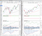
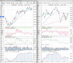
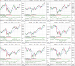
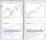
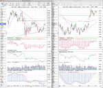
Gold (GC) also had a positive week, but the daily Stage 2 continuation move that I highlighted on Thursday wasn't confirmed by the weekly chart, as it pulled back again in Friday's session into the consolidation once more and also closed below the long term trend line.

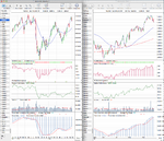
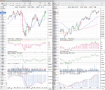
Copper (HG) moved slightly higher, but mostly had a consolidation week above it's near term support.

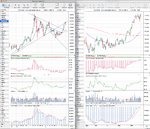
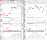
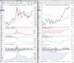
Crude Oil (CL) had a volatile week, trading down to close to it's $87 support level from the summer breakout and pullback, but is holding above it for now, but looks weak.

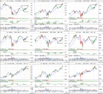
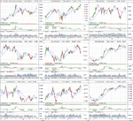
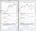
The weak bounce in the Dollar Index (DX) gave up around the $80 resistance and rolled over and traded down towards the $79 level again. The daily cumulative volume gave another sell signal on Friday and the weekly cumulative volume continued to drift down.

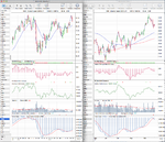
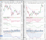
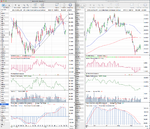
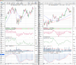
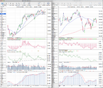
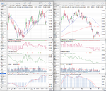
US Treasuries also rolled over and swung back below the 30 week WMA once more in it's Stage 3 range. If you look at the daily chart, the 30 year Treasuries have now made 3 lower highs and 2 lower lows and the relative performance is back below the trend line versus the S&P 500. Most interestingly though, was the fact that the mostly inverse relationship with stocks broke down during Friday's trade as both stocks and the 10 and 30 year Treasuries moved lower together. However, Treasuries are mostly only traded by professional traders, whereas stocks have a mix of all skill levels, so I'm more inclined personally to lean towards what the Treasuries traders are doing and what the institutional volume data is showing - which still favours equities for the time being imo from these collection of markets.

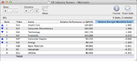
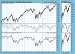
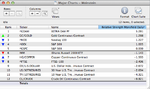
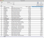
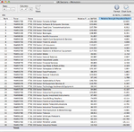
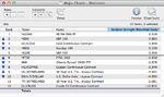
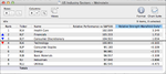
Below is the relative performance versus the S&P 500 table and attached are the major charts for analysis.

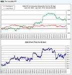
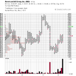
There was only minor moves in the table with the FTSE 100 gaining ground back towards it's zero line, but still in negative territory for now. The S&P 100 Mega Caps (^OEX) which has outperformed for the last year moved from 4th to 2nd spot and made a new 52 week high. The Nasdaq 100 (^NDX) dropped to 4th spot and broke through it's long term relative strength trend line versus the S&P 500. But, I believe this was mostly due to Apples (AAPL) weak performance which makes up around 20% of the index.

attachment.php
 

Attachments

  • FTSE100_Weekly_5_10_12.png
    FTSE100_Weekly_5_10_12.png
    143.2 KB · Views: 344
  • DAX_Weekly_5_10_12.png
    DAX_Weekly_5_10_12.png
    135.1 KB · Views: 295
  • IWM_Weekly_5_10_12.png
    IWM_Weekly_5_10_12.png
    128.2 KB · Views: 286
  • NDX_Weekly_5_10_12.png
    NDX_Weekly_5_10_12.png
    138.5 KB · Views: 357
  • SPX_Weekly_5_10_12.png
    SPX_Weekly_5_10_12.png
    132.2 KB · Views: 313
  • US_30yr_Treasuries_5_10_12.png
    US_30yr_Treasuries_5_10_12.png
    132.6 KB · Views: 339
  • TY_10yr_Treasuries_5_10_12.png
    TY_10yr_Treasuries_5_10_12.png
    133.3 KB · Views: 335
  • CL_Weekly_5_10_12.png
    CL_Weekly_5_10_12.png
    134.5 KB · Views: 308
  • HG_Weekly_5_10_12.png
    HG_Weekly_5_10_12.png
    135.1 KB · Views: 301
  • GC_Weekly_5_10_12.png
    GC_Weekly_5_10_12.png
    131.7 KB · Views: 315
  • DX_Weekly_5_10_12.png
    DX_Weekly_5_10_12.png
    135.3 KB · Views: 288
  • Major_Charts_RS_list_5_10_12.png
    Major_Charts_RS_list_5_10_12.png
    23.3 KB · Views: 1,080
Last edited:
US Industry Sectors

Attached are the updated US Industry sector charts which shows that Health Care (XLV) continued to strengthen at the top of the relative performance table, but notably Technology (XLK) fell back below it's zero line which it's been above since the summer in 2011. So now only 3 sectors of the 9 are outperforming the S&P 500, which are Health Care (XLV), Financials (XLF) and Consumer Discretionary (XLY).

Below is the relative performance table and thumbnail charts

attachment.php
 

Attachments

  • US_Industry_Sectors_5_10_12.png
    US_Industry_Sectors_5_10_12.png
    117.9 KB · Views: 323
  • US_Industry_Sectors_D_5_10_12.png
    US_Industry_Sectors_D_5_10_12.png
    114.1 KB · Views: 312
  • US_Industry_Sectors_list_5_10_12.png
    US_Industry_Sectors_list_5_10_12.png
    20.8 KB · Views: 1,065
hi isa
ok...well the charts are good.....
but they have no meaning to me
what sector is trending relative to the s&p 500 ??
you have marked res areas...ok...that is fine
but we really need to look at trend and where the trend gets supported or resisted
thinking that is more useful...but that is my opinion
the same applies to duplessis book...optimisation....you cannot optimise a set of data for trading signals...you have to define each trend first and then optimise for trading signals for that trend only.
each trend will have its own range volatility and will have different parameters for signals
do you get where i am coming from ???
 
think that it is more important to chart the trend of relative strength of sector against the index
now how do we do this ???
a line chart of sector against the index with different parameters
say..daily close
3 day close
and weekly close
we then get 3 different charts
and we can look and see where the trend is...and breakout points
if necessary go to 1.2 3 day close etc etc
this can be done on freestockcharts
even still..this is only a rough idea of things as each stock in a sector can behave very differently
just an opinion
 
Top