Stan Weinstein's Stage Analysis

hi isa
ok...well the charts are good.....
but they have no meaning to me
what sector is trending relative to the s&p 500 ??
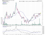
you have marked res areas...ok...that is fine
but we really need to look at trend and where the trend gets supported or resisted
thinking that is more useful...but that is my opinion
the same applies to duplessis book...optimisation....you cannot optimise a set of data for trading signals...you have to define each trend first and then optimise for trading signals for that trend only.
each trend will have its own range volatility and will have different parameters for signals
do you get where i am coming from ???

Hi dentist007, I do get where you are coming from and to be honest I get the impression that you haven't read Weinstein's book or the majority of the thread, as we've gone into great detail over over the last 75 pages studying the method and how to apply it.

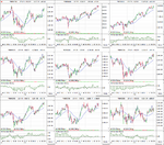
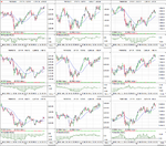
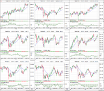
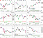
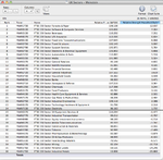
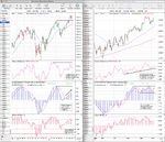
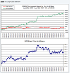
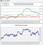
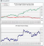
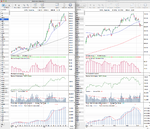
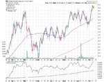
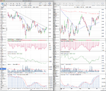
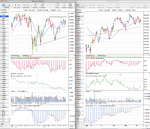
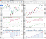
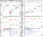
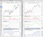
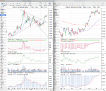
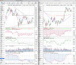
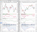
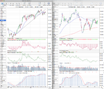
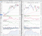
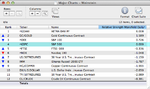
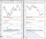
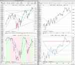
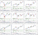
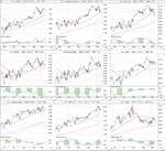
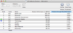
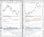
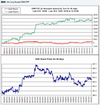
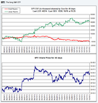
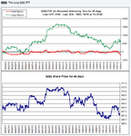
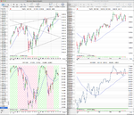
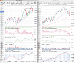
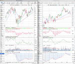
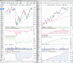
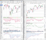
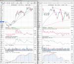
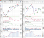
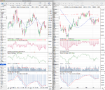
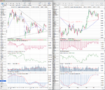
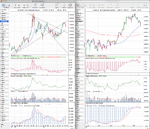
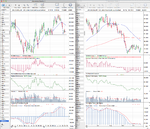
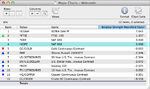
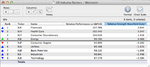
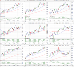
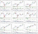
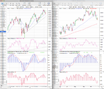
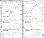
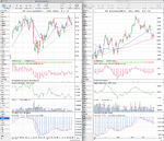
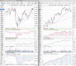
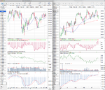
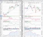
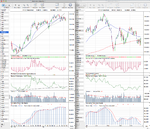
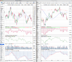
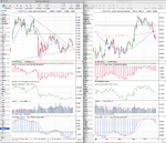
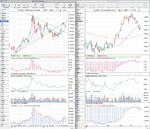
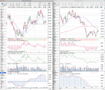
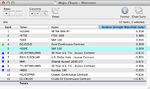
For the uninitiated, it's a top down method that begins with identifying what Stage the market is in (the trend) - of the four stages that Weinstein identified in his book. The next step is to identify the few groups that look the very best technically. Then once you've determine that the market trend is bullish and Group A acts the very best technically, the final step in the process is to zero in the one or two best individual chart patterns in that sector. So the reason that I post the major charts each week with their relative performance table and also the major US Industry sectors with their relative performance table, is that we can fulfill the first two requirements of the method - by identifying the major long term trend and seeing which sectors are outperforming the market. That way we can focus our stock searches in the strongest groups and avoid the weakest. And hence increase our probabilities of success.

If you have read the book you should be able to look at the nine US Industry sector charts that I posted and identify the stage that each is in. If you can do this then you will have a very clear idea of what the trend is for the broad market and where the strength and weakness is within the market. If you can't, then I'd recommend you read the book first as that is what the thread is about discussing.
 
think that it is more important to chart the trend of relative strength of sector against the index
now how do we do this ???
a line chart of sector against the index with different parameters
say..daily close
3 day close
and weekly close
we then get 3 different charts
and we can look and see where the trend is...and breakout points
if necessary go to 1.2 3 day close etc etc
this can be done on freestockcharts
even still..this is only a rough idea of things as each stock in a sector can behave very differently
just an opinion

The Mansfield Relative Strength (RS Mansfield Weekly) shown on the charts below the Price action is a line chart of the relative performance of the sector or stock versus the S&P 500. It has simply been flattened with a zero line to make it an oscillator. The zero line is simply the 52 week moving average of the relative performance on the weekly charts and the 200 day moving average of the relative performance on the daily charts. Crosses above or below the zero line help you identify when the stock, sector or index that you have chosen is outperforming the S&P 500. For example in this weeks post http://www.trade2win.com/boards/technical-analysis/134944-stan-weinsteins-stage-analysis-75.html#post1982962 I identified that Health Care (XLV), Financials (XLF) and Consumer Discretionary (XLY) are outperforming and so are the place to focus currently. Technology on the other hand fell below it's zero line (52 week MA of it's relative performance versus the S&P 500) for the first time since summer 2011. This shows that it's outperformed the S&P 500 for over a year, but now is beginning to under perform and so stocks in it should be avoided for the time being unless it can get back above it's zero line again.

Weinstein's method is very straightforward and I would recommend you read the book and the in depth examples in the thread so that you can join in the discussion properly and not go off topic. :eek:fftopic:
 
Last edited:
isa..ok
got the wrong end of the stick
however,,i have given you an idea to start youre own analysis thread
let us have a thread "isa"s trend anlysis of sector strength"
a far better approach
it will give us the trend..say as a line chart aginst the index
you must find those trends..it will be good for ur actual trading..imho
 
Hi dentist007, I do get where you are coming from and to be honest I get the impression that you haven't read Weinstein's book or the majority of the thread, as we've gone into great detail over over the last 75 pages studying the method and how to apply it. . . .
I can vouch for that. It does involve identifying trends, and it does involve a good deal of reading to make sure you have got it right, and isatrader's generous thread is a great tool to help people to apply the ideas of the book.
Also useful I have spotted an authoritative comment on how Weinstein thinking can help you avoid the perils of buying a simple downtrend break. Is Halfords Group a Buy? | ShareHunter 5 Oct 2012
 
isa..ok
got the wrong end of the stick
however, i have given you an idea to start your own analysis thread
let us have a thread "isa"s trend analysis of sector strength"
a far better approach
it will give us the trend..say as a line chart against the index
you must find those trends..it will be good for your actual trading..imho

I think between this thread and my Market Breadth thread that I spend enough time on t2w. But if you really read them both you'll understand how to identify those trends that you are talking about. It's just takes a bit of work of your part to understand what you are reading. As I said before, read Weinstein's book and then go through the hundreds of marked up examples in the thread, Weinstein's interviews, the Global Trend Alert reports that I managed to get hold of and our detailed discussions on here. I'm not qualified to teach, I've just studied this method more than most people do, and am still learning to apply it. Which is why I limit my opinions and try my best to just present the facts on here and promote a substantive discussion from the group in the hope that we can help each other and be challenged to do better in our own trading.
 
Last edited:
UK FTSE 350 Sectors

Attached are the UK FTSE 350 Sectors in order of relative strength. To understand the table, the first column is the Rank, of which #1 is the strongest sector currently on a relative basis and #36 is the weakest sector currently on a relative basis. It is sorted using the last column called "Relative Strength Mansfield Daily". This measures the percentage distance it is above or below the 200 day MA of it's Relative Performance line versus the S&P 500, and hence the larger the number the stronger the sector.

For traders it's also useful to look at the sectors crossing above or below their zero line as this shows that they are just beginning to outperform or underperform versus the market. For example this week Electricity (^NMX7530) has crossed above it's zero line from last weeks chart here: http://www.trade2win.com/boards/technical-analysis/134944-stan-weinsteins-stage-analysis-74.html#post1977894 and so a search in that sector on the LSE site here: http://www.londonstockexchange.com - FTSE 350 gives you two stocks to look at - DRX and SSE. Of which SSE is the best pick imo, using Weinstein's method, but needs to breakout and close above 1447.91, so above 1450 to be sure as it's still in a longer term Stage 3 until it does and hence not a buy yet as it could still reverse at the top of it's large two year range.

There were other sectors that crossed above and below their zero lines too. But I'll leave it up to you to do the work for yourselves, as hopefully I've shown how to use the relative strength tables clearly now?

Below is the UK FTSE 350 Sectors Relative Performance table and the thumbnail charts so you can determine the stages that each are in.

attachment.php
 

Attachments

  • UK_Sectors_1_5_10_12.png
    UK_Sectors_1_5_10_12.png
    103.5 KB · Views: 315
  • UK_Sectors_2_5_10_12.png
    UK_Sectors_2_5_10_12.png
    103.2 KB · Views: 301
  • UK_Sectors_3_5_10_12.png
    UK_Sectors_3_5_10_12.png
    106.4 KB · Views: 197
  • UK_Sectors_4_5_10_12.png
    UK_Sectors_4_5_10_12.png
    102.6 KB · Views: 303
  • UK_Sectors_list_5_10_12.png
    UK_Sectors_list_5_10_12.png
    50.8 KB · Views: 1,190
Last edited:
It's been over a month since I last looked at the Momentum Index (MI) - which is the 200 day moving average of the NYSE Advance Decline line. This is shown under the daily chart attached along with the 200 week moving average of the NYSE Advance Decline line to give a longer term view. On the MI we are currently seeing it track the price action reasonably well, but it is slightly weaker overall. More notable is the weekly MI which has a much clearer divergence with the price action although it is still trending higher since the May low.

My personal momentum measure that calculates the speed of the 30 week weighted moving average (30 WMA Momentum) on the weekly chart and the speed of the 50 day simple moving average (50 SMA Momentum) on the daily chart is still positive and moving higher, however it's also showing a divergence with the price action which can be seen also on the daily chart that has gone sideways for the last 3 months.

The divergences are warning signs, but they can stay out of touch with the price action for a long time, and have more significance once they start breaking down below previous lows imo - which they are still well above currently. So my read of the Momentum Index currently is that it's cautiously bullish still, but that's my opinion and you may interpret it differently.

Attached is the charts
 

Attachments

  • SPX_momentum_5_10_12.png
    SPX_momentum_5_10_12.png
    152.2 KB · Views: 271
Re: Effective Volume

The large player effective volume data continues to highlight that the current weakness is in the Nasdaq 100 ETF (QQQ), as the S&P 500 (SPY) large player volume and the Russell 2000 (IWM) large player volume is still pushing up against new highs. The small (retail) traders however are still selling in the SPY, diverging further from what the institutions are doing during this consolidation period.

Interestingly, Apple which makes up around 19.36% of the QQQ and 4.68% of the SPY pulled back to it's Stage 2 continuation breakout level today, and so could form a possible B entry point this week. So it's definitely one to watch closely as it's heavy index weightings effect the Nasdaq 100 and the S&P 500.

Below is the volume charts taken from the Effective Volume site so you can analyse them for yourselves.

attachment.php


attachment.php


attachment.php
 

Attachments

  • IWM_Effective_Vol_8_10_12.png
    IWM_Effective_Vol_8_10_12.png
    13.5 KB · Views: 1,078
  • QQQ_Effective_Vol_8_10_12.png
    QQQ_Effective_Vol_8_10_12.png
    13.6 KB · Views: 1,068
  • SPY_Effective_Vol_8_10_12.png
    SPY_Effective_Vol_8_10_12.png
    13.5 KB · Views: 1,064
Last edited:
Re: UK FTSE 350 - FGP.L continuation break down

Thanks for your great work in constructing and sharing all these charts, isatrader.
Although some income investors have propped this company up, and there is the relief from committing to the reckless tender for the West Coast Line, it looks a breakdown to me today below 190p. (The main breakdown was twelve months ago at 300p, I think.)Firstgroup PLC, UK:FGP- 4yrly wkly - BigCharts.com
 
Apple is attempting to create a continuation B entry point today after reversing at support yesterday. It needs to close above yesterdays high of 640.49 to confirm imo and is very important for the broad market. Attached is the chart.
 

Attachments

  • AAPL_Weekly_10_10_12.png
    AAPL_Weekly_10_10_12.png
    119.7 KB · Views: 350
Re: FXI 36 stage 1 b/o to stage 2

Just needs vol by the end of the week FXI - 3yr wkly 30week ema - StockCharts.com

It's an interesting one. But I'm not sure I'd agree on the Stage 2A yet, as the 30 week weighted MA has only just turned up last week and it hasn't made it's first swing high above the 200 day MA yet - which I prefer to see personally, especially when there is a large amount of near term resistance to work through as that will likely give the swing high that becomes the Stage 2 breakout level. However, it's making the right moves otherwise, as the 200 day MA has gone flat unlike it's previous attempt to breakout into Stage 2 in February when it was still declining strongly and it's broken the two year down trend line support. So I'd actually put it back in Stage 1, maybe Stage 1B on the near term and in a larger Stage 1 base on the longer term, as it's been building the larger base since last year, but fell back into Stage 4B- on the shorter term time frame during the summer. It's definitely got potential though for more aggressive short term traders looking to play this initial breakout, but they just need to be aware of the support and resistance levels. The initial swing target would be around the 40 level imo, and the traders stop loss would be about 33.35 - which is about 4.5x ATR(200) risk, which is a bit out my comfort zone as I prefer not to risk any more than 3x the ATR(200).

Attached is the charts, plus I've done a flipped version of weekly the chart as it gives a interesting perspective on it.
 

Attachments

  • FXI_Weekly_11_10_12.png
    FXI_Weekly_11_10_12.png
    131.7 KB · Views: 251
  • FXI_Weekly_flipped_11_10_12.png
    FXI_Weekly_flipped_11_10_12.png
    14.5 KB · Views: 229
Last edited:
Stocks reversed the previous weeks gains and have formed a lower swing high on the S&P 500 daily chart and closed the week below the previous swing low, right on the rising 50 day moving average. However, it's still above the April high of 1442.38 and if it does break down further then it also has recent price support down to just below 1400, and the 200 day moving average is not much further below that at around 1370. So although the short term momentum might be waning from the last six months uptrend; from a stage analysis perspective we are still in Stage 2B, which is considered "Getting late in uptrend. Watch carefully. But still a hold." And if it starts closing below the 50 day MA next week then I'll give it a minus rating as well, which is an "Unexciting pattern in that Stage." But to move into Stage 3A it would have to close next week a bit below 1400 imo, to get below the rising 30 week weighted moving average.

Below the S&P 500 chart is the NYSE percentage of stocks above their 150 day (30 week) moving averages breadth chart - which shows that currently 67.01% of stocks are above their 150 day moving average. It's moved to Bear Alert status by falling back below the key 70% level, but it is still on a buy signal for time being as it would need to get below it's 30 week WMA to go to a sell signal, which is currently at the 60.45% level and would need approximately another 204 stocks to fall below their 150 day (30 week) moving averages in the NYSE.

The Nasdaq 100 is much closer to going into Stage 3A as it's currently well below it's 50 day MA and in Stage 2B-. It is still above it's two year uptrend line, but relative performance versus the S&P 500 has been falling since April and went negative on the weekly chart last week. So the Nasdaq 100 needs to have a strong rebound in the next week or so or it will move into Stage 3.

The German DAX is still the strongest of the stock indexes and has outperformed the S&P 500 by around 9% since the June low. It's a long way above it 30 week WMA and still above the March high, but it is also closing in on it's 50 day MA and is in Stage 2B.

Gold (GC) moved up the relative strength rankings to 2nd place as the mega cap stocks in the S&P 100 moved lower with the rest of stocks. But the Gold chart looks closely inversely correlated to the US Dollar Index (DX) chart at the moment, which is bouncing around at support from earlier in the year. The Dollar Index is trading in Stage 3, below it's 200 day MA, and the volume is still very weak on the recent consolidation. The 50 day and 200 day MA have also crossed, so a break below the September swing low would put it into a new Stage 4A imo. If that does happen then Gold and the other commodities like Copper will likely make continuation moves.

Copper (HG) again looks like an inverse chart of the Dollar Index on the daily chart. It's consolidating in a tight range after running into the resistance range from earlier in the year, but it's above it's 200 day MA, which is close to crossing with the 50 day MA and so I'd rate it in Stage 1 at the moment. To become Stage 2A I think it needs to close above 3.85 - which is above the swing high of the recent range. However, it would still have resistance at the 4 level to overcome before it has a bit of clear air.

30 Year Treasuries (US) are holding in there and could potentially break out of it's three month down trend this week. That would probably tip stocks to the down side, so it's a key chart to watch next week. If however, it holds and reverses again then I am looking for a close below the September swing low for it to move into Stage 4A. Currently though it's still in Stage 3 and so could go either way here. The 10 Year Treasuries (TY) Stage 3 pattern is much clearer, as it broke convincingly below it's 30 week WMA in August and has struggled to get back above it a few times since. The 30 week WMA is completely flattened and the price is near to it's 50 and 200 day MA currently, but it could also break out as has made a few higher swing lows since August, so a critical week ahead imo.

Attached are the updated major charts for your own analysis and below is the relative performance versus the S&P 500 table ranked by the Mansfield RS Daily reading in the final column, so that you can see what the movement was over the last week.

attachment.php
 

Attachments

  • FTSE100_Weekly_12_10_12.png
    FTSE100_Weekly_12_10_12.png
    144.1 KB · Views: 261
  • DAX_Weekly_12_10_12.png
    DAX_Weekly_12_10_12.png
    138.2 KB · Views: 226
  • IWM_Weekly_12_10_12.png
    IWM_Weekly_12_10_12.png
    132.7 KB · Views: 183
  • NDX_Weekly_12_10_12.png
    NDX_Weekly_12_10_12.png
    139.6 KB · Views: 231
  • GC_Weekly_12_10_12.png
    GC_Weekly_12_10_12.png
    131.6 KB · Views: 200
  • HG_Weekly_12_10_12.png
    HG_Weekly_12_10_12.png
    138.6 KB · Views: 234
  • CL_Weekly_12_10_12.png
    CL_Weekly_12_10_12.png
    134.8 KB · Views: 308
  • TY_10yr_Treasuries_12_10_12.png
    TY_10yr_Treasuries_12_10_12.png
    131.4 KB · Views: 253
  • US_30yr_Treasuries_12_10_12.png
    US_30yr_Treasuries_12_10_12.png
    134.6 KB · Views: 260
  • Major_Charts_RS_list_12_10_12.png
    Major_Charts_RS_list_12_10_12.png
    23.8 KB · Views: 1,289
  • DX_Weekly_12_10_12.png
    DX_Weekly_12_10_12.png
    133.2 KB · Views: 248
  • SPX_Weekly_12_10_12.png
    SPX_Weekly_12_10_12.png
    145.5 KB · Views: 256
Last edited:
US Industry Sectors

Attached are the updated US Industry sector charts and the relative performance table. Health Care (XLV) and Financials (XLF) still top the RS rankings, and Consumer Staples (XLP) moved above it's zero line (200 day MA of the XLP/SP500 ratio) knocking Technology (XLK) down to 5th place in the RS rankings.

Below is the relative performance table and thumbnail weekly and daily charts of the nine major industry groups.

attachment.php
 

Attachments

  • US_Industry_Sectors_12_10_12.png
    US_Industry_Sectors_12_10_12.png
    124.4 KB · Views: 258
  • US_Industry_Sectors_D_12_10_12.png
    US_Industry_Sectors_D_12_10_12.png
    114.2 KB · Views: 259
  • US_Industry_Sectors_list_12_10_12.png
    US_Industry_Sectors_list_12_10_12.png
    20.7 KB · Views: 1,126
To follow up my post on EURUSD from October 4th here: http://www.trade2win.com/boards/tec...weinsteins-stage-analysis-75.html#post1981700 it's still trading in Stage 1B and looks suitable for a traders method entry imo. The trader stop loss point would be around 1.287 for more aggressive traders and below the recent range at 1.273 for less aggressive traders imo. Intra-day it's already moved it's ATR(200), so you might want to wait for a small pullback to get a better risk reward setup. Attached is the weekly and daily charts.
 

Attachments

  • EURUSD_Weekly_16_10_12.png
    EURUSD_Weekly_16_10_12.png
    127.5 KB · Views: 293
Last edited:
The effective large and small player volume in the QQQ, SPY and IWM ETFs was very interesting today following the Google sparked sell off. Big divergence, especially in the QQQ (Nasdaq 100 ETF) between the large institutional players that continued this weeks recovery in buying volume and the small retail traders that dumped their shares in the fastest rate in months. Below is the data and price charts

attachment.php


attachment.php


attachment.php
 

Attachments

  • IWM_Effective_Vol_18_10_12.png
    IWM_Effective_Vol_18_10_12.png
    14.9 KB · Views: 1,539
  • SPY_Effective_Vol_18_10_12.png
    SPY_Effective_Vol_18_10_12.png
    16 KB · Views: 1,603
  • QQQ_Effective_Vol_18_10_12.png
    QQQ_Effective_Vol_18_10_12.png
    15 KB · Views: 1,595
Attached are the updated major charts for your own analysis and below is the relative performance versus the S&P 500 table ranked by the Mansfield RS Daily reading in the final column, so that you can see what the movement was over the last week.

attachment.php


It was an interesting week, with the stock indices pushing strongly higher, before revering sharply on the last two days of the week to erase the majority of the prior gains following Google's early released results. The Nasdaq 100 took the biggest hit and reversed at it's 50 day MA resistance and is now pushing lower towards it's 200 day MA. This has moved it's stage to Stage 3A as the 30 week weighted moving average turned lower, and the Mansfield relative performance versus the S&P 500 crossed strongly below it's zero line. However, although it's showing the most weakness, it's still above it's 200 day MA and one year trendline - which has been tested multiple times. So I think it could find some support in the next week and attempt to form a swing low around that support and the 200 day MA.

The Dollar Index (DX) found support around the 79 level again to form a swing low as you can see on the daily chart. However, the cumulative volume is still very weak, so it needs more confirmation and so continues to be short term range bound. The direction it breaks out will be critical for commodities especially like Gold (GC) and Copper (HG).

Gold and Copper have pulled back strongly to their 50 day MA and so could find some support there. But the short term direction is still negative as there hasn't been any any attempt to bottom yet.

US 30 Year Treasuries and the 10 Year Treasuries are right on the edge of their trend lines. The 30 Year Treasuries spiked below the trendline, but closed the week just above it. These are the key charts to watch imo next week as they are at a critical juncture and would move into early Stage 4A if they break below their September swing lows, which would give support to the stock indices. If however, they continue Friday's pivot and move back up into their Stage 3 ranges then stocks will come under further pressure. The cumulative volume is flat in the 10 Year Treasuries, but is relatively weaker in the 30 Year Treasuries, so it still looks like it will eventually breakdown into Stage 4. But it's a battleground area, so it could still go either way.

So a very interesting week ahead, and for people that like to study seasonal patterns, the last week of October is the seasonal low point for the S&P 500. The 208th trading day which will be Friday 26th, from my own study of the all years average chart of the S&P 500, is the swing low point before an average 4% or so run up into the new year. So am hoping the seasonal pattern holds true this year.
 

Attachments

  • SPX_Weekly_19_10_12.png
    SPX_Weekly_19_10_12.png
    145.7 KB · Views: 338
  • NDX_Weekly_19_10_12.png
    NDX_Weekly_19_10_12.png
    137 KB · Views: 329
  • IWM_Weekly_19_10_12.png
    IWM_Weekly_19_10_12.png
    131.7 KB · Views: 228
  • DAX_Weekly_19_10_12.png
    DAX_Weekly_19_10_12.png
    139.7 KB · Views: 228
  • FTSE100_Weekly_19_10_12.png
    FTSE100_Weekly_19_10_12.png
    144.6 KB · Views: 286
  • US_30yr_Treasuries_19_10_12.png
    US_30yr_Treasuries_19_10_12.png
    134.8 KB · Views: 267
  • TY_10yr_Treasuries_19_10_12.png
    TY_10yr_Treasuries_19_10_12.png
    130.4 KB · Views: 272
  • CL_Weekly_19_10_12.png
    CL_Weekly_19_10_12.png
    135.8 KB · Views: 204
  • HG_Weekly_19_10_12.png
    HG_Weekly_19_10_12.png
    137.4 KB · Views: 280
  • GC_Weekly_19_10_12.png
    GC_Weekly_19_10_12.png
    131.9 KB · Views: 233
  • DX_Weekly_19_10_12.png
    DX_Weekly_19_10_12.png
    132.3 KB · Views: 232
  • Major_Charts_RS_list_19_10_12.png
    Major_Charts_RS_list_19_10_12.png
    23.9 KB · Views: 1,560
Last edited:
US Industry Sectors

Below is the relative performance table versus the S&P 500 and thumbnail weekly and daily charts of the nine major industry groups. Note Techs fall to bottom of the RS table and break of it's uptrend line which has put it into Stage 3A.

attachment.php
 

Attachments

  • US_Industry_Sectors_list_19_10_12.png
    US_Industry_Sectors_list_19_10_12.png
    21 KB · Views: 1,406
  • US_Industry_Sectors_D_19_10_12.png
    US_Industry_Sectors_D_19_10_12.png
    114.7 KB · Views: 266
  • US_Industry_Sectors_19_10_12.png
    US_Industry_Sectors_19_10_12.png
    123.7 KB · Views: 260
Attached are the updated major charts for stage analysis and below is the relative performance versus the S&P 500 table ranked by the Mansfield RS Daily reading in the final column, so that you can see what the relative movement was over the last week.

attachment.php


The Treasuries charts were the most interesting last week as they broke from their normal inverse relationship from equities and traded down with them for most of the week before reversing on Friday. I consider both of them to be Stage 3B now, especially the 10 year.

I've included the S&P 500 chart with the momentum indicators. The Advance Decline Line Momentum Index (MI) - which is the 200 day moving average of the Advance Decline Line, is trading close to the level it was at in July. If it starts closing below that then it would be a warning of more potential on the downside, but it's not there yet. However, the 30 week moving average momentum has crossed below it's own 10 week MA which indicates that the 30 week MA is starting to flatten and so the probability is high that it will go into Stage 3 again in the coming weeks. This doesn't mean that the market is going to go straight into a Stage 4 downtrend, although that does happen occasionally. But instead, just that it will start to form a sideways range between the September high and a swing low that it has yet to put in. The one year trend line is at 1375 and the 200 day MA is around the same level, so that seems a likely area for the S&P 500 to try to pivot, possibly in the next week or two imo.
 

Attachments

  • SPX_Weekly_26_10_12.png
    SPX_Weekly_26_10_12.png
    149.2 KB · Views: 286
  • NDX_Weekly_26_10_12.png
    NDX_Weekly_26_10_12.png
    136.5 KB · Views: 267
  • IWM_Weekly_26_10_12.png
    IWM_Weekly_26_10_12.png
    131.4 KB · Views: 240
  • DAX_Weekly_26_10_12.png
    DAX_Weekly_26_10_12.png
    137.9 KB · Views: 261
  • FTSE100_Weekly_26_10_12.png
    FTSE100_Weekly_26_10_12.png
    145.3 KB · Views: 290
  • US_30yr_Treasuries_26_10_12.png
    US_30yr_Treasuries_26_10_12.png
    136 KB · Views: 285
  • TY_10yr_Treasuries_26_10_12.png
    TY_10yr_Treasuries_26_10_12.png
    132.3 KB · Views: 257
  • CL_Weekly_26_10_12.png
    CL_Weekly_26_10_12.png
    136 KB · Views: 202
  • HG_Weekly_26_10_12.png
    HG_Weekly_26_10_12.png
    135.8 KB · Views: 275
  • GC_Weekly_26_10_12.png
    GC_Weekly_26_10_12.png
    131.3 KB · Views: 300
  • DX_Weekly_26_10_12.png
    DX_Weekly_26_10_12.png
    135.1 KB · Views: 254
  • Major_Charts_RS_list_26_10_12.png
    Major_Charts_RS_list_26_10_12.png
    24 KB · Views: 1,314
Last edited:
Top