Hey, I have a question. I also read the book and want to explore the techniques discussed further. However, an important concept is relative strength. On stockcharts.com and yahoo finance, they provide you with the RSI, which is a little different I think from relative strength as defined in the book. can you please explain to me how to find out what the relative strength is as defined in the book? thanks so much. Awesome thread, keep it up.
You are using an out of date browser. It may not display this or other websites correctly.
You should upgrade or use an alternative browser.
You should upgrade or use an alternative browser.
isatrader
Senior member
- Messages
- 2,965
- Likes
- 136
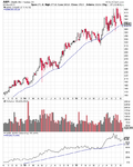
Thanks kwang2311, the relative strength indicator used is not the RSI that you find on stockcharts.com. It was a proprietary method calculated on the paid for Mansfield charts that he used. After exploring the issue myself for a while I realised that it was actually the relative performance of the stock versus the market, but turned into an indicator. So to create your own version of this you need to divide the price of the stock by the S&P 500. For example on stockcharts you can do this by selecting the price or price performance indicator and then putting AAPL:$SPX if you wanted Apple divided by the S&P 500. Which then shows you the relative performance vs the market. On my chart software I change the start date. So I adjust it to the last major low. Hope that helps.
Here's the link to the stockcharts page that should help: technical_indicators price_relative and I've attached an example chart from stockcharts below setup in a similar way to the book, but with an EMA as stockcharts doesn't have a weighted moving average.
Here's the link to the stockcharts page that should help: technical_indicators price_relative and I've attached an example chart from stockcharts below setup in a similar way to the book, but with an EMA as stockcharts doesn't have a weighted moving average.
Attachments
Last edited:
isatrader
Senior member
- Messages
- 2,965
- Likes
- 136
Can you explain why you used an exponential moving average instead of a simple moving average, and what the differences of the two are?
In the book he talks about the 30 week moving average (MA) in all of his basic examples. However, the Mansfield charts that he used for all the actual examples used a 30 week weighted moving average. Which is important as it is more sensitive to the recent prices, whereas a simple moving average gives an equal weighting to all the prices over the last 30 weeks.
I used an exponential MA in the stockcharts chart example, as they don't have a weighted MA, but it is the closest they have to it.
So if you can, use the 30 Week Weighted Moving Average. As that is what he was looking at in the book.
Hi isa,
I've read Stan's book numerous times now, and must admit it is brilliant. Over the last year or so I have been fiddling with shorter timeframes, but have come to the conclusion that my attempts boil down to "account death by a 1000 cuts!" So I am now following a more faithful Stan methodology, and so far with some good success. I use my own software to calculate the 30 week weighted moving average as per Stan's reference Mansfield charts.
Cheers!
isatrader
Senior member
- Messages
- 2,965
- Likes
- 136
Hi leonarda, good to see you're using his method as well. Feel free to contribute to the thread with your own charts if you'd like to.
I agree about the shorter time frames. I think the reason for it not being suitable for very short term trading is that volume is so important to the method, and on an intra-day basis it is less significant. So I'm trying to trade it to the letter, using weekly and daily charts only.
I agree about the shorter time frames. I think the reason for it not being suitable for very short term trading is that volume is so important to the method, and on an intra-day basis it is less significant. So I'm trying to trade it to the letter, using weekly and daily charts only.
isatrader
Senior member
- Messages
- 2,965
- Likes
- 136
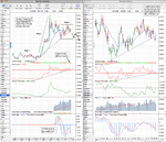
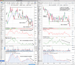
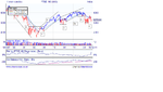
EURGBP Stage Analysis
I stumbled upon an interesting chart today, and thought I'd mark it up as I think it shows a lot of promise for a long term sell. The EURGBP chart has formed a large stage 3 top over the last 3 years or so after a huge Stage 2 run up of around 3000 points in 2007 and 2008.
The price broke down last year to give a Stage 3 low point below the 30 month moving average. This gave a pivot point for a 5 year trendline, which held over the last year until it was breached in September. Price has bounced around that trendline for the last 3 months, but it looks like the sell side is winning as it's not been able to get back above the trendline this November and was sharply rejected when it tested it again this week.
Volume on forex isn't the same as stocks, so I can't use the crucial volume part of the method faithfully on this chart. So I use my backup of cumulative volume at the bottom with a moving average to determine the conviction of the move. Which seems strongly negative as cumulative volume is near the low, but price hasn't fully broken yet - so there is a negative divergence.
The 30 month moving average has turned down for the last 3 months and the weekly chart has moved in early Stage 4A. So I'm looking to sell this with an initial swing target at 81, but hopefully it will eventually take that out as well and continue lower. But as I'm using a monthly chart for this, it could take a very long time to play out.
Attachments
isatrader
Senior member
- Messages
- 2,965
- Likes
- 136
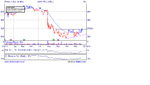
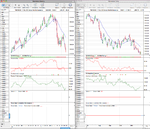
RAI - Reynolds American Stage Analysis
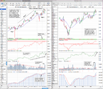
Reynolds American (RAI) looks like a good candidate for a Stage 2 continuation buy. Volume looks good on the breakout, with a contraction in volume on the pullback to the breakout level. Relative strength vs the S&P 500 is positive and the 30 week moving average is rising.
If you took a trade here then I think the stop loss level is below the recent low and the 30 week moving average. Somewhere below 37.50 seems sensible or even below 37 for a bit of extra room but you'd need a smaller position size to accommodate the extra space.
Attachments
isatrader
Senior member
- Messages
- 2,965
- Likes
- 136
for anyone who is interested ProRealTime free charts (daily and above) have the mansfield relative strength indicator built in
Thanks jesteruk, I didn't know that. I've also had a search around the web and found a page that explains the calculation of it so people can program it into their own charting software. Here's the link:
ChartMill.Com | Articles on Technical Analysis Indicators and Screeners
theblackmamba
Active member
- Messages
- 106
- Likes
- 3
interesting thread.
which stage would you put the ftse and SRP(serco) in at the moment?
could you give a few examples of recent trades either closed or still in?
hopefully il be able to contribute something as this method is interesting me..
which stage would you put the ftse and SRP(serco) in at the moment?
could you give a few examples of recent trades either closed or still in?
hopefully il be able to contribute something as this method is interesting me..
isatrader
Senior member
- Messages
- 2,965
- Likes
- 136
interesting thread.
which stage would you put the ftse and SRP(serco) in at the moment?
hopefully il be able to contribute something as this method is interesting me..
Hi @theblackmamba, thanks for the reply. I'd say the FTSE 100 is currently still in Stage 4 - the declining stage. I did a number of examples earlier in the thread of each stage to compare with, so I could learn to identify the stages and give others a reference also. Here's the link to the stage 4 examples:
http://www.trade2win.com/boards/technical-analysis/134944-stan-weinsteins-stage-analysis-4.html#post1701114
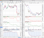
I've marked up the monthly, weekly and daily charts of SRP. Using the method I'd say it's in a Stage 4 continuation phase on the weekly chart - so the declining phase. However the monthly chart shows a large amount of support in the range it's approaching, but it's is quite old support, so it may not be as valid as if it was within the last few years.
The trendline on the monthly chart is currently being tested so a significant break of it would be quite negative and could cause a drop towards 350. But it easily rebound here if the markets turn around as that's a major trendline.
could you give a few examples of recent trades either closed or still in?
A couple of my current trades are:
01/11/11 - RR.L long @ 678.85
24/11/11 - Silver short @ 32.009
25/11/11 - STI short @ 16.729
25/11/11 - RAI long @ 40.06
Attached are the charts of SRP.L
Attachments
Last edited:
theblackmamba
Active member
- Messages
- 106
- Likes
- 3
hi thanks very much
i see you do the daily and weekly. doyou treat them both differently? ie if say serco looks good on weekly you wll short it, and if looks a weinstein on daily you open a seperate short?
i see you do the daily and weekly. doyou treat them both differently? ie if say serco looks good on weekly you wll short it, and if looks a weinstein on daily you open a seperate short?
theblackmamba
Active member
- Messages
- 106
- Likes
- 3
ps. just seen the ones you in. thanks for posting.
theblackmamba
Active member
- Messages
- 106
- Likes
- 3
isatrader
Senior member
- Messages
- 2,965
- Likes
- 136
hi thanks very much
i see you do the daily and weekly. doyou treat them both differently? ie if say serco looks good on weekly you wll short it, and if looks a weinstein on daily you open a seperate short?
I look at all the time frames in the same way, but give more weight to the higher time frame. The method in the book is based on the weekly time frame, so when you look at what stage it's in, that should be your first chart.
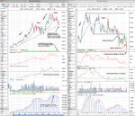
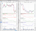
aml looks like a potential stage 2 on daily chart, but on weekly still at best beginning stage1.
On the daily chart, I'd say it's Stage 1,and would move into Stage 1B if it breaks above the recent high at 322.10, as it then has to break resistance above resistance above 354.50. That would then be a move move into Stage 2A on the daily. However, the weekly Stages are the most important and currently AML.L is still in Stage 4 - see the downward moving average. So any trades should still be either short or nothing as it's still in the declining stage. Also don't forget volume when you are looking as a decent increase on the breakout is crucial.
You also shouldn't look at the chart in isolation. First you need to see what the major trend of the market overall is?
Then look at how the sector group is performing - I've attached the chart for non life insurance.
Compare relative performance of AML.L versus the general market and also versus the sector. Is it outperforming?
Compare the sector versus the market as well.
If all looks good then you buy half your position on the breakout to stage 2.
If volume looks promising on the breakout (2x the 4 week average) and then contracts on the pullback towards the initial breakout level, then buy the remaining half of the position.
If volume doesn't increase enough on the breakout then sell on the first rally. If it doesn't manage to rally and falls back below the breakout point then dump it immediately.
Edit: Attached is the charts including the relative performance vs the S&P 500 and versus the Non life insurance sector. You can also see the sectors performance versus the S&P 500 on the sector chart, which is under performing.
Edit 2: An additional thing I like to look at is the 200 day correlation with the S&P 500 as this tells you how much of the daily movement is influenced by the general market. AML.L has a current correlation of 0.86. So 86% of the daily movement is caused by the general market.
Attachments
Last edited:
isatrader
Senior member
- Messages
- 2,965
- Likes
- 136
hi thanks very much
i see you do the daily and weekly. doyou treat them both differently? ie if say serco looks good on weekly you wll short it, and if looks a weinstein on daily you open a seperate short?
I would say regarding Serco, the bias is negative, but you missed the breakdown point. So you'd want to wait for the pullback towards that and then watch the daily price action to see if it was failing at resistance, as that would then give you a lower risk entry point as you'd be able to have a tighter initial stop loss above where it failed.
theblackmamba
Active member
- Messages
- 106
- Likes
- 3
hi, thanks for your explanations. much appreciated....its a lot more complicated/in depth than i imagined, but it is the way i want to go with my longer term trading..
basically april/may/june 09 was the best time to buy.
basically april/may/june 09 was the best time to buy.
isatrader
Senior member
- Messages
- 2,965
- Likes
- 136
hi, thanks for your explanations. much appreciated....its a lot more complicated/in depth than i imagined, but it is the way i want to go with my longer term trading..
basically april/may/june 09 was the best time to buy.
They were, but the Stage 2A breakout would have been late July once the initial resistance had been breached.
When I started learning this I was seeing stage 2 too early as well. Look at the reference examples of Stage 1B and Stage 2A earlier in the thread here: http://www.trade2win.com/boards/technical-analysis/134944-stan-weinsteins-stage-analysis-3.html#post1698062 and that should give you a better idea what to look for. The method works in reverse as well, so shorting in Stage 4A.
I really recommend getting a copy of the book as it has exercises at the end of each chapter that you do to make sure you understand what you have read properly and I'm happy for you to post charts etc on here as it will help us all learn together.
Last edited:
theblackmamba
Active member
- Messages
- 106
- Likes
- 3
Similar threads
- Replies
- 2
- Views
- 5K
- Replies
- 170
- Views
- 30K
- Replies
- 9
- Views
- 17K
- Replies
- 0
- Views
- 2K