Trading the ES (E mini) December 2003

SOX and BIX

You can see that the initial move down, the SOX MACD was diverging as it did on the Tick MACD.
 

Attachments

  • dow 5min195.png
    dow 5min195.png
    74.4 KB · Views: 303
Mate

Let me stick your averages on my charts so I can see what your on about.

Do you have any hard and fast rules geez.
 
matey internals (%wise) r very important in seeing how indices relate to each other, but I find their positions with respect to THEIR RESPECTIVE key averages to be at least just as crucial. just because key averages incorporate betas (largely) and respective positioning shows if high beta indices move "MORE" than their beta wud suggest.
 
ndx, comp, sox, bix all well below 240 and 600 mas on 5 min. spx hugging it. dow above slightly. this is how I am seeing it.
 
Mate

A key average is a trend following tool, right? I have stuck your
5 35 10 setting on the $RUT, BIX, SOX and ES. The bars on the MACDs were below zero but progressivley and to me deliberatly made HLs. I drew a line in the sand at 1066 this morning before trade started. That the ES found support here did not really surprise me. Especially as the MACDs to me looked positive. Do me a favour geez and post a chart of a good example how this works later on.

Ta mate
 
ndx key averages

ndx - like all other techies and bix below key averages
 

Attachments

  • ndx0912keyavrg.jpg
    ndx0912keyavrg.jpg
    60.5 KB · Views: 239
spx key averages

spx slightly above its key averages
 

Attachments

  • spx0912keyavrg.jpg
    spx0912keyavrg.jpg
    65.8 KB · Views: 218
From the 2 charts above - naz leading more to the downside than its mere beta as reflected in key averages would suggest - neg divs across indices.

HOWEVER - dow up whilst naz down AND, even more importantly, making HLs on techies' LLs (that true for spx as well). THIS IS the case for abberation - similar to yesterday.
 
Mate

Why do you call these key averages. Have they been identified by market professionals as the ones to look at and for this reason carry more weight.

Can I ask you and whoever else may know the answer to this. I calculate daily, a simple pivot point by using sterolines calculator.
The RUS, SOX and BIX have traded below this all day. The ES on the other hand sort of walked around it then spiked up after FOMC and then crashed beneath it. With the other indecis not being able to get above their pivots, can we view in the same way as we view your EMAs.

Cheers
Andy
 
240 and 600 ema/5 min = 20 and 50 ema/1 hour.

These r key averages on hourly charts. Even more important, they r the smallest time scales (20 and 50 hours) where beta-based play is meaningful.

I will post later on abberation - a rare animal indeed - which I do not think we had a chance to address b4.

Stoploss, what u wrote is spot-on and very related to what i will post later. cheers mate
 
SOX and Pivot

And the SOX

Yellow line is pivot and white lines (just blow away) are S levels taken from calculator.

Candles are SOX and bars are ES overlay.
 

Attachments

  • dow 5min197.png
    dow 5min197.png
    79.6 KB · Views: 214
China, As you know i am new to futures trading, but after several weeks of working thru this thread I am really getting to grips with your system. One of the things I find difficult to judge,
( and I guess it's the same for all beginners) is when to take a
profit. Some of the really good Tick set ups yield only 1-2 points, then some without the MACD div yield 8-10 pts, as in the last
1 1/2 hours yesterday. Any tips?
cheers,
hampy
 
Stoploss,

Although they are not based on the same principals as China's 20 and 50 hour mas I find viewing action relative to pivots across the different indices helpful.

Must confess, never have watched sox or bix but as China said on something else, that's because (for me at least) the extra effort isn't worth any extra insight they might give me.

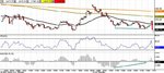
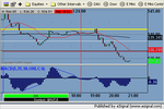
As we've discussed before, I do keep pivot points on ES, NQ and YM simply so that (as you suggest) I can judge the relative strength or weakness of each at a glance.

As we've said before, if nothing else, the pivot can be viewed as a "balance point" for the previous days action. Viewed in the context of their pivots, you can see that yesterdays and todays NQ was particularly weak and non-supportive of the run up on the YM. The ES lay somewhere in the middle.

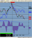
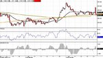
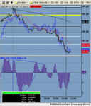
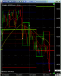
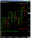
As an extension of the same concept I keep longer time frame charts of ES, NQ and DJ up with weekly pivots on. Don't want to move off topic with this so I'll just include the charts with a brief description and if necessary we can take it to another thread to follow up.

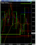
OK. First chart.... weekly ES. Each bar is 30 minutes with each surrounding box being a days action.

White lines: Weekly R2 calculated from previous week close/current week open.
Blue lines: Weekly R1.
Dotted Red Line: Weekly pivot calculated from previous weeks close.
Dotted Green Line: Weekly pivot calculated from current weeks open.
Solid Green Line: Previous weeks high.
Solid Red Line: Previous week low.
Solid Brown Line: Previous weeks close.

As I said won't go into too much detail to save going off topic. However, the one REALLY important thing that you can immediately extract from this chart is the significance of 1064.25 to 1068.5................
 

Attachments

  • weekly es.gif
    weekly es.gif
    22 KB · Views: 210
Last edited:
Weekly NQ chart.

Key is the same as the ES chart above. But the weakness of NQ failing to hold above weekly pivot was in stark contrast to ES.
 

Attachments

  • weekly nq.gif
    weekly nq.gif
    19.8 KB · Views: 206
And finally, weekly YM.

Even starker contrast to NQ. However, like the ES, look how long price traded around 9870-9890. Also worth noting is how weekly R2 contained yesterdays/todays move up.
 

Attachments

  • weekly ym.gif
    weekly ym.gif
    19.5 KB · Views: 224
Top