Stan Weinstein's Stage Analysis

Here's a link to a mini Q&A email I did with Stan on a range of questions about the method that people have asked on here and on the Stage Analysis boards: Stan Weinstein Q&A
 
Hi, isatrader,

great thread. I am a big fan of Sam Weinstein's stage analysis after reading his book, 'Secrets for Profiting in Bull and Bear Markets'. It seems like quite a long thread so need to get reading to catch up :)

I'm quite junior in the investing/trading space, having been doing it for the last four years, so trying to get my trading system set up currently.

Do you have a chart showing the current state of stage analysis for the S&P 500 and Russell 2000?

Thanks
 
Hi, isatrader,

great thread. I am a big fan of Stan Weinstein's stage analysis after reading his book, 'Secrets for Profiting in Bull and Bear Markets'. It seems like quite a long thread so need to get reading to catch up :)

I'm quite junior in the investing/trading space, having been doing it for the last four years, so trying to get my trading system set up currently.

Do you have a chart showing the current state of stage analysis for the S&P 500 and Russell 2000?

Thanks

The thread was getting too big on here and so has moved to the StageAnalysis forum, where it is now multiple threads to make it easier to find the information.
 
The thread was getting too big on here and so has moved to the StageAnalysis forum, where it is now multiple threads to make it easier to find the information.

no worries, isatrader. I've just registered over at your stageanalysis website.

Thanks
 
The thread was getting too big on here and so has moved to the StageAnalysis forum, where it is now multiple threads to make it easier to find the information.

Hello,

Struggling to find the new thread..can you post the link pls?

Very interesting thread....im just looking at Weinsteins technique and it seems like it could be quite effective
 
Hello,

Struggling to find the new thread..can you post the link pls?

Very interesting thread....im just looking at Weinsteins technique and it seems like it could be quite effective

You can find it via the second post on this page through the link to the Stan Weinstein Q&A - post #962, or just Google Stage Analysis forum and you will find it.
 
Last edited:
FAQ: How to create the Mansfield Relative Strength Indicator

One of the core components of Stan Weinstein's method is the use of Relative Performance compared to an index such as the S&P 500, to a sector or to another stock. Which was referred to in his book as Relative Strength.

However, this should not to be confused with the popular RSI (Relative Strength Index developed J. Welles Wilder), which is a momentum oscillator that measures the speed and change of price movements on a single stock. And so, to avoid any confusion when talking about the kind of Relative Strength we are interested in, I've renamed to be "Relative Performance".

Weinstein defines it as the following on page 18 of the book:

"How a given stock (or group) acts in relation to the overall market. For instance, if stock XYZ rallies 10 percent while the market moves ahead 20 percent, that's poor relative strength even though the stock has advanced. On the other hand, if stock XYZ declines 10 percent while the market averages decline 20 percent, that's favorable relative strength even though the stock has moved lower. The formula for measuring relative strength is simply the price of a stock ( or group average) divided by the price of a market average."

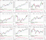
Relative Performance Indicators

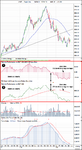
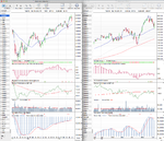
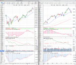
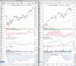
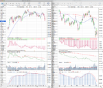
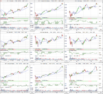
On here I have two ways of representing the Relative Performance on a chart. The first version I show is the representation that people are used to from the book (#1 on the below chart) which is the Mansfield Relative Strength Indicator. The second version that I show immediately below (#2 on the below chart) is the standard relative performance line that you get if you divide the closing price of the stock by the index that you want to reference, which in the majority of cases will be the S&P 500 Index unless otherwise stated.

So as you can see, these two indicators are identical, however, they show the Relative Performance data in slightly different ways, which I personally find useful to see. For example, the "zero line" on the Mansfield version is a flattened 52 week moving average which shows the data more like an oscillator and so is easier to see when it reaches extremes. However, on the standard relative performance line the slope of the 52 week moving average (zero line) can be seen, which can give further clues to the relative performance of the stock versus the index on a longer term basis.

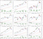
Below is a weekly chart of Apple (AAPL) showing the two versions of the Relative Performance Indicator versus the S&P 500 Index.

attachment.php


Standard Relative Performance indicator

The formula for calculating standard relative performance indicator is quite simple:

Code:
RP = ( stock_close / index_close ) * 100

And then a 52 week moving average is added to the indicator to show the zero line.

So the longer version is:

Standard Relative Performance = (today's close of the stock divided by today's close of the index) * 100


Mansfield Relative Performance indicator

The formula of this indicator is a bit more difficult than the regular Standard Relative Performance indicator:

Code:
MRP = (( RP(today) / sma(RP(today), n)) - 1 ) * 100

Where:
RP = Standard Relative Performance indicator (see above)
SMA = Simple moving average over n days.
n = 52 for weekly charts, and n = 200 on daily charts

So to make it a bit clearer:

Mansfield Relative Performance = (( Today's Standard Relative Performance divided by Today's Standard Relative Performance 52 Week Moving Average )) - 1) * 100

I hope the above calculations all make sense, but if you need further assistance then chartmill.com did a good article on it which you can find here: ChartMill.Com | Articles on Technical Analysis Indicators and Screeners
 

Attachments

  • Mansfield-Relative-Strength-Ex.png
    Mansfield-Relative-Strength-Ex.png
    44.9 KB · Views: 4,567
Re: FAQ: How to create the Mansfield Relative Strength Indicator

Great post, isatrader. Bookmarked for when it comes to me putting my home chart setup together

Thought this thread at finished now at its all moved over to the stageanalysis website?
 
Re: FAQ: How to create the Mansfield Relative Strength Indicator

Great post, isatrader. Bookmarked for when it comes to me putting my home chart setup together

Thought this thread at finished now at its all moved over to the stageanalysis website?

I'm still keeping it alive with occasional duplicate posts from the other threads, but 95% is over there now. But it is hard to let this one go, as have been doing it for the last few years, so will still post occasionally on here.
 
US 10 & 30 Year Treasuries

Attached is the updated US 10 & 30 Year Treasuries charts, which have made a Stage 4 continuation move below the March swing low on the heaviest weekly volume I can see on my chart this week. It was a contract rollover week, and so the adjusted charts don't show the breakdown that the unadjusted charts that I show do.

The cumulative volume has broken down strongly though on both the 10 & 30 Year Treasuries charts and relative performance versus the S&P 500 continues to be weak.

The Treasuries did previously move into Stage 1A briefly in April, but have had a strong sell off during May on increasing volume.

Attached is the updated charts and I've also attached the 10 and 30 year yield charts to give a different perspective as you can see the secondary Stage 2 breakouts on both yield charts.

TY_10yr_Treasuries_31_5_13.png$TNX_W_31-5-13.png

US_30yr_Treasuries_31_5_13.png$TYX_W_31-5-13.png
 
UK FTSE 350 Stocks Relative Performance

Below is the updated FTSE 350 stocks relative performance table

Top 50 FTSE 350 Stocks by Overall RS Score

FTSE350_RS_top50_31-5-12.png

Also attached below is the biggest moving FTSE 350 stocks since last week by their Mansfield Relative Performance figures. Brewin Dolphin (BRW.L) was this weeks strongest stock and Thomas Cook Group (TCG.L) was the weakest.

FTSE 350 Gainers

FTSE350_RS_top35_31-5-12.pngBRW-L_31-5-13.png

FTSE 350 Fallers

FTSE350_RS_bot35_31-5-12.pngTCG-L_31-5-13.png
 
FTSE 350 Sectors Relative Performance

Below is the updated FTSE 350 Sectors Relative Performance table in order of 200 day Mansfield Relative Strength.

attachment.php


P.S. For anyone that wants to trade the UK FTSE 350 sectors directly. I believe IG Index has over 30 of them available to trade, with only a few of the smaller ones missing from the list.

Attached is the updated sector charts in order of Relative Performance.
 

Attachments

  • FTSE350-Sectors-L1_31-5-13.png
    FTSE350-Sectors-L1_31-5-13.png
    89.9 KB · Views: 409
  • FTSE350-Sectors-L2_31-5-13.png
    FTSE350-Sectors-L2_31-5-13.png
    100.4 KB · Views: 414
  • FTSE350-Sectors-L3_31-5-13.png
    FTSE350-Sectors-L3_31-5-13.png
    96.7 KB · Views: 369
  • FTSE350-Sectors-L4_31-5-13.png
    FTSE350-Sectors-L4_31-5-13.png
    105.7 KB · Views: 410
  • FTSE350-Sectors-L5_31-5-13.png
    FTSE350-Sectors-L5_31-5-13.png
    36.3 KB · Views: 366
  • FTSE350-Sectors-RS_31-5-13.png
    FTSE350-Sectors-RS_31-5-13.png
    32.2 KB · Views: 1,520
UK FTSE 350 Stocks and Sectors Relative Performance

Below is the updated the weekly FTSE 350 stocks and sectors relative performance tables

FTSE 350 Sectors by Overall RS Score

FTSE350-Sectors-RS_7-6-13.png

Top 50 FTSE 350 Stocks by Overall RS Score

FTSE350_RS_top50_7-6-13.png

Also attached below is the biggest moving FTSE 350 stocks since last week by their Mansfield Relative Performance figures.

FTSE 350 Gainers

FTSE350_RS_top35_7-6-13.png

FTSE 350 Fallers

FTSE350_RS_bot35_7-6-13.png
 
Major Stock Indexes Update

Attached is the updated major equity index charts and relative performance table.

attachment.php
 

Attachments

  • DAX_Weekly_7-6-13.png
    DAX_Weekly_7-6-13.png
    138.4 KB · Views: 413
  • NYA_Weekly_7-6-13.png
    NYA_Weekly_7-6-13.png
    132.7 KB · Views: 395
  • IWM_Weekly_7-6-13.png
    IWM_Weekly_7-6-13.png
    131.7 KB · Views: 378
  • IXIC_Weekly_7-6-13.png
    IXIC_Weekly_7-6-13.png
    136.7 KB · Views: 377
  • SPX_Weekly_7-6-13.png
    SPX_Weekly_7-6-13.png
    144.8 KB · Views: 352
  • FTSE100_Weekly_7-6-13.png
    FTSE100_Weekly_7-6-13.png
    136.7 KB · Views: 364
  • Major_Charts_RS_list_7_6_13.png
    Major_Charts_RS_list_7_6_13.png
    25.4 KB · Views: 1,302
Futures

Attached is the updated major commodities charts, Gold (GC), Copper (HG), West Texas Intermediate Crude (CL), plus the Dollar Index (DX) and the US 10 & 30 Year Treasuries charts.
 

Attachments

  • TY_10yr_Treasuries_7_6_13.png
    TY_10yr_Treasuries_7_6_13.png
    131.9 KB · Views: 284
  • DX_Weekly_7-6-13.png
    DX_Weekly_7-6-13.png
    134.4 KB · Views: 311
  • CL_Weekly_7-6-13.png
    CL_Weekly_7-6-13.png
    145.8 KB · Views: 297
  • HG_Weekly_7-6-13.png
    HG_Weekly_7-6-13.png
    133.6 KB · Views: 312
  • GC_Weekly_7-6-13.png
    GC_Weekly_7-6-13.png
    126.2 KB · Views: 309
  • US_30yr_Treasuries_7_6_13.png
    US_30yr_Treasuries_7_6_13.png
    135.6 KB · Views: 283
US Industry Sectors

Attached are the updated US Industry Sector Charts and relative performance table.

attachment.php
 

Attachments

  • US_Industry_Sectors_7_6_13.png
    US_Industry_Sectors_7_6_13.png
    115.2 KB · Views: 270
  • US_Industry_Sectors_D_7_6_13.png
    US_Industry_Sectors_D_7_6_13.png
    106.1 KB · Views: 299
  • US_Industry_Sectors_list_7_6_13.png
    US_Industry_Sectors_list_7_6_13.png
    20 KB · Views: 1,121
Hi there,

I'm a newbie to trading and have recently read Stan Weinstein's book. I trade with esignal. They don't seem to have heard of the Mansfield Relative Strength Indicator which seems to be an integral part of Stan's trading strategy. How can I get this indicator coded on EFS (Esignal)? If anyone has any ideas, my email address is [email protected]. Will appreciate any advice.
 
Last edited:
Top