A follow up question to your stage comments in your last post...
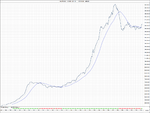
So is one of the key things to identifying a stage one is the flattening out of the 30 week MA first and then a price spike above this (which will then define your stage 1 range)?
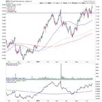
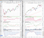
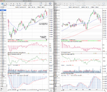
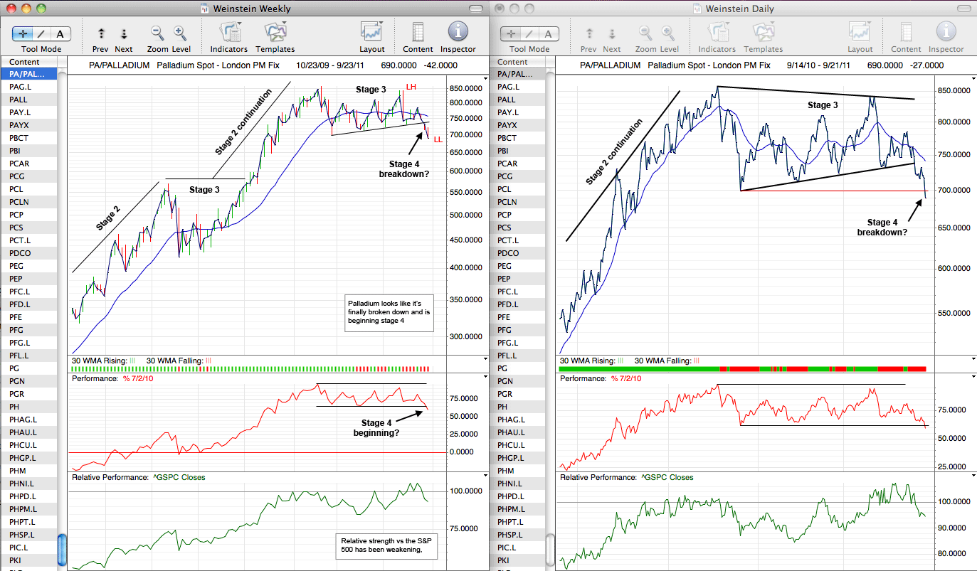
No, the 30 week simple moving average does not have to have flattened out for it to start forming into Stage 1, that comes later during Stage 1 in most cases imo. But you do want to see the 10 week MA (50 day MA) flattening and turning up with price trading above or around that. Stage 1 and Stage 3 can both be hard to define sometimes until they are almost complete, and so you need to look for signs of improvement in the relative performance versus the market, less volume on the down weeks, and one thing I look for personally for early Stage 1 is for a weekly close above the 30 week
weighted moving average and for that to turn up, which is what the green and red strip below the price action on my charts is for.
Basically you want to start seeing an improvement and not just in the price action. So you need to look also at the shape of the moving averages, relative performance and volume.
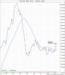
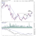
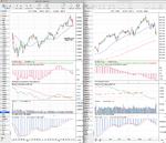
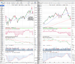
Is it possible for the subsequent swing up to go higher than the first swing high after the flattened 30 week MA? If so, I guess you just draw horizontal approximate ranges at the top and bottom, or do you actually move the horizontal lines each time there is a new extreme swing high and low within stage 1?
Hopefully this isn't confusing, but the breakout line doesn't have to be a horizontal line. If, for example, you have a previous close by swing high to the recent swing high that you've identified to mark the top of Stage 1 range, then you can draw a trendline between those peaks to give you a slightly earlier breakout level. But a horizontal line is obviously a truer breakout level.
During Stage 1, you can get a number of false breakouts above the initial swing high that you've identified as the top of the Stage 1 range, especially on a daily chart. So, it's key to watch for a weekly close above that level for more confirmation, as you'll often get daily closes above it that then fall back into the range in the following days. So I don't believe there's any strict rules for this, and you
may want to expand your Stage 1 range to the new swing high when this happens if it's a clear swing high, but personally if the weekly close doesn't break the original swing high, then I stick with that still, but that's just my preference.
So to clarify, Stage 1 ranges are not always clear until they are nearly complete, and the range can change if you get false breakouts. It's always a judgement call and takes time and practice to learn to identify, as do the other Stages.


