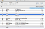
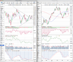
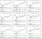
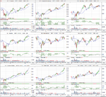
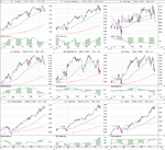
You'll find that different websites categorize stock sectors in different ways, which can be annoying, but the differences are normally minor, and are usually different ways of saying the same thing. Stockcharts has all the NYSE stocks and Nasdaq stocks in it. The nine S&P sectors are just how they are categorized. See here:
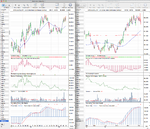
StockCharts Sector Summary - Free Charts - StockCharts.com and if you click through on one of the them, like for example
Health Care Sector then it will take you through to the Dow Jones US Sector Indexes, which are the minor sectors of which there are a few hundred sectors.
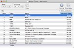
You can also see them in stockcharts by doing a search for the $ symbol in the site search and then go to page 6 of the results to find all of the Dow Jones US Indexes.
Another site you might find useful for sectors especially is chartmill. Go to:
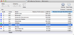
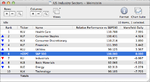
ChartMill.Com | Sector Rankings: evaluate sectors on Euronext, Amex, NYSE and Nasdaq. which has a list of 213 sectors, and you can order by relative strength which is what you need with Weinstein's method.
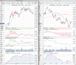
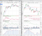
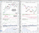
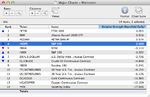
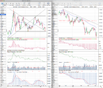
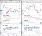
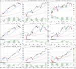
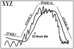
I personally use multiple free websites and download the free end of day data from yahoo finance to a desktop chart software program to look at. There's not a really good option for the sectors unfortunately. It takes a bit of work to organize, but once you find a solution that suits your needs you'll be alright. But I wouldn't focus too much on it initially. The first step when learning Weinstein's method is to understand the stages properly and the various breakout points. This will take a while and a fair bit of effort, so get your charts set up correctly first, and then start going through charts and identifying the stages. Once you can identify a charts stage at a glance, then you can start worrying about identifying the best sectors. I hope that helps. But for more info there's over 100 pages of discussions about it in this thread on here, or you can visit the new stageanalysis thread where I spend most of my time these days.