isatrader
Senior member
- Messages
- 2,965
- Likes
- 136
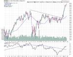
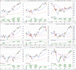
Re: Breakdowns and Breakouts - S&P 500
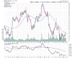
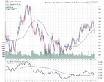
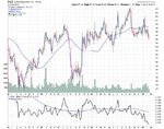
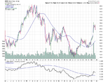
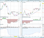
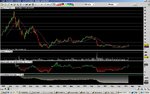
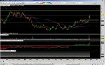
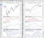
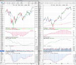
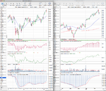
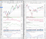
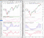
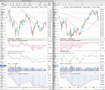
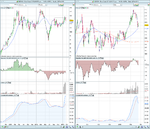
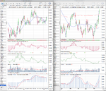
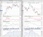
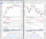
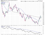
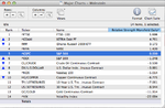
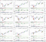
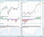
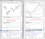
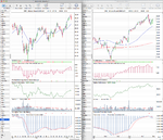
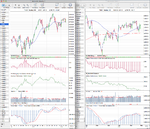
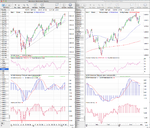
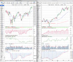
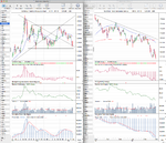
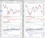
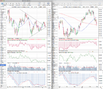
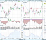
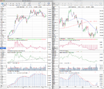
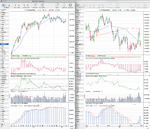
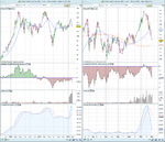
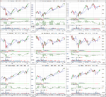
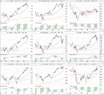
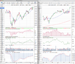
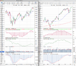
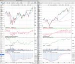
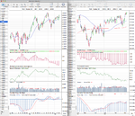
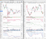
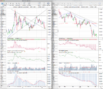
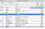
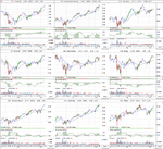
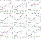
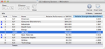
I'm actually using the stockcharts screener, as I don't think PRT can identify the P&F breakouts, as P&F in it is more of an afterthought, whereas on stockcharts the site was built as much for P&F as standard charting. So I've setup a custom scan that looks for double top breakouts and double bottom breakdowns that can be done at the end of the day or intraday. But you can only do the custom coded scans if you subscribe to the extra service unfortunately.
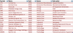
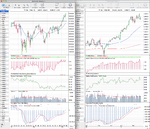
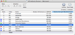
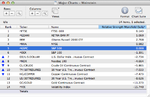
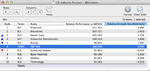
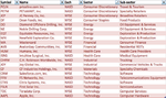
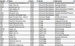
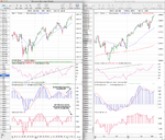
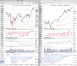
I've also been thinking about the best way to screen for opportunities without having to spend hours going through charts. I started with the idea of making lists of the constituents of the strongest and weakest sector SPDR ETFs and then manually go through the charts picking the strongest and weakest stocks respectively. That is how I found the XLF constituents I posted up recently. However the sector ETFs don't include all the stocks in the sectors, it is a bit labourious and the constituents change now and again. I did think about trying to code a screener in PRT for the methods volume characteristics but I think we've established that this is not very reliable now.
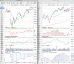
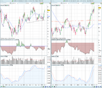
Your idea seems to be much better, I presume you are using a screener included in your ProTA package. I don't know anything about P&F charts yet but do you reckon it could be coded into PRT?
I'm actually using the stockcharts screener, as I don't think PRT can identify the P&F breakouts, as P&F in it is more of an afterthought, whereas on stockcharts the site was built as much for P&F as standard charting. So I've setup a custom scan that looks for double top breakouts and double bottom breakdowns that can be done at the end of the day or intraday. But you can only do the custom coded scans if you subscribe to the extra service unfortunately.