Stan Weinstein's Stage Analysis

European Indexes

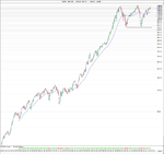
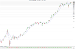
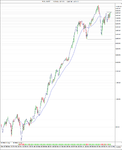
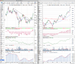
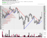
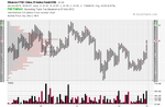
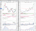
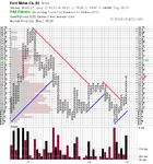
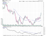
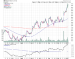
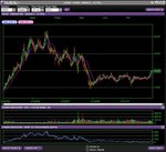
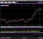
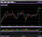
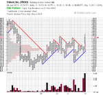
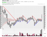
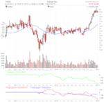
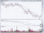
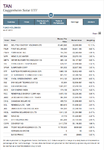
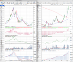
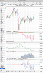
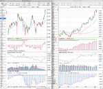
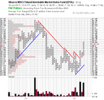
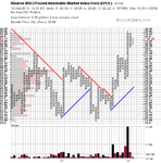
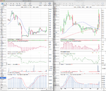
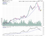
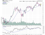
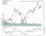
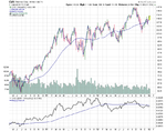
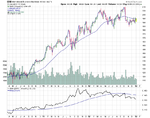
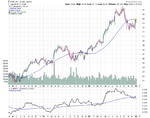
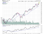
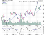
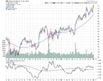
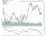
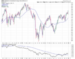
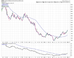
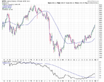
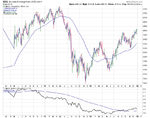
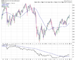
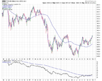
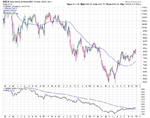
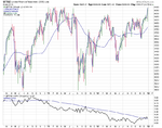
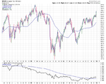
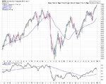
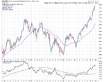
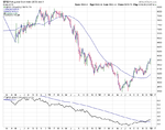
I thought it would interesting to have a look at the charts of the European Stock Indexes as the DAX has lead the relative performance table on my weekly update for over 6 months now. So attached are the weekly charts which are all in Stages 1 and 2 unlike the US indexes.
 

Attachments

  • sc-14.png
    sc-14.png
    34 KB · Views: 237
  • sc-15.png
    sc-15.png
    24.8 KB · Views: 209
  • sc-16.png
    sc-16.png
    31.2 KB · Views: 249
  • sc-17.png
    sc-17.png
    33.4 KB · Views: 217
  • sc-18.png
    sc-18.png
    33.5 KB · Views: 232
  • sc-23.png
    sc-23.png
    31 KB · Views: 206
  • sc-22.png
    sc-22.png
    31.1 KB · Views: 194
  • sc-21.png
    sc-21.png
    39.7 KB · Views: 210
  • sc-20.png
    sc-20.png
    34.5 KB · Views: 203
  • sc-19.png
    sc-19.png
    36.6 KB · Views: 227
  • sc-25.png
    sc-25.png
    34.2 KB · Views: 218
  • sc-24.png
    sc-24.png
    30.1 KB · Views: 197
Quarterly US Indexes

Attached is the updated long term quarterly charts for the S&P 500, Dow Jones Industrial Average and the NYSE.
 

Attachments

  • SPX_Quarterly_4_1_13.png
    SPX_Quarterly_4_1_13.png
    42.3 KB · Views: 187
  • DJI_Quarterly_4_1_13.png
    DJI_Quarterly_4_1_13.png
    52.4 KB · Views: 205
  • NYA_Quarterly_4_1_13.png
    NYA_Quarterly_4_1_13.png
    39.3 KB · Views: 207
I wanted to do a follow up on lplates FXI pick from October 2012 on page 77 here: http://www.trade2win.com/boards/technical-analysis/134944-stan-weinsteins-stage-analysis-77.html#post1987370 as it has reached the initial swing target that I noted just below 40 and broke through major longer term resistance last week into Stage 2 properly, although the Stage 2A breakout point was probably the break above the swing high in early December, and so now becomes more interesting on a longer term basis if it can hold above the breakout level. Short term it looks a bit extended and so it's probably wiser to wait for a pullback now if you are considering it imo.

But well done to lplate if he took it at the traders entry he highlighted on the 11th October, as it's had a 8.47% x ATR(200 day) move since then, which is excellent imo, and is a great example an aggressive Stage 1B trader pick. I previously said I'd put the initial stop loss at 33.35, and that would have moved up to under 35 at the beginning of December when the second swing low was completed, and now you could possibly push it further to below the more minor recent swing low which was at 38.88, but personally I'd still keep it below the 50 day MA as well to give it a bit of room because that pullback was only minor. So I'd put my trailing trader stop under 38 at about 37.85 now I think. For an investor stop it needs to go under the last major swing low and the 30 week MA, so would go under 35 imo.

I'll try to keep an eye on this trade in the thread to have an ongoing example on here of using the trader and investor trailing stop methods, as I haven't done any properly since the silver trade at the beginning of the thread, so will be something different. I'll also do some other ones as well when I see a some good candidates come up.
 

Attachments

  • FXI_Weekly_4_1_13.png
    FXI_Weekly_4_1_13.png
    127.2 KB · Views: 221
  • SharpChartv05-10.png
    SharpChartv05-10.png
    48.8 KB · Views: 214
  • SharpChartv05-11.png
    SharpChartv05-11.png
    32.6 KB · Views: 193
Last edited:
Ford (F) Stage Analysis

I was just having a look through the charts and came across Ford (F) in the US and it just jumped out at me. It formed a small head and shoulders pattern in it's Stage 1 base over the 2012 summer, and broke out above it and the 200 day MA on strong volume and formed a small consolidation during November and early December, which gave the Stage 2A breakout level. On the 19th December it broke out into Stage 2 and volume started to increase significantly to more than double the weekly average. Relative performance versus the S&P 500 has also picked up and it's broken above it's zero line as well. Finally near term resistance from earlier in 2012 was also cleared last week, so it's looking in good shape in Stage 2. Near term it's overbought, so I'd again be looking for a pullback entry point to form before getting in as the ideal Stage 2A entry point was missed.

[EDIT] I've added the GM chart as well, as it is in the same same sector and is making a similar early Stage 2 move.
 

Attachments

  • F_Weekly_4_1_13.png
    F_Weekly_4_1_13.png
    124.7 KB · Views: 242
  • SharpChartv05-12.png
    SharpChartv05-12.png
    32.3 KB · Views: 249
  • sc-26.png
    sc-26.png
    29.1 KB · Views: 197
  • sc-28.png
    sc-28.png
    29.6 KB · Views: 221
Last edited:
One that I have been following for a few months now and whose chart looks similar to isa's Ford post (which I love) is Yahoo (YHOO). It has had a very long consolidation period (over 4 years) and has recently broken out on a very fast climb to breach resistance with a strong move positive vs SPX. The volume is borderline there but I think the trade has potential. Again, like the Ford chart, it looks overbought right now but should consolidate that away and continue up imo.

Any thoughts?


On another note, I was just wondering which Weinstein trade was the most successful for everyone in 2012. Mine would have to be HOV which is still on the rise. Even though i abandoned it way too early by not following the rules (gotta learn somehow...)

What is yours?
 

Attachments

  • YahooWeekly.JPG
    YahooWeekly.JPG
    103.7 KB · Views: 213
  • YahooDaily.JPG
    YahooDaily.JPG
    102.4 KB · Views: 196
  • Yahoo 4 year.JPG
    Yahoo 4 year.JPG
    125.6 KB · Views: 231
One that I have been following for a few months now and whose chart looks similar to isa's Ford post (which I love) is Yahoo (YHOO). It has had a very long consolidation period (over 4 years) and has recently broken out on a very fast climb to breach resistance with a strong move positive vs SPX. The volume is borderline there but I think the trade has potential. Again, like the Ford chart, it looks overbought right now but should consolidate that away and continue up imo.

Any thoughts?

YHOO looks to be a reasonable pick for the method imo. The October breakout was on just under twice the 52 week average volume, and it has continued to accumulate since then as you can see in the attached point and figure charts (traditional box setting and 200 day ATR box setting). On the monthly chart it's made a large four year Stage 1 base, and has broken out into Stage 2 on a monthly basis with the 30 month MA turning up since October and price making a monthly close above the breakout level. It has good relative performance versus the S&P 500 and no major near term resistance to deal with. So it could be both an investor and a trader pick on a pullback imo, but personally I'd want to see it pivot and stay above the 50 day MA on the pullback for a potential entry point. If however, it drops below the 50 day MA, then I'd personally be more cautious and wait for a further breakout above the recent swing high.

One problem area I can see though is that the institutional buyers don't believe in it at the moment (see attached chartmill weekly chart) and have been net sellers from the effective volume indicator data. So this needs to change, as for the price to really breakout strongly in the coming year it will need the institutional money to get behind it and for the broad market to breakout strongly in a Stage 2 continuation move.
 

Attachments

  • SharpChartv05-13.png
    SharpChartv05-13.png
    27.8 KB · Views: 242
  • SharpChartv05-14.png
    SharpChartv05-14.png
    45.9 KB · Views: 225
  • yhoo_Weekly_ef_9-1-13.png
    yhoo_Weekly_ef_9-1-13.png
    60.7 KB · Views: 187
Last edited:
Speaking as an investor, I don't know if it is my lack of experience or not, but owing to the poor volume characteristics of most stocks and indices breaking out over the last few weeks I get the feeling that these stage 2's are n't going to go far. I only want to go long the "A" trades, have I missed any, and any comments on this strategy appreciated, save me getting the book out:)?

Thanks and thanks again ISA for posting up your charts.

The thing with volume in the stocks in the major indices is that these days there are numerous etfs which weren't around when Weinstein wrote the book, and they distort the volume in the large individual stocks as funds etc buy the etfs, which in turn have to buy the stocks, and institutional investors use automated systems to break down their orders into smaller pieces as they are too large and would cause the price to move too far before they filled all of the allocation that they were after. In order to see the volume characteristics that are shown in the examples in the book these days you need to go down to the small caps which are less affected by indexing and sector ETFs etc. That's why I added the cumulative force index volume to my charts as the straight volume data isn't as useful for larger stocks imo.

For a long term investor, only going long the "A" trades is a good strategy imo, and the examples in the book are of course almost all A trades. But, the problem is of course finding them as they are developing, as they are more rare. Think of a statistical bell curve that shows average distribution, in which the bulk of stocks would be in the middle and it would thin out considerably on each side of the curve. So I think of that when trying to grade a stocks potential personally, but there's no definitive guide in the book, so it's up to each person to judge on case by case basis.

At a guess, I'd say it's probably less than 5% of stocks that could be considered Weinstein "A" trades each year, and a lot of them won't immediately show their hands on the break out. i.e they might have only a modest doubling of average volume on the breakout and then get some heavy volume increase come in once they've run up a bit a few months later. So all I can suggest is finding the best picks you can that are at least a "B" in characteristics on the breakout, and then some them will turn out to be the A trades as they progress. LEN is a good example imo of a "B" trade on the breakout from it's major Stage 1 base that's turned out to be a A trade over the last year. I highlighted the LEN monthly and weekly chart in January 2012 on the thread after theblackmamba showed me the chart here: Post#228 as it's sector had outperformed the S&P 500 the most since the October 2011 low. I've attached the up to date monthly and weekly charts which show you what I mean hopefully.
 

Attachments

  • LEN_9-1-13.png
    LEN_9-1-13.png
    126.8 KB · Views: 233
Last edited:
Solar Stocks showing huge strength.

Solar sector and almost all individual solar stocks showing incredible strength, volume and powerful stage 2 breakout patterns

TAN is an ETF of solar stocks

Powerful accumulation volume and relative strength as the 30=week MA has flattened and the sector has broken out of channel into stage 2.

Warren Buffett also recently announced a $2.5 BILLION investment in solar.

Happy Trading

(disclosure: Long TAN for several weeks as it broke above 30-week)

Considering adding to position if we get the occasional "pullback" to breakout point.
 

Attachments

  • Solar sector.jpg
    Solar sector.jpg
    229.8 KB · Views: 351
Solar Stocks showing huge strength.

Solar sector and almost all individual solar stocks showing incredible strength, volume and powerful stage 2 breakout patterns

TAN is an ETF of solar stocks

Powerful accumulation volume and relative strength as the 30=week MA has flattened and the sector has broken out of channel into stage 2.

Warren Buffett also recently announced a $2.5 BILLION investment in solar.

Happy Trading

(disclosure: Long TAN for several weeks as it broke above 30-week)

Considering adding to position if we get the occasional "pullback" to breakout point.

The solar sector is showing excellent relative performance right now, but just a note on your TAN pick. Make sure you know what's in it, and their individual weightings in the ETF, as then you can monitor the individual charts of each to make sure there's no big resistance zones, or other warnings to be aware of.

The biggest holding in the TAN etf according to it's holdings page: ETFs | Guggenheim Investments is GCL-Poly Energy Holdings Ltd (3800.HK) which makes up 10.13% of the ETF, the next biggest is First Solar (FSLR) at 8.80% etc. I've attached the GCL-Poly Energy Holdings chart, which is listed in Hong Kong, as it has some very interesting volume characteristics - huge increase on the recent Stage 1 base and 2A breakout. It is however now trading back into resistance at 2 which was support for a number of months in late 2011, after an 86% move in the last 4 months, and so is something to be aware of as it's the biggest holding in the ETF and the resistance doesn't show up on the TAN sector chart.
 

Attachments

  • TAN_holdings_9-1-13.png
    TAN_holdings_9-1-13.png
    58.1 KB · Views: 302
  • 3800_GCL-Poly-Energy-Holdings.png
    3800_GCL-Poly-Energy-Holdings.png
    121.4 KB · Views: 332
Last edited:
The thing with volume in the stocks in the major indices is that these days there are numerous etfs which weren't around when Weinstein wrote the book, and they distort the volume in the large individual stocks as funds etc buy the etfs, which in turn have to buy the stocks, and institutional investors use automated systems to break down their orders into smaller pieces as they are too large and would cause the price to move too far before they filled all of the allocation that they were after. In order to see the volume characteristics that are shown in the examples in the book these days you need to go down to the small caps which are less affected by indexing and sector ETFs etc. That's why I added the cumulative force index volume to my charts as the straight volume data isn't as useful for larger stocks imo.

For a long term investor, only going long the "A" trades is a good strategy imo, and the examples in the book are of course almost all A trades. But, the problem is of course finding them as they are developing, as they are more rare. Think of a statistical bell curve that shows average distribution, in which the bulk of stocks would be in the middle and it would thin out considerably on each side of the curve. So I think of that when trying to grade a stocks potential personally, but there's no definitive guide in the book, so it's up to each person to judge on case by case basis.

At a guess, I'd say it's probably less than 5% of stocks that could be considered Weinstein "A" trades each year, and a lot of them won't immediately show their hands on the break out. i.e they might have only a modest doubling of average volume on the breakout and then get some heavy volume increase come in once they've run up a bit a few months later. So all I can suggest is finding the best picks you can that are at least a "B" in characteristics on the breakout, and then some them will turn out to be the A trades as they progress. LEN is a good example imo of a "B" trade on the breakout from it's major Stage 1 base that's turned out to be a A trade over the last year. I highlighted the LEN monthly and weekly chart in January 2012 on the thread after theblackmamba showed me the chart here: Post#228 as it's sector had outperformed the S&P 500 the most since the October 2011 low. I've attached the up to date monthly and weekly charts which show you what I mean hopefully.
Attached Thumbnails

__________________
isatrader


Great post ISA. Interesting insight on the ETF issue and modern day iceberg orders. Weinstein had it easy:) he says jokingly. I'll take on board your suggestions for selecting the best "B,s" The risk reward ratio is so good with this method you can afford to have a lot of failures. Other points noted as well.

Well done on nailing Lenar, did you manage to get in? It's a great looking chart and as you said a great example of stage analysis. Half a dozen of those every year would do me.

I use mainly price action trading on FX and I currently looking at the carry trade pair AUD/JPY for what would be a weinstein investor entry on a pullback to the breakout level. I don't have any volume and there is overhead resistance but it's back in 2008 , you may like to take a look. Sorry I don't post any charts but my brokers are pit pony and trap. Once I see the profits rolling in I'll be more wiling to invest in a charting package (perhaps the wrong way around I know :rolleyes:)
 
Last edited:
Great post ISA. Interesting insight on the ETF issue and modern day iceberg orders. Weinstein had it easy:) he says jokingly. I'll take on board your suggestions for selecting the best "B,s" The risk reward ratio is so good with this method you can afford to have a lot of failures. Other points noted as well.

Well done on nailing Lenar, did you manage to get in? It's a great looking chart and as you said a great example of stage analysis. Half a dozen of those every year would do me.

I use mainly price action trading on FX and I currently looking at the carry trade pair AUD/JPY for what would be a weinstein investor entry on a pullback to the breakout level. I don't have any volume and there is overhead resistance but it's back in 2008 , you may like to take a look. Sorry I don't post any charts but my brokers are pit pony and trap. Once I see the profits rolling in I'll be more wiling to invest in a charting package (perhaps the wrong way around I know :rolleyes:)

Unfortunately, I was already fully invested when I posted the Lennar chart last year to highlight the 2A breakout to people on the thread. However, I remember Peter (theblackmamba) was in it for a few months, but I'm not sure if he held on for the long haul as he's more of short term trader. It is the kind of monthly pattern that I'm looking for my long term picks though for my ISA, and potentially a SIPP soon as well. i.e. big, multi year Stage 1 base, that's breaking out.

So I might need to ask you advice on SIPPs on private message, as I remember you posting in the interactive brokers thread about SIPPs last year.

Attached is the monthly, weekly and daily AUDJPY charts. It broken above it's massive four year stage 1 range this month, so it will be key to get a monthly close above imo. Volume is weak the last few months, but cumulatively it's been rising. Relative performance looks positive as is above the zero line, but short term as with so many charts at the moment it looks extended and could do with a pullback.
 

Attachments

  • AUDJPY_Monthly_9-1-13.png
    AUDJPY_Monthly_9-1-13.png
    57 KB · Views: 369
  • AUDJPY_Weekly_9-1-13.png
    AUDJPY_Weekly_9-1-13.png
    131.6 KB · Views: 350
Unfortunately, I was already fully invested when I posted the Lennar chart last year to highlight the 2A breakout to people on the thread. However, I remember Peter (theblackmamba) was in it for a few months, but I'm not sure if he held on for the long haul as he's more of short term trader. It is the kind of monthly pattern that I'm looking for my long term picks though for my ISA, and potentially a SIPP soon as well. i.e. big, multi year Stage 1 base, that's breaking out.

So I might need to ask you advice on SIPPs on private message, as I remember you posting in the interactive brokers thread about SIPPs last year.

Attached is the monthly, weekly and daily AUDJPY charts. It broken above it's massive four year stage 1 range this month, so it will be key to get a monthly close above imo. Volume is weak the last few months, but cumulatively it's been rising. Relative performance looks positive as is above the zero line, but short term as with so many charts at the moment it looks extended and could do with a pullback.

At least someone got on.

SIPPs, yes, ideal for the investor approach. Please do PM me and I'll be only too pleased if I can help out.

Thanks for the AUD/JPY charts and comment.

PS Polish index maybe an investor buy at this point
 
Last edited:
After having missed the breakout entry point I looked at the Polish index today on the daily charts using my intended vehicle the ETF EPOL on the Arca exchange. The volume on the pullback so far looks far from ideal, will keep and eye on it though. Any thoughts?

I am looking at TLT (Arca) for analysis purposes of the US long bond and TBT for the vehicle. Correct me if I'm wrong but TBT is showing some excellent volume characteristics as far as accumulation is concerned whereas that cannot be said of TLT. I presume this has something to do with the nuances of ETF share creation, for the want of better terminology. As an aside, I understand that under W D Gann's cyclical work on bonds (60 year cycle) the 30 year up cycle tops out in 2013.

Am I correct in saying that volume on the break out on short plays is not as significant as in potential long plays. Refresher question ;-)
 
After having missed the breakout entry point I looked at the Polish index today on the daily charts using my intended vehicle the ETF EPOL on the Arca exchange. The volume on the pullback so far looks far from ideal, will keep and eye on it though. Any thoughts?

I find point and figure charts can be useful to gauge the pullback volume as each column is a cumulative figure. I like to set the chart using the 200 day ATR figure and looking at the volume characteristics, and also dividing it by two to have a faster chart to compare against. I use the 200 day ATR to gauge my position sizes and also the risk reward of the trade. So I find this an easy way to see if a trade is suitable. For example on your EPOL trade the 200 day ATR is 0.57, so using today's close of 29.25 minus the stop position which I've put at 27.89 = 1.36 / 0.57 = 2.39 x ATR(200) risk, which is reasonable imo, as I generally look for under 3 x ATR(200) risk on a trade entry as I'm looking to get a 10 x ATR(200) gain. Obviously, for investor positions this is much larger on both metrics.

See the attached charts which shows that the EPOL volume on the pullback column of Os was around five times smaller than the breakout column of Xs. But note that the pullback wasn't big enough to make a reversal column on the full size ATR(200) chart, and so is only a minor pullback.

Am I correct in saying that volume on the break out on short plays is not as significant as in potential long plays. Refresher question ;-)

Yes, that's correct. Volume on the breakdown to Stage 4A matters much less.

I am looking at TLT (Arca) for analysis purposes of the US long bond and TBT for the vehicle. Correct me if I'm wrong but TBT is showing some excellent volume characteristics as far as accumulation is concerned whereas that cannot be said of TLT. I presume this has something to do with the nuances of ETF share creation, for the want of better terminology. As an aside, I understand that under W D Gann's cyclical work on bonds (60 year cycle) the 30 year up cycle tops out in 2013.

The TBT is 2x leveraged ETF and so is more speculative in nature imo than the TLT, which tries to follow the US 30 year Treasuries futures. Also TBT only trades less than half the average volume that TLT does and so it's volume is less reliable imo. So personally, I think you need to give the actual Treasuries futures volume the most weighting, which is currently fairly sideways as you can see on my chart from last weekend, and hasn't seen any major pickup in outflows.
 

Attachments

  • SharpChartv05-16.png
    SharpChartv05-16.png
    31 KB · Views: 342
  • SharpChartv05-18.png
    SharpChartv05-18.png
    30.6 KB · Views: 366
Last edited:
Re: UK:TCM / TCM.L Telit

$60m growth stock Telit Comms had good results this week and good volume in the last two weeks, and, if it breaks out this week or next, would be an interesting model UK small cap
There looks a bit of profit-taking on results, with sellers at 62p, forming horrid candle, so, on the face of it, looks wrong and looks very expensive, but to my perverse mind I think it might move this week or next. Ideally it would close this week above 2012 highs of 65p or so.
Resistances from 2011 are at 75p, 85p, 95p, 105p but each 10p is of course approx 15%
Real spread looks just over 1p.
Telit Communications PLC, UK:TCM - BigCharts.com
Telit Communications Plc: LON:TCM - Google Finance

Thanks lplate, it's an interesting pick and is something different than the large caps I usually show.

Attached is a weekly and daily chart of TCM. It's a bit thinly traded for my personal preferences, but there's been clear volume accumulation during the current year long Stage 1 phase, and the relative performance versus the S&P 500 is flirting with the zero line, which it has pulled back above this week.
 

Attachments

  • TCM_Weekly_10_1_13.png
    TCM_Weekly_10_1_13.png
    119.4 KB · Views: 324
Last edited:
I find point and figure charts can be useful to gauge the pullback volume as each column is a cumulative figure. I like to set the chart using the 200 day ATR figure and looking at the volume characteristics, and also dividing it by two to have a faster chart to compare against. I use the 200 day ATR to gauge my position sizes and also the risk reward of the trade. So I find this an easy way to see if a trade is suitable. For example on your EPOL trade the 200 day ATR is 0.57, so using today's close of 29.25 minus the stop position which I've put at 27.89 = 1.36 / 0.57 = 2.39 x ATR(200) risk, which is reasonable imo, as I generally look for under 3 x ATR(200) risk on a trade entry as I'm looking to get a 10 x ATR(200) gain. Obviously, for investor positions this is much larger on both metrics.

See the attached charts which shows that the EPOL volume on the pullback column of Os was around five times smaller than the breakout column of Xs. But note that the pullback wasn't big enough to make a reversal column on the full size ATR(200) chart, and so is only a minor pullback.


Yes, that's correct. Volume on the breakdown to Stage 4A matters much less.

P.S. I'll answer your other question a bit later, as I've got a few things to sort out.

Thanks for sharing your own personalisations of the method, I can't comment as P&F charts are a whole new ball game to me. I will have to "gen up" on them when I've time, looks interesting.

EPOL, the volume on the pullback days looked very much like that of the highest advancing days on my charts. So according to the P&F charts is it likely that the correction (assumption) is not complete. The pull back was very shallow as far as fib levels are concerned using the last daily major pivot at 25.11, it has not even reached the 38.2% level, consequently I stayed out despite it having gaped up.

I see Ford gaped up today also, probably a continuation gap so I let that one go for now. I did dip a toe in GDX today but that's not using Weinstein's method so not for discussion here.
 
EPOL, the volume on the pullback days looked very much like that of the highest advancing days on my charts. So according to the P&F charts is it likely that the correction (assumption) is not complete. The pull back was very shallow as far as fib levels are concerned using the last daily major pivot at 25.11, it has not even reached the 38.2% level, consequently I stayed out despite it having gaped up.

No, it can stay in a column of Xs for ages if the momentum is strong, as it needs to reverse by 3 boxes to change columns. So it all depends on the box size that you choose, which is obviously dependent on your trade length, but why I find the 200 day ATR method useful, as each chart is sized by it's average true range. In really strong momentum moves, it can stay in a column of Xs for over 20 boxes before the first significant correction. P&F is definitely something worth learning imo, and I find it very useful for helping to identify the stages and key levels, as it filters out a lot of the noise and helps you see the important support and resistance zones.
 
Last edited:
S&P 500 Top 10 Holdings

Attached is the current weekly charts for the S&P 500 top 10 stocks by weighting in the index. These stocks make up 19.25% of the index, and the largest holding is Apple, which currently has a weighting of 3.75%, and so these ten stocks control 1/5th of the indexes moves and are likely the reason why the S&P 500 hasn't made new highs. As by contrast the equal weighted S&P 500 ($SPXEW) broke out to new highs last week.

So I think it's interesting to look at the stages of the individual charts that have the most influence in indexes and ETFs. As at the current level we need additional information to see how healthy the current rally is.
 

Attachments

  • sc-33.png
    sc-33.png
    28.3 KB · Views: 301
  • sc-34.png
    sc-34.png
    33.1 KB · Views: 291
  • sc-35.png
    sc-35.png
    35.8 KB · Views: 336
  • sc-36.png
    sc-36.png
    31.9 KB · Views: 275
  • sc-37.png
    sc-37.png
    29.4 KB · Views: 331
  • sc-42.png
    sc-42.png
    28.1 KB · Views: 283
  • sc-41.png
    sc-41.png
    28.7 KB · Views: 321
  • sc-40.png
    sc-40.png
    36.2 KB · Views: 296
  • sc-39.png
    sc-39.png
    32.9 KB · Views: 301
  • sc-38.png
    sc-38.png
    38.1 KB · Views: 250
  • SPX_breakdown_10_1_13.png
    SPX_breakdown_10_1_13.png
    36.3 KB · Views: 222
Last edited:
Top