Stan Weinstein's Stage Analysis

UA - Under Armour

Another stage 3 topping stock which has violated a long term uptrend and looks poised for a stage 4 move.

Relative strength has been underperforming the indexes in this most recent rally.

high Volume selloffs are sign of distribution.

30 MA has flattened out and is starting to roll.

Sidenote: UA has had 2 negative quarters back to back of negative EPS surprises. The EPS estimates as shown on yahoo finance for next year have been in declining mode.

Chart is looking toppy.

Happy Trading....everyone!
 

Attachments

  • Ua-6 year trend.jpg
    Ua-6 year trend.jpg
    236.1 KB · Views: 351
  • UA-short idea.jpg
    UA-short idea.jpg
    237 KB · Views: 316
Attached is the current major charts for your own stage analysis. I've updated the market breadth thread as well so that we can see what the weight of evidence is suggesting this week from the market internals here: http://www.trade2win.com/boards/technical-analysis/147476-market-breadth-24.html#post2056574

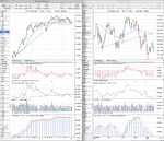
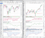
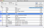
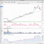
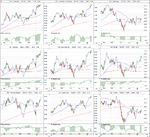
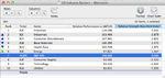
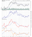
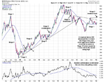
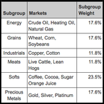
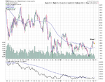
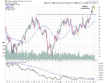
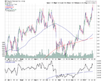
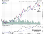
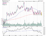
Below is the updated relative performance table in order of strength using the daily Mansfield RS reading. Crude Oil was the notable mover this week and continued to climb the relative performance rankings and is now only one position below the S&P 500 and hence close to crossing above it's zero line. This positive price action can be seen on the chart with the price breaking above resistance of the one year downtrend line and the 30 week MA turning up for a number of weeks now. There is however still near term resistance up to the 100 zone and so it could possibly still be in a broader Stage 1 recovery phase. But with the break out above horizontal resistance around the 94 zone it may be in Stage 2A now.

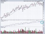
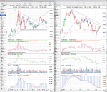
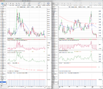
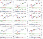
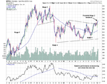
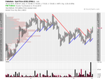
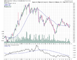
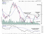
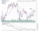
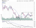
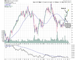
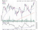
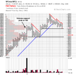
Also included in this weeks roundup is the five year weekly Apple (AAPL) chart. I've included this chart to highlight the test of the four year trend line that AAPL made this week, which has been tested five times previously since 2009 and held. So it will be interesting to see if it holds again on this sixth attempt to break it.

attachment.php


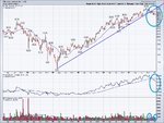
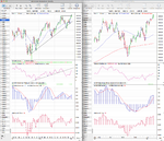
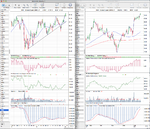
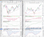
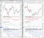
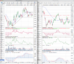
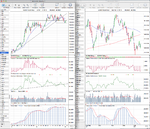
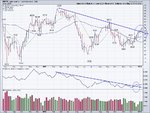
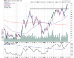
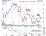
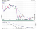
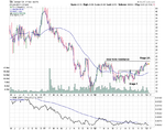
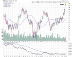
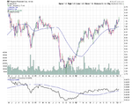
The S&P 500 broke out to new highs and has now joined the NYSE and Russell 2000 in potential Stage 2 continuation moves. However, the Nasdaq 100 still continues to lag and ended the week slightly lower at the top of it's recent range that it has formed since the beginning of the year. So I'd put it in Stage 1B as this point personally. The relative performance table also shows that the small caps are outperforming the mega caps currently as the S&P 100 continues to under perform the other stock indexes except for the Nasdaq 100.

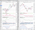
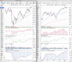
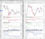
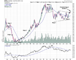
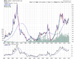
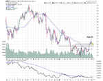
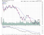
Gold (GC) moved higher for a second weekend has now put in a new swing low at 1626. If it can close back above it's 50 day MA and the downtrend line around the 1700 level, then it may become interesting again. As that would be a failed Stage 4 breakdown and hence it would recover it's Stage 1 rating. Currently I'd give it a Stage 4A-

US Treasuries (US & TY) held the key support levels that I mentioned a few weeks back and have completed new swing lows, as they have traded higher for another week - contrary to their normal inverse relationship with equities. So they continue in Stage 3B for time being.

The Dollar Index continues to trade sideways since failing to move below the major support after breaking down into Stage 4 in September. It's formed a clear short term range, but it continues to mostly trade below it's key MAs, and the 30 week MA is still falling, so it's currently still in Stage 4B-

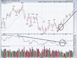
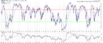
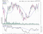
The VIX is interesting as it broke down to new lows this week that haven't been seen since the 2004 to early 2007 period, where it consistently traded at low levels during the majority of that bullish period. So the volatility traders are clearly extremely bullish at this point.
 

Attachments

  • SPX_Weekly_18_1_13.png
    SPX_Weekly_18_1_13.png
    145.2 KB · Views: 306
  • NDX_Weekly_18_1_13.png
    NDX_Weekly_18_1_13.png
    139.7 KB · Views: 286
  • IWM_Weekly_18_1_13.png
    IWM_Weekly_18_1_13.png
    130.3 KB · Views: 341
  • NYA_Weekly_18_1_13.png
    NYA_Weekly_18_1_13.png
    134.8 KB · Views: 342
  • DAX_Weekly_18_1_13.png
    DAX_Weekly_18_1_13.png
    136.5 KB · Views: 299
  • TY_10yr_Treasuries_18_1_13.png
    TY_10yr_Treasuries_18_1_13.png
    135.6 KB · Views: 296
  • CL_Weekly_18_1_13.png
    CL_Weekly_18_1_13.png
    137.5 KB · Views: 308
  • HG_Weekly_18_1_13.png
    HG_Weekly_18_1_13.png
    134.6 KB · Views: 274
  • GC_Weekly_18_1_13.png
    GC_Weekly_18_1_13.png
    134.3 KB · Views: 342
  • FTSE100_Weekly_18_1_13.png
    FTSE100_Weekly_18_1_13.png
    139.6 KB · Views: 315
  • Major_Charts_RS_list_18_1_13.png
    Major_Charts_RS_list_18_1_13.png
    25.3 KB · Views: 2,131
  • AAPL_Weekly_18_1_13.png
    AAPL_Weekly_18_1_13.png
    74.2 KB · Views: 344
  • VIX_Weekly_18_1_13.png
    VIX_Weekly_18_1_13.png
    129.3 KB · Views: 289
  • DX_Weekly_18_1_13.png
    DX_Weekly_18_1_13.png
    134.3 KB · Views: 255
  • US_30yr_Treasuries_18_1_13.png
    US_30yr_Treasuries_18_1_13.png
    137 KB · Views: 340
Last edited:
US Industry Sectors

Attached are the updated US Industry Sectors and the relative performance table. Financials (XLF) holds on to the top spot for another week although it's relative strength did decline from the previous week as a few stocks dropped back below their 50 day MAs following earnings results.

Energy (XLE) was another sector of note as it moved back above it's daily relative performance zero line and is close to breaking above the weekly as well.

Industrials (XLI), Consumer Discretionary (XLY) and Health Care (XLV) are all in Stage 2 continuation phases now as they clearly closed the week above their previous highs, but Technology (XLK) still looks weak and pulled back to close below it's 30 week WMA.

Volumes in the sector ETFs were again very light and well below their 52 week averages

attachment.php
 

Attachments

  • US_Industry_Sectors_18_1_13.png
    US_Industry_Sectors_18_1_13.png
    124.6 KB · Views: 306
  • US_Industry_Sectors_D_18_1_13.png
    US_Industry_Sectors_D_18_1_13.png
    122.2 KB · Views: 303
  • US_Industry_Sectors_list_18_1_13.png
    US_Industry_Sectors_list_18_1_13.png
    21.7 KB · Views: 2,089
Crude Oil (WTI) has made an impressive breakout above its 30 week MA which has now flattened out.

Relative Strength has broken out of a 9-month drown-trend since March.

A breakout in relative strength is one of Stan's core teachings when searching for winners.

Crude Oil appears to be moving into late stage 1 or early stage 2.

Happy Trading

disclosure: Long crude futures (CL - April)

UPDATE on the WTI (crude trade): Several weeks ago I alerted the forum page here to a powerful breakout that was happening in crude oil.

Flash forward several weeks now and crude has made an impressive breakout not only into a stage 2 rally but has broken out of a 9 monthdowntrend.

We have closed 2 weeks now above this trendline as confirmation (as circled on weekly chart).

Relative strength has broken out (as circled).

I've used the ongoing series of stage 2 confirmation signals to pyramid correctly and I now have upside targets of $100 to much much higher if crude can close above its resistance level in the $100 level...sky's the limit and we know how parabolic stage 2 advances can go!

Not only is the 30 week rising, but he 40 & 50 days moving avergages have joined along and are both rising.

In Stans book he recommends using a 40 day MA for futures as he says stage 2 advances will play out much faster in a matter of weeks not months (like stocks)

I've provided a daily chart as well which confirms that crude is in a powerful stage 2 advance using a 40 day MA as a guide. (40 or 50 both work well for futures)

Stan recommends managing your trades via trendlines when a distinct trendline has emerged. The daily chart shows the trendline in place for crude. You can manage your stops via a trendline break as well as a break of the 40 MA using the "investor" rules for managing stops.

Happy Trading all!
 

Attachments

  • WTI-breakout.jpg
    WTI-breakout.jpg
    229.9 KB · Views: 356
  • wti-40 day trend.jpg
    wti-40 day trend.jpg
    241.5 KB · Views: 335
Palladium ($PALL)

It's been a long time since I did a stage analysis on Palladium and it was one of my earliest posts in thread on post #6 and post #9 where I noted the Stage 4 breakdown. It's long term chart is a really good example of how you can use stage analysis effectively with products other than stocks to capture really strong long term moves imo.

The palladium chart is interesting at the moment as recently it's started to outperform both Gold and Silver (see attached relative performance chart) and has broken above it's major Stage 1 range that has formed since the Stage 4 breakdown that I highlighted in post 9 on Sep 21, 2011. Palladium has broken above it's most recent swing high and relative performance versus the S&P 500 is trading back above the zero line for a number of weeks now. Volume has improved on the recent up move (as can be seen most clearly on the P&F chart) and contracted during the consolation before breaking out into the start of potential new Stage 2A. It still needs to close a week above the February 2012 swing high to confirm the new Stage 2, but is showing some good signs for this more minor precious metal. Silver and Gold got the headlines in 2009 and 2010, but Palladium moved over 800% with only one single significant pullback, and if you look back on the monthly chart you can see that the move in late 90s was even bigger. And so after making such a large range this could be an interesting one, although it's still got technical resistance from the 2011 top which could hamper it. But technically it's shaping nicely for a potential Stage 2 run and so I'll be looking to get in this week if the short term price action looks right and holds above the horizontal support I've marked on the daily chart.

The P&F price target from the 10pt box size is at 960, and the swing target from the Stage 1 range is to 920.60 - which would be a breakout above the 2011 highs and give the potential to challenge the high of 1090 from Jan 2001, when it made a 939% move from absolute bottom to the top, and the Stage 2 phase captured 796.2% of that move. A move to challenge the 2001 high from Fridays close would only be a 50% move, which seems small by comparsion to it's previous runs in the last 15 years or so, but would still be a very substantial gain.

There are a number of ways to trade it. I'll be using a CFD personally, but you can also trade it via physically backed ETFs in the US and UK called ETFS Physical Palladium - through the tickers PALL and PHPD.L

154016d1358731356-stan-weinsteins-stage-analysis-pall_weekly_5yr_18-1-13.png
 

Attachments

  • PALL_Weekly_18-1-13.png
    PALL_Weekly_18-1-13.png
    38.3 KB · Views: 279
  • PALL_Weekly_5yr_18-1-13.png
    PALL_Weekly_5yr_18-1-13.png
    36 KB · Views: 37,819
  • PALL_Daily_18-1-13.png
    PALL_Daily_18-1-13.png
    31.7 KB · Views: 311
  • PALL_Monthly_18-1-13.png
    PALL_Monthly_18-1-13.png
    32.1 KB · Views: 272
  • PALL_RS_18-1-13.png
    PALL_RS_18-1-13.png
    48.1 KB · Views: 314
  • SharpChartv05-10.png
    SharpChartv05-10.png
    45.1 KB · Views: 285
Last edited:
Continuous Commodity Index ($CCI)

Following the palladium analysis yesterday I decided to take a further look at the out of favour commodities charts. And the best broad chart for doing that imo is the Continuous Commodity Index ($CCI), which is the ninth revision of the CRB Index. The tenth revision of the CRB index changed both the composition and weighting of the index from an fairly equal weighted index, to one heavily weighted in energy and agriculture. In the CRB, Energy makes up 39%, agriculture 41%, precious metals 7%, and base metals 13%. By comparison the CCI has 17.6% in Energy, 17.6% in Grains, 11.8% in Industrials, 11.8% in Meats, 23.5% in Softs and 17.6% in Precious Metals. See below table:

attachment.php


Currently the Continuous Commodity Index (CCI) is basing in Stage 1, and the 30 week MA has turned higher. Relative performance is getting closer to it's zero line and would likely break above it if the price makes a Stage 2 breakout above 600. More aggressive traders could get in earlier in Stage 1B, which would be a close above the recent swing high imo. Obviously the CCI is a lagging indicator, as it's a mix of all commodities. So the fact that it's in Stage 1, should mean that you can find some individual commodities close to, or already breaking out into Stage 2.

However, you might want to trade the Continuous Commodity Index (CCI) directly - for which there is only one ETF available I believe, which is the GreenHaven Continuous Commodity Index Fund (GCC). I've attached the weekly chart so you can compare with the CCI index chart and also the relative performance chart, which shows that it suffers from some tracking error and is currently a 2.11% spread from the CCI index itself. But it appears to be the only option if you want to trade the index directly other than futures on the ICE exchange which trade at $25 per 0.05 index points. i.e $500 per point - so considering the current 200 day ATR is 5.432 points per day. That's a $2716 a day movement on a futures account if I've calculated it correctly.

154048d1358771351-stan-weinsteins-stage-analysis-cci_weekly_5yr_18-1-13.png


I've had a quick scan through the weekly charts and the most interesting commodity charts for potential Stage 2 moves in the near future that I can see currently are: Copper, Gasoline, Gold, Heating Oil, Natural Gas, Palladium, Silver and Soybean Oil.
 

Attachments

  • CCI_Weekly_5yr_18-1-13.png
    CCI_Weekly_5yr_18-1-13.png
    42 KB · Views: 2,125
  • CCI_components.png
    CCI_components.png
    10.1 KB · Views: 2,060
  • GCC_Weekly_18-1-13.png
    GCC_Weekly_18-1-13.png
    28.4 KB · Views: 328
  • GCC_Tracking_error_18-1-13.png
    GCC_Tracking_error_18-1-13.png
    12.5 KB · Views: 513
Last edited:
Absolutely excellent work ISA, much appreciated. I've still got lots to learn.

P&F charts, whats the best way to learn?
 
Absolutely excellent work ISA, much appreciated. I've still got lots to learn.

Thanks, and I still think I've got lots to learn myself, but I'm pleased with the progress I've made with my study of the method through discussing it on this thread so far. As it's really helped me.

P&F charts, whats the best way to learn?

There are a few good books by Tom Dorsey and Jeremy Du Plessis. But the easiest way to start is to use the free resources on Stockcharts and the P&F University. It's a very simple method, so you can learn the basics very quickly from there and get started. The link to stockcharts pages is: Point & Figure Charting - ChartSchool and to the P&F University is here: Dorsey PnF University which has 6 lessons with questions at the end of each lesson to test your understanding of what you have read. I also found it very useful when learning point and figure to manually create charts as it helps you to really understand how it works and is how it was done in the old days before computers. Once you learn the basics, you'll be able to apply it with Weinstein's method and it will really help imo.

On another note, Steve the CEO of T2W has granted my request to make to first post editable in the thread, so I'm planning on doing a broad overview of whats been talked about over the last 100 or so pages and the highlights from the thread, and some frequently asked questions as well, so that anyone new can see what's it's about on the opening post and find the most useful content more easily through the links to the various posts like the Stage examples.
 
Last edited:
Thanks, and I still think I've got lots to learn myself, but I'm pleased with the progress I've made with my study of the method through discussing it on this thread. It's really helped me.


There are a few good books by Tom Dorsey and Jeremy Du Plessis. But the easiest way to start is to use the free resources on Stockcharts and the P&F University. It's a very simple method, so you can learn the basics very quickly from there and get started. The link to stockcharts pages is: Point & Figure Charting - ChartSchool and to the P&F University is here: Dorsey PnF University which has 6 lessons with questions at the end of each lesson to test your understanding of what you have read. I also found it very useful when learning point and figure to manually create charts as it helps you to really understand how it works and is how it was done in the old days before computers. Once you learn the basics, you'll be able to apply it with Weinstein's method and it will really help imo.
That's great thanks, I've booked marked those two for when I get a time. I've also PMed you about your ISA broker.

I have to say I'm not too confident about committing too much on the long side because of the generally low volume across most of the stocks I've looked at i.e. the ones being flagged up here. Also the break outs seem to be very lethargic in nature, I think Ford is the only one that I've seen that resembles an A+ (that was from an investor point of view). Another thing that concerns me is what looks like an ascending wedge pattern in the Dow and S&P500 and the Nasdaq not confirming the price action of the other two. Further more the 2007 high is not far away. Should I be thinking this way or should I just abandon the investor approach and adopt the trader methodology with appropriate R2R parameters.

This is an area which is only briefly touched on in the book if I remember correctly. But the idea is to do most Stage 2A investor buying early in a major market bull after a big Stage 4 decline in the indexes. i.e the last example of that was during 2009, but 2011 was also fairly a significant sell off. We are now four years in to a major bull market though, so I believe that the book said you'll see less early Stage 2 breakouts as a bull market progresses and more continuation moves. So to use the charts as you guide.

Personally, I think it's a hard one to gauge really as I'm seeing a lot of early Stage 2A breakouts currently, as well as continuation moves from big Stage 3 ranges. So it might have legs yet and individual stocks aren't completely tied to the broad market as a lot of the stock picks at the start of the thread have stayed in Stage 2 through the market turmoil over the last year and should have been held to this day still if I'd followed the method correctly, and raised the stop loss as described in the book. As the 2011 sell off took the froth out and pushed the vast majority of stocks to long term oversold levels. All I can say is that currently some of major indexes are making Stage 2 continuation moves, which would suggest having a weighting towards trader positions, but I don't think you shouldn't do A+ investor positions as well as the longer trades (12 months or more, is what this method is mostly about as Weinstein constantly goes on about the long term being a 10 on the Richter scale, and the short term being a 2.

However, I personally use the breadth charts to gauge good times to be doing investor positions or trader positions. Attached is the 10 year chart of the NYSE Percentage of Stocks above their 150 day Moving Averages, which I think shows it very clearly. As you want to be doing your investor buying when it's below 30% and then mostly trader buying as it gets overbought near the top over 70%. Currently as you can see it's at 83.07%, so 1928 stocks out of 2363 are trading in Stages 1, 2 or 3 as they are above their 150 day (30 week) MAs. Which shows there's quite extreme bullishness currently, but also as you can see looking back over the years is that it has stayed this way for many months in some periods and so is something to be aware of, but risk is certainly heightened at this point.
 

Attachments

  • NYA150R_10yr_18-1-13.png
    NYA150R_10yr_18-1-13.png
    85.4 KB · Views: 314
Last edited:
Stan Weinstein's Book - Chapter 5

I've just joined T2W and I am very impressed with the quality and professionalism of its member's posts; their opinions and the level of detail and workmanship is remarkable. I've been a multi-decade 'investor' who has tried many ways of making an honest dollar in the market, yet I can't shake the images that leap off the pages of Chapter 5 of the classic 'Secrets for Profiting in Bull and Bear Markets' by Stan Weinstein. I've looked at hundreds of historical charts that exhibit the pattern of prices spiking out of a prolonged trading channel on huge volume, the surest sign that there is renewed and vigorous interest in a company's shares after a long period in the doldrums.
I would like to initiate a trading routine of buying only these breakouts, even if it takes weeks, months to find one, perhaps only three or four times a year for short holding periods. Is anyone aware of a filter, screen, or technical analysis website that would select for this specific type of breakout? As expressed in the book, the longer the prelude, the time in which prices stay within a narrow trading channel, the more dramatic the move, especially on exceptionally high volume.
Thank you for any advice or guidance that you may offer.
 
Re: Stan Weinstein's Book - Chapter 5

I've just joined T2W and I am very impressed with the quality and professionalism of its member's posts; their opinions and the level of detail and workmanship is remarkable. I've been a multi-decade 'investor' who has tried many ways of making an honest dollar in the market, yet I can't shake the images that leap off the pages of Chapter 5 of the classic 'Secrets for Profiting in Bull and Bear Markets' by Stan Weinstein. I've looked at hundreds of historical charts that exhibit the pattern of prices spiking out of a prolonged trading channel on huge volume, the surest sign that there is renewed and vigorous interest in a company's shares after a long period in the doldrums.
I would like to initiate a trading routine of buying only these breakouts, even if it takes weeks, months to find one, perhaps only three or four times a year for short holding periods. Is anyone aware of a filter, screen, or technical analysis website that would select for this specific type of breakout? As expressed in the book, the longer the prelude, the time in which prices stay within a narrow trading channel, the more dramatic the move, especially on exceptionally high volume.
Thank you for any advice or guidance that you may offer.

Hi Trout080, thanks for posting and appreciate the positive feedback on the thread.

There aren't any websites that I know of personally that can find big Stage 1 breakouts, but a work around that I can think of is to look at the daily list of 52 week highs that you can find on various sites like barchart.com for example. As for a big base I'd want a year in Stage 1 at least, and so you can scan manually through the 52 week highs charts each evening and quickly narrow down your potential candidates to only a few that are Stage 1 base breakouts and then look at those in more detail in your own chart software to see if any fit the profile you are looking for.
 
Last edited:
Welcome to the thread Trout080.

Screening for stocks has crossed my mind but I mindful of Weinstein saying "the more you put into the method the more chips you will take off the table". On page 75 he describes his three step "Forest to the trees approach" or top down approach I think is the vernacular. So if using a screener I would still want to ensure that everything else is in alignment. You may find the screener at Finviz useful as it includes (among many others)filters for 52 week highs and lows, by price over and under a specified amount, and a sector filter. It also has a country filter if you prefer Canadian stocks and it also satisfies the UK members in this respect. There is n't a filter for above or below the 150dma but there is one for the 200dma, so that should be useful, furthermore there is a relative volume filter, however the settings are based on a multiple of the average days volume over the previous three months so I don't know how effective this will be, if at all.

I have been toying with it today on US under $10 stocks. My SIPP most definitely needs turbo charging if it is going to provide me with an income when I need it so trading with these seems like the best way for me to go. If anyone is interested I don't mind posting my finds up for discussion.

Anyone know of a more suitable UK stock filter in this respect, either free or paid?
 
I came across this chart today as a potential Stage 2A breakout. It has a decent sized Stage 1 base at over a year. Relative performance versus the S&P 500 is trading above the zero line and it's broken above it's most recent swing high. It's above volume resistance that can be seen on the P&F chart around the 22-23 zone, but overall volume has been weakening except for the rally off the lows in July/August 2012 when it picked up nicely as can be seen on the P&F chart. However, it also still has to clear the resistance from the February 2012 high of 26.08, but if it does then the swing target from the low is to 36.90 which is a 41.48% potential move, or 34.20 if you use the most recent swing high for the calculation - which would be a 38.29% move. Finally, another thing to be aware of is earnings, which are on the 21st February.

The Industrials sector is 3rd on the relative performance table currently and making new highs in a Stage 2 continuation move, and the market is also making a continuation move at the moment.

So I'll give this one a B- rating, and put it as a trader pick only, as the volume is missing and it has some resistance still to clear. But it does have some potential imo to make a decent sized move compared to it's average true range, and the risk reward is good.

154166d1358892616-stan-weinsteins-stage-analysis-fwlt_weekly_22-1-13.png


attachment.php


attachment.php
 

Attachments

  • FWLT_Weekly_22-1-13.png
    FWLT_Weekly_22-1-13.png
    33.8 KB · Views: 1,357
  • FWLT_PnF_22-1-13.png
    FWLT_PnF_22-1-13.png
    26.4 KB · Views: 1,302
  • FWLT_Daily_22-1-13.png
    FWLT_Daily_22-1-13.png
    27.9 KB · Views: 1,343
Last edited:
Thank you very much gentlemen for your quick and very useful replies.
I've a lot to digest and much research to do. The 'net makes the job infintiely easier, but I'm retired now and have the time to put in.
All the best and I look forward to a long and profitable stay.
 
Steel

The Market Vectors Steel ETF (SLX) was brought to my attention today, and after seeing that it had made a weak Stage 2A breakout, I decided to investigate what stocks make up the bulk of the ETFs weighting and to see if any looked good, as the ETF itself showed a number of problems, such as resistance, weak volume and relative performance still below the zero line.

Below is the list of the top holdings in the ETF by weighting. My favourite personally out of the ten charts is ArcellorMittal (MT) as it's the only one that has a volume surge and it was an institutional buyer as it can be seen in the effective volume data (not shown on these charts). However, again it has resistance to work through from early 2012 and the relative performance is still below the zero line. So I wouldn't consider going into any of these yet until they begin showing outperformance and cross above their zero lines. But I think this is a good exercise to do whenever you are considering trading an ETF made up of multiple individual stocks.

SLX Top Ten Holdings
  1. Rio Tinto PLC ADR (RIO): 13.33%
  2. Vale SA ADR (VALE): 12.15%
  3. POSCO ADR (PKX): 7.55%
  4. ArcelorMittal SA ADR (MT): 7.00%
  5. Timken Company (TKR): 5.52%
  6. Nucor Corp. (NUE): 5.32%
  7. Ternium SA ADR (TX): 5.26%
  8. Reliance Steel and Aluminum (RS): 4.99%
  9. Gerdau SA ADR (GGB): 4.40%
  10. Companhia Siderurgica Nacional ADR (SID): 3.91%
% Assets In Top 10: 69.43%
Total Holdings: 26
Data as of 2013-01-04

As a side note, I've updated the opening post today in the thread here: http://www.trade2win.com/boards/technical-analysis/134944-stan-weinsteins-stage-analysis.html to start summarising the thread and make it easier to keep track of the best content, interviews, examples, frequently asked questions etc. It's a work in progress, but if anyone has any suggestions that they think should be in the opening post then let me know.

Another side note - Rewardz pick of ALXN on post #660 from Dec 11, looks to be making a Stage 4 continuation move today. Here's the latest chart: http://stockcharts.com/h-sc/ui?s=ALXN&p=W&b=5&g=0&id=p15674424399 and his other pick of Apple (AAPL) from the same post looks to be continuing it's Stage 4 decline after earnings tonight, as it has dropped -10.45% after hours to a low of 460.

attachment.php
 

Attachments

  • SLX_Weekly_23-1-13.png
    SLX_Weekly_23-1-13.png
    36.3 KB · Views: 1,297
  • RIO_Weekly_23-1-13.png
    RIO_Weekly_23-1-13.png
    33.5 KB · Views: 265
  • VALE_Weekly_23-1-13.png
    VALE_Weekly_23-1-13.png
    29.3 KB · Views: 262
  • PKX_Weekly_23-1-13.png
    PKX_Weekly_23-1-13.png
    31.7 KB · Views: 258
  • MT_Weekly_23-1-13.png
    MT_Weekly_23-1-13.png
    28.1 KB · Views: 264
  • GGB_Weekly_23-1-13.png
    GGB_Weekly_23-1-13.png
    29.4 KB · Views: 249
  • RS_Weekly_23-1-13.png
    RS_Weekly_23-1-13.png
    30.3 KB · Views: 293
  • TX_Weekly_23-1-13.png
    TX_Weekly_23-1-13.png
    28.4 KB · Views: 279
  • NUE_Weekly_23-1-13.png
    NUE_Weekly_23-1-13.png
    32 KB · Views: 281
  • TKR_Weekly_23-1-13.png
    TKR_Weekly_23-1-13.png
    33 KB · Views: 278
  • SID_Weekly_23-1-13.png
    SID_Weekly_23-1-13.png
    25.8 KB · Views: 255
Last edited:
Here is a low priced US stock which has been consolidating for over 2 years, relative strength is negative at the moment (not shown). I understand that what appears to be over head resistance not to far away should not be a problem after this length of time. It's lively little chap. Cott Corp NYSE:COT

COT-CottCorp24113.jpg


And another - Regions Financial NYSE:RF

RF-RegionsFinancialCorp24113.jpg


RS a bit negative on this one also at the moment (not shown, have to use my other charting package for that but does n't have volume).
 
Last edited:
Here is a low priced US stock which has been consolidating for over 2 years, relative strength is negative at the moment (not shown). I understand that what appears to be over head resistance not to far away should not be a problem after this length of time. It's lively little chap. Cott Corp NYSE:COT

And another - Regions Financial NYSE:RF

RS a bit negative on this one also at the moment (not shown, have to use my other charting package for that but does n't have volume).

Thanks goodtyneguy for those charts. I was in Regions Financial last year for a few months, but sold it too soon. You say on both of the charts above that the RS is negative at the moment. Which unfortunately means that you are not calculating the Mansfield RS correctly, as the daily and the weekly Mansfield RS on both charts are above their zero line, and the weekly RS on both have been outperforming since early in 2012.

The Mansfield RS is very simple to calculate:

The Weekly Mansfield RS is the Stock/S&P 500, and then the zero line is a 52 week simple moving average of the Stock/S&P 500 calculation.

The Daily Mansfield RS is the Stock/S&P 500, and then the zero line is a 200 day simple moving average of the Stock/S&P 500 calculation.

So if you want to chart it with the flattened zero line then you need to divide the Stock/S&P 500 value by the zero line value. Then minus 1, and finally multiply that by 100.

For example on the COT weekly chart that would be: ((0.0058/0.0056)-1)*100 = 3.57142
And on the RF weekly chart it would be: ((0.0051/0.0048)-1)*100 = 6.25

So you can see that Regions Financial (RF) has better realtive strength versus the S&P 500 than Cott (COT), as RF has a weekly Mansfield RS of 6.25 and COT has a weekly Mansfield RS of 3.57

For a detailed explanation of how to create the Mansfield RS go to: ChartMill.Com | Relative Strength (Mansfield)

P.S. this have given me another frequently asked question to put in the opening thread, so thanks as I'd forgotten this about this one.
 

Attachments

  • sc-30.png
    sc-30.png
    40.7 KB · Views: 352
  • sc-29.png
    sc-29.png
    32.8 KB · Views: 418
  • sc-31.png
    sc-31.png
    39.6 KB · Views: 412
  • sc-32.png
    sc-32.png
    39.5 KB · Views: 392
Last edited:
VF Corp (VFC)

Attached is a potential for a Stage 4 breakdown that is challenging the bottom of it's Stage 3 range. Relative performance is weakening and well below the zero line. Volume isn't relevant on Stage 4 breakdowns, so it doesn't matter that it's only light. There is however reasonably close support in the low 130 zone and the 30 week MA is slightly rising, but that would rollover if it breaks here.

The daily ATR(200) is 3.177, so recent range would give a good level of risk at just over 3 x ATR(200) to place a stop above.

I'd suggest that the Stage 4A breakdown point would be a daily close below the 146 level that has been strong support as you can see in the attached P&F chart horizontal volume, and ideally a weekly close below that level as well.
 

Attachments

  • VFC_Weekly_24-1-13.png
    VFC_Weekly_24-1-13.png
    29.9 KB · Views: 374
  • VFC_Daily_24-1-13.png
    VFC_Daily_24-1-13.png
    30.9 KB · Views: 398
  • VFC_PnF_24-1-13.png
    VFC_PnF_24-1-13.png
    17.2 KB · Views: 377
Last edited:
Thanks goodtyneguy for those charts. I was in Regions Financial last year for a few months, but sold it too soon. You say on both of the charts above that the RS is negative at the moment. Which unfortunately means that you are not calculating the Mansfield RS correctly, as the daily and the weekly Mansfield RS on both charts are above their zero line, and the weekly RS on both have been outperforming since early in 2012.

Thanks ISA, I stand corrected by a gentleman of superior knowledge. My attention has been focused on many issues the past few days, a few too many for my little brain to assimilate all at once. I was using the RS indicator in the advanced charting package one gets as a customer of IG Index, a limited version of ProRealTime. I could probably create the code for the MA's myself for the Mansfield RS indicator or code it with a flattened line but alas, the package does not come with volume. I presume the RS line is just the stock/SP500. When I asked IG why there was no volume they said that is because you are betting on the price and it is not the stock itself, so no volume on the price. :D. I suppose PRT don't allow them to include too many features of the main product for obvious reasons.

I should have known that the word Mansfield in front of RS indicated that it was not your normal RS indicator.:rolleyes: I apologize and hope fellow weinsteiners will not hold that against me in future;)

So, it's probably best I just use chartmill when I want to check this aspect of the method. Having said that I was subscribed to ProRealTimes' EOD service (outside of IG, the main product) sometime ago but did not use it. I have reactivated it now and hopefully I can configure it for the method. I am pretty sure I saw PRT mentioned earlier on in the thread..... anyone?

As an aside, anyone noticed what looks like a nice H&S forming on the Nazzy, lower volume so far on the right side. Apple fell out of bed in out of hours trading yesterday, I presume earnings were down.

Cheers
 
Last edited:
Top