isatrader
Senior member
- Messages
- 2,965
- Likes
- 136
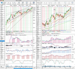
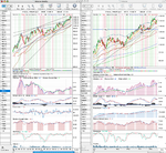
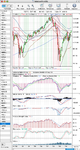
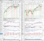
Market Breadth Charts
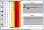
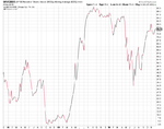
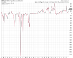
I recently reread “The Visual Investor by John J Murphy” and it made me think about market breadth charts again for the first time in a while. So I thought I’d have a look at a few today and see what they say about underlining market strength at the moment.
Attached is the the following from stockcharts.com free charts section:
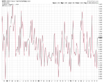
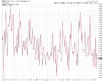
$CPC (CBOE Options Total Put/Call Ratio)
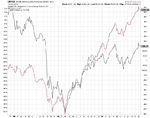
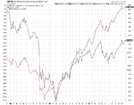
$NYAD (NYSE Advance Decline Issues (EOC)) – I’ve put the S&P 500 behind to compare.
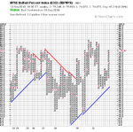
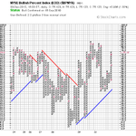
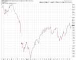
$BPNYA (NYSE Bullish Percent Index) – I’ve included the point and figure chart and the plain line chart.
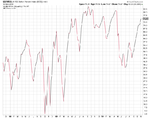
$NYHL (NYSE New Highs-New Lows (EOD))
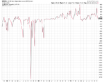
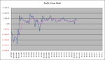
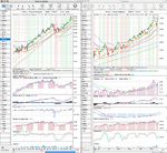
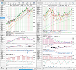
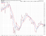
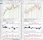
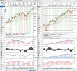
I recently reread “The Visual Investor by John J Murphy” and it made me think about market breadth charts again for the first time in a while. So I thought I’d have a look at a few today and see what they say about underlining market strength at the moment.
Attached is the the following from stockcharts.com free charts section:
$CPC (CBOE Options Total Put/Call Ratio)
$NYAD (NYSE Advance Decline Issues (EOC)) – I’ve put the S&P 500 behind to compare.
$BPNYA (NYSE Bullish Percent Index) – I’ve included the point and figure chart and the plain line chart.
$NYHL (NYSE New Highs-New Lows (EOD))