'No indicators' revisited

clylbw said:
May I ask why you think the impulse up was weak on Tuesday but not so on Thursday?
Can you also explain more about 'the up waves became stronger than the down waves'?

I dont know why or need to know why the up impulses (the retracements in the down trend) were weaker Yesterday than on Thursday the 8th.

The only thing I want to concern myself with is being on the right side of the market in the present and making money.

And what I mean by when the up impulses become greater than the down impulses is when the market rises more than it falls.

Theres too much jargon in trading, you can call them waves, impulses, swings and so on..

The left diagram characterised yesterday. The right chart is what I wanted to see to start looking to go long.
 

Attachments

  • waves.png
    waves.png
    4 KB · Views: 510
clylbw said:
Hi dbphoenix,

Can you please define more about 'selling climax'? Why do you think there was one on Thursday but not on Tuesday?

Note the volume bar at 1420 on Thursday and the close higher than the low. This is the first indication that selling is becoming exhausted. The climax then comes at 1510 with a close at the low, after which there is no follow-through.

The 1520 volume bar is also strong, with price closing much closer to the high than the low. If you were to combine the 1510 and 1520 bars, they would form a hammer. You don't show S/R on your chart, but you'll find that price found support at the same point as the last swing low in February.

None of this dynamic, of course, is found on Tuesday's chart.
 
ford

Would I be correct in saying that your 'downs stronger than ups' = lower lows and your ups stroger than downs = higher highs

Regards

bracke
 
Taken from page 17....

Underbalancing corrections....
 

Attachments

  • asiunderbance11.jpg
    asiunderbance11.jpg
    151.1 KB · Views: 470
bracke said:
ford

Would I be correct in saying that your 'downs stronger than ups' = lower lows and your ups stroger than downs = higher highs

Absolutely .. in the context of 'swings' not just individual bars.
 
Many thanks to all of you indeed.

Have had a good day with NQ, which I would not have achieved without all your help here. :D
 
Another question if I may.

I have been watching Time & Sales, and found while bids and asks are often quoted in hundreds and thousands in amount, actual trades are mostly dozens or several in amount for each trade. Why is the discrepancy?

Thanks indeed.
 
A Bradley date.. 26/4 @ the top of the chart below...

For your viewing pleasure :idea:

CJ
 

Attachments

  • asibradley2004.jpg
    asibradley2004.jpg
    49.5 KB · Views: 531
Last edited:
The S&P 500 High YTD occurred on the 5th of March.... interesting coincidence maybe ;) :cheesy:


CJ
 
Last edited:
Skim, I have a Q about yesterday's action if you don't mind.
I recall a while ago when you illustrated tops & bottoms and said that with experience you should be able to spot them.
Well I thought i was getting better, until yesterday, when during the down trend I thought it had bottomed 3 times only for it to continue down shortly after.
Even with hindsight I can't really see where I went wrong.
I'd be grateful for any advice
Thx,
hampy
 
Couldn't answer before, as I was trading, and the answer is not a quick one.

Yes, you can spot tops and bottoms with experience. And it's quite easy, but you have to know what a good one looks like, and when a good one turns into a bad one.

Let's start with the big picture yesterday, on the ES 10 minute chart (posted below). A trend reversal pattern (a double top) formed, so the movement was then down. The longer time the top takes to form, the greater the resultant move. That double top took an hour to form.

The drop from the top to the bottom I've marked in wellington boot green and labelled A. The same length bar (marked B) is then placed at the top of wave 4, to give you an idea of how low the price may drop.

The price bounced at the 15:00 bar which was at the exact level of the measured move B. That bounce, I suggest, was where geometric traders went long because of the measured move. But the positioning of wave 2 suggested to me as if there was more down to come. The move down finally ended on a doji bar.
 

Attachments

  • cme-es04m- 10 minute.jpg
    cme-es04m- 10 minute.jpg
    70.8 KB · Views: 581
I always find it helps to look at the other indices to see what's happening there.

The following chart is the COMPX (the Nasdaq Composite Index), and you'll see that the same measured move as above, works perfectly to pick the bottom.
 

Attachments

  • nasdaq combined composite indx- 5 minute.jpg
    nasdaq combined composite indx- 5 minute.jpg
    35.5 KB · Views: 498
Most interesting how others see the same thing but from a completely different technique/method.
 
Hi Skim,

Thanks indeed. Your posts are very helpful.

I assume you look at the COMPX alongside ES? May I ask if you also look at other cash indexes? It seems that ES often moves with YM, but there is often divergence between ES/YM and NQ. As I do NQ, I am still trying to find out what indexed/futures to look at for indications for NQ.

Thanks indeed.
 
I'm note sure it matters which one.... I use ES for Dow confirmation. If both tell me the same,that's good enough. I guess I could equally use the COMPX. I used to look at all 3 , but it got far too confusing. I only look at ES where/when the Dow does not give clear signals.
 
I usually look at ES, COMPX, and Dow, in other words one from each of the three main indices. It doesn't really matter which ones, it could be NDX (Nasdaq 100) or NQ, and SPX or INX, you just need to know when one is out of sync with the others. When that happens the laggard will either have to catch up with the other two, or it will pull the others down with it. So you keep your eye on the laggard.

Yesterday in the ones I watch the laggard was COMPX. In other words, Nasdaq was bearish when the S&P and Dow were bullish. So by watching the Nasdaq you would know what was likely to happen. If it got bullish then up we went, if it continued to be bearish then down we went.

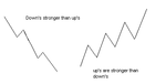
There is never one index which leads - they take it in turns, both throughout the day and overall.

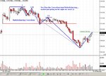
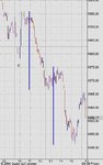
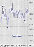
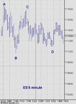
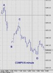
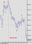
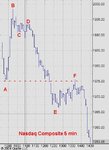
I'll illustrate what I mean. The following are the three markets for the same period yesterday, all on the 5 minute charts.

I've adjusted the charts so that they are all the same size, and the move from A to B is the same on each chart - in other words, they're as close as I can get to being equal, so that you can see the differences.

I've marked four points - A, B, C, D - and if you look at the relative positioning of them you can see which is leading the others.

At points A and B the markets were in sync. But at point C at around 11:15, the Dow was leading, S&P was in the middle and Nasdaq was lagging. The Nasdaq was considerably bearish. Point D is above point B on both the Dow and the S&P, but it was below point B on the Nasdaq. So the Nasdaq has gone from being considerably bearish to being exceedingly bearish.

This shows you the set-up, prior to what was a big drop. So you know to be exceedingly careful with any longs in the afternoon session as shorts are the order of the day.

No messy calculations, just open your eyes and look! LOL
 

Attachments

  • dow jones industrial average index- 5 minute (all sessions).jpg
    dow jones industrial average index- 5 minute (all sessions).jpg
    30.9 KB · Views: 404
The sole purpose of comparing the indices is to get a feel for the character of each market at that time. It helps me know whether my trades are going to be long or short (both in type of trade, and duration of hold).

To answer Hampy's question above, I posted the 10 min and 5 min charts of ES for Thursday 29 April.

Just to show how the comparison between indices works, I'll now post the 5 min chart of both COMPX and Dow for the same date, so that you can see that the Dow was leading and was bullish, but the Nasdaq was bearish and was lagging. This showed up right at the start of the day at the double top I illustrated on the ES chart.

On the following two charts the double top is at points B, C, D. You can see how at point D the Dow was bullish and the Nasdaq bearish. At point F the Dow was bullish yet the Nasdaq was bearish.

Remember that it's never the leading indicator which you should keep your eyes on, but the lagging one. This goes against the stuff taught on courses and in books, but hey, I trade, I don't write books.
 

Attachments

  • dow jones industrial average index- 5 minute (all sessions).jpg
    dow jones industrial average index- 5 minute (all sessions).jpg
    30.9 KB · Views: 368
Top