Stan Weinstein's Stage Analysis

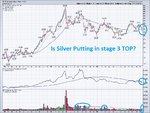
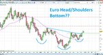
Has SILVER put in a MAJOR STAGE 3 TOP????

Isatrader thanks for the great post on Gold. I'm starting to think a major top may be in for precious metals across the board (I'm now short silver)

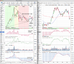
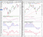
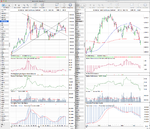
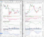
3 Charts I'd like to share which suggest Silver may be putting in a major top or perhaps going into a bearish time.

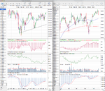
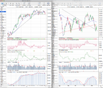
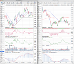
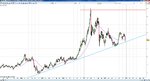
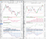
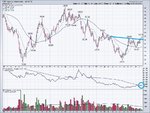
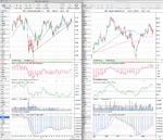
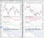
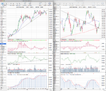
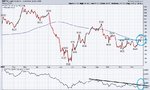
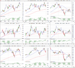
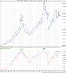
Chart #1 shows that a flat 150 Moving average for past 12 months and Silver breaking under the 150 (30wk) recently as relative strength declines & breaks down. Also if you review the volume for the past 12-18 months, High RED (Selloff) Volume has dominated the price bars, suggesting DISTRIBUTION. Is this the start of Stage 4???

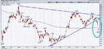
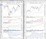
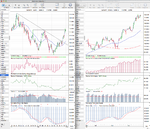
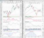
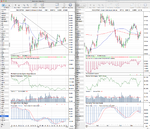
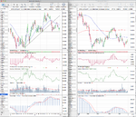
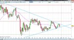
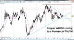
Chart #2 Shows Silver has recently broken out of a major wedge pattern to the downside.

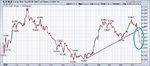
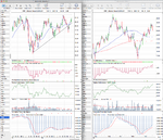
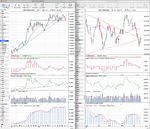
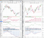
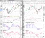
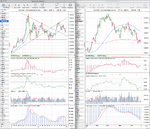
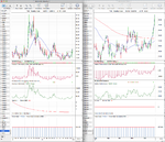
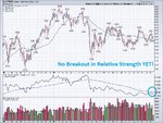
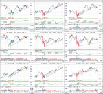
Chart #3 Shows the relative performance of Silver vs Gold. In precious metals bull runs, silver tends to "outperform" gold. Recently this has shifted and silver has broken trendline and is now grossly underperforming Gold and leading to the downside on the selloff in precious metals.

All 3 charts look ultra bearish for Silver. Unless silver can regain its 150 MA (30week) I'm a BEAR!

Happy Trading. Thanks all and Thank you Stan Weinstein for sharing your methods with the world!!!!
 

Attachments

  • SLV - 3 year.jpg
    SLV - 3 year.jpg
    239.9 KB · Views: 372
  • Silver - wedge.jpg
    Silver - wedge.jpg
    148.8 KB · Views: 328
  • Slv-vs-Gld.jpg
    Slv-vs-Gld.jpg
    123.8 KB · Views: 396
Silver (SI) Stage Analysis

Hi Rewardz, good post on Silver. Attached is my Stage Analysis of it using the more complete data from the Silver (SI) continuous futures contract. As like Gold, Silver is traded more like a currency and trades 24 hours a day, whereas the SLV only covers the US market times. So I personally think it's important to look at the complete data.

I've highlighted in different colour sections on the chart of how I see the stages. Although similar to Gold, Silver had a much more parabolic move, and after the blow off top towards 50, it formed a Stage 3 during May to September 2011. I see it as breaking down into Stage 4 in September 2011 and it then attempted to move into Stage 1 in February 2012, but failed under the declining trend line and continued in it's Stage 4 decline. It sold off back towards the lows of 2011, where it met and held the rising four year uptrend line in the summer and broke out above the one year old downtrend line and the 30 week WMA in August to move into Stage 1 finally. It then advanced towards the top of the major range that had been forming over the last year and put in a lower high. This weeks breakdown below the Stage 1 range low from November puts Silver back into Stage 4A imo. However, it is still above the four year trendline and within the major range - which you could argue is a Stage 1 range, as unlike Gold whose range has formed beginning with a rising 30 week SMA. Silvers range formed below a declining 30 week SMA which then flattened out and began to rise. But, whether a major Stage 3 or Stage 1 range doesn't matter per se, as all that matters is which way it breaks out, as if that is down below the range lows then it will be in Stage 4 proper again.

The short term swing target from the recent range only projects a target down towards 26, which like Golds target is at the bottom of the range, and so will be a major point of support. So I guess my view from the analysis is that it's in a short term Stage 4A decline, but within a bigger Stage 1 / 3 range still, and so I personally wouldn't go all in yet and call a major breakdown, as the lows of the range have been tested twice in the last year and held. But it could be a good short term traders pick.

Incidentally, Silver was one of my first Stage Analysis's in the thread in post #5 here: http://www.trade2win.com/boards/technical-analysis/134944-stan-weinsteins-stage-analysis.html#post1675734, where I highlighted the stop placement from the book and Stage 3 range forming.
 

Attachments

  • Silver_Stage_Analysis_21_12_12.png
    Silver_Stage_Analysis_21_12_12.png
    143.7 KB · Views: 460
Last edited:
Attached is the updated major charts for your own Stage Analysis and the relative performance table ranked using the 200 day Mansfield RS. The German DAX continues to be the outperformer of the group and broke out to a new high this week.

I've also updated the market breadth thread with the moving average breadth charts, advance decline line charts, put call ratio etc, so that we can look at the current weight of evidence. Here's the link: http://www.trade2win.com/boards/technical-analysis/147476-market-breadth-21.html#post2040162

attachment.php
 

Attachments

  • FTSE100_Weekly_21_12_12.png
    FTSE100_Weekly_21_12_12.png
    142.5 KB · Views: 365
  • DAX_Weekly_21_12_12.png
    DAX_Weekly_21_12_12.png
    137.2 KB · Views: 333
  • IWM_Weekly_21_12_12.png
    IWM_Weekly_21_12_12.png
    131.2 KB · Views: 350
  • NDX_Weekly_21_12_12.png
    NDX_Weekly_21_12_12.png
    138.5 KB · Views: 322
  • SPX_Weekly_21_12_12.png
    SPX_Weekly_21_12_12.png
    147.7 KB · Views: 371
  • GC_Weekly_21_12_12.png
    GC_Weekly_21_12_12.png
    129 KB · Views: 344
  • HG_Weekly_21_12_12.png
    HG_Weekly_21_12_12.png
    134.3 KB · Views: 348
  • CL_Weekly_21_12_12.png
    CL_Weekly_21_12_12.png
    139.3 KB · Views: 254
  • TY_10yr_Treasuries_21_12_12.png
    TY_10yr_Treasuries_21_12_12.png
    136.1 KB · Views: 339
  • US_30yr_Treasuries_21_12_12.png
    US_30yr_Treasuries_21_12_12.png
    135.1 KB · Views: 338
  • Major_Charts_RS_list_21_12_12.png
    Major_Charts_RS_list_21_12_12.png
    23.9 KB · Views: 1,443
  • DX_Weekly_21_12_12.png
    DX_Weekly_21_12_12.png
    131 KB · Views: 307
Last edited:
Re: Silver (SI) Stage Analysis

IsaTrder....Thanks for you silver analysis. Great work.

I went ahead and took a look at a more historical perspective of silver and yes, by golly the trendline you reference goes all the way back to 2008!

I did not realzie this until now. I will revise my target on my short to that trendline and then review what happens at that point.

That is the beauty and power of this type of group support/sharing.

This trendline has been touched mutiple times the past 5 years.

Thanks a MILLION! Happy Trading & Happy Holidays.

I'll share my chart (purple line is the 30 week)
 

Attachments

  • Silver 5year weekly.jpg
    Silver 5year weekly.jpg
    333.9 KB · Views: 399
US Industry Sectors Relative Performance

It was a interesting week for the sectors, with the three sectors with the largest amount of stocks in the S&P 500 (Financials, Industrials and Consumer Discretionary) making a new high, but then closing back below them in the lower portion of their weeks range.

Consumer Staples (XLP) closed back below it's 30 week MA after making a lower high the previous week to form it's Stage 3 range. Health Care (XLV) also made a lower high, but it hasn't closed back below it's 30 week MA or trend line yet - but the Stage 3 range is clear now.

So although the S&P 500 itself has pushed higher over the last month, from the sector charts it's still a quite negative picture. With seven sectors in Stage 3 and two sectors - Utilities (XLU) and Technology (XLK) in Stage 4 imo.

Attached is the US Industry Sectors weekly and Daily charts and below is the relative performance table.

attachment.php
 

Attachments

  • US_Industry_Sectors_21_12_12.png
    US_Industry_Sectors_21_12_12.png
    126 KB · Views: 351
  • US_Industry_Sectors_D_21_12_12.png
    US_Industry_Sectors_D_21_12_12.png
    119.7 KB · Views: 343
  • US_Industry_Sectors_list_21_12_12.png
    US_Industry_Sectors_list_21_12_12.png
    20.9 KB · Views: 1,324
I hope everyone that reads the thread had a nice Christmas day.

Attached is the weekly and daily charts of some the Euro major pairs for stage analysis. And as sector analysis is a key component of the stage analysis method, I thought it would useful to look at it's major peer charts to create a sector view of sorts. So attached are the charts for the EUR/AUD, EUR/GBP, EUR/JPY, and EUR/USD.

I see the EUR/AUD as is in Stage 1B currently with improving weekly relative performance, but significant near term resistance. EUR/GBP is making a Stage 2A breakout attempt. It's relative performance is also improving and the 30 week MA is turning up. EURJPY is the strongest of the group and is already in Stage 2 since November. It has strong relative performance, but it's currently testing it's March 2012 highs. Finally EUR/USD is also attempting to make a fledgling Stage 2A breakout, but it's doing it in some near term resistance from early this year and so is struggling a bit. Relative performance versus the S&P 500 is close to crossing the zero line and the 30 week MA is moving higher.

Of the four charts we have a Stage 1B, 2A, 2A & 2, and so the "sector" for the Euro looks to be late in the basing phase / early in the advancing stage, with improving relative strength, but with near term resistance to contend with. So although things are improving, some them may fall back into Stage 1 if the resistance is too much to overcome in the near term. But it does mean that using Weinstein's method that you can start dipping your toes back in the Euro as it's not in Stage 4 anymore, which it was for the majority of the last year.

Attached are the charts up until Christmas Days close.
 

Attachments

  • EURUSD_Weekly_25_12_12.png
    EURUSD_Weekly_25_12_12.png
    126 KB · Views: 364
  • EURJPY_Weekly_25_12_12.png
    EURJPY_Weekly_25_12_12.png
    125.7 KB · Views: 347
  • EURGBP_Weekly_25_12_12.png
    EURGBP_Weekly_25_12_12.png
    125.2 KB · Views: 344
  • EURAUD_Weekly_25_12_12.png
    EURAUD_Weekly_25_12_12.png
    127.5 KB · Views: 371
IsaTrader. I dont trade currencies but wow. I was looking at your Euro/USD weekly chart. There is a CRYSTAL CLEAR.....HEAD & SHOULDERS BOTTOM on the weekly chart. Makes me want to jump in on this forex move.

Let me add my own chart of the forex & FXE etf. Target on this H/S bottom would be Euro/USD $1.40

The Euro bounced off its 150 day (30 week) MA recently and its starting to rise. Relative Strength has BROKEN OUT! Very good confirmation on this pattern.....If I dont open a forex account I may just play via FXE etf.

Happy Trading!!!
 

Attachments

  • Euro Head Shoulders Bottom weekly.jpg
    Euro Head Shoulders Bottom weekly.jpg
    255.6 KB · Views: 328
  • FXE - etf.jpg
    FXE - etf.jpg
    243 KB · Views: 380
Last edited:
Attached are the major charts and the relative performance table. I've added in the VIX and the overall NYSE charts to the mix. The VIX has gone immediately to the top spot on the RS table as it broke out strongly into Stage 2A this week.

I highlighted some areas on the S&P 500 chart that shows the comparative period last year for the 30 week MA momentum and distance from the 30 week MA. It doesn't mean the same will happen again, but is certainly a warning sign to be aware of. As well as the Nasdaq 100 making a Stage 4 continuation move below it's 200 day MA, which has dropped it back to the bottom of the chart. The Nasdaq 100 is a leading indicator imo as it has more speculative money in it, and so the fact that it's at the bottom of RS table again is not a good sign.

I've also updated the market breadth thread so that we can gauge the weight of evidence: http://www.trade2win.com/boards/technical-analysis/147476-market-breadth-22.html#post2042562

attachment.php
 

Attachments

  • DAX_Weekly_28_12_12.png
    DAX_Weekly_28_12_12.png
    136.1 KB · Views: 304
  • NYA_Weekly_28_12_12.png
    NYA_Weekly_28_12_12.png
    135.8 KB · Views: 276
  • IWM_Weekly_28_12_12.png
    IWM_Weekly_28_12_12.png
    131.6 KB · Views: 249
  • NDX_Weekly_28_12_12.png
    NDX_Weekly_28_12_12.png
    138.7 KB · Views: 296
  • SPX_Weekly_28_12_12.png
    SPX_Weekly_28_12_12.png
    149.9 KB · Views: 319
  • TY_10yr_Treasuries_28_12_12.png
    TY_10yr_Treasuries_28_12_12.png
    136.8 KB · Views: 300
  • CL_Weekly_28_12_12.png
    CL_Weekly_28_12_12.png
    138.1 KB · Views: 256
  • HG_Weekly_28_12_12.png
    HG_Weekly_28_12_12.png
    134.9 KB · Views: 356
  • GC_Weekly_28_12_12.png
    GC_Weekly_28_12_12.png
    130.9 KB · Views: 328
  • FTSE100_Weekly_28_12_12.png
    FTSE100_Weekly_28_12_12.png
    142.8 KB · Views: 312
  • US_30yr_Treasuries_28_12_12.png
    US_30yr_Treasuries_28_12_12.png
    136.2 KB · Views: 235
  • DX_Weekly_28_12_12.png
    DX_Weekly_28_12_12.png
    132.4 KB · Views: 297
  • VIX_Weekly_28_12_12.png
    VIX_Weekly_28_12_12.png
    129.1 KB · Views: 253
  • Major_Charts_RS_list_28_12_12.png
    Major_Charts_RS_list_28_12_12.png
    24.5 KB · Views: 1,148
Last edited:
A very interesting WEDGE formation is coming to a point for COPPER.

Copper is currently above its 150 MA and bounced recently The 150 is starting to rise.

One drawback is there has been no breakout in relative strength for copper yet (see 3 year chart)

However, there is a multi-year wedge pattern coming to a point. Copper is about to make a big move one way or another.

Deflation or Stagflation????

When these wedge patterns break one way or another they can launch some very big & fast moves......

Stay tuned!!!
 

Attachments

  • Copper wedge.jpg
    Copper wedge.jpg
    264.8 KB · Views: 301
  • copper 100 period.jpg
    copper 100 period.jpg
    234.7 KB · Views: 294
  • copper 3 year.jpg
    copper 3 year.jpg
    279.4 KB · Views: 292
Deflation or stagflation?

Exciting times, at the risk of being labelled a heretic in chartist circles, it all hinges on the outcome of the fiscal cliff talks imho.
 
I hope you don't mind me saying, but GTG, this isn't really the thread to discuss macro and Rwz nor chart patterns such as wedges or h&s . Well observed, but in Weinstein terms isatrader has shown copper to be going sideways http://www.trade2win.com/boards/att...nsteins-stage-analysis-hg_weekly_28_12_12.png and this isn't of much interest yet until 4.00 is broken.
Likewise, as isatrader's charts show, EURUSD is of interest, with the breakout line just below 1.32 as he has drawn it, but the main reservation is the early resistance up to 1.35 (but OK if you like day-trading).
http://www.trade2win.com/boards/att...ins-stage-analysis-eurusd_weekly_25_12_12.png
 
IPLATE. thanks for your post. However Head & Shoulders Bottoms are a HUGE part of Stans methods.

Please reference pages 116-123 of Stans Book. They are VERY relevant in applying Stan's methods.

I will share his image of a head and shoulders bottom as well as a quote.

"The first one is the head-and-shoulder bottom formation. This
is the most powerful and reliable of all bottom formations." - Stan Weinstein pg. 116.

"Back in Chapter 4,1 showed you the importance of spotting head-andshoulder
bottom formations, since they lead to incredibly profitable
upside advances. The converse is also true. Head-and-shoulder top
formations (especially when they come after a dynamic advance) are
among the most profitable short-selling signals. While they don't occur
with great frequency, they do form more often than head-andshoulder
bottom patterns, and they do appear often enough to be a
source of great gain. In fact, when you start to see a bevy of these
formations occurring, it's a signal that a major market top is moving
into place." - Stan Weinstein pg. 241

As for "wedges" they essential consist of two trendlines which are another of Stans core techniques. Not a wedge specifically, however a break of the trendline is what Stan looks for. Obviously a "wedge" consists of 2 trendlines intersecting each other, and there is a 100% probability that it breaks one way or another. I simply used the overlay of 2 trendlines to a chart of Stans work with relative strength and the 150 Moving average. In the case of copper I realize the "break" of a trendline has not occurred yet, however rest assured one is coming, one of the two trendlines must be violated within the next 30-60 trading days.

Happy Trading!
 

Attachments

  • HS-Stan.jpg
    HS-Stan.jpg
    38 KB · Views: 336
  • Hs top - stan.jpg
    Hs top - stan.jpg
    38.1 KB · Views: 291
  • Euro Head Shoulders Bottom weekly.jpg
    Euro Head Shoulders Bottom weekly.jpg
    255.6 KB · Views: 332
  • Copper wedge.jpg
    Copper wedge.jpg
    264.8 KB · Views: 310
Crude Oil (WTI) has made an impressive breakout above its 30 week MA which has now flattened out.

Relative Strength has broken out of a 9-month drown-trend since March.

A breakout in relative strength is one of Stan's core teachings when searching for winners.

Crude Oil appears to be moving into late stage 1 or early stage 2.

Happy Trading

disclosure: Long crude futures (CL - April)
 

Attachments

  • WTI - 12-29-12.jpg
    WTI - 12-29-12.jpg
    291.5 KB · Views: 316
  • wti-daily.jpg
    wti-daily.jpg
    154.8 KB · Views: 337
Last edited:
It is good to see some discussion going on, as that was why I created the thread after all - to get people discussing how they use Weinstein's method. As was a long time of me talking to myself, so is nice to see.

With regards to what's been mentioned, on the Euro I posted a chart on the 20th Dec here: http://www.trade2win.com/boards/tec...weinsteins-stage-analysis-90.html#post2038720 noting the Stage 2A breakout had been made, but said that I only considered it a C- breakout personally as it wasn't fulfilling the all of the methods main requirements, due to the near term resistance to 1.35 and the declining volume, which were highlighted on the chart. In the follow up on Boxing day showed that the breakout had been weak and that it was struggling with the near term resistance, but that the group of euro charts as a whole were late in the basing phase / early in the advancing stage, with improving relative strength, but with near term resistance to contend with. The EURUSD is not the strongest of the group of Euro charts I showed, and so I agree with lplate in that until it breaks above the near term resistance zone that it's in up to the 1.35 level you should be cautious. Especially with forex, as it's much more technically traded than stocks, and so support and resistance levels have even more importance imo. That's why I try to go for longer term moves on FX personally using a monthly chart of which currently the EURJPY monthly chart stands out imo, as it's just closed above the 30 month MA for the first time since 2008. Short term it's reached resistance, so I'll be waiting for a decent pullback and pivot for a possible entry.

Copper next and trendlines. I'd say that trendlines are subjective, and you could put lines all over the place quite easily, but what you are looking for is a "significant" trendline. And I think Weinstein's rule was that in order to be significant, it needs to have 3 strong touch points and have moved away a decent distance following the test. So in Coppers case I personally think the 2009 low isn't as relevant anymore, which is why I've chosen the 2010, 2011 and 2012 closing weekly lows for my main trendline, which is much shallower and it now has 5 touch points and so I believe it is a more significant level to watch. In the technically speaking interview, he said to use the intraday lows for drawing the trendline, but that the 30 week MA was more important. And so I differ slightly from the method in that respect in that I use the weekly closes, but it's just a personal preference.

Crude Oil - is another one trading up into some strong near term resistance up to around the 94 level. I make it Stage 1, and the break up from recent lows has been on decreasing volume. So not a Weinstein candidate yet imo, however the improving relative strength is a positive, but it's only just moved one spot off the bottom of the relative performance table after many many months in the bottom spot.
 
Last edited:
US Industry Sectors

Attached is the updated US Industry Sectors charts and the relative performance table. There was a few more trendline breaks this week and moves below the 30 week WMA. Energy (XLE) and Consumer Staples (XLP) moved down towards the bottom of their Stage 3 ranges and so could move into Stage 4 if the swing lows don't hold. Health Care (XLV) also looks weak now below it's 30 week WMA and trendline, and so will need to hold it's 200 day MA and swing low or it too will move into Stage 4.

The relative performance table below shows this well, as the late Stage 3B and Stage 4 sectors all make up the bottom of the list. But the overall Stages of the US market are still weighted towards the negative side, as I have it as four sectors in Stage 3, three sectors in Stage 3B and two in Stage 4.

attachment.php
 

Attachments

  • US_Industry_Sectors_28_12_12.png
    US_Industry_Sectors_28_12_12.png
    125.6 KB · Views: 309
  • US_Industry_Sectors_D_28_12_12.png
    US_Industry_Sectors_D_28_12_12.png
    121.3 KB · Views: 278
  • US_Industry_Sectors_list_28_12_12.png
    US_Industry_Sectors_list_28_12_12.png
    21.8 KB · Views: 1,082
Last edited:
I hope you don't mind me saying, but GTG, this isn't really the thread to discuss macro

Hi Iplate, I appreciate that you do not want this thread evolving into a discussion on macro economics as I feel sure we all don't. I should inform you that Weinstein does mention macro economics, seasonality and historical precedence in the March 2005 edition of GTA.

As we’ve shown you many times over the years, as long as the trend for Debt is higher, that correlates very strongly with bull markets (while conversely, contracting Debt goes hand in hand with bear markets).

First of all, in addition to the fact that January was a problem month (and we’ve shown you many times over the years that while it’s not an infallible indicator, a weak January has often forecast a problem market - note that January was weak in 1957, 1960, 1962, 1969, 1972, 1973, 1977, 1981, 1990, 2000, and 2002 and all those years turned out to be bearish). In addition, we’re also in a post election year mode and again, while this statistic is not infallible, it is important to be aware of the fact that many post election years have been less than thrilling for the market (such as was the case in 1969, 1973, 1977, 1981, and 2001). Furthermore, there have now been 6 rate hikes (with more on the way), and a study of history shows that markets have not done well in such periods of rising interest rates.

He even mentions considering fundamentals
At the same time, make sure that you aren’t short stocks with poor fundamentals that we’re bullish on

Whilst I do not recall these consideration in his book I think they are relevant here. ISAtrader has made a sterling effort to find out what refinements have been made to his methodology and I think theses considerations are relevant to that cause. Whilst this is not stage analysis I do think that ISAtrader's intention for this thread was to create a discussion on all aspects of the Weinstein method. On this basis, I see both RewardZ and my comments in context.
 
Thanks to everyone for their well researched and considered replies. I will add that Weinstein's "Weight of Evidence" approach is a 100% technical - although the cravat to that statement is that a number of the technical gauges he looks at are of fundamental data. They are just looked at from a technical perspective by charting them, for example, the price/dividend ratio mentioned on pages 301-304 in the book; the Pension Fund Cash Ratio, the Bank Cash Ratio, Margin Debt, Insider Sell/Buy Ratio, Net Free Reserves, Large Block Ratio, Mutual Fund Cash Ratio in the GTA reports etc. I'm sure there's many more...the point is that he uses a lot of fundamental information in his reports, it's just charted and looked at in a technical way. So I don't mind macro being discussed on the thread, but I'd ask that when it is, that it's done in technical way through the relevant charts, as they do in the Global Trend Alert - to keep the thread from going off topic.

So as an example if you wanted to talk about Margin Debt you can download the statistics from the NYSE site NYSEData.com Factbook: Securities market credit ($ in mils.) and create your own chart. So I did that and created the all years Margin Debt chart, and the last 20 years which are below. This shows that margin debt is back to 2007 levels, which was the year that it made all time highs and looks to be quite correlated with the S&P 500, so it could be useful to look for divergences like can be seen in Aug 2000, and Oct 2007.
 

Attachments

  • Margin_Debt_dec12.png
    Margin_Debt_dec12.png
    22.7 KB · Views: 268
  • Margin-Debt_20-year.png
    Margin-Debt_20-year.png
    47.4 KB · Views: 291
Last edited:
Thanks to everyone for their well researched and considered replies. I will add that Weinstein's "Weight of Evidence" approach is a 100% technical - although the cravat to that statement is that a number of the technical gauges he looks at are of fundamental data. They are just looked at from a technical perspective by charting them, for example, the price/dividend ratio mentioned on pages 301-304 in the book; the Pension Fund Cash Ratio, the Bank Cash Ratio, Margin Debt, Insider Sell/Buy Ratio, Net Free Reserves, Large Block Ratio, Mutual Fund Cash Ratio in the GTA reports etc. I'm sure there's many more...the point is that he uses a lot of fundamental information in his reports, it's just charted and looked at in a technical way. So I don't mind macro being discussed on the thread, but I'd ask that when it is, that it's done in technical way through the relevant charts, as they do in the Global Trend Alert - to keep the thread from going off topic.

I agree 100%. Stan has pages of graphics of "bullish" headlines which were seen at MARKET TOPS. and pages of negative graphics of pessimistic economic numbers/sentiment at MARKET BOTTOMS.

Stans approach seems to be ignore the fundamentals and simply follow the "markets reaction to the news"

Thus the charts are what matter and not the headlines or econmic numbers.
 
Thanks to everyone for their well researched and considered replies. I will add that Weinstein's "Weight of Evidence" approach is a 100% technical - although the cravat to that statement is that a number of the technical gauges he looks at are of fundamental data. They are just looked at from a technical perspective by charting them, for example, the price/dividend ratio mentioned on pages 301-304 in the book; the Pension Fund Cash Ratio, the Bank Cash Ratio, Margin Debt, Insider Sell/Buy Ratio, Net Free Reserves, Large Block Ratio, Mutual Fund Cash Ratio in the GTA reports etc. I'm sure there's many more...the point is that he uses a lot of fundamental information in his reports, it's just charted and looked at in a technical way. So I don't mind macro being discussed on the thread, but I'd ask that when it is, that it's done in technical way through the relevant charts, as they do in the Global Trend Alert - to keep the thread from going off topic. I suppose at the end of the day it is just an economic news event albeit a very important one in my opinion shortly afterwards which we could see the volume characteristics and breakouts we are looking for.

Fair comment ISAtrader, this is already one of the "cleanest" and most focused on topic threads on T2W and that idea should help keep it that way.

Having said that, I can't think of one chart which would have supported my comment on the outcome of the fiscal cliff deliberations being of significant importance to the future direction of the markets.
 
Last edited:
Top