Relative Strength Trading

A comparison between SPYV - Value - and SPYG - Growth.
Let's see the SPYV & SPYG charts first:
SPYV.jpg


SPYG.jpg


We notice that, since early November, the Relative Strength of SPYV is going up and that of SPYG is going down. This is normally a bearish sign, as investors move to the more conservative Value stocks.

That being said, however, we also see that in the last two sessions SPYG is bullish and SPYV bearish.

So, it'll be interesting to see if the reversal to more aggressive Growth stocks will continue or we will return to the more defensive Value stocks.
 
December 15th update: The strongest stocks in the S&P400
400.jpg

See below one of the strongest stocks taken from the above diagram

401.jpg


December 15th update: The strongest Index ETFs

WOR.jpg

See below one of the strongest Index ETFs taken from the above diagram
WORA.jpg
 
December 22nd update: The strongest stocks in the S&P500

500.jpg


See below one of the strongest stocks taken from the above diagram

550.jpg
 
December 23rd update: The strongest stocks in the S&P500
500.jpg

We calculate the long- and short-term strength using a combination of appropriate momentum readings.

It’s a simple and objective way to choose strong stocks and profit from their strength.

You can use either the long-term or the short-term strength, or a combination of them that suits your strategy and time horizon.

See below one of the strongest stocks from the above diagram

550.jpg
 

Attachments

  • 100.jpg
    100.jpg
    106.4 KB · Views: 146
December 23rd update: The Relative Strength of the 11 US Sector ETFs

SEC.jpg

We can invest directly in the strongest Sectors.

Alternatively, we can choose stocks from the Sectors that show long-term and/or short-term strength.

Research shows that 80% of the profits come from the 20% of the strongest securities.

See below one of the strongest Sector ETFs taken from the above diagram
SECA.jpg
 
December 30th update: The strongest stocks in the S&P500

50X.jpg

See below one of the strongest stocks taken from the above diagram
55.jpg

 
See below the daily chart of Amazon
The price moved above the upper Bollinger Band.
Apart from that, the price moves above its 10- 20- and 50-day moving average.

What's more, the Relative Strength of AMZN just turned up and moved above its 20-day moving average

AMZN.jpg


From AMZN’s weekly chart below, we can see:
· The stock is moving along its 10- and 20--week moving average and above its 50-week moving average
· From the Relative Strength chart, we can see that it turned up and touched its 20-week moving average.

AMZNW.jpg
 
January 9th update: The strongest stocks in the S&P100
100.jpg

See below one of the strongest stocks taken from the above diagram
110.jpg
 
Having used relative strength in forex for 20 years i love this thread .......some real value here if people research and expand these ideas ........always go where the money is ....

Has anyone looked at short selling the weakest sectors ?....although forex is much more forgiving and balanced this way than equity markets ......
 
KOPN - Copin Corp. daily chart
KOPN.jpg


In early January KOPN broke out and started moving along the upper Bollinger Band.

The price is currently moving horizontally, a sign there’s equilibrium between the bulls and the bears.

Finally, the stock is moving above its rising 10- 20- and 50-day moving averages.

The Relative Strength of KOPN is moving up and above its 20-day moving average since mid-December.

KOPN - Copin Corp. weekly chart

KOPNW.jpg


From KOPN’s weekly chart below, we can see:

  • The stock is moving up and above its 10- 20- and 50-week moving average
  • What is more, price moves above the upper Bollinger Band, a sign of bullish strength
  • From the Relative Strength chart, we can see that KOPN outperforms our benchmark.

Money Management Guidelines

Suggested Buy: 5.53

Suggested Sell: 4.47

Suggested Trade Size: 940
 
WFC is showing strength

First of all WFC - Wells Fargo & Co. - belongs to the Financial Sector that is showing strength now.

Let's look at WFC daily chart

WFC.png


Price has just broken above a local resistance.
MACD is moving up and above its signal line
The stock's Relative Strength is also moving up and above its 20-day moving average

Let's look now that the stock's weekly chart:

WFCW.png


Price is moving in a bullish channel between its 10-week moving average and the upper Bollinger Band.
Price has also broken above a resistance.
MACD is moving up and above its signal line
The stock's Relative Strength is also moving up and above its 20-day moving average.

I prefer to look at both the daily and the weekly charts to have a better respective of the stock.
 
Caterpillar has just started an uptrend

CAT.jpg


In early February WFC broke out and above the blue resistance line and started moving along the upper Bollinger Band.

Finally, the stock is also moving above its rising 10- 20- and 50-day moving averages.

The Relative Strength of WFC is moving up and above its 20-day moving average.

Now, let's move to CAT's weekly chart for a wider view.
CATW.jpg


From WFC’s weekly chart below, we can see:

The stock is moving up and above its 10- 20- and 50-week moving average

What is more, since November, the price moves between its 10-week moving average and the upper Bollinger Band, a sign of bullish strength

From the Relative Strength chart, we can see that WFC outperforms our benchmark.

Money & Risk Management:

Suggested Buy: 37.8

Suggested Sell: 34.4

Suggested Trade Size: 340

We made the above estimates based on a hypothetical $100000 initial capital and a 1% risk per trade
 
Monday, April 19th update: Wells Fargo is getting stronger

Here's the daily chart of WFC:
WFC.jpg


Price started climbing along the upper Bollinger Band, a sign of a strong bullish trend.
At the same time, the stock's Relative Strength moved up and above its 20-day moving average.

Let's look at the stock's weekly chart, a simple Multi Timeframe Analysis:

WFCW.jpg


The stock has been moving in a bullish trend between its 10-week moving average and the upper Bollinger Band since mid-November.

At about the same time the stock's Relative Strength moved above its 20-week moving average.

Finally, the stock belongs to the Financial Sector, one of the best performing sectors in the last few weeks.

SE.jpg
 
A strong stock from a strong Sector.

Hello!

I've calculated the long- and the short-term of the 11 US Sectors. Here are the results.

SE.jpg


Let's choose a stock from XLRE as its short-term momentum is the highest.

Here's the daily chart of SPG - Simon Property Group - a large-cap stock belonging in the XLRE Sector.

SPG.jpg


The stock has recently dropped close to its 50-day moving average (the blue box) but the bulls reacted and moved the stock above its 10- and 20-day moving averages.
On its way up the stock moved above a resistance line at about 126 (the orange line).
The stock is currently moving along the upper Bollinger Band, a sign of a strong uptrend.
The stock's Relative Strength is also moving up and above its 20-day moving average (the green box).

Let's have a look at the stock's weekly chart.

SPGW.jpg

The stock has been moving in a healthy uptrend between its 10-week moving average and the upper Bollinger Band since last November.

In addition, its Relative Strength is also moving up and above its 20-week moving average.

Let's sum up:
1. We choose a Sector that shows Relative Strength
2. We then choose a stock from this Sector that has a healthy uptrend and Relative Strength in the daily chart.
3. We check this stock in the weekly chart to make sure that there's also a strong uptrend and Relative Strength in the longer time frame.

In short, I'm trying to improve my chances by choosing a stock from a strong sector that has bullish characteristics and Relative Strength both in the daily and the weekly charts.

Please tell me what you think of this approach.
 
Last edited:
CHOOSING A STOCK WITH BULLISH CHARACTERISTICS, FROM A STRONG SECTOR

Everybody’s trying to increase their odds by using various strategies and adding filters to narrow down their choice of stocks.

My personal approach is to use the following filters:
  • Choose stocks only from Sectors that are relatively strong at the time of trading.
  • Examine the weekly chart of the stock, in addition to the daily chart.
  • In both the daily and the weekly chart, I want the Relative Strength of the stock to be going up, which means that the stock outperforms my benchmark, which is SPY.
  • Apart from the above, I use some Technical Analysis tools, such as Moving Averages, Bollinger Bands, as well as PPO (MACD measured as a percentage) and MFI (Money Flow Index that takes volume into account).
So, I start my analysis by calculating the long- and short-term strength of the 11 US Sectors. Here are the results:

SE.jpg


From the above graph, I choose the Technology Sector, as its momentum is quite promising.

Let’s look at the technology sector’s daily chart.

XLK.jpg


As we can see in the above chart, XLK is moving in a strong uptrend between its 10-day moving average and the Upper Bollinger Band.
XLK’s momentum is also evident in the PPO, which is moving up and above its Signal Linge.
In addition, XLK’s Relative Strength is moving up and above its 20-day moving average.
So, let's choose a stock from the Technology Sector.

Here's the daily chart of NET – Cloudflare Inc. - a large-cap stock belonging in the Technology Sector.

NET.jpg


For more than a month the stock had no trend and its price was moving in a narrow range between 116$ and 126$ (the brown box).

Then the bulls reacted and moved the stock above its 10- and 20-day moving averages and along the upper Bollinger Band, a sign of a strong trend (green box).

The stock's Relative Strength is also moving up and above its 20-day moving average (the green box).

Another filter I’m using is to do some basic Multiple Time Frame Analysis. The weekly chart can reveal interesting info about the stock’s behavior that is not evident in the daily chart. So, a stock may seem a good trade in the daily chart, but show some weakness in the weekly chart.

Let's have a look at the stock's weekly chart.

NET-W.png

In the period between November 2020 and April 2021, the stock was not trending (brown box).

The stock has been moving in a healthy uptrend between its 10-week moving average and the upper Bollinger Band since last May (green box).

In addition, its Relative Strength is also moving up and above its 20-week moving average (blue box).

Let's sum up:

1. We choose a Sector that shows Relative Strength
2. We then choose a stock from this Sector that has a healthy uptrend and Relative Strength in the daily chart.
3. We check this stock in the weekly chart to make sure that there's also a strong uptrend and Relative Strength in the longer time frame.

In short, I'm trying to improve my chances by choosing a stock from a strong sector that has bullish characteristics and Relative Strength both in the daily and the weekly charts.

Please tell me what you think of this approach.
 
one of the best new threads for a long time ...well done 1nvest

N
 
one of the best new threads for a long time ...well done 1nvest

N
I'd love to take credit, however the dues all go to @tatrader ;)
and yes I agree, its a great thread, with a really solid foundation. Its a shame it doesn't show perhaps what you are actually trading however, and why the one chart for example of NET. was that the strongest stock in the sector?
It would be great to see the whole story as it were
 
Thank you for your comments.

As I said, I only trade stocks from Sectors whose Relative Strength is positive, that is, is going up, relative to SPY, and above its 20-day moving average. This of course means that these sectors outperform the SPY.
I've found out that trading stocks from the strongest sector(s) can increase the percentage of my winners.
So, first, I scan stocks belonging to the three strongest Sectors, which are currently Real Estate, Technology, and Communications - see the first Figure.
By the way, I calculate on a daily basis the long- and short-term Momentum Strength of the Sectors taking into account their Day-Week-Month-3 Month-6 Month and 12 Month Momentums.
You can see this info in www.globalactivetrading.com which I update daily.
I never said NET was the strongest stock in the technology sector. I chose NET simply because it had the features I explain above regarding its momentum and its Relative Strength shown in the daily and the weekly charts.

Thank you again for your response. I'll be glad to keep in touch with you
 
American Express: A strong stock from an outperforming Sector

As of October 8, the best performing sectors in the US Stock Market are the Energy and the Financial Sectors.

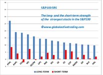
See the long- and the short-term momentum of all 11 US Sectors, plus the SPY for comparison.

SE.jpg


Although both the long- and the short-term momentum of the Energy Sector are bigger, let’s try to find stocks from the Financial Sector, as there is more potential for profit to them.

As we can see in the chart below, the Financial Sector ETF has just broken above the resistance line at 39. Price itself started moving above its 10- 20- and 50-day moving averages, another sign of a bullish trend.

XLF.jpg


Apart from that, XLF’s PPO moved to positive territory, as it moved above its Signal Line.

In addition to the above, XLF’s Relative Strength is moving up and above its 20-day moving average. The same is true of XLF’s Money Flow Index.

I chose the AXP - American Express Co. as an example of a Large Cap promising stock belonging to the Financial Sector.

Below is the daily chart of AXP.

AXP.jpg


Although the stock is still trying to break above the resistance line at 176, it’s currently moving above its rising 10- 20- and 50-day moving averages, and along the upper Bollinger Band.

This build-up of momentum is evident in PPO, which is moving in positive territory.

In addition, the stock’s MFI is moving up and above its rising 20-day moving average, a sign that money is flowing into the stock.

Finally, the stock’s Relative Strength is moving up and above its rising 20-day moving average, which of course means that the stock outperforms our benchmark, which is the SPY.

Let’s have a look at the stock’s weekly chart to get a longer-term view of its behavior.

AXPW.jpg


In the weekly chart, we see that the stock found support on the 10- and 20-week moving averages, before moving up.

This bullish momentum has started showing up in the PPO Histogram, which has started moving up toward zero.

Furthermore, the stock’s Relative Strength on the weekly chart has moved up and above its 20-week moving average.


Finally, let’s calculate our Stop Loss and the Size of our position.

We suppose that our capital is USD 100000 and we don’t want to lose more than 1% or our capital in any trade.

That is, our risk tolerance is USD 1000 (100000*1%) per trade.

We decide to buy AXP at 176 and sell the stock when it falls below 171. So, our risk per stock is USD 5 (176-171).

If we divide the total risk, USD 1000, by the risk per stock, USD 5, we find that we should buy 200 shares (1000:5=200).

Let’s sum up:

Buy at USD 176

Sell at USD 171 (this is our first Stop Loss, in case the stock moves lower)

We buy 200 shares to limit our total loss to USD 1000.


Our approach tries to combine:

  • Technical Analysis
  • Relative Strength
  • Multiple Time Frame Analysis
  • Sound Money Management


Any comments are welcome!
 
Top