Over the coming week, the legion of earnings announcements will hit the market and will continue over the next few weeks. Being in the seasonally most volatile period of the year and hand in hand with some very interesting technical developments recently, we look to this period to bring in precious volatility and exciting price action.
The big event over the last several days in the financial markets is a fresh, multi-year breakout in Gold to new, All Time High. In our June 28th Newsletter as well as some recent discussions in the Evolution Trading Studio, we pointed out some Bullish price behavior and that the Gold market was beginning to "heat-up." It is gratifying to see the price follow through on our expectations, and the time has come to assess the breakout. Although to analyze the short-term action is tempting, we shall take a look at a far more important structure in the Monthlies, let's begin:
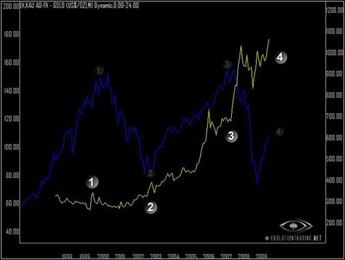
The Monthly chart of GOLD (yellow) overlayed to the SPY (blue) goes back more than 1 decade. It is interesting note that Gold's multi year breakouts over the last decade correspond with the Stock Market's most important turning points. While Gold's correlation to Stock Market over smaller time periods is inconsistent and nebulous at best, the larger time horizons beginning with our chart above illustrate a plausible correlation within this cycle. The multi year high breakout points in Gold are labeled with the bright numbers, while the corresponding turning points in the Stock Market (as represented by the SPY here) are marked with the transparent numbers. The most recent breakout in Gold (4) signals an important turning point in Equities, which interestingly, sits right in the middle of this decade's range.
Our current momentum target on Gold sits at approximately $1100, while our longer term target sits much higher, based upon range expansion (discussed later) at approximately $1500 between Spring 2010 to Spring 2011. While these figures may seem large to some, let's note that within the context of these time frames, they are not entirely far fetched. Gold, after all, is a currency that has been exchanged for thousands of years. A 1500, 2000 or 3000 figure in that market is not much different from a move on AAPL from 6 to 60, to 120 and beyond, much like a hill is structurally no different than a mountain. As much as Gold's multi year breakouts tend to coincide (and in fact LEAD) important turning points in Equities, the rising prices also signal some unparalleled inflationary scenario ahead?
Speaking of AAPL, let's now take a close look at the technical price behaviors that surround the Equities beginning with the Dow:
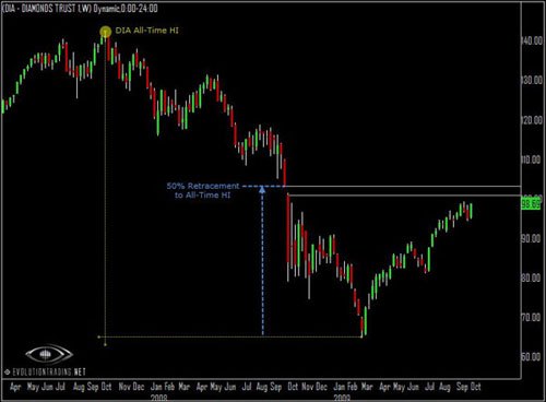
The chart above is a Weekly Chart of the DOW represented by the DIA, going back approximately 2.5 years. Readers following this newsletter will recognize this chart from the previous issue. The only difference now is that we note a flat correction ahead of the move to the gap from Oct 08 (white lines). At the top of this gap sits exactly a 50% retracement to the all time high in the Dow. We believe this area is most likely to serve as a formidable resistance point. In the larger time frame, it is simply a commonsensical warning of downside risks over the intermediate term time horizon, at the least, as this market now enters the epicenter of the violent downward momentum experienced by the equities in 2008 (50% retracement point, in blue). I suppose between our Gold chart earlier and the DOW chart above, the technical plots here are "haunting" enough to fit for a nice Halloween frame at your local brokerage house, except that the picture does not pretend to be scary. To my eyes, they are, and I wonder about the future. Perhaps there is a larger force that we do not see that will save the market from a continuation of 2008 - I am ready to be proven wrong.
SHORT-TERM MOMENTUM NOTATIONS: Our prior two charts illustrate very large time frames, while our next two will address short term momentum.
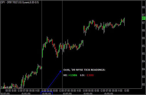
Our 15min chart of the S&P 500 above (via SPY) suggests some interesting price action that is not very common. On Oct 6th last week, we had opposing extreme breadth readings (via NYSE TICK) in a single day. It is very rare that the market will hit both sides of the TICK extremes on the same day and we did see that rarity last Tuesday. Although it was somewhat bizarre, we now have the luxury of seeing how this resolved in hindsight: the market's ability to resolve higher on conflicting readings in extremity of breadth shows that there is still enough "fuel" in the market to move higher, at least over the very short-term. This makes sense, based upon the path to the short term upside our next chart illustrates.
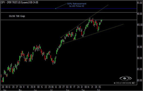
The chart above is the Daily chart of the S&P500 via SPY, going back approximately 6 months. In the weeks following the July 13th low this year, we pointed out a broadening range in the trend that started very small and has been growing ever since. Our chart above is the realization of our theories in range expansion, evident in all windows of time from the minutia up to the largest imaginable time frames (such as those on historical charts of the DOW or even larger yet, Gold). The market is now on the mid-point of the expansion and carrying momentum off the most recent swing low. It also sits at the Opening of the Oct 6th 08 Gap (white lines). A breakout into the gap puts 3 crucial areas into play: (1) The Gap Closure Point; (2) The 50% Retracement to All Time High (blue) and; (3) The top of the triangle. While the short term momentum has, and undoubtedly still does, favor the Bulls, the key resistance points here, in conjunction with those of the DOW puts quite a good dose of pressure against upside breakout gives plausible evidence that the market is either already at or near a major turning point.
© Evolution Trading 2009 All Rights Reserved.
The big event over the last several days in the financial markets is a fresh, multi-year breakout in Gold to new, All Time High. In our June 28th Newsletter as well as some recent discussions in the Evolution Trading Studio, we pointed out some Bullish price behavior and that the Gold market was beginning to "heat-up." It is gratifying to see the price follow through on our expectations, and the time has come to assess the breakout. Although to analyze the short-term action is tempting, we shall take a look at a far more important structure in the Monthlies, let's begin:
The Monthly chart of GOLD (yellow) overlayed to the SPY (blue) goes back more than 1 decade. It is interesting note that Gold's multi year breakouts over the last decade correspond with the Stock Market's most important turning points. While Gold's correlation to Stock Market over smaller time periods is inconsistent and nebulous at best, the larger time horizons beginning with our chart above illustrate a plausible correlation within this cycle. The multi year high breakout points in Gold are labeled with the bright numbers, while the corresponding turning points in the Stock Market (as represented by the SPY here) are marked with the transparent numbers. The most recent breakout in Gold (4) signals an important turning point in Equities, which interestingly, sits right in the middle of this decade's range.
Our current momentum target on Gold sits at approximately $1100, while our longer term target sits much higher, based upon range expansion (discussed later) at approximately $1500 between Spring 2010 to Spring 2011. While these figures may seem large to some, let's note that within the context of these time frames, they are not entirely far fetched. Gold, after all, is a currency that has been exchanged for thousands of years. A 1500, 2000 or 3000 figure in that market is not much different from a move on AAPL from 6 to 60, to 120 and beyond, much like a hill is structurally no different than a mountain. As much as Gold's multi year breakouts tend to coincide (and in fact LEAD) important turning points in Equities, the rising prices also signal some unparalleled inflationary scenario ahead?
Speaking of AAPL, let's now take a close look at the technical price behaviors that surround the Equities beginning with the Dow:
The chart above is a Weekly Chart of the DOW represented by the DIA, going back approximately 2.5 years. Readers following this newsletter will recognize this chart from the previous issue. The only difference now is that we note a flat correction ahead of the move to the gap from Oct 08 (white lines). At the top of this gap sits exactly a 50% retracement to the all time high in the Dow. We believe this area is most likely to serve as a formidable resistance point. In the larger time frame, it is simply a commonsensical warning of downside risks over the intermediate term time horizon, at the least, as this market now enters the epicenter of the violent downward momentum experienced by the equities in 2008 (50% retracement point, in blue). I suppose between our Gold chart earlier and the DOW chart above, the technical plots here are "haunting" enough to fit for a nice Halloween frame at your local brokerage house, except that the picture does not pretend to be scary. To my eyes, they are, and I wonder about the future. Perhaps there is a larger force that we do not see that will save the market from a continuation of 2008 - I am ready to be proven wrong.
SHORT-TERM MOMENTUM NOTATIONS: Our prior two charts illustrate very large time frames, while our next two will address short term momentum.
Our 15min chart of the S&P 500 above (via SPY) suggests some interesting price action that is not very common. On Oct 6th last week, we had opposing extreme breadth readings (via NYSE TICK) in a single day. It is very rare that the market will hit both sides of the TICK extremes on the same day and we did see that rarity last Tuesday. Although it was somewhat bizarre, we now have the luxury of seeing how this resolved in hindsight: the market's ability to resolve higher on conflicting readings in extremity of breadth shows that there is still enough "fuel" in the market to move higher, at least over the very short-term. This makes sense, based upon the path to the short term upside our next chart illustrates.
The chart above is the Daily chart of the S&P500 via SPY, going back approximately 6 months. In the weeks following the July 13th low this year, we pointed out a broadening range in the trend that started very small and has been growing ever since. Our chart above is the realization of our theories in range expansion, evident in all windows of time from the minutia up to the largest imaginable time frames (such as those on historical charts of the DOW or even larger yet, Gold). The market is now on the mid-point of the expansion and carrying momentum off the most recent swing low. It also sits at the Opening of the Oct 6th 08 Gap (white lines). A breakout into the gap puts 3 crucial areas into play: (1) The Gap Closure Point; (2) The 50% Retracement to All Time High (blue) and; (3) The top of the triangle. While the short term momentum has, and undoubtedly still does, favor the Bulls, the key resistance points here, in conjunction with those of the DOW puts quite a good dose of pressure against upside breakout gives plausible evidence that the market is either already at or near a major turning point.
© Evolution Trading 2009 All Rights Reserved.
Last edited by a moderator: