"I contend that for a nation to try to tax itself into prosperity is like a man standing in a bucket and trying to lift himself up by the handle." Winston Churchill
"We begin with a clean slate"
There is something refreshing about the first day of a New Year - for a brief period of time, it feels like a clean slate where we have the opportunity to begin anew and possibly right the wrongs of the year that just ended. Let's all hold that thought and see if we can "will" some good things for 2007. It would appear that the machine that runs our country can use all the help it can get.
As bad as the news was on occasion last year, the market put in a good showing. The following performance for the major indices is worth viewing:
Dow Jones Industrials +16.3%
S&P 500 +13.6%
NASDAQ Composite + 9.5%
NASDAQ 100 + 6.7%
Russell 2000 +16.9%
The stock market did well in 2006. It was robust into the spring; had a sharp decline into the summer and then came on strong the rest of the year. The blue chips were the clear winners, for the most part, however, the Russell 2000 won the performance sweepstakes. 2006 was the best year for stocks since 2003, when the market was recovering from a horrendous bear market.
Let's take a look at a chart of the Dow Jones Industrials through the end of the year and see what we can determine. Charts plot price movements and there are three basic things to be aware of with respect to price movements that define a change in trend - if they occur in conjunction with one another. The first is the break of a major trendline. The next variable is if the trend stops making higher highs in an uptrend or lower lows in a downtrend. An example of this would be in an uptrend when prices have a correction, but then fail to makes new highs when they rally again. The opposite is true for a downtrend. Generally, this is referred to as a test of the high or the low. A failure of these "tests" usually implies that the existing trend is in the process of changing. The final element is when prices go below a previous short term minor sell-off in an uptrend or above a previous short term minor rally high in a downtrend.
It is important to be aware that either of the first two conditions usually are evidence of a probable change in trend. The probability is increased when two out of the three are in play. When three out of three of the conditions are met, a change in trend is virtually always the result.
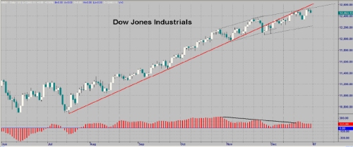
When looking at the Dow Jones Industrials, we see that the trend line was definitely broken. However, the Industrials haven't stopped making higher highs nor have they made a recent lower low. Therefore, we have to conclude that the Industrials are fine until one or two of the other variables kicks in.
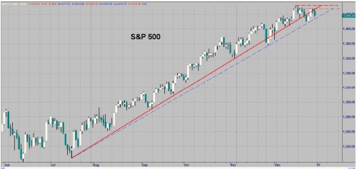
The S&P 500 has broken the trend line and has failed to make a new high, but has not yet made a new low. The S&P 500 is one step closer than the Dow Industrials to completing the "magic 3", but the jury is still out. If you look at the dashed blue line, one can make the argument that the uptrend line has not even been broken, in which case only the failure to make a new high is in place. In my estimation, the red line is the correct trend line, but I wanted to point out the other line just to be fair.
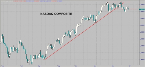
The third chart is the NASDAQ Composite chart. At first glance, it appears that only two of the requirements may be in place, but that is not really the case. The "double top" high is actually a bit higher than the first top, so it does not qualify for a lower high. However, the recent top is a lower high and that makes all three requirements legitimately in place. The trend line was broken and a new low was made below a prior low. This is potentially meaningful and means this market must be watched very closely. If a new high is made, then we have to wait. If not, then we have a legitimate reversal in the NASDAQ Composite. If that turns out to be the case, then we have to watch the S&P 500 and the Dow Jones Industrials very closely to see if they confirm.
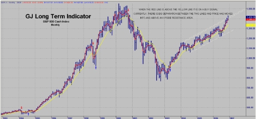
The final chart to look at is my long term indicator chart which is clearly still in a very strong buy signal. Note the red line is well above the yellow line which signifies the strength the market has had. Also note that price had broken out of the upper resistance channel to the upside. We have to be aware of the large separation between the two lines and the extreme move from the lower channel line to (and through) the upper channel line. This can imply incredible strength or a very extended market that is in need of a correction. Granted, the market has exceeded all Fibonacci retracement levels which implies that it will reach the old highs. At the same time, this is the second longest market in history without having as much as a 10% correction. So, we have the basis for a very strong market in 2007 if the economy continues to improve, but we are set up for a correction that is likely to begin very shortly.
Gold & Silver:
If you are looking for a very impressive market performer for 2006, you need look no further than gold and silver. Gold was up 22.9% which is quite impressive - silver essentially doubled the move in gold.
Gold +22.9%
Silver +44.6%
This is particularly impressive when you consider gold is in its fifth year of bull market since its low in 2001. Silver's move is even more impressive when you consider that silver almost quadrupled its price from its low in 2001. Gold and silver are insurance against a falling dollar and insurance against inflation. The U.S. financial system is weakening relative to the world's financial systems. Massive amounts of dollars are consistently being injected into the economy to keep things from collapsing. Obviously, if the housing market were allowed to collapse, it would bring the economy down with it. We are a nation of consumers and when you remove our sources of |funds (mortgages on our real estate [homes]), our spending addiction becomes a very serious problem. Let's face it - addictions are addictions - the US spending addiction may appear to be much different than a drug addict's addiction, but, in reality, it's the same process. In fact, when the final outcome plays out, the spending addiction may prove to be just as ugly as any other addiction.
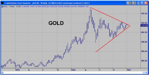
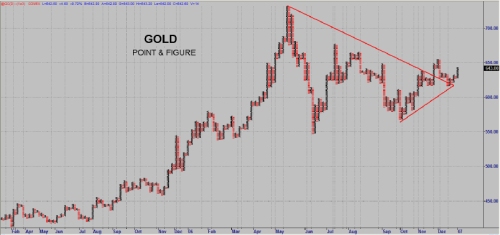
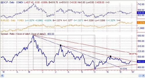
In the upper gold chart, gold appears to be in a multi month coil pattern. This implies that gold is having an internal power struggle and will likely head in the direction of its ultimate breakout. The second gold chart is a point and figure chart. This chart shows a more bullish alternative for the near term. It shows that gold has already broken out of the pattern; pulled back to test the breakout line; and is now ready to make an explosive move to the upside. One way to determine which of these charts may be more accurate is to see how gold is doing in terms of other major currencies. Gold is poised to break out of its pattern in terms of euros (see chart below). These charts will have to be watched very carefully for confirmation, but the bias appears to be to the upside for gold. Gold is clearly undervalued - particularly in terms of its ratio of gold to US dollars in circulation.
In closing, it appears that the stock market is close to having a reversal. My cycle dates fall after the first week of January. This may correspond with a move up in gold and silver, as well. Arguably, the dollar has fallen and it is clear the Fed doesn't want to see the dollar drop out of sight, so this market has to be monitored very closely. However, a breakout is a breakout - so look for a signal first and then look for confirmation of that signal.
My very best wishes to all of you for a Happy, Healthy and Prosperous New Year!
All the best,
Garrett Jones
Last edited by a moderator: