Fourier Transform (How to design more adaptive indicators )

Been looking at this, and I'm not so convinced the original author's methods are sound. He appears to just ignore everything above a period of 50 because he doesn't want to see it. While it's fine to ignore the results, I think his calculations are trying to ignore it too...

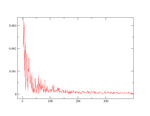
Personally, I just did a Fourier transform on GBP/USD (Sep-Mar-ish of the last year on one minute data) in Grace Home and got the attached image, which is rather interesting IMHO. I'll write more later, but need some more results first...
 

Attachments

  • GBPUSD.png
    GBPUSD.png
    7.1 KB · Views: 48
hi guys I found an interesting link regarding fourier analysis using stock data

here is a link...

Fourier Cycle Analysis of Stock Data

I am still confused with this subject but it measures cycle length based on past movement...

if anybody could code this up in TS it would be interesting to see its results

hope you guys find this interesting.
 
IMHO, this stuff is a pretty difficult area. If it wasn't then every engineering or physics graduate would be making a fortune fiddling around with Fourier transforms.

As already pointed out, calculation of cycles is done on past data and there is no guarantee that any cycle is going to complete. Another is that the price time series go though periods when there is very little cyclical behavior and are driven by momentum. The latter, I guess, are exemplified by Grey's non-technical days. At the end of the day, MACCIs over several time frames may be just about as good as anything else.

I suspect that rather than trying to enforce a cyclical model onto every instrument and using more sophisticated maths to find the cycles, it might be better to try to find the instruments that are more likely to exhibit cyclical behavior - which of course is no easy matter.

One measure of the trendiness (and by implication non-cyclical behavior) of a time series is the Fractal Dimension. Plently of references can be had by googling, but it basically quantifies how "squiggly" a chart is - the length in getting from point A to point B. It has values between 1 and 2 with a straight line having a value of 1. A strongly trending instrument will have a value less than 1.5 and one with cyclical (or random) behavior > 1.5.

Attached are two charts - one with low FDI and one with a high FDI. The FDIs are calculated over 250 bars. This kind of illustrates the point.

The question is whether this measure has any merit as a predictor of future cyclical, or trending behavior, and if so can it be used to select better instruments for cyclical analysis. There is free code for Tradestation and eSignal if anybody wants to have a look. I translated TS code into Java to generate the attached charts.
 

Attachments

  • PLFE.png
    PLFE.png
    26.2 KB · Views: 45
IMHO, this stuff is a pretty difficult area. If it wasn't then every engineering or physics graduate would be making a fortune fiddling around with Fourier transforms.

.

It’s also worth noting that on Ehler’s eminiz web site it seems his calls on the Dow (using his adaptive cycle based indicators) over the last 2years have lost $$$ and with quite a large draw down as well.

belflan
 
I
...

One measure of the trendiness (and by implication non-cyclical behavior) of a time series is the Fractal Dimension. Plently of references can be had by googling, but it basically quantifies how "squiggly" a chart is - the length in getting from point A to point B. It has values between 1 and 2 with a straight line having a value of 1. A strongly trending instrument will have a value less than 1.5 and one with cyclical (or random) behavior > 1.5.

Attached are two charts - one with low FDI and one with a high FDI. The FDIs are calculated over 250 bars. This kind of illustrates the point.

The question is whether this measure has any merit as a predictor of future cyclical, or trending behavior, and if so can it be used to select better instruments for cyclical analysis. There is free code for Tradestation and eSignal if anybody wants to have a look. I translated TS code into Java to generate the attached charts.

Dcraig1, this is very interesting work you have done. Especially as I read Mandelbrot's book on the subject recently. I'm not a mathematician but I get the concept.
Question if I may: if an instrument has a high degree of roughness >1.5, would that imply cyclicality or actually the opposite. To me a cyclical instrument is one with fairly well defined cycle lows and highs. Whether it trends or squiggles inbetween may not matter. Somtimes a trending instrument like GBPUSD shows very nice multi timeframe cycles. it will be interesting to hear back from rnicoll on his analysis.
I haven't got the code running to find the FDI of cable so it may actually be high.
Thanks, Jonnie
 
Question if I may: if an instrument has a high degree of roughness >1.5, would that imply cyclicality or actually the opposite.

The $64 question. I don't know. I've been playing around with this for a couple of days screening out interesting stocks but it's not very conclusive at the moment. If we replace "cyclical" with "mean reverting" then then question might not be so meaningfull.

It might be interesting to detrend them by correcting for the movement of an index eg SPX.

I read somewhere that a period of at least 2000 bars should be used, but that was referring to fx with intraday data. I expect that that would be too long for daily stock data.
 
It might be interesting to detrend them by correcting for the movement of an index eg SPX.

Do you mean - see how an instrument moves independent of the market. Whether the instrument has cyclical properties of it's own?
 
Okay... first of all, it's important to note I'm working on the high/low values of minute bars. The following analsis is GBPUSD for the last 6-ish months, on the high bars.

GBPUSD_high.png


Note the way it curves down; this is probably what's referred to as 1/f noise. Working on that theory, what we really want to see is how the data differs from that. So, doing a non-linear curve fitting (using the formula y = 1/(A0*x) ), we get the green line shown in:

GBPUSD_high_fitted.png


Take the difference, we get:

GBPUSD_high_difference.png


Lets zoom in a bit:

GBPUSD_high_zoom.png


That shows significant spikes at 7, 11, 16, 23, 29, 58 and 67, all of which would be well worth trying as parameters for an indicator. 58 and 67 particularly stick out for popping up significantly after the majority of the spikes.
 
Linked over on ET (something interesting for a change). A bit off topic, but related to quants and the losses taken by "market neutral" hedge funds in Aug '07. I confess to not reading it all yet, but I think there are some excellent insights into how the market is changing over time due to the activities of ever increasing numbers of funds using increasing amounts of leverage (because their strats are progressively less profitable because of all the competition) and a non-transparent network of credit obligations. Well worth a read.

http://web.mit.edu/alo/www/Papers/august07_2.pdf
 
Top