Many of us are already using support/resistance levels to locate possible turning points in the markets. We can identify these by looking at multiple time frame charts. Depending on your style of trading (investor, swing trader, day trader, etc), you could use two larger time frame charts to identify trends and support/resistance levels. For a day trader this could be perhaps a daily and a 30-minute chart. Once we have an idea of potential turning points from the bigger picture charts, we can step down to a smaller chart. This could be a 5-minute chart that we will use to manage our trade once we enter the position. Our next chart will be our action chart. This one will be the smallest time frame in our charts we look at. Perhaps a 1 or 2-minute chart. From this chart we will time our entries at these larger time frame turning points.
Notice how I listed four chart time frames to observe. This is important because what seems to happen is that people get caught up in looking at too many variable time periods. Not only does this waste time, but leads to inconsistency in our analysis. One day we look at four or five periods, then the next day for the same market, we are looking at seven or eight trying to analyze the market. Pick out four time frames that you are comfortable looking at and stick to them every day for your analysis. As we observe charts over time, we begin to get very intuitive about trading. By focusing on the same time periods each day, we will become market intuitive more quickly.
Now that we have an idea where we feel the market has the greatest chance of turning, wouldn't it be nice to have added confirmation that this trade has a higher probability of working? This is where I would like to show you how to use indicator divergence at these chart points.
When we talk about divergence in the markets, we can be referring to a divergence between price action in different markets or price and a technical indicator. This article will refer to the latter type.
Price trends in one direction or the other until it meets with excess supply or demand counter to the current trend. If price is rallying, we can assume it will continue until excessive supply comes into the market to absorb all the buy orders at a price level. This will cause price to fall simply because there are no more buyers left, thus creating a supply level. As price approaches this area where the supply will exceed demand, an interesting event happens. The price starts to slow down and sometimes we cannot see it with the naked eye. This is where using a technical indicator comes in handy. These indicators are designed to see the price slowing down at these turning points and when used correctly, can lead to some trade setups.
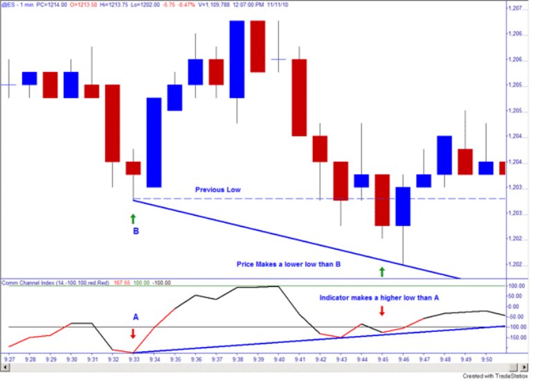
Figure 1
Figure 1 demonstrates a buy setup. There are many different momentum indicators available on our trading platforms. I prefer to use the Commodity Channel Index (CCI), but this is purely a personal preference. In this example, we see how price came down to point B. As price was approaching this level, the CCI was trading under -100 (oversold condition). Price soon rallied off this point B and found some overhead supply causing price to come back and test the previous low at B. At this point, we start to notice something different in the way price is coming back to test this previous low; we are losing momentum on the re-test. How do we know this? By looking at the CCI indicator as price comes down to test the B lows, we notice that the indicator is actually higher than it was at point A. Also, the CCI is, again, in the oversold area. The indicator is telling us that the sellers are not as aggressive on this re-test as they were when point B was put in on the price chart. A loss of momentum to the downside at a support level is very good information to help give you an edge in trading.
Information like this can be very helpful if used in the proper context. You must use these indicators at anticipated turning points (support/resistance) from your larger time frame charts, or be using them in the context of the trend.
If you try using every divergence or buy/sell signal without applying the above rules, I can guarantee you will just lose money trading with them.
There are two types of divergences you will hear traders referring to:
Now that we know how to identify a price and technical indicator divergence, let's look at an example. Fig 2 will show us a 30-minute ES chart. We have looked at our daily chart and see that we are in an uptrend. Looking at our 30-minute chart, we find a Demand level below the market. This allows us to do our pre-market analysis and be prepared for a possible trade in this vicinity.
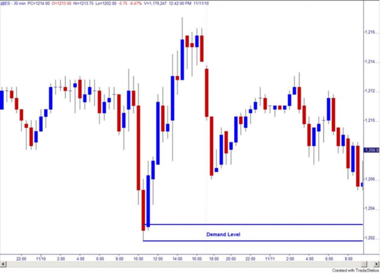
Figure 2
After identifying this level, we can wait for the market to open at 9:30am EST and watch our shorter time frame 1-minute chart for a possible positive divergence (buy setup) in our Demand zone under current price action.
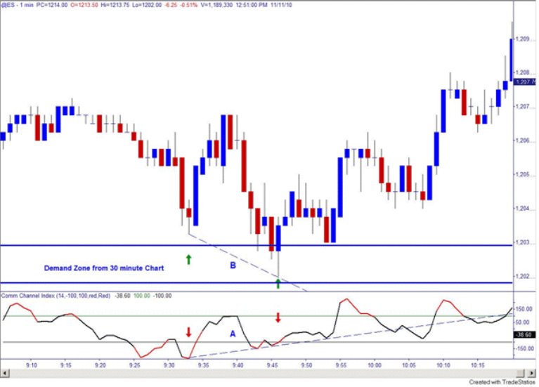
Figure 3
Fig 3 shows our 1-minute timing chart with the Demand Zone drawn in from the 30-minute chart. After the market opened at 9:30am EST, we see the price come close to our Demand Zone and then rally. Price meets some Supply and then comes back to test our lows from the early morning. What we see is on this re-test of the lows as price goes lower, our CCI is staying above its previous low. This is creating a positive divergence in a Demand Zone from a larger time frame.
Entries on this trade could be either waiting for the CCI to close back inside the -100 level after seeing the positive divergence, or just buying anywhere in the Demand Zone after seeing this loss of momentum to the downside at a Demand Zone.
After we enter this trade on our 1-minute chart, we can start watching a 5-minute chart to manage our trade. During your pre-market analysis you would have identified a Supply Zone overhead for your profit objective, using the 5-minute chart to trail your stop under the market as price makes it way to your target.
Using indicators correctly can tell you a lot about a market and help you confirm these turning points. As I stated previously, do not take every buy and sell signal from an indicator blindly. We always start with our larger time frame charts to identify the important trend and support/resistance points. Then we use our 5-minute chart to manage our trade once in a position. The 1-minute chart can be used as our timing tool to enter the market using our indicators. Remember to pick out some time frames that work for you and only use them. Too many randomly used time frames will only serve to confuse and take you longer to get a feel for the market you are trading.
"The most important thing about goals is having one. "Geoffry Abert"
Notice how I listed four chart time frames to observe. This is important because what seems to happen is that people get caught up in looking at too many variable time periods. Not only does this waste time, but leads to inconsistency in our analysis. One day we look at four or five periods, then the next day for the same market, we are looking at seven or eight trying to analyze the market. Pick out four time frames that you are comfortable looking at and stick to them every day for your analysis. As we observe charts over time, we begin to get very intuitive about trading. By focusing on the same time periods each day, we will become market intuitive more quickly.
Now that we have an idea where we feel the market has the greatest chance of turning, wouldn't it be nice to have added confirmation that this trade has a higher probability of working? This is where I would like to show you how to use indicator divergence at these chart points.
When we talk about divergence in the markets, we can be referring to a divergence between price action in different markets or price and a technical indicator. This article will refer to the latter type.
Price trends in one direction or the other until it meets with excess supply or demand counter to the current trend. If price is rallying, we can assume it will continue until excessive supply comes into the market to absorb all the buy orders at a price level. This will cause price to fall simply because there are no more buyers left, thus creating a supply level. As price approaches this area where the supply will exceed demand, an interesting event happens. The price starts to slow down and sometimes we cannot see it with the naked eye. This is where using a technical indicator comes in handy. These indicators are designed to see the price slowing down at these turning points and when used correctly, can lead to some trade setups.

Figure 1
Figure 1 demonstrates a buy setup. There are many different momentum indicators available on our trading platforms. I prefer to use the Commodity Channel Index (CCI), but this is purely a personal preference. In this example, we see how price came down to point B. As price was approaching this level, the CCI was trading under -100 (oversold condition). Price soon rallied off this point B and found some overhead supply causing price to come back and test the previous low at B. At this point, we start to notice something different in the way price is coming back to test this previous low; we are losing momentum on the re-test. How do we know this? By looking at the CCI indicator as price comes down to test the B lows, we notice that the indicator is actually higher than it was at point A. Also, the CCI is, again, in the oversold area. The indicator is telling us that the sellers are not as aggressive on this re-test as they were when point B was put in on the price chart. A loss of momentum to the downside at a support level is very good information to help give you an edge in trading.
Information like this can be very helpful if used in the proper context. You must use these indicators at anticipated turning points (support/resistance) from your larger time frame charts, or be using them in the context of the trend.
- Uptrend = only take buy signals from oversold region
- Downtrend = only take sell signals from overbought region
If you try using every divergence or buy/sell signal without applying the above rules, I can guarantee you will just lose money trading with them.
There are two types of divergences you will hear traders referring to:
- Positive Divergence = Buy Setups
- Negative Divergence = Sell Setups
Now that we know how to identify a price and technical indicator divergence, let's look at an example. Fig 2 will show us a 30-minute ES chart. We have looked at our daily chart and see that we are in an uptrend. Looking at our 30-minute chart, we find a Demand level below the market. This allows us to do our pre-market analysis and be prepared for a possible trade in this vicinity.

Figure 2
After identifying this level, we can wait for the market to open at 9:30am EST and watch our shorter time frame 1-minute chart for a possible positive divergence (buy setup) in our Demand zone under current price action.

Figure 3
Fig 3 shows our 1-minute timing chart with the Demand Zone drawn in from the 30-minute chart. After the market opened at 9:30am EST, we see the price come close to our Demand Zone and then rally. Price meets some Supply and then comes back to test our lows from the early morning. What we see is on this re-test of the lows as price goes lower, our CCI is staying above its previous low. This is creating a positive divergence in a Demand Zone from a larger time frame.
Entries on this trade could be either waiting for the CCI to close back inside the -100 level after seeing the positive divergence, or just buying anywhere in the Demand Zone after seeing this loss of momentum to the downside at a Demand Zone.
After we enter this trade on our 1-minute chart, we can start watching a 5-minute chart to manage our trade. During your pre-market analysis you would have identified a Supply Zone overhead for your profit objective, using the 5-minute chart to trail your stop under the market as price makes it way to your target.
Using indicators correctly can tell you a lot about a market and help you confirm these turning points. As I stated previously, do not take every buy and sell signal from an indicator blindly. We always start with our larger time frame charts to identify the important trend and support/resistance points. Then we use our 5-minute chart to manage our trade once in a position. The 1-minute chart can be used as our timing tool to enter the market using our indicators. Remember to pick out some time frames that work for you and only use them. Too many randomly used time frames will only serve to confuse and take you longer to get a feel for the market you are trading.
"The most important thing about goals is having one. "Geoffry Abert"
Last edited by a moderator:
