In the first part of this article Return of the Bear - Part One we looked at secular patterns the stock markets move in and the current state of the Bull Market.
The Monetary Background
I've always believed that the "rate-of-change" (ROC) of interest rates is more important than the actual level of interest rates. If levels are so important, how can one explain the extreme economic weakness in the 1930s when rates were in the basement compared to relative prosperity in the 1970s and 1980s when rates were in the stratosphere?
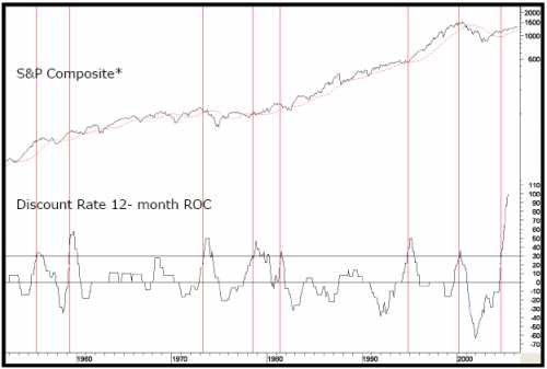
caption: Chart 8. Vertical lines show when ROC crosses above +30, stocks become more risky.
To prove this point, Chart 8 compares the annual change in the level of the Discount Rate to the S&P Composite. The vertical lines show that when the ROC initially moves up to the +30% level, this almost invariably spells trouble for equities. The only exception we can find going back to 1919 is the 1995 experience when equities totally ignored rises in short-term interest rates. The latest signal developed in mid-2004, so even if prices declined from here it could not be regarded as a particularly timely one. However, the main point of this exercise is that it's still flashing danger for equities, because when rates rise at an exceptionally fast clip, the economy weakens and stocks sell off in anticipation.
caption: Chart 9. Bearish periods highlighted in the light plot. See Chart 9A for more detail.
caption: Chart 9A. Bearish periods highlighted in the light plot.
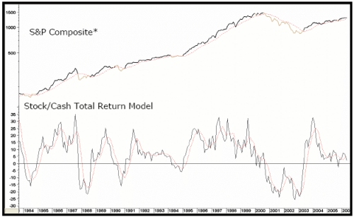
Another technique you can use is to compare the total return on stocks less the total return on 3-month Commercial Paper to find out when the rise or decline in rates is starting to affect equities. A version of this indicator has been plotted in the middle panel of Chart 9.
A sell signal is given when the indicator moves below zero because it implies the rate of return on cash is about to exceed the rate of return of stocks. The indicator is currently bullish, but is clearly not far from a negative signal.
Key Intermarket Relationships
Stocks vs. Commodities
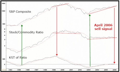
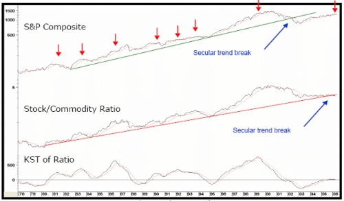
In Stages III and IV (see Figure 1) stocks and commodities are both rising. There are few distortions during this mid-cycle phase because commodities are not advancing with a vengeance, which reflects an improving economy. This, in turn, allows equities to thrive because they're able to look forward to a healthy growth in profits. After a while, the economy picks up steam so commodity prices advance at a faster pace, triggering acceleration in the upward trend in interest rates. Stock market participants now begin to sense these pressures will eventually result in an economic slowdown, or actual recession, so they cull profits, and become more cautious. This results in a loss of upside momentum in equity prices, causing the balance to tip to the deflationary side, and the ratio of stocks to commodities peaks out.
Chart 10 shows this relationship. The arrows mark the chart points where the KST, or smoothed momentum, peaks out.
The chart also emphasizes that during the 2002-200? S&P bull market the commodity adjusted S&P Composite only managed to experience a sideways trading range. This in itself is a clear indication that a secular peak was reached in 2000. It has since moved close to a post 2000 low in May and violated its secular up trendline (Chart 11).
This is an extremely serious technical breakdown and offers further evidence that a secular peak was seen in 2000. This is one of the longest secular breaks in the last 200-years and if the average drop in real prices from previous violations is achieved, this would send prices back to the "real" levels last seen at the 1994 low. (This relationship is discussed at length, together with its performance since the mid 1950s in, The Investor's Guide to Active Asset Allocation.)
caption: Chart 10. Arrows show KST peaks.
caption: Chart 11. For more detail see Chart 11A.
caption: Chart 11A. Arrows show KST peaks.
caption: Chart 12. Arrows show KST peaks.See Chart 12A for more detail.
caption: Chart 12A. Arrows show KST peaks.
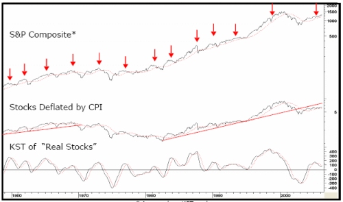
Because the Consumer Price Index (CPI) is less volatile than commodity prices CPI, adjusted equity prices have been in an uptrend since 2002 (Chart 12), even though the secular trend break and the consistently accurate sell signals from peaking KST of this relationship are still very apparent. If you look at the historical chart that covers the period prior to the 1960s, you will see that apart from the 1924 signal, reversals in this indicator from above zero have consistently forecasted primary bear markets on a very timely basis, with the most recent signal developing in April 2004. So based on past relationships, we should expect a stock market peak at any time.
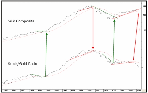
Stocks vs. Gold
Trend reversals in the Stock/Gold Ratio also warn of an impending U-turn in equities. These signals are not triggered very often, but when they are, it's a good idea to pay attention. Gold prices typically lead commodities at both tops and bottoms, so it's not surprising this Ratio is an excellent forecasting tool for equities.
Chart 13 shows the secular trendlines for both the ratio and the S&P were violated a few years ago and it's possible to construct trendlines for both series on Chart 14. When they are jointly violated, a reliable trend reversal signal is given.
The ratio is already at a new cyclical and secular low, which is a very ominous sign from a long-term perspective. Confirmation of this ratio break will come when the S&P Composite itself violates its (end-of-month) up trendline at 1260.
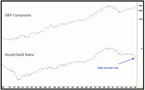
caption: Chart 13.
caption: Chart 14.
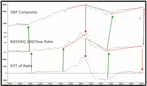
The NASDAQ 100 vs. the Dow
The ratio between the NASDAQ 100 and the Dow has offered timely market signals over the past fifteen years (Chart 15).
The Dow consists of many different stocks, but on balance, they tend to be defensive, high yielding blue chips, while the NASDAQ 100 equities are growth-oriented. This means that when the NASDAQ is out performing the Dow, investors are optimistic and tend to push up equity prices in general. On the other hand, a falling ratio means sentiment has turned more cautious, which is negative for the market.
caption: Chart 15.
Trendline violations and decisive KST reversals have often been followed by major reversals in both the ratio and the market. The only period when the ratio experienced anemic price action was between 1996 and 1997, but at that time there were no trendline violations to back up the signals. That's certainly not true of the current situation, as the ratio has broken below an up trendline and its 12-month MA. In addition, the KST is also in a bearish mode, so consequently, the brief history of this relationship adds more fuel to the proverbial bearish fire that the whole market is likely to experience a major decline.
Leading Market Sectors and Divergences
We have already established that bond prices lead equity prices. For this reason, market sectors that are sensitive to interest rate changes often provide advance warning of impending trouble. One well-known relationship is the between the S&P and the Dow Jones Utility Average, shown in Chart 16.
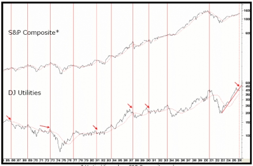
caption: Chart 16. Vertical lines show S&P composite peaks.
The vertical lines flag the bull market highs in the S&P. On most occasions the Utilities give us a warning by peaking ahead of the S&P, but sometimes that is not the case. For instance, in 1977 and again in 1994, the Utilities lagged the S&P. This didn't make the situation any less bearish, just that Utilities didn't offer their usual warning. This time, they peaked in September of 2005, well ahead of the high for the S&P, which was set in April 2006. Fair warning this time!
The relationship of Homebuilders, another interest-sensitive sector, is shown in Chart 17 along with the S&P Composite. In most situations, the S&P Homebuilders peak well ahead of the S&P. Chart 18 shows this relationship back to its inception in 1966 as well as introducing the relationship's relative action.
An additional warning to the market, in general, is shown in Chart 18, when the Homebuilders coincide or lag the S&P, the RS line typically has a sharp sell off. In the current situation, the Homebuilders have not only completed a top, and decisively violated a major up trendline, but the sharply falling RS line is below its 18-month MA. This relationship doesn't tell us the S&P is about to decline but, like the utility divergence, warns us that the market is now extremely vulnerable. Consequently, when the S&P violates its 12-month MA, the weakness in these two indicators will be confirmed.
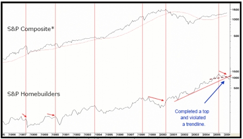
caption: Chart 17. Vertical lines show S&P primary trend peaks.
Finally, market peaks are often preceded by weakness in the breadth data along with numerous other negative divergences. The April peak did experience some small-time divergences with the NYSE A/D Line, but nothing of primary trend significance. However, Chart 19 does show there were numerous negative divergences (flagged by the red arrows) between the S&P, Short-term KST, 39-week ROC, and the NYSE NYSE Net New Highs. Notice the final rally at F was extremely weak for the KST. This means when the S&P confirms with a break below the trendline and 65-week EMA, a sharp decline is likely to follow. In mid-June 2006, the line and the 65-week EMA were around 1245.
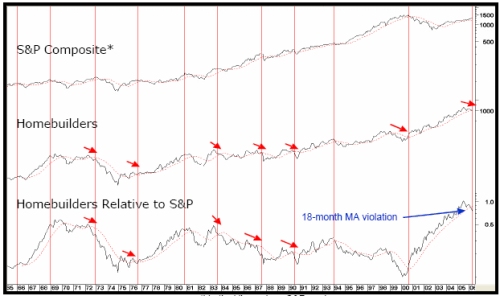
caption: Chart 18. Vertical lines show S&P peaks.
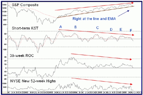
caption: Chart 19.
Summary -
If our assumption regarding the secular peak is correct, then the current bull market, based on previous counter-secular rallies, is extremely long in the tooth. Moreover, since a four-year cycle low is due in 2006, it's probable the market will now play catch-up on the downside. The evidence, whether it comes from monetary aspects, financial market sequences, or intermarket analysis, is strongly bearish. If we use valuation measures, such as Shiller's Price Earnings Ratio (26 on 12/05), or even the paltry 1.85% yield on the S&P as a sentiment indicator, long-term optimism is still very much in vogue, continuing to point to the fact that the market is vulnerable.
Talking of optimism, look at the recent Barron's cover story that developed just one week prior to the top. I must add that Barron's doesn't have a reputation as a contrary indicator like, Time, Newsweek, The Economist, or Business Week, but the consensus optimism of money managers is too significant to be ignored.
One thing that has not yet happened is a break by the S&P below its 12-month MA, a benchmark that often reliably confirms major trend reversals. As I mentioned earlier, the average is expected to be around 1255 at the end of June. Normally, I like to see this average breeched. Not that it has a perfect record, but negative crossovers usually offer reliable signals that the bear has returned. With so many other indicators pointing south though, it will be surprising if the market does follow suit for the remainder of 2006.
The Monetary Background
I've always believed that the "rate-of-change" (ROC) of interest rates is more important than the actual level of interest rates. If levels are so important, how can one explain the extreme economic weakness in the 1930s when rates were in the basement compared to relative prosperity in the 1970s and 1980s when rates were in the stratosphere?
caption: Chart 8. Vertical lines show when ROC crosses above +30, stocks become more risky.
To prove this point, Chart 8 compares the annual change in the level of the Discount Rate to the S&P Composite. The vertical lines show that when the ROC initially moves up to the +30% level, this almost invariably spells trouble for equities. The only exception we can find going back to 1919 is the 1995 experience when equities totally ignored rises in short-term interest rates. The latest signal developed in mid-2004, so even if prices declined from here it could not be regarded as a particularly timely one. However, the main point of this exercise is that it's still flashing danger for equities, because when rates rise at an exceptionally fast clip, the economy weakens and stocks sell off in anticipation.
caption: Chart 9. Bearish periods highlighted in the light plot. See Chart 9A for more detail.
caption: Chart 9A. Bearish periods highlighted in the light plot.
Another technique you can use is to compare the total return on stocks less the total return on 3-month Commercial Paper to find out when the rise or decline in rates is starting to affect equities. A version of this indicator has been plotted in the middle panel of Chart 9.
A sell signal is given when the indicator moves below zero because it implies the rate of return on cash is about to exceed the rate of return of stocks. The indicator is currently bullish, but is clearly not far from a negative signal.
Key Intermarket Relationships
Stocks vs. Commodities
In Stages III and IV (see Figure 1) stocks and commodities are both rising. There are few distortions during this mid-cycle phase because commodities are not advancing with a vengeance, which reflects an improving economy. This, in turn, allows equities to thrive because they're able to look forward to a healthy growth in profits. After a while, the economy picks up steam so commodity prices advance at a faster pace, triggering acceleration in the upward trend in interest rates. Stock market participants now begin to sense these pressures will eventually result in an economic slowdown, or actual recession, so they cull profits, and become more cautious. This results in a loss of upside momentum in equity prices, causing the balance to tip to the deflationary side, and the ratio of stocks to commodities peaks out.
Chart 10 shows this relationship. The arrows mark the chart points where the KST, or smoothed momentum, peaks out.
The chart also emphasizes that during the 2002-200? S&P bull market the commodity adjusted S&P Composite only managed to experience a sideways trading range. This in itself is a clear indication that a secular peak was reached in 2000. It has since moved close to a post 2000 low in May and violated its secular up trendline (Chart 11).
This is an extremely serious technical breakdown and offers further evidence that a secular peak was seen in 2000. This is one of the longest secular breaks in the last 200-years and if the average drop in real prices from previous violations is achieved, this would send prices back to the "real" levels last seen at the 1994 low. (This relationship is discussed at length, together with its performance since the mid 1950s in, The Investor's Guide to Active Asset Allocation.)
caption: Chart 10. Arrows show KST peaks.
caption: Chart 11. For more detail see Chart 11A.
caption: Chart 11A. Arrows show KST peaks.
caption: Chart 12. Arrows show KST peaks.See Chart 12A for more detail.
caption: Chart 12A. Arrows show KST peaks.
Because the Consumer Price Index (CPI) is less volatile than commodity prices CPI, adjusted equity prices have been in an uptrend since 2002 (Chart 12), even though the secular trend break and the consistently accurate sell signals from peaking KST of this relationship are still very apparent. If you look at the historical chart that covers the period prior to the 1960s, you will see that apart from the 1924 signal, reversals in this indicator from above zero have consistently forecasted primary bear markets on a very timely basis, with the most recent signal developing in April 2004. So based on past relationships, we should expect a stock market peak at any time.
Stocks vs. Gold
Trend reversals in the Stock/Gold Ratio also warn of an impending U-turn in equities. These signals are not triggered very often, but when they are, it's a good idea to pay attention. Gold prices typically lead commodities at both tops and bottoms, so it's not surprising this Ratio is an excellent forecasting tool for equities.
Chart 13 shows the secular trendlines for both the ratio and the S&P were violated a few years ago and it's possible to construct trendlines for both series on Chart 14. When they are jointly violated, a reliable trend reversal signal is given.
The ratio is already at a new cyclical and secular low, which is a very ominous sign from a long-term perspective. Confirmation of this ratio break will come when the S&P Composite itself violates its (end-of-month) up trendline at 1260.
caption: Chart 13.
caption: Chart 14.
The NASDAQ 100 vs. the Dow
The ratio between the NASDAQ 100 and the Dow has offered timely market signals over the past fifteen years (Chart 15).
The Dow consists of many different stocks, but on balance, they tend to be defensive, high yielding blue chips, while the NASDAQ 100 equities are growth-oriented. This means that when the NASDAQ is out performing the Dow, investors are optimistic and tend to push up equity prices in general. On the other hand, a falling ratio means sentiment has turned more cautious, which is negative for the market.
caption: Chart 15.
Trendline violations and decisive KST reversals have often been followed by major reversals in both the ratio and the market. The only period when the ratio experienced anemic price action was between 1996 and 1997, but at that time there were no trendline violations to back up the signals. That's certainly not true of the current situation, as the ratio has broken below an up trendline and its 12-month MA. In addition, the KST is also in a bearish mode, so consequently, the brief history of this relationship adds more fuel to the proverbial bearish fire that the whole market is likely to experience a major decline.
Leading Market Sectors and Divergences
We have already established that bond prices lead equity prices. For this reason, market sectors that are sensitive to interest rate changes often provide advance warning of impending trouble. One well-known relationship is the between the S&P and the Dow Jones Utility Average, shown in Chart 16.
caption: Chart 16. Vertical lines show S&P composite peaks.
The vertical lines flag the bull market highs in the S&P. On most occasions the Utilities give us a warning by peaking ahead of the S&P, but sometimes that is not the case. For instance, in 1977 and again in 1994, the Utilities lagged the S&P. This didn't make the situation any less bearish, just that Utilities didn't offer their usual warning. This time, they peaked in September of 2005, well ahead of the high for the S&P, which was set in April 2006. Fair warning this time!
The relationship of Homebuilders, another interest-sensitive sector, is shown in Chart 17 along with the S&P Composite. In most situations, the S&P Homebuilders peak well ahead of the S&P. Chart 18 shows this relationship back to its inception in 1966 as well as introducing the relationship's relative action.
An additional warning to the market, in general, is shown in Chart 18, when the Homebuilders coincide or lag the S&P, the RS line typically has a sharp sell off. In the current situation, the Homebuilders have not only completed a top, and decisively violated a major up trendline, but the sharply falling RS line is below its 18-month MA. This relationship doesn't tell us the S&P is about to decline but, like the utility divergence, warns us that the market is now extremely vulnerable. Consequently, when the S&P violates its 12-month MA, the weakness in these two indicators will be confirmed.
caption: Chart 17. Vertical lines show S&P primary trend peaks.
Finally, market peaks are often preceded by weakness in the breadth data along with numerous other negative divergences. The April peak did experience some small-time divergences with the NYSE A/D Line, but nothing of primary trend significance. However, Chart 19 does show there were numerous negative divergences (flagged by the red arrows) between the S&P, Short-term KST, 39-week ROC, and the NYSE NYSE Net New Highs. Notice the final rally at F was extremely weak for the KST. This means when the S&P confirms with a break below the trendline and 65-week EMA, a sharp decline is likely to follow. In mid-June 2006, the line and the 65-week EMA were around 1245.
caption: Chart 18. Vertical lines show S&P peaks.
caption: Chart 19.
Summary -
- Secular trends in equity prices are determined by multi-decade swings in sentiment, as investors move from a generational swing in pessimism to the overconfident and "irrational exuberance" at peaks.
- History tells us that once an extreme in optimism has been reached, it takes a very long time, decades, in fact, for the pendulum to move to the other extreme.
- Our indicators advocate that a secular peak was seen in the year 2000.
- These types of secular market turning points have always been followed by massive bear markets like the one that developed in 1929, or multi-year trading ranges as witnessed in the 1900/21 and 1966/81 periods.
- Without exception, stock prices, when adjusted for inflation, experienced a significant loss in purchasing power following previous long-term tops.
If our assumption regarding the secular peak is correct, then the current bull market, based on previous counter-secular rallies, is extremely long in the tooth. Moreover, since a four-year cycle low is due in 2006, it's probable the market will now play catch-up on the downside. The evidence, whether it comes from monetary aspects, financial market sequences, or intermarket analysis, is strongly bearish. If we use valuation measures, such as Shiller's Price Earnings Ratio (26 on 12/05), or even the paltry 1.85% yield on the S&P as a sentiment indicator, long-term optimism is still very much in vogue, continuing to point to the fact that the market is vulnerable.
Talking of optimism, look at the recent Barron's cover story that developed just one week prior to the top. I must add that Barron's doesn't have a reputation as a contrary indicator like, Time, Newsweek, The Economist, or Business Week, but the consensus optimism of money managers is too significant to be ignored.
One thing that has not yet happened is a break by the S&P below its 12-month MA, a benchmark that often reliably confirms major trend reversals. As I mentioned earlier, the average is expected to be around 1255 at the end of June. Normally, I like to see this average breeched. Not that it has a perfect record, but negative crossovers usually offer reliable signals that the bear has returned. With so many other indicators pointing south though, it will be surprising if the market does follow suit for the remainder of 2006.
Last edited by a moderator: