Candlestick Charting
Candlestick charting originates from Japan, where it was used from the 17th century to examine patterns in the price of rice. Candlestick charting has come a long way since then and is now part of the mainstream technical analysis toolkit. Reading candlesticks is an attempt to understand the collective emotions that drive the financial markets every day.
Candlesticks are formed using the open, high, low and close of a stock or other security. If the close is above the open, then a hollow candlestick (an up day) is drawn. If the close is below the open, then a filled candlestick (a down day) is drawn.
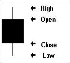
The hollow or filled portion of the candlestick is called the body (also referred to as the "real body"). The long thin lines above and below the body represent the high/low range and are called shadows (also referred to as wicks and tails). The high is marked by the top of the upper shadow and the low by the bottom of the lower shadow.
Engulfing Patterns
There are numerous candlestick patterns, all with wonderful names and visual set ups. For a more comprehensive overview we suggest you read Steve Nison's excellent book on the subject. In this short article we'll cover our favourite patterns, the "Bullish Engulfing" (+BE) and "Bearish Engulfing" (-BE) patterns.
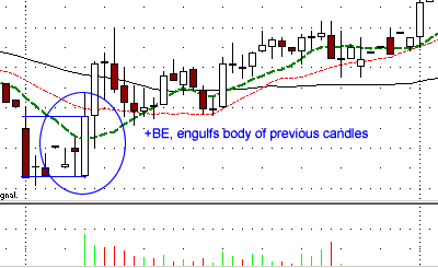
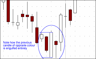
An engulfing pattern occurs when a candlestick with a large body literally engulfs the body of the preceding candlestick. Ideally the engulfing candlestick will be a different colour to the preceding one, signalling a change in trend. A Bullish engulfing will signal the reversal of a down trend and follow a negative candlestick. A Bearish engulfing is simply the opposite of this.
caption: An example Bullish Engulfing (+BE)
The theory behind the formation is that after a trend in one direction, the second large candlestick begins to form when residual pressure causes the security to open above or below the previous open/close. However, the new market direction is revealed as buyers/ sellers step in after this opening gap and begin to drive prices up/ down. Towards the end of the period, this change in direction is so intense that prices move to engulf the previous open/close as well.
Good volume is an indication of the strength of the push the engulfing pattern will give to a new trend. The pattern is also strongest when the engulfing occurs after a marked trend in one direction. In the example above note the "V" that is formed by the immediate reversal of the previous trend. Finally ensure you wait until the candle has closed before identifying it as an engulfing pattern.
How we use the Engulfing pattern
Engulfing patterns provide strong signals on the daily charts, particularly when combined with their interactions with other indicators such as moving averages. This is seen very clearly in the example below with Marvel Technologies (MRVL). Note the strong +BE engulfs several preceding days while bouncing of the moving average.
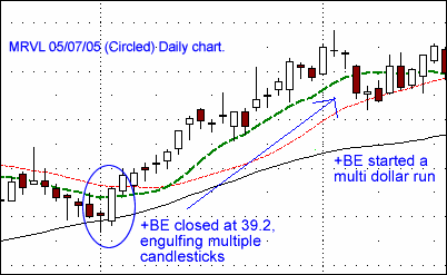
caption: MRVL 05/07/05 (Circled) Daily chart.
However to get in sync with market action we regularly study charts over different time frames. The lower time frames can often signal moves unseen or before they occur on the higher times. For this reason we often study the 15 minute, 60 minute and Daily charts of a stock in parallel to see what patterns are developing.
For example in AAPL (15 minute chart) below we note a +BE formation on the open with good volume. The prior trend was clearly negative, meaning the candlestick has something meaningful to reverse. The candlestick opened at 45.26 and closed at 45.46, engulfing multiple candlesticks
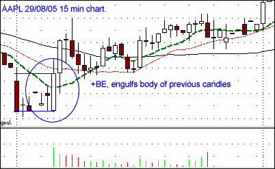
caption: AAPL 29/08/05 15 min chart.
When we flip to the 60 min chart we notice that the 15 minute pattern has continued to create a +BE on the higher timeframe. The candlestick opened at 45.26 and closed at 45.83, again engulfing multiple candlesticks
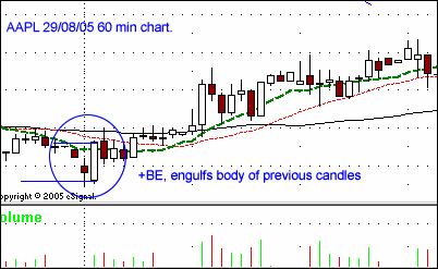
caption: AAPL 29/08/05 60 min chart.
When you look at the daily picture you could easily dismiss the day's action not revealing much on its own. However, if you'd have entered intraday based on the information from the various time frames you could have set yourself up with a nice swing trade from around $46 to around $50

caption: AAPL 29/08/05 (Circled) Daily chart.
QCOM displayed a similar pattern on the 9th of September 2005. The 15 minute chart revealed a +BE that bounced nicely off the moving average. This +BE not only set up a strong intraday move but preceded a multidollar run on the daily chart.
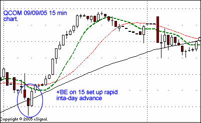
caption: QCOM 09/09/05 15 min chart.
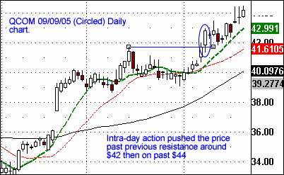
caption: QCOM 09/09/05 (Circled) Daily chart
FNM recently showed the power of the Bearish Engulfing (-BE), again with multiple time frame analysis revealing the bigger picture. Following a strong up trend a -BE formed on the 60minute chart. When viewing the daily chart alone you would have been forgiven for thinking that day simply represented indecision in the form of a spinning top. However if you had drilled down to the 60 minute chart you seen that the market had already made a decision about where it wanted to go.
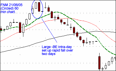
caption: FNM 21/06/05 (Circled) 60 min chart.
The daily chart's -BE actually occurred a day later on the 22nd followed by a prolonged down trend. The 60 minute chart indicated this weakness a day earlier and set up a 3 month run from around $60 to around $45 in October.

caption: FNM 22/06/05 (Circled) daily chart.
Getting in sync with the market
The crucial layer we add to our candlestick charting is getting in sync with the main market and market movers, primarily the NDX and QQQ. Through intricate Triple Q chart watching and pattern reading, any serious new market phase will be revealed. Using the QQQ and NDX as your market barometer can add a crucial edge to your candlestick charting. Remember that inauspicious daily chart of AAPL on the 29th of August?
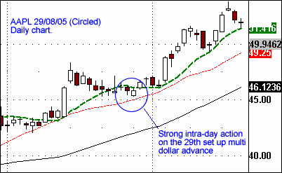
caption: AAPL 29/08/05 (Circled) Daily chart.
If you had also been following the QQQ in conjunction with your individual stock analysis you would have received strong confirmation of the impending move in AAPL. The 60 minute chart showed a strong upsurge, stronger than that seen in AAPL itself at the time. The completed daily chart on the QQQ revealed a strong +BE, which only strengthened the case presented by the +BE in the lower timeframes on AAPL. Understanding the broader market flow and layering this on top of your individual chart action increases accuracy, timing and ultimately profitability.
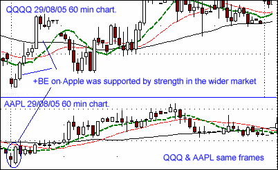
caption: QQQQ & AAPL 29/08/05 60 min chart.
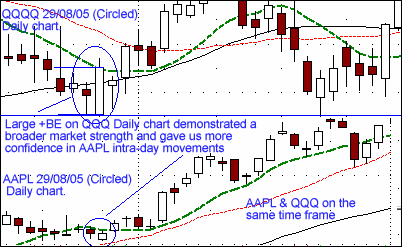
caption: QQQQ & AAPL 29/08/05 (Circled) Daily chart
The beauty of this layering is again displayed in a Google trade back on the 7th of September 2005. In the first hour after the open, Google shot up to $290, clearly rising above the previous day's close.
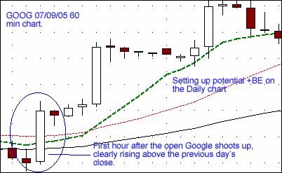
caption: GOOG 07/09/05 60 min chart.
Switching to the daily chart, even at this stage in the day you would have known that if it kept this up the daily chart would form a large +BE bouncing off the moving average on closing. The 60 minute chart displayed strength, but no sign up of our favourite candlestick pattern that would provide strong confirmation.
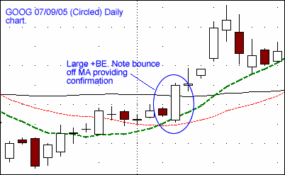
caption: GOOG 07/09/05 (Circled) Daily chart
.
It's at this stage we turn to our market barometers (in reality we'd already have an eye on their activity). Unfortunately the QQQ provided now clues as to the broader market sentiment at the time.
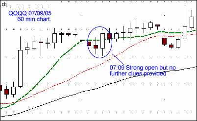
caption: QQQQ 07/09/05 60 min chart.
However our other market barometer the NDX displayed a neat +BE bouncing off the moving average on its 60 minute chart, a clear indication that the bulls might have a run in the short term. Sure enough, Google ran up a good head of steam from $295 on the close of that day to an all time high of $320.
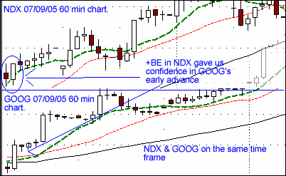
caption: NDX & GOOG 07/09/05 60 min chart.
Engulfing pattern conclusions
The engulfing pattern is in our opinion one of the strongest patterns available to the technical trader. We hope this guide will help you to use it within your own trading.
Conclusions:
Candlestick charting originates from Japan, where it was used from the 17th century to examine patterns in the price of rice. Candlestick charting has come a long way since then and is now part of the mainstream technical analysis toolkit. Reading candlesticks is an attempt to understand the collective emotions that drive the financial markets every day.
Candlesticks are formed using the open, high, low and close of a stock or other security. If the close is above the open, then a hollow candlestick (an up day) is drawn. If the close is below the open, then a filled candlestick (a down day) is drawn.
The hollow or filled portion of the candlestick is called the body (also referred to as the "real body"). The long thin lines above and below the body represent the high/low range and are called shadows (also referred to as wicks and tails). The high is marked by the top of the upper shadow and the low by the bottom of the lower shadow.
Engulfing Patterns
There are numerous candlestick patterns, all with wonderful names and visual set ups. For a more comprehensive overview we suggest you read Steve Nison's excellent book on the subject. In this short article we'll cover our favourite patterns, the "Bullish Engulfing" (+BE) and "Bearish Engulfing" (-BE) patterns.
An engulfing pattern occurs when a candlestick with a large body literally engulfs the body of the preceding candlestick. Ideally the engulfing candlestick will be a different colour to the preceding one, signalling a change in trend. A Bullish engulfing will signal the reversal of a down trend and follow a negative candlestick. A Bearish engulfing is simply the opposite of this.
caption: An example Bullish Engulfing (+BE)
The theory behind the formation is that after a trend in one direction, the second large candlestick begins to form when residual pressure causes the security to open above or below the previous open/close. However, the new market direction is revealed as buyers/ sellers step in after this opening gap and begin to drive prices up/ down. Towards the end of the period, this change in direction is so intense that prices move to engulf the previous open/close as well.
Good volume is an indication of the strength of the push the engulfing pattern will give to a new trend. The pattern is also strongest when the engulfing occurs after a marked trend in one direction. In the example above note the "V" that is formed by the immediate reversal of the previous trend. Finally ensure you wait until the candle has closed before identifying it as an engulfing pattern.
How we use the Engulfing pattern
Engulfing patterns provide strong signals on the daily charts, particularly when combined with their interactions with other indicators such as moving averages. This is seen very clearly in the example below with Marvel Technologies (MRVL). Note the strong +BE engulfs several preceding days while bouncing of the moving average.
caption: MRVL 05/07/05 (Circled) Daily chart.
However to get in sync with market action we regularly study charts over different time frames. The lower time frames can often signal moves unseen or before they occur on the higher times. For this reason we often study the 15 minute, 60 minute and Daily charts of a stock in parallel to see what patterns are developing.
For example in AAPL (15 minute chart) below we note a +BE formation on the open with good volume. The prior trend was clearly negative, meaning the candlestick has something meaningful to reverse. The candlestick opened at 45.26 and closed at 45.46, engulfing multiple candlesticks
caption: AAPL 29/08/05 15 min chart.
When we flip to the 60 min chart we notice that the 15 minute pattern has continued to create a +BE on the higher timeframe. The candlestick opened at 45.26 and closed at 45.83, again engulfing multiple candlesticks
caption: AAPL 29/08/05 60 min chart.
When you look at the daily picture you could easily dismiss the day's action not revealing much on its own. However, if you'd have entered intraday based on the information from the various time frames you could have set yourself up with a nice swing trade from around $46 to around $50
caption: AAPL 29/08/05 (Circled) Daily chart.
QCOM displayed a similar pattern on the 9th of September 2005. The 15 minute chart revealed a +BE that bounced nicely off the moving average. This +BE not only set up a strong intraday move but preceded a multidollar run on the daily chart.
caption: QCOM 09/09/05 15 min chart.
caption: QCOM 09/09/05 (Circled) Daily chart
FNM recently showed the power of the Bearish Engulfing (-BE), again with multiple time frame analysis revealing the bigger picture. Following a strong up trend a -BE formed on the 60minute chart. When viewing the daily chart alone you would have been forgiven for thinking that day simply represented indecision in the form of a spinning top. However if you had drilled down to the 60 minute chart you seen that the market had already made a decision about where it wanted to go.
caption: FNM 21/06/05 (Circled) 60 min chart.
The daily chart's -BE actually occurred a day later on the 22nd followed by a prolonged down trend. The 60 minute chart indicated this weakness a day earlier and set up a 3 month run from around $60 to around $45 in October.
caption: FNM 22/06/05 (Circled) daily chart.
Getting in sync with the market
The crucial layer we add to our candlestick charting is getting in sync with the main market and market movers, primarily the NDX and QQQ. Through intricate Triple Q chart watching and pattern reading, any serious new market phase will be revealed. Using the QQQ and NDX as your market barometer can add a crucial edge to your candlestick charting. Remember that inauspicious daily chart of AAPL on the 29th of August?
caption: AAPL 29/08/05 (Circled) Daily chart.
If you had also been following the QQQ in conjunction with your individual stock analysis you would have received strong confirmation of the impending move in AAPL. The 60 minute chart showed a strong upsurge, stronger than that seen in AAPL itself at the time. The completed daily chart on the QQQ revealed a strong +BE, which only strengthened the case presented by the +BE in the lower timeframes on AAPL. Understanding the broader market flow and layering this on top of your individual chart action increases accuracy, timing and ultimately profitability.
caption: QQQQ & AAPL 29/08/05 60 min chart.
caption: QQQQ & AAPL 29/08/05 (Circled) Daily chart
The beauty of this layering is again displayed in a Google trade back on the 7th of September 2005. In the first hour after the open, Google shot up to $290, clearly rising above the previous day's close.
caption: GOOG 07/09/05 60 min chart.
Switching to the daily chart, even at this stage in the day you would have known that if it kept this up the daily chart would form a large +BE bouncing off the moving average on closing. The 60 minute chart displayed strength, but no sign up of our favourite candlestick pattern that would provide strong confirmation.
caption: GOOG 07/09/05 (Circled) Daily chart
.
It's at this stage we turn to our market barometers (in reality we'd already have an eye on their activity). Unfortunately the QQQ provided now clues as to the broader market sentiment at the time.
caption: QQQQ 07/09/05 60 min chart.
However our other market barometer the NDX displayed a neat +BE bouncing off the moving average on its 60 minute chart, a clear indication that the bulls might have a run in the short term. Sure enough, Google ran up a good head of steam from $295 on the close of that day to an all time high of $320.
caption: NDX & GOOG 07/09/05 60 min chart.
Engulfing pattern conclusions
The engulfing pattern is in our opinion one of the strongest patterns available to the technical trader. We hope this guide will help you to use it within your own trading.
Conclusions:
- Engulfing patterns work best when reversing a previous trend (a V pattern).
- Look for strong volume support.
- Wait for the candlestick to close on whatever timeframe you are viewing.
- The engulfed candlestick should be the opposite colour to the engulfing candlestick.
- Look for technical support from moving average bounces.
- Drill down and up on multiple time frames to get a more complete picture.
- Seek confirmation from the broader market.
Last edited by a moderator: