The emerging market meltdown that occurred between May 12 and June 13, 2006, had an impact on currencies, the carry trade and incredible growth in derivatives over the last decade, as described in Part 1.
In summary, here are the issues we will be examining in part 2.
Real Emerging Market Risks
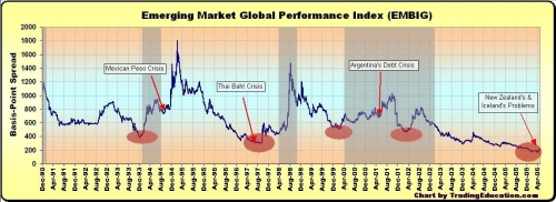
caption: Figure 6 - Chart of the JP Morgan Emerging Market Bond Index from initiation in December 1990 showing areas of relative lows (red ovals) and Dow bear markets (grey boxes).
In the late 1980s, Brady Bonds came into being, designed to spread the risk of loaning to emerging markets from governments and large international banks to international investors willing to play the game. To track the risk of these instruments, JP Morgan introduced a number of indexes including the Emerging Market Brady Only Index (EM_Brady), the Emerging Market Bond Index Plus (EMBI+) and Emerging Market Bond Index Growth Performance (EMBI_Performance). These indexes plotted the difference between a basket of emerging market bond yields and comparable U.S. Treasury yields - the lower the value (spread), the more complacent global investors were becoming about emerging market risk.
The EM Brady Only was initiated in December 1990 and the EMBI indexes go back to 1993. Putting the two together with data from JPM produces the chart shown in Figure 6, a composite of the EM Brady Only (1990-93) and the EMBIG Performance (1993- present).
It is interesting to note that each time that spreads have shrunk to a relative low, some sort of emerging market fiscal crisis and/or bear market followed (see Figure 6).
Note the lows:
On May 1, 2006, the EMBI+ and EMBIG - Performance hit historic lows of 172 basis points. The May 12-June 13 "canary" correction followed. Unless the relationship has changed, we should expect more trouble in the coming months. Every time global investors become complacent about emerging market risks, look out.
Yield Curve Inversion...Again
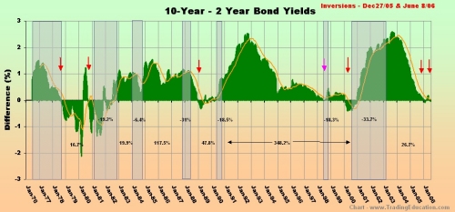
caption: Figure 7 - Monthly chart of the difference between 10-year and 2-year yields. Red arrows show inversions, grey boxes show bear markets. Also shown are the percentage gains in bull markets and drops in bear markets for the Dow Industrial Average. The orange line is a 50-month moving average.
July 14 marked the sixth week for the most recent yield curve inversion, the third since late December 2005.
In his article for Trade2Win. "The Yield Curve," my friend John Mauldin makes an excellent case for inversions warning of potential recessions. He outlines his findings in a table on page 2. Granted, inversions have been relatively good at providing warnings of upcoming recessions, but my research shows that they are even more powerful in presaging bear stock markets. Since bear markets (not recessions) do the majority of damage to portfolios, isn't the bear market what investors should try to avoid? Like the captain who only alters course once his ship has been hit by a torpedo, by the time a recession hits, it's too late to take evasive action.
In examining data on various yield relationships including 3-month over 30-year yields (a full inversion), Fed funds/10-year yields, 3-month/10-year and 2-year/10-year yields, the 2-year/10-year inversion provided the earliest warning of a bear market. Looking at Figure 7, there is a 100% chance of a bear market occurring within 26 months of an inversion and an 80% chance of one occurring within 12 months of an inversion. Unless it's different this time, as some analysts have postulated, investors and traders ignore yield curve inversions at their peril.
Potential Real Estate Time Bomb
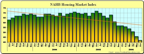
caption: Figure 8 - The National Association of Home Builders housing market index hit 42 in June, the most pessimistic level since April 1995, in a survey of 455 homebuilders. A rating of 50 means that half see positive sales numbers and the other half see negative. NAHB Chief Economist David Seiders now expects new-home sales to drop by 13% from the record posted in 2005 with a decline in single-family homes of 9% from the record.
Pressure Point 1: Jobs generator breakdown
Housing represents the single largest component of the economy, a point that was brought home with the revelation from Bloomberg in early July that housing-related activity has accounted for "up to one-half of economic growth since 2001." This includes not only the construction boom but also real estate sales, mortgage lending activities, legal fees, accounting fees and the plethora of related industries. In other words, as many as half of the jobs created in the last few years have been housing or real estate related.
As real estate demand slows, job losses mount. For example, building giant KB Homes recently announced it was letting 7% of its workforce go. Similar announcements have come in banking and other housing-related industries, and the worst is yet to come. This helps explain the weak non-farm payrolls new jobs number and 25% jump in layoffs in June.
Pressure Point 2: Cheap source of cash drying up
Thanks to the lowest interest rates in 46 years in 2004 and rising prices, homeowners (currently 68% of U.S. households) had access to a cheap source of cash. As long as the value of homes appreciated, banks were only too happy to lend money to support consumer-shopping habits.
Consumer spending represents 70%+ of the U.S. economy and has not been driven by wage growth. Instead, it has been strong, thanks to the availability of cheap money (with some help from tax cuts). Once real estate prices top out, the property ATM is closed. The double whammy borrowers face is the removal of access to a cheap source of cash compounded by the higher costs to carry debt. Total credit market debt (debt at all levels of the economy) now stands at just over 320% of GDP, nearly twice what it was as a percent of the economy in the early1980s, the last time a major property market crash occurred.
Pressure Point 3: Mounting mortgage strain as rates and prices rise
According to a 2006 Harvard University housing study, the number of households spending more than half their income on housing jumped 14% to 15.8 million between 2001 and 2004. Homeowners carrying "severe housing cost burdens" jumped most in upper-middle incomes ($60,000/annually) - up an incredible 34.6%.
Now consider this: Interest rates hit a 46-year low in June 2004 and have steadily risen since, increasing mortgage burdens by as much as 60%. In some cases, the costs of adjustable rate mortgages (ARMs) have doubled since 2004 as ARMs rates approach 7%. Those suffering under severe cost burdens increased 14% while rates were falling. This means that the homeowners' suffering under severe housing costs will only increase along with rates.
How big is the problem? According to Barron's, approximately $1 trillion in ARMs come due this year and another $1.7 trillion next year in the United States. Real estate equity totalled more than $19 trillion in Q3-2005, $8.2 trillion of which is mortgage debt. This means that nearly one-third of outstanding mortgages are shorter-term ARMs. Total mortgage debt grew $300 billion between Q4-2005 and Q1-2006 at an annual adjusted rate of nearly 15%. At this rate, total mortgage debt would double every five years, and that is quite clearly unsustainable.
Mortgage applications are a useful gauge of housing demand. For the week of June 23, total mortgage applications dropped 7% from the week before and were down 31% from the same week a year ago, according to the Mortgage Banker's Association (MBA). The biggest drop was refinancings, down a whopping 46.4% in a year, reflecting the impact of rising rates on consumers. Two weeks later, total mortgage applications were down 36.3% and refinancings had dropped 52% from the previous year.
Housing represented 34% of household assets at the end of 2005, nearly one and a half times the 24% of household assets at the start of 2000, according to Moody's Economy.com. This would evaporate quickly in the event of a sizable downturn in property markets, imparting a more serious impact than the bear market of 2000-2002.
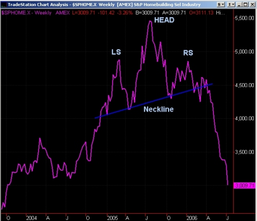
caption: Figure 9 - A weekly chart of the S&P Homebuilding Select Index shows homebuilders falling out of bed between April and July 2006. Note the bearish head-and-shoulders top pattern with the break of the neckline in April that gave traders the warning. Between the July 20, 2005, peak and July 14, 2006, the index shed more than 46%. Chart - Tradestation.com.
Pressure Point 4: Expanding unsold home inventories
A question that has been bandied about in the last year is whether there will be a soft or hard landing in property markets. Housing inventories provide part of the answer. Through 2006 inventories of both new and existing homes have grown to all-time highs. In July, existing home inventories rose 3.7% from June, hitting 2.751 million, the highest level since May 1988. There are approximately 565,000 unsold new homes. According to the National Association of Realtors, this represents an all-time high in existing home inventories since records began in 1982. As sales slow, this will grow expanding inventories increase the probability of a hard landing.
Excellent leading indicators of the real estate market are homebuilder's indexes such as the S&P Homebuilding Select (Figure 9) and the Philadelphia Housing Index (HGX). Like the lamb in the famous nursery rhyme, where homebuilders go, the rest of the real estate market and prices are sure to follow.
Connecting the housing dots
We are in the very early stages of a property correction in North America that could last five years or longer so the pain is just beginning. Even an average drop in real estate prices of 20% across the nation would mean a loss of $3.8 trillion. Prices in many parts of Florida are already down that much, and some analysts are calling for drops of between 40% and 60% over the next five years.
Raymond James analyst Rick Murray sees a number of factors including affordability, excess inventories, orders and use of incentives at levels that are similar or worse to those that existed in 1980 before the last big crash. Aggressive lending practices by banks have put lenders at the greatest exposure to the real estate sector than at any time since WW II. The economy has grown more dependent on real estate than at any time in recent memory, so any correction would have a widespread economic impact.
Economic dependence on real estate means that as markets slow, jobs are being lost and consumer spending slows as the source of cheap funds (and well-paying jobs) dries up. As job losses mount, further declines in consumer spending result in a negative feedback loop. Add record levels of debt and the highest real estate prices in history to the mix means that prices have a long way to drop, and heavy debt burdens will speed their descent.
Real Average Hourly Earnings Growth: Where's the beef?
Something that has been strangely absent so far in the latest economic recovery is real growth in average hourly earnings (hourly earnings less inflation). As Figure 10 shows, growth has slowly but steadily declined since 1965. After peaking in 2002, hourly earnings dropped steadily into negative territory in early 2004 and remained negative for most of the next two years. Wage growth has remained anemic through 2006 so far.
As noted, economic prosperity has been carried on the back of rising mortgage equity, the lowest interest rates in decades and tax breaks. If this economic recovery is to last, it must be accompanied by real wage growth that has yet to materialize.
In his book Ahead of the Curve, Joe Ellis makes a strong case for the relationship between wage growth peaks and bear markets. Red arrows in Figure 10 show past earnings peaks and grey rectangles, the bear markets that often ensued. Black boxes are past recessions. Bear markets have been delayed in the past by fiscal events such as tax breaks and, more recently, the ready access to cheap money, thanks to appreciating home values.
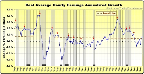
caption: Figure 10 - This chart, inspired by Joe Ellis' book Ahead of the Curve, shows real average hourly earnings after correcting for inflation, bear markets (grey boxes) and earnings peaks (red arrows). The brown dashed line is the linear regression trend line. Note the number of times that red arrows presage bear markets.
Where We Are in the Election Cycle
The most powerful short-term cycle operating in markets is the four-year election cycle in the United States. Between 1913 and 2005, the Dow Jones Industrial Average has dropped an average 22.2% from its post-election high to mid-term year low in September of the second year of a mandate, according to The Almanac Investor. This means that the next few months will be a challenge to markets if history is any guide.

But the good news is that, thanks to a government habit of kicking the printing presses into high speed and doing everything it can to promote economic prosperity heading into elections, the Dow has gained an average 50% over the two-year period from the mid-term low to election year high. There have been no losing pre-election years in the Dow Industrial Average since 1939, according to the Almanac.
View from 30,000 Feet?
The recent canary correction revealed growing chinks in the armor of global markets and economy. An unwinding of the carry trade strained a number of smaller and emerging market economies. What was more amazing was the speed and severity of the drop as more than $6 trillion dollars evaporated globally in the space of just 24 trading days impacting all asset classes (stocks, bonds, commodities and currencies) together. This is unusual. The big question remains, is it over or just the beginning?
Add to the mix unprecedented international investor complacency as evidenced by the record low value in the Emerging Market Bond Index, re-inversion of the yield curve, rapid real estate price escalation, reliance on mortgage equity to fund consumer spending, surge in mortgage and overall debt, anemic growth in real wages, big drops in homebuilding stocks and you have the makings for a potential bear market in the U.S. and around the world.
On the positive side, we are heading into a cyclical low in September-October, thanks to the election cycle. Once the smoke has settled, the market could see a healthy lift for the next 12 to 24 months. However, given the other challenges, this may only be a temporary reprieve in a downtrend that has the potential to last into the next decade.
In summary, here are the issues we will be examining in part 2.
- An index that has been uncannily accurate in providing advance warning of emerging market trouble and what it is saying now.
- What the yield curve inversion for the third time in the last six months means. How accurate has it been in the past in warning of a pending slow down?
- Based on the importance that real estate and related construction activities play in economies around the globe, what impact will a real estate correction have?
- Real wage growth, a principal driver in consumer spending, has been trending down since 1965. What does it mean for the economy going forward?
- What are the most important cycles saying about what to expect in the coming months and years?
- Finally, we will tie these factors together to provide an overall snapshot from 30,000 feet and suggest what it means for markets in the future.
Real Emerging Market Risks

caption: Figure 6 - Chart of the JP Morgan Emerging Market Bond Index from initiation in December 1990 showing areas of relative lows (red ovals) and Dow bear markets (grey boxes).
In the late 1980s, Brady Bonds came into being, designed to spread the risk of loaning to emerging markets from governments and large international banks to international investors willing to play the game. To track the risk of these instruments, JP Morgan introduced a number of indexes including the Emerging Market Brady Only Index (EM_Brady), the Emerging Market Bond Index Plus (EMBI+) and Emerging Market Bond Index Growth Performance (EMBI_Performance). These indexes plotted the difference between a basket of emerging market bond yields and comparable U.S. Treasury yields - the lower the value (spread), the more complacent global investors were becoming about emerging market risk.
The EM Brady Only was initiated in December 1990 and the EMBI indexes go back to 1993. Putting the two together with data from JPM produces the chart shown in Figure 6, a composite of the EM Brady Only (1990-93) and the EMBIG Performance (1993- present).
It is interesting to note that each time that spreads have shrunk to a relative low, some sort of emerging market fiscal crisis and/or bear market followed (see Figure 6).
Note the lows:
- December 1993. Eleven months later the Tequila Peso crisis occurred and there was also a bear market in U.S. stocks.
- September 1997. The Thai baht crisis started in July 1997 as the index was at new all-time lows and developed into the Asian flu.
- December 1999. That relative low was followed by a bear market in U.S. stocks. The Nasdaq bear started in March 2000.
On May 1, 2006, the EMBI+ and EMBIG - Performance hit historic lows of 172 basis points. The May 12-June 13 "canary" correction followed. Unless the relationship has changed, we should expect more trouble in the coming months. Every time global investors become complacent about emerging market risks, look out.
Yield Curve Inversion...Again

caption: Figure 7 - Monthly chart of the difference between 10-year and 2-year yields. Red arrows show inversions, grey boxes show bear markets. Also shown are the percentage gains in bull markets and drops in bear markets for the Dow Industrial Average. The orange line is a 50-month moving average.
July 14 marked the sixth week for the most recent yield curve inversion, the third since late December 2005.
In his article for Trade2Win. "The Yield Curve," my friend John Mauldin makes an excellent case for inversions warning of potential recessions. He outlines his findings in a table on page 2. Granted, inversions have been relatively good at providing warnings of upcoming recessions, but my research shows that they are even more powerful in presaging bear stock markets. Since bear markets (not recessions) do the majority of damage to portfolios, isn't the bear market what investors should try to avoid? Like the captain who only alters course once his ship has been hit by a torpedo, by the time a recession hits, it's too late to take evasive action.
In examining data on various yield relationships including 3-month over 30-year yields (a full inversion), Fed funds/10-year yields, 3-month/10-year and 2-year/10-year yields, the 2-year/10-year inversion provided the earliest warning of a bear market. Looking at Figure 7, there is a 100% chance of a bear market occurring within 26 months of an inversion and an 80% chance of one occurring within 12 months of an inversion. Unless it's different this time, as some analysts have postulated, investors and traders ignore yield curve inversions at their peril.
Potential Real Estate Time Bomb

caption: Figure 8 - The National Association of Home Builders housing market index hit 42 in June, the most pessimistic level since April 1995, in a survey of 455 homebuilders. A rating of 50 means that half see positive sales numbers and the other half see negative. NAHB Chief Economist David Seiders now expects new-home sales to drop by 13% from the record posted in 2005 with a decline in single-family homes of 9% from the record.
Pressure Point 1: Jobs generator breakdown
Housing represents the single largest component of the economy, a point that was brought home with the revelation from Bloomberg in early July that housing-related activity has accounted for "up to one-half of economic growth since 2001." This includes not only the construction boom but also real estate sales, mortgage lending activities, legal fees, accounting fees and the plethora of related industries. In other words, as many as half of the jobs created in the last few years have been housing or real estate related.
As real estate demand slows, job losses mount. For example, building giant KB Homes recently announced it was letting 7% of its workforce go. Similar announcements have come in banking and other housing-related industries, and the worst is yet to come. This helps explain the weak non-farm payrolls new jobs number and 25% jump in layoffs in June.
Pressure Point 2: Cheap source of cash drying up
Thanks to the lowest interest rates in 46 years in 2004 and rising prices, homeowners (currently 68% of U.S. households) had access to a cheap source of cash. As long as the value of homes appreciated, banks were only too happy to lend money to support consumer-shopping habits.
Consumer spending represents 70%+ of the U.S. economy and has not been driven by wage growth. Instead, it has been strong, thanks to the availability of cheap money (with some help from tax cuts). Once real estate prices top out, the property ATM is closed. The double whammy borrowers face is the removal of access to a cheap source of cash compounded by the higher costs to carry debt. Total credit market debt (debt at all levels of the economy) now stands at just over 320% of GDP, nearly twice what it was as a percent of the economy in the early1980s, the last time a major property market crash occurred.
Pressure Point 3: Mounting mortgage strain as rates and prices rise
According to a 2006 Harvard University housing study, the number of households spending more than half their income on housing jumped 14% to 15.8 million between 2001 and 2004. Homeowners carrying "severe housing cost burdens" jumped most in upper-middle incomes ($60,000/annually) - up an incredible 34.6%.
Now consider this: Interest rates hit a 46-year low in June 2004 and have steadily risen since, increasing mortgage burdens by as much as 60%. In some cases, the costs of adjustable rate mortgages (ARMs) have doubled since 2004 as ARMs rates approach 7%. Those suffering under severe cost burdens increased 14% while rates were falling. This means that the homeowners' suffering under severe housing costs will only increase along with rates.
How big is the problem? According to Barron's, approximately $1 trillion in ARMs come due this year and another $1.7 trillion next year in the United States. Real estate equity totalled more than $19 trillion in Q3-2005, $8.2 trillion of which is mortgage debt. This means that nearly one-third of outstanding mortgages are shorter-term ARMs. Total mortgage debt grew $300 billion between Q4-2005 and Q1-2006 at an annual adjusted rate of nearly 15%. At this rate, total mortgage debt would double every five years, and that is quite clearly unsustainable.
Mortgage applications are a useful gauge of housing demand. For the week of June 23, total mortgage applications dropped 7% from the week before and were down 31% from the same week a year ago, according to the Mortgage Banker's Association (MBA). The biggest drop was refinancings, down a whopping 46.4% in a year, reflecting the impact of rising rates on consumers. Two weeks later, total mortgage applications were down 36.3% and refinancings had dropped 52% from the previous year.
Housing represented 34% of household assets at the end of 2005, nearly one and a half times the 24% of household assets at the start of 2000, according to Moody's Economy.com. This would evaporate quickly in the event of a sizable downturn in property markets, imparting a more serious impact than the bear market of 2000-2002.

caption: Figure 9 - A weekly chart of the S&P Homebuilding Select Index shows homebuilders falling out of bed between April and July 2006. Note the bearish head-and-shoulders top pattern with the break of the neckline in April that gave traders the warning. Between the July 20, 2005, peak and July 14, 2006, the index shed more than 46%. Chart - Tradestation.com.
Pressure Point 4: Expanding unsold home inventories
A question that has been bandied about in the last year is whether there will be a soft or hard landing in property markets. Housing inventories provide part of the answer. Through 2006 inventories of both new and existing homes have grown to all-time highs. In July, existing home inventories rose 3.7% from June, hitting 2.751 million, the highest level since May 1988. There are approximately 565,000 unsold new homes. According to the National Association of Realtors, this represents an all-time high in existing home inventories since records began in 1982. As sales slow, this will grow expanding inventories increase the probability of a hard landing.
Excellent leading indicators of the real estate market are homebuilder's indexes such as the S&P Homebuilding Select (Figure 9) and the Philadelphia Housing Index (HGX). Like the lamb in the famous nursery rhyme, where homebuilders go, the rest of the real estate market and prices are sure to follow.
Connecting the housing dots
We are in the very early stages of a property correction in North America that could last five years or longer so the pain is just beginning. Even an average drop in real estate prices of 20% across the nation would mean a loss of $3.8 trillion. Prices in many parts of Florida are already down that much, and some analysts are calling for drops of between 40% and 60% over the next five years.
Raymond James analyst Rick Murray sees a number of factors including affordability, excess inventories, orders and use of incentives at levels that are similar or worse to those that existed in 1980 before the last big crash. Aggressive lending practices by banks have put lenders at the greatest exposure to the real estate sector than at any time since WW II. The economy has grown more dependent on real estate than at any time in recent memory, so any correction would have a widespread economic impact.
Economic dependence on real estate means that as markets slow, jobs are being lost and consumer spending slows as the source of cheap funds (and well-paying jobs) dries up. As job losses mount, further declines in consumer spending result in a negative feedback loop. Add record levels of debt and the highest real estate prices in history to the mix means that prices have a long way to drop, and heavy debt burdens will speed their descent.
Real Average Hourly Earnings Growth: Where's the beef?
Something that has been strangely absent so far in the latest economic recovery is real growth in average hourly earnings (hourly earnings less inflation). As Figure 10 shows, growth has slowly but steadily declined since 1965. After peaking in 2002, hourly earnings dropped steadily into negative territory in early 2004 and remained negative for most of the next two years. Wage growth has remained anemic through 2006 so far.
As noted, economic prosperity has been carried on the back of rising mortgage equity, the lowest interest rates in decades and tax breaks. If this economic recovery is to last, it must be accompanied by real wage growth that has yet to materialize.
In his book Ahead of the Curve, Joe Ellis makes a strong case for the relationship between wage growth peaks and bear markets. Red arrows in Figure 10 show past earnings peaks and grey rectangles, the bear markets that often ensued. Black boxes are past recessions. Bear markets have been delayed in the past by fiscal events such as tax breaks and, more recently, the ready access to cheap money, thanks to appreciating home values.

caption: Figure 10 - This chart, inspired by Joe Ellis' book Ahead of the Curve, shows real average hourly earnings after correcting for inflation, bear markets (grey boxes) and earnings peaks (red arrows). The brown dashed line is the linear regression trend line. Note the number of times that red arrows presage bear markets.
Where We Are in the Election Cycle
The most powerful short-term cycle operating in markets is the four-year election cycle in the United States. Between 1913 and 2005, the Dow Jones Industrial Average has dropped an average 22.2% from its post-election high to mid-term year low in September of the second year of a mandate, according to The Almanac Investor. This means that the next few months will be a challenge to markets if history is any guide.

But the good news is that, thanks to a government habit of kicking the printing presses into high speed and doing everything it can to promote economic prosperity heading into elections, the Dow has gained an average 50% over the two-year period from the mid-term low to election year high. There have been no losing pre-election years in the Dow Industrial Average since 1939, according to the Almanac.
View from 30,000 Feet?
The recent canary correction revealed growing chinks in the armor of global markets and economy. An unwinding of the carry trade strained a number of smaller and emerging market economies. What was more amazing was the speed and severity of the drop as more than $6 trillion dollars evaporated globally in the space of just 24 trading days impacting all asset classes (stocks, bonds, commodities and currencies) together. This is unusual. The big question remains, is it over or just the beginning?
Add to the mix unprecedented international investor complacency as evidenced by the record low value in the Emerging Market Bond Index, re-inversion of the yield curve, rapid real estate price escalation, reliance on mortgage equity to fund consumer spending, surge in mortgage and overall debt, anemic growth in real wages, big drops in homebuilding stocks and you have the makings for a potential bear market in the U.S. and around the world.
On the positive side, we are heading into a cyclical low in September-October, thanks to the election cycle. Once the smoke has settled, the market could see a healthy lift for the next 12 to 24 months. However, given the other challenges, this may only be a temporary reprieve in a downtrend that has the potential to last into the next decade.
Last edited by a moderator:

