Let's begin by looking at the chart in figure 1. At this stage of the cycle, my main purpose in writing is to "alert" you to potential danger in the market. I attempt to do this by explaining the Long Wave cycle, sharing its history and accuracy, and then pointing out where we are in the cycle ... and the implications of being there. As a refresher, we are in the very late stages of a roughly 75 to 80 year cycle. In my observation, I refer to these cycles as "life cycles" because they last expectancy at the late stages of the cycle Kondratieff wrote about cycles, they lasted about 50 years which was the average 'life cycle' or life expectancy of that era. Currently, the average life expectancy is about 78 years. Is it a coincidence, that the prior 'life cycle' top was in 1929 and when you add 78 to 1929 you get 2007 the current life cycle? Note in the chart I show where I wrote prior alerts in my attempt to warn my readers of potentially dangerous times. The July 2007 alert pegged that market top to the exact day. The following alert called the all-time high in the S&P 500 to the exact week. My last alert was extremely close to the May 2011 top. The chart shows the head and shoulder pattern at the recent May high. Note the channel lines that are drawn in to show the bullish and bearish price trends since the 2002 low.
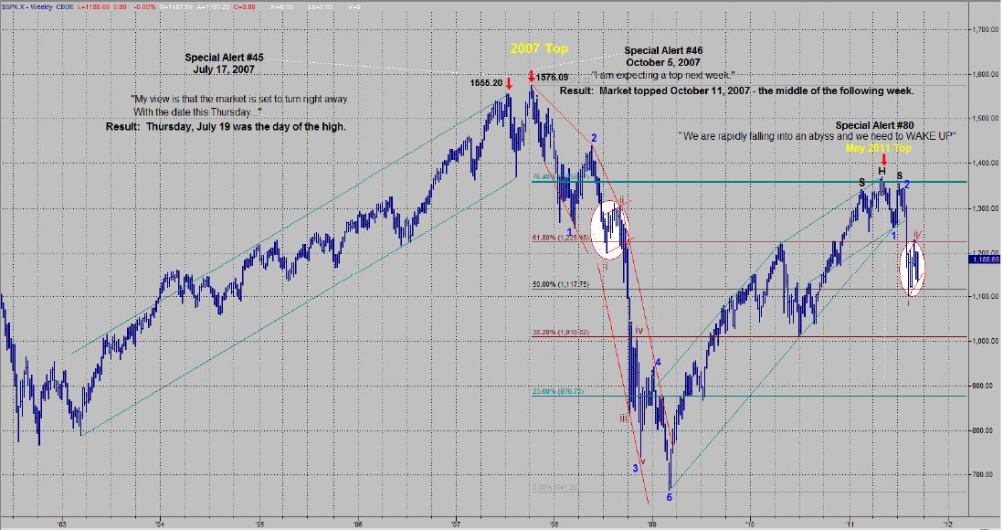
Figure 1
Both the up channel from the 2009 low and the more recent internal channel have been broken. This would imply that the May top was the recovery high and that we are now in the "C" wave headed down. There was an almost perfect Fibonacci price retracement of 76.4% at the May high. You can see the Elliott wave count from the October 2007 top through the March 2009 low. I have drawn in a potential Elliott count for the recent decline. If this count is correct, there is extreme risk for a crash-like decline right now (see the white circled areas on the chart). The market is either completing a small wave 2 or it has completed it. There is another obvious count that is more bullish. That count would have the S&P in the process of completing a fifth wave of wave 1 to the downside.
Big Picture: Bullish or Bearish?
That would seem to be a rhetorical question, as we have attempted to prove our point over and over. However, it is man's eternal nature to be bullish ... particularly at times when it is extraordinarily dangerous to be bullish.
The charts in figures 2 and 3 are two of my favorites and both provide us with a good deal of evidence as to where we are in the cycle ... and whether our outlook should be bullish or bearish. In the top chart, I have drawn a trend line from the 1974 low to the 2000 top. I then paralleled this line off the 1982 low. After the 2000 top and the subsequent low in 2002, this new line defined the ultimate top of the next move i.e. the rally from the 2002 low to its ultimate top in 2007. I am a big fan of trend lines and marvel at what well drawn trend lines are capable of projecting ... but this is one for the ages. I was so surprised by these two trend lines that I just had to make another parallel line. I attached the last line to the key low in 1994 that launched the robust advance signified by the "technology stock boom" leading into the 2000 top. It was the significant low before the next major advance in the same manner that both the 1974 and 1982 lows launched the next major advance. After the top in 2007 and the low in 2009 that followed, the final line defined the ultimate high for the rebound top that occurred in May 2011. This would seem to be a pretty good argument for a top to be in place. The lower chart is one that I frequently refer to because it is the Institutional Index and the institutions dominate the market. The Institutional Index made its top in 2000 with the secondary high in 2007 and rebound top this year. Its message is very clear -- we are in the 12th year of a secular bear market. From the chart, it would appear that the market is in a third wave decline right now -- implying the potential for a large decline.
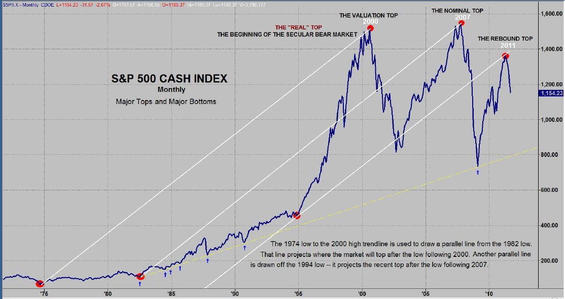
Figure 2
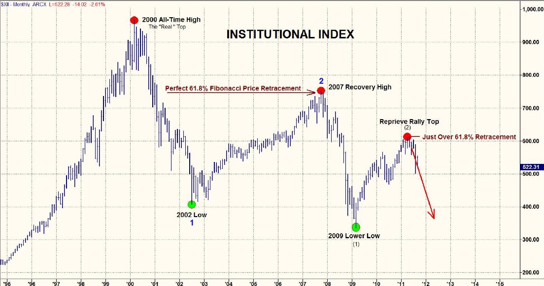
Figure 3
Both of the above charts imply that the market has entered a period where "the second shoe will drop". The market is either in the process of finishing up the initial decline or it is about to have a crash-like move. The volatility has become fairly extreme. Just recently, every day of the week was a triple digit day in the Dow Jones Industrials. The Volatility Index (VIX) has been rising since May as you can see on the Monthly chart on the next page.
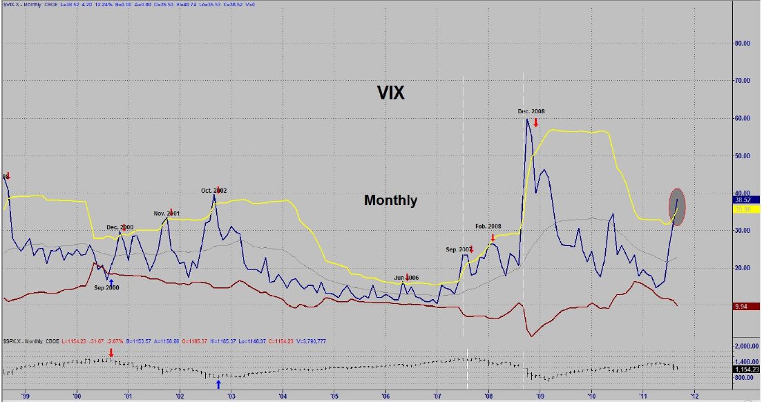
Figure 4
In fact, it has broken above the upper band (yellow line). Normally, in VIX charts a buy signal is given when VIX goes above the upper band and then comes back inside the line. You can see where this worked well in October of 2002, but it isn't always a great signal on a monthly chart. Breakouts above the upper line also coincide with severe declines. If you look at the first white dashed line to the left of the current period, you will see that it is a sharp vertical breakout period just like now. That happened to be right at the end of September 2008 -- just before the 2008 collapse. The time that it broke out immediately before that was just before the all time high in the S&P 500 (the market top in 2007). This points out not only the potential danger, but the clear potential for a market crash.
Bonds
It never ceases to amaze me that people rush to the bond market for safety. I'm sure this is a habit that is due to the fact that for as long as I remember, investors would move to bonds when they got out of stocks ... and vice versa. Most of the time it is a decent decision, but it would seem almost insane currently. The nation is essentially bankrupt and just recently had to raise the debt ceiling to remain solvent i.e. we are in a debt crisis and these investors are purchasing debt??? Isn't that kind of like being in a drought and purchasing sand bags? Bonds were priced at about 141 earlier in the week -- which is potentially a lot of risk when you consider they got down to 55 in late 1981. Are the investors getting paid to take such a risk? Uh, no. So, you have an extremely expensive asset backed by a bankrupt establishment that is paying next to nothing for the investor to take extreme risk. I guess I'm just not intelligent enough to figure out the attraction.
Since the 1940s, the tax income for the USA in relation to the Gross Domestic Product (GDP) has fluctuated between 15 and 20%. We know that tax income is down due to the economy, let's take a look at governments debt compared to annual tax income. The figures below are played down by the government, but in my view, the chart always tells the story. The two charts on this page tell a story and they don't really require any input from me.
I have recently discussed the fact that "every 40 years or so something bad happens ... and every other 40 years or so something really bad happens. This observation shows up on many different charts. On the left, 40 years ago government debt lifted off its flat line path and has now gone almost vertical. That's bad. In the chart below, you also have a chart of government debt. This time it is labeled as Total Credit Market Debt as a % of GDP. For roughly 40 years the Debt as a % of GDP was either declining or flat. 1969 was the last year the government had a "real" surplus. Bill Clinton claimed to have a surplus, but we all know what a great kidder he was. Unlike recent presidents, Bill really was smart. He created "off budget items" which were the items that needed to be removed from the budget to have a surplus. So, as I was saying, 1969 was the last year of surplus for the USA. The USA was at its peak in 1970. General Motors was the largest corporation in the world and it was the year of peak oil production in the US. It was the first year the USA eclipsed $1 trillion in GDP and it took the next 15 countries to match the US's production. In the 40 years prior, the US was growing to this position. From 1970, the US has fallen backwards visa- vis the rest of the world. Changes of magnitude don't happen overnight, they take time ... the US is still #1 in GDP, but this process of decline began 40 years ago.
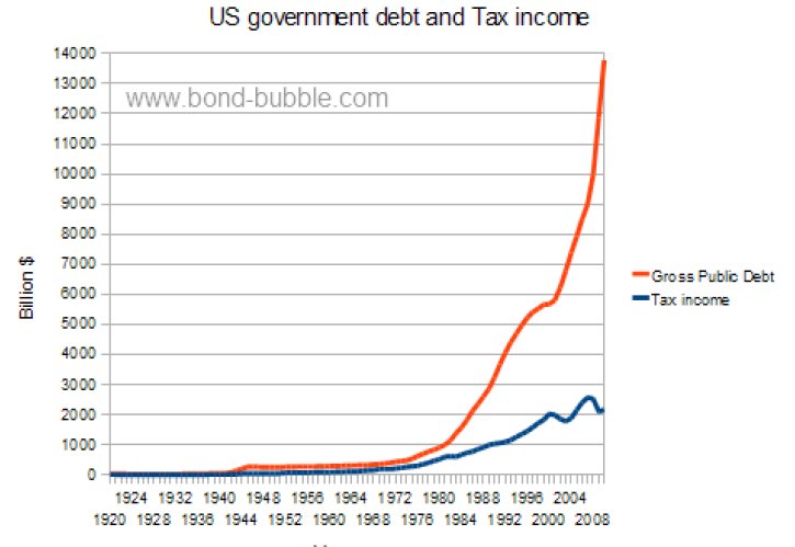
Fig 5
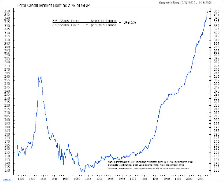
Fig 6
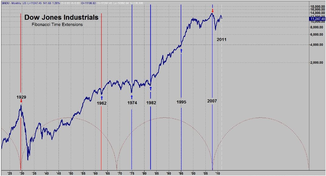
Fig 7
Summary
We are in a very exciting time -- to say the least. Our big picture argument remains the same with no reason to change our opinion. I utilize a top-down technical approach when I want to get a feel for the market. Our monthly chart is bearish with the last signal being a monthly sell in June at 1311. The weekly chart is also on a sell signal from back in May. The daily chart gave a buy signal last week. I have two turn dates for this month, the 16th for a buy set up and the 26th for a sell off. Now let's look at one more chart shown in Figure 8.
Figure 8
The chart is the SSOX (Semiconductors). I included it because it is a market leader. The SOX made its recovery high well before the S&P did, but comparing similar time period tops and bottoms, the SOX turned before the S&P at the February and May tops as well as at the first two August bottoms. Each chart has formed a bearish flag pattern. Note that the SOX chart had an upside breakout while the S&P is nowhere near an upside breakout. At this point, the SOX has s made a non-confirmed breakout i.e. no other index chart that I follow has broken out . The NASDAQ 100 did, but it couldn't hold it and closed under the trend line. Here are some factors to consider: The stock market has topped and is in a bearish down trend with a bearish flag pattern. The monthly chart is bearish. The weekly chart is close to a turn and the daily chart gave a buy signal. The implications for a turn are in the works and we are close to one of my turn dates. Recent action was news based --regarding potentially good news on the Greek debt but this may now be changing. The move in the futures began just before the first hour of trading ended and ended with under an hour of trading left. The market fell back to retrace a Fibonacci 38.2% of the daily advance --which is decent. Market breadth is not impressive yet --in fact, the advances vs. declines numbers are remarkably underwhelming. Sentiment numbers have picked up in that the bulls have dropped to 35.5% this week from 49.5% at the market highs of July. This is the lowest reading for bulls in a year. The bears this week are at 40.9% vs. 21.5% in late July --which is their highest level since March 2009. There are now 5.4% more bears than bulls which is in buy range territory. Sentiment signaled a top in May.
So, there you have it. Things are big picture ugly, but could be in the process of making a bottom. If you are an astute trader, this could be an opportunity to make some money and then re-establish your short positions at a higher price. If you aren't an astute trader, then you may just be setting yourself up to get severely pummeled. It's fairly clear that most folks learned nothing from the two tops shown previously ... I can't imagine why the top earlier this year would succeed where the others failed. Remember, our friends at the Fed artificially stopped the decline in 2008 - 2009. To me, we are at a similar point to April 1930. If we are fortunate enough to get a rally, don't waste the opportunity. Human nature is surely not your friend. Government can't produce a good economy or create a consumer. When you don't have a consumer, I find the hyper-inflation argument hard to swallow ... although we do seem to be this generation's Weimar Republic.
Garrett Jones can be contacted by email at [email protected]
Figure 1
Both the up channel from the 2009 low and the more recent internal channel have been broken. This would imply that the May top was the recovery high and that we are now in the "C" wave headed down. There was an almost perfect Fibonacci price retracement of 76.4% at the May high. You can see the Elliott wave count from the October 2007 top through the March 2009 low. I have drawn in a potential Elliott count for the recent decline. If this count is correct, there is extreme risk for a crash-like decline right now (see the white circled areas on the chart). The market is either completing a small wave 2 or it has completed it. There is another obvious count that is more bullish. That count would have the S&P in the process of completing a fifth wave of wave 1 to the downside.
Big Picture: Bullish or Bearish?
That would seem to be a rhetorical question, as we have attempted to prove our point over and over. However, it is man's eternal nature to be bullish ... particularly at times when it is extraordinarily dangerous to be bullish.
The charts in figures 2 and 3 are two of my favorites and both provide us with a good deal of evidence as to where we are in the cycle ... and whether our outlook should be bullish or bearish. In the top chart, I have drawn a trend line from the 1974 low to the 2000 top. I then paralleled this line off the 1982 low. After the 2000 top and the subsequent low in 2002, this new line defined the ultimate top of the next move i.e. the rally from the 2002 low to its ultimate top in 2007. I am a big fan of trend lines and marvel at what well drawn trend lines are capable of projecting ... but this is one for the ages. I was so surprised by these two trend lines that I just had to make another parallel line. I attached the last line to the key low in 1994 that launched the robust advance signified by the "technology stock boom" leading into the 2000 top. It was the significant low before the next major advance in the same manner that both the 1974 and 1982 lows launched the next major advance. After the top in 2007 and the low in 2009 that followed, the final line defined the ultimate high for the rebound top that occurred in May 2011. This would seem to be a pretty good argument for a top to be in place. The lower chart is one that I frequently refer to because it is the Institutional Index and the institutions dominate the market. The Institutional Index made its top in 2000 with the secondary high in 2007 and rebound top this year. Its message is very clear -- we are in the 12th year of a secular bear market. From the chart, it would appear that the market is in a third wave decline right now -- implying the potential for a large decline.
Figure 2
Figure 3
Both of the above charts imply that the market has entered a period where "the second shoe will drop". The market is either in the process of finishing up the initial decline or it is about to have a crash-like move. The volatility has become fairly extreme. Just recently, every day of the week was a triple digit day in the Dow Jones Industrials. The Volatility Index (VIX) has been rising since May as you can see on the Monthly chart on the next page.
Figure 4
In fact, it has broken above the upper band (yellow line). Normally, in VIX charts a buy signal is given when VIX goes above the upper band and then comes back inside the line. You can see where this worked well in October of 2002, but it isn't always a great signal on a monthly chart. Breakouts above the upper line also coincide with severe declines. If you look at the first white dashed line to the left of the current period, you will see that it is a sharp vertical breakout period just like now. That happened to be right at the end of September 2008 -- just before the 2008 collapse. The time that it broke out immediately before that was just before the all time high in the S&P 500 (the market top in 2007). This points out not only the potential danger, but the clear potential for a market crash.
Bonds
It never ceases to amaze me that people rush to the bond market for safety. I'm sure this is a habit that is due to the fact that for as long as I remember, investors would move to bonds when they got out of stocks ... and vice versa. Most of the time it is a decent decision, but it would seem almost insane currently. The nation is essentially bankrupt and just recently had to raise the debt ceiling to remain solvent i.e. we are in a debt crisis and these investors are purchasing debt??? Isn't that kind of like being in a drought and purchasing sand bags? Bonds were priced at about 141 earlier in the week -- which is potentially a lot of risk when you consider they got down to 55 in late 1981. Are the investors getting paid to take such a risk? Uh, no. So, you have an extremely expensive asset backed by a bankrupt establishment that is paying next to nothing for the investor to take extreme risk. I guess I'm just not intelligent enough to figure out the attraction.
Since the 1940s, the tax income for the USA in relation to the Gross Domestic Product (GDP) has fluctuated between 15 and 20%. We know that tax income is down due to the economy, let's take a look at governments debt compared to annual tax income. The figures below are played down by the government, but in my view, the chart always tells the story. The two charts on this page tell a story and they don't really require any input from me.
I have recently discussed the fact that "every 40 years or so something bad happens ... and every other 40 years or so something really bad happens. This observation shows up on many different charts. On the left, 40 years ago government debt lifted off its flat line path and has now gone almost vertical. That's bad. In the chart below, you also have a chart of government debt. This time it is labeled as Total Credit Market Debt as a % of GDP. For roughly 40 years the Debt as a % of GDP was either declining or flat. 1969 was the last year the government had a "real" surplus. Bill Clinton claimed to have a surplus, but we all know what a great kidder he was. Unlike recent presidents, Bill really was smart. He created "off budget items" which were the items that needed to be removed from the budget to have a surplus. So, as I was saying, 1969 was the last year of surplus for the USA. The USA was at its peak in 1970. General Motors was the largest corporation in the world and it was the year of peak oil production in the US. It was the first year the USA eclipsed $1 trillion in GDP and it took the next 15 countries to match the US's production. In the 40 years prior, the US was growing to this position. From 1970, the US has fallen backwards visa- vis the rest of the world. Changes of magnitude don't happen overnight, they take time ... the US is still #1 in GDP, but this process of decline began 40 years ago.
Fig 5
Fig 6
Fig 7
The chart above is a long term chart going back to the 1920s. The vertical lines are Fibonacci time extension lines. The initial points are 1929 and 1962. It is interesting to note that, so far, the time extension points have hit some major turning points: 1974, 1982, 1995 (this was an acceleration point, not a reversal - in late 1994), and 2007. If you look closely at the chart, the points are impressive. The dashed white line is a 38.2% line and falls in the September 2011 time period. Will this provide a clue for the market? We have to wait and see.
Summary
We are in a very exciting time -- to say the least. Our big picture argument remains the same with no reason to change our opinion. I utilize a top-down technical approach when I want to get a feel for the market. Our monthly chart is bearish with the last signal being a monthly sell in June at 1311. The weekly chart is also on a sell signal from back in May. The daily chart gave a buy signal last week. I have two turn dates for this month, the 16th for a buy set up and the 26th for a sell off. Now let's look at one more chart shown in Figure 8.
Figure 8
The chart is the SSOX (Semiconductors). I included it because it is a market leader. The SOX made its recovery high well before the S&P did, but comparing similar time period tops and bottoms, the SOX turned before the S&P at the February and May tops as well as at the first two August bottoms. Each chart has formed a bearish flag pattern. Note that the SOX chart had an upside breakout while the S&P is nowhere near an upside breakout. At this point, the SOX has s made a non-confirmed breakout i.e. no other index chart that I follow has broken out . The NASDAQ 100 did, but it couldn't hold it and closed under the trend line. Here are some factors to consider: The stock market has topped and is in a bearish down trend with a bearish flag pattern. The monthly chart is bearish. The weekly chart is close to a turn and the daily chart gave a buy signal. The implications for a turn are in the works and we are close to one of my turn dates. Recent action was news based --regarding potentially good news on the Greek debt but this may now be changing. The move in the futures began just before the first hour of trading ended and ended with under an hour of trading left. The market fell back to retrace a Fibonacci 38.2% of the daily advance --which is decent. Market breadth is not impressive yet --in fact, the advances vs. declines numbers are remarkably underwhelming. Sentiment numbers have picked up in that the bulls have dropped to 35.5% this week from 49.5% at the market highs of July. This is the lowest reading for bulls in a year. The bears this week are at 40.9% vs. 21.5% in late July --which is their highest level since March 2009. There are now 5.4% more bears than bulls which is in buy range territory. Sentiment signaled a top in May.
So, there you have it. Things are big picture ugly, but could be in the process of making a bottom. If you are an astute trader, this could be an opportunity to make some money and then re-establish your short positions at a higher price. If you aren't an astute trader, then you may just be setting yourself up to get severely pummeled. It's fairly clear that most folks learned nothing from the two tops shown previously ... I can't imagine why the top earlier this year would succeed where the others failed. Remember, our friends at the Fed artificially stopped the decline in 2008 - 2009. To me, we are at a similar point to April 1930. If we are fortunate enough to get a rally, don't waste the opportunity. Human nature is surely not your friend. Government can't produce a good economy or create a consumer. When you don't have a consumer, I find the hyper-inflation argument hard to swallow ... although we do seem to be this generation's Weimar Republic.
Garrett Jones can be contacted by email at [email protected]
Last edited by a moderator: