Best Thread The Basics of Trading

Hi All

Here’s the charts as I see them :)

BAE Systems

BA301003.png


Gaffs – The important part was the resistance at 196 which you spotted :)
Yes there is support at 160, but there is more immediate support at 166 (the red line on the chart) The support and resistance points don’t need as many touches as trendlines, so the ones we have identified are important.
The trendline I have drawn in needs another bounce off that to make the ascending triangle complete.

If I was short I would be looking closely for any bounce off the trendline and after that looking for a chance to get out. Target at 166


Barclays

BARC301003.png


Gaffs – There is a reason why you can’t see a triangle, there isn’t one on this chart ;)
The thing to notice was the 2 trendlines, one over the high’s and the one connecting the lows. Yes it could be called an expanding triangle, but I don’t think the trendlines are going away from each other fast enough. :(

For a short trade I would be looking to have a stop-loss at 527 and a target of the lower trendline. As I mentioned earlier, the problem with this type of pattern is that the risk increases as the days / bars go by.


Centrica

CNA301003.png


Gaffs – Well spotted :cool:

Eek, I can’t believe I said long on this chart :rolleyes: I would have a very tight stop at 184 and take any profits sooner rather than latter. Not a nice chart that one :(


Cable & Wireless

CW301003.png


Gaffs – Yet again, Superb :) Yes the height of the triangle added to the break-out point does give the first target for the move, but I have to be honest and say I’ve yet to get any of them to work :confused:

I added the short trendline in, even though it’s a bit short-term for a EOD chart. In this case it will act as a stop-loss point. A good tight stop just in case it doesn’t get past it’s resistance point :)


GlaxoSmithKline

GSK301003.png


Gaffs – Superb once again :)
The one thing to notice is that the price is getting very close to the apex of the triangle, which is slightly worrying as they are supposed to break ¾ of the way along


Thank Gaffs for sharing your thoughts on these charts :)
The PDF and word files are now in production, and I hope to have them done this weekend

Take care :)
 
Mark,

Your analysis lacks a few things:

1. Context
2. Accuracy

But does contain:

1. Poor terminology
2. Dangerous statements (for beginners)

If this is to be a thread for ‘First Steps’ then it is essential that the process of reading a chart is followed from the basics through to the current situation and an assessment made of the price action, covering all the time frames downwards, identifying the overall state of the chart and what we would expect to be the major and minor trends, support and resistance areas, coupled with the chart patterns themselves.

You must start the chart analysis at least from the start of the previous major trend; in some cases this may mean going back to 10-year charts.
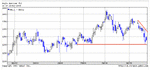
BAE

Start with the longterm chart:

ba31104.gif


This gives us the overall view of the current major trend of the market, the context of the recent price action within the bigger picture and highlights any major chart patterns and support/resistance levels that should be noted.

If you are looking for triangles, try that one as a continuation breakdown, it broke a bit early, but nailed the 100 level as a target.

Moving the time frame in a bit:

ba31103.gif


This 5 year chart highlights the support and resistance areas better, and still manages to include the top of the price action and the major down trend. It also shows just how fast the stock broke down, accelerating away from the major trend. Please also note the very fast descending triangle as the “ooh it’s cheap” mob held to price after the drop through 275.

ba31101.gif


Here we have the 2 year chart, plenty of nice breaks to the downside with minor recovery trends, these levels now provide the support and resistance levels as we go forward.

Finally (in this case – if you were trading intra day you would need to continue down to your time frame), the one year chart:

ba31102.gif


Here we can get some detail of the current recovery trend. 135 became a huge resistance level in the chart once the price action had settled down from the drops. As we entered a period of higher lows an ascending triangle pattern emerged with 135 as the break point. The pattern completed and is an almost perfect example of the patter, hitting its target at 170. There is no other triangle pattern here at the moment. The accelerated 3rd phase trend has broken, the 2nd phase ‘normal’ trend is still in force. The price action is in a consolidation phase which is well bounded by 195 at the top and 165 at the bottom. For the short term trader these levels may provide trading points, for the longer term holder the break of trend (currently also at 165) is the important decision point, although a break above 195 may be an opportunity to add to existing positions if it takes your fancy.

Your analysis:
Yes there is support at 160, but there is more immediate support at 166 (the red line on the chart) The support and resistance points don’t need as many touches as trendlines, so the ones we have identified are important.
The trendline I have drawn in needs another bounce off that to make the ascending triangle complete.


What ascending triangle? There isn’t one. Your ‘trendline’ is plucked out of thin air and comments about ‘touches’ is very odd!

Barclays

barc31103.gif


A horrible chart – potential for a massive 5 year H&S should the base support at 300 be broken – with a target of 0!

However, a band of key resistance levels acting as a sort of pivot to the price action (do not confuse this with pivot points!) sitting between 480 and 520, fairly clear water to the upside up to 580.

barc31101.gif


A 2 year chart, getting a better handle on the support/resistance levels and chart aptterns as the market fell over/recovered. Eventually a reasonable H&S reversal back through 400 defining the current bottom of the market. The long term bear trend has also been broken and a fairly strong bull trend has followed, moving through support, retesting and then moving on again.

barc31102.gif


A better view of the trend, some ‘scary’ moments where the trend and support have come under pressure – 435, 455 – but the price action has managed to hold both trend and support. Above the price action a return line is being established. Ideally this should be parallel to the trend, in this case is is squeezing the price action slightly, never-the-less becoming well established.

In conclusion, a good trend, working its way up the ladder of support and resistance. However, it has reached the top of the major resistance levels found in the longer term charts, so worth keeping an eye on should it fail to continue to break to new highs within the trend. There are no obvious chart patterns as such.

Your analysis:
There is a reason why you can’t see a triangle, there isn’t one on this chart
The thing to notice was the 2 trendlines, one over the high’s and the one connecting the lows. Yes it could be called an expanding triangle, but I don’t think the trendlines are going away from each other fast enough.

For a short trade I would be looking to have a stop-loss at 527 and a target of the lower trendline. As I mentioned earlier, the problem with this type of pattern is that the risk increases as the days / bars go by.


Correct, no triangle. But why are you talking about 2 trendlines, the top line is a return line, please don’t call it a trendline otherwise people new to this will start drawing ‘trends’ over the price action! There is no chart pattern it is a straight trend, and again your ‘trendline’ cannot be correct as it does not include the lows, they must be included, or the trendline justified by saying why it doesn’t include the lows.


Centrica

Long term chart:

cna31103.gif


A great over view of the price action with a huge descending triangle formation which failed to make target by c 10 points. The overall bear trend is still intact and the price action is currently stuck against the previous base around 195.

cna31104.gif


A closer view of the breakdown and the subsequent fast 3rd phase trend. From this picture we can see how the price action is reaching critical levels in terms of potential breakouts and the completion of a large H&S reversal through the old support levels 190/200.

cna31101.gif


As we ‘zoom in’ to the price action, some of the smaller chart patterns become more obvious, a couple of sets of descending triangles, the importance of the 170/175 level becomes apparent as the neckline of the recovery H&S.

cna31102.gif


Getting right into the recovery phase we can pick out how the trend has developed, straightforward areas of consolidation, before a further move higher. These are not defined triangles; they are the standard ebb and flow of the market. This is a simple case of trend, support & resistance interacting, if anything the continuation patterns resemble rectangles more than anything else – should you feel the need to try and define them.

Currently the price action has run out of steam, not a surprise considering that it has reached the breakdown point from the longer term charts, the trend has been broken and the price is bounded by 195/185.

Your analysis:

Eek, I can’t believe I said long on this chart I would have a very tight stop at 184 and take any profits sooner rather than latter. Not a nice chart that one

The chart is fine, it has been a good run up from the lows, hitting the H&S target, but again, your ‘trendline’ is worthless, all you have done is join some lows together with no regard for the full trend from the lows.

Cable & Wireless

Ah, nothing like a failed telecom stock to raise the blood pressure of private investors!

cw31104.gif


Disaster area, but great TA. Tremendous descending triangle from the tops giving a target of 50 – and it basically made it! The chart was basically like a stepladder all the way down, breaking support and never threatening to break above resistance.

cw31103.gif


This is one of the few occasions where a new trendline can be justifiably drawn as the price action is moving downwards. The break through 700 was so severe that the following trend could be mapped separately – however, that does not excuse losing sight of the longer term trend.

A nice couple of continuation patterns – descending triangle and Head & Shoulders.

cw31101.gif


Getting closer in we can see how the break downs have continued until we eventually get to the point where the price action moves sideways enough to break the immediate trendline in April and we can tentatively draw in a base trend.

The break above 110 is particularly significant as it is the first break of resistance since the peak – some £14.00 ago. It also confirms the recovery trend.

cw31102.gif


No triangles, no chart patterns, just a steady up trend which is starting to gather some pace as investors come back into the stock.

Still has some major hurdles to overcome; immediate support is at 130 and (more importantly) 110. To the upside resistance at 155/160 is where the hard work really begins.

Your analysis:
Yet again, Superb Yes the height of the triangle added to the break-out point does give the first target for the move, but I have to be honest and say I’ve yet to get any of them to work

What triangle? Because you have decided to write about them, you are seeing them everywhere, this is a simple case of a trend starting off and breaking some resistance for confirmation, don’t look for things that aren’t there! Chart patterns are in reality rare enough without trying to label every bit of price action.

Glaxo

gsk31104.gif


This looks like a Chinese guard report – however, you can see how the trendline accelerated on the way up, and on the way down. There is an almighty double top still sitting there with a target of 600.

gsk31103.gif


Coming in a bit closer, we can see a few of the chart patterns emerge, descending triangles and a nice continuation flag/rectangle. 1000 is providing the psychological support holding the base of the current price action and 1400 is the critical overhead resistance. Note how even by looking at this 3 year chart you may not have realised the importance of 1400 as a level. For GSK to shake off the spectre of the double top, it needs to regain the 1400 level.

Please also note, that in reality we are faced with a stock that is in a very well defined range, very different from the previous charts where the recovery in the markets has helped push them quite a way from their lows and into some form of recovery.


gsk31101.gif


Here we can see a descending triangle that failed, the price kept pushing hard against the 1100 level, but failed to crack the 1000.

gsk31102.gif


More amplification of the range, the H&S recovery has failed, the H&S to the downside has also failed. The recovery trend is broken, there is no chart pattern here, just a damn awful range, great for writing options, not so great for anything else – until it breaks either through 1400 or 1000 there are much better opportunities out there.

Your analysis:

The one thing to notice is that the price is getting very close to the apex of the triangle, which is slightly worrying as they are supposed to break ¾ of the way along

Again, no triangle, again trend not taken from the lows, if so you would be aware that it has already been broken and this stock is in a horrible range.

You may think I am being harsh – I am, this isn’t a nice business. If you are seriously considering putting a document together then you really need to sort your analysis out because you are ignoring the basics of even picking up a chart. At the moment you are more likely to, unwittingly and with the best intentions, lead someone up the garden path.
 
Thank you FTSE & TBS,
All this info is great for me as a ' First Steps' follower!
The importance of chart timescales has already been touched upon somewhere in this thread, and I appreciate being reminded of its importance.

My main aim is to understand the actual charting methods at the moment, rather than to take analysis posted on this thread and plunge in!

It's really is important to me to take te charts that are posted here and analyse them as individual data, irrespective of the past history! This way I can compare my analysis "like for like' rather than incorporating historical factors. - I need to understand how to analyse A SINGLE chart! - once I'm confident I can do that, I can incorporate other factors (historical data etc!).

I'm obviously having a good look at everything posted here which I haven't had time to give my full attention to yet (the joys of being a EOD trader!). But I noticed that on the BA. chart that Mark posted, it finished on the 13th October, whereas TSB Chart finished later. Mark mentioned a Ascending triangle - specific to the chart that he posted.
I'd be interested to know how TSB would interpret the chart that was originally posted, without the benefit of knowing the shares or it's historical data etc.
Thanks again for the imput!

Rich
 
TBS
Sterling piece of analysis

There is a hell of a lot of information in TBS's post here if you are prepared to look am quite certain that people have paid a lot of money for what has been said by TBS above.

I would suggest that anyone new to this read, re-read and read again what he has posted.

A starter for people would be to look up "top down analysis" and swot up on basic TA that is explained in may books and you will see what TBS has managed to demonstrate here....

Priceless :cheesy:
 
Hi Gaffs,

Story time, but first a couple of comments:

1. Although the principles of this analysis are correct, you really do need to start with the previous low/high rather than half way through a chart.

2. Whatever you are trading it is essential that you are fully aware of your time frame and what level of trend you are prepared to play with.


Consider Mr Gunslinger – he looks for short-term patterns and trends. He has a stock universe of some 200 movers and is quite happy to play close to the price action and move onto the next deal and deals with EOD data.

Also consider Mrs Trender – she also looks for short term patterns but longer term trends. She is prepared to hold positions for as long as she is comfortable to do so, has a universe of c 50 stocks.

Mrs Trender is not as aggressive as Mr Gunslinger, she is prepared to let the major trends develop, but both are pretty ruthless in their approach to reading the chart and applying their particular timeframe to it.

I have taken FB’s BA chart, re-based it, cut off all the references etc….

ba2.gif


Both look at this chart, both immediately identify the support and resistance levels in the market. The immediate thoughts are:

1. To the downside, a close below 4.5 would complete a double top and would provide an entry point.
2. To the upside a break of 12 would negate any chart patterns and provide a bullish entry point.

At the moment there is nothing to be done, the only trend in evidence is a bear as the price is being squeezed downwards.

ba3.gif


Time for action by both, the price has closed above the resistance level at 12 and it is time to buy the next day. Both can also draw in the beginnings of a bull trend which will provide a close point should it be broken.

ba4.gif


The next day the price opens at the high, they wait till the first flushes of madness are out of the way and get filled at 11.

To their dismay, the price drops over the next couple of days, breaks though the trend line, but manages to close above it. At this point the trend line can be widened to encompass the new low. This is only done because the price action failed to close below the original trend.

To the relief of both, the price action continues to recover and the new trend is in force.

ba5.gif


As the chart unfolds, MrG notices that the level of 12.5 is becoming more important and that the price action is being pushed against it, developing an ascending triangle. He measures the height of the price action going into the triangle and comes up with a target trade of 10 points, or 22.5 as a level. He immediately puts a sell stop in. To his delight the pattern breaks and he gets filled on the third day. That is him out of the market for the moment, having bagged 11.5 points.

MrsT also notices the triangles, is very happy to see that they are going in her direction, and is also happy to see them break. However, her priority is the base trend which is progressing nicely. She does not trade the pattern, merely regards it as an extension of her trend.

Both now take note that 12.5 – the break level of the triangles is retested and becomes support. 25, the high of the market now becomes the main resistance point.

ba6.gif


As time progresses MrsT is becoming happier and happier, the support at 12.5 has held and now new levels at 15 and 20 have been established. She notices that the price action is accelerating away from her base trend line, so draws in a second phase trend.

MrG has been off trading other things, but continues to keep an eye out on this chart as part of his universe.

He is delighted to see the price action break to new highs, triggering a trade where he gets filled at 27.5. He notes the base and phase 2 trends, but is also particularly interested in the faster trend that has developed since the break through 20, this gives him a very low risk point as a break of this trend would signal an exit for him.

ba7.gif


MrsT is now in raptures, the price action continues to accelerate upwards and she can draw in a phase 3 ‘fast’ trend, however, she is cautious about getting too close to the price action and selects the recent break point at 25 as her ‘pivot’ for the trend line, this will suffice until a better defined point arises.

MrG is also delighted to see the price action move quickly away from his entry point. He follows the fast trend. At one point the trend is broken intra-day, but recovers by the end of the day, so he widens his trend line slightly to encompass this low. Eventually the price action closes below his trend line and he closes out his position at 32, bagging another 4.5 points to add to his original 11.5. He immediately notes the resistance at 37.5 and the support at 28 – moves onto the next trade somewhere else.

ba8.gif


The price action continues to move upwards, breaking through the previous highs, MrG takes this as another entry point and notes the 3rd phase trend and the even faster trend which he is working against. He gets filled at 41. Within 2 days the price reverses and breaks through his trend, he closes at 34, a loss of 7 points

MrsT sees the move above 37 as confirmation that she can include the lows at 30 as part of her 3rd phase trend – this becomes her close point, should the trend be broken.

ba9.gif


All good things must come to an end, MrsT sees her 3rd phase trend broken and decides to close her position at 32, giving her an overall return of 21 points. She notes support at 27 and takes that as an entry point for a short play, and notes the overhead resistance at 42.5 as an entry for another bull position – the same levels apply for MrG.

In this case MrsT made a better return from the trades than MrG – it isn’t always the case. The important thing is that both identified the points at which they were prepared to close their positions by studying the chart and by applying their time frames.
 
Yes indeed, excellent stuff,
Mr Gunslinger & Ms Trender seem to have their systems working well.
I need to digest this a bit as I've only had one read through so far!- but very informative, thank you!

Mr.G & Ms.T's trading chart starts from "day dot" as it were, and seems to be traded without the hindsight of historical trends being incorporated whithin their analysis. - I take that in trading for real both Mr G & Mrs T would be building long term price movement's into their calculations?

Thanks again for the imput.

cheers

Rich
 
I take that in trading for real both Mr G & Mrs T would be building long term price movement's into their calculations?

Certainly MrsT would be working from the low of the price action, MrG is a different kettle of fish, but he would still be doing a top-down analysis across his basket of stocks, each week. Once he has done it once, it doesn't take long to flick through the charts as a refresher.
 
Okay, excuse my lack of knowledge, but I shall have a foolish attempt. I have never traded anything, but would like to learn to try. I don't know what sort of trading would be best, but seeing as I don't get much free time during the day, something useing end of day charts would be good.

Anyway I thought I would have a look at the AAL chart that FTSE Beater has been going on about. It is the first chart I have ever tried to anylise.

My thoughts were, I have drawn a line on the bottom, which will be the point the price doesn't fall below, and have also marked a down trend. Therefore I would wait for that trend to hit my bottom line, and then buy as it would have to go into an uptrend.

Am I talking complete rubbish, or is that sort of correct?

Cheers,

Matt
 

Attachments

  • aal.gif
    aal.gif
    13.5 KB · Views: 528
mattgrant said:
... and then buy as it would have to go into an uptrend.

You're on the right lines, however I must disagree with the above statement of yours. It does not 'have' to go into an uptrend ... it is just 'quite likely' to reverse direction (ie go up). The reverse could be the start of an uptrend or it could be a pullback/retracement before continuing down.

And if it doesn't go as you would wish/expect, you will know quite quickly, so can exit with a very small loss.

The stock is still in an overall downtrend, so if you had gone long at the bounce you would use a stop to keep you in the trade, but don't expect this necessarily to go on up and up and up.

You can see quite easily that the overall trend is down because the down swings are longer in depth than the up swings - this is a quick visual way to remind you of the bigger picture. When the up swing is longer than the down swing, then you 'may' be in an uptrend. Just use this as a guideline, not a rule.

Now look at that last candle - it's a filled in one and looks like a brick (bricks are heavy and so go down; the light ones are like balloons and so are rising). In a good reversal you would expect that last candle to be light as it is rising with the close above the open. Look at previous reversals - mid February and 2/3rd way through March - you will see that a light candle happens just after the reversal, showing strength in the up move. The opposite happens on the reversals down (light candle followed by a heavy candle), and you can see this quite clearly on the chart you've posted.

Without confusing you, notice that the previous support at 1225 was broken without a bounce on the daily chart. This is usually not a good sign of an imminent reversal.

A good reversal should have a 'spring in its step' and a nice bouncy bounce - there's no signs of one yet which makes me feel there is more down to come.

As you've said, there's quite strong support at 1150, so this may be where the bounce will be.
 
ftse beater's explanation of the risk reward ratio argument is very clear but limited to a mechanical methodology which is the best that most ordinary people can achieve, and then with difficulty. What ultimately defeats them is their own humanity. When this is finally conquered a higher level of awareness is attained that overrides everything. The question of which choice to make then becomes clear as a consequence of replacing the previous mechanism with self governance of the highest order. Very few individuals have the right character to enact the type of self discipline markets demand. If you are looking to find a truly adult conduct requirement this is the arena to look in, and to master, or it will master you.
 
advice please

could you help i read your post on support and resistance and im quite new to trading,could you naswer the following for me.
1.what time scale should the chart be ie 6 months
2.when you putting in the support level what if only one day in six months is the lowest point does that become the support level
3.will this work on the dow and ftse
4.when drawing trend lines it must be at least 3 points that join on a straight line what if theres only two.
any advice appreciated
ps do you gut feeling much
thanks matthew
 
Hi Matty199

1.what time scale should the chart be ie 6 months
3.will this work on the dow and ftse
Technical analysis works on any time frame and on any market. So Support, Resistance and trendlines apply to anything

2.when you putting in the support level what if only one day in six months is the lowest point does that become the support level
Yes it does. The reason is that the price reversed off that level in the past, so it is likely to reverse again if the price comes back to test that level.

when drawing trend lines it must be at least 3 points that join on a straight line what if theres only two.
If there is only two, then you have to see what happens when price comes to the trendline. If it bounces off it, then you have support. If it goes straight through, then it wasn't seen as a true trendline in the market.

ps do you gut feeling much
When I first learning to trade I did. However as time has gone by, I learnt that my gut feeling usually results in losing trades :(

I hope this helps, and if I can help in any other way, please let me know.
 
thanks for advice

thanks and its appreciated,could i ask a few more questions please.
1.do you trade only on support/res/trend lines?
2.what do you trade
3.would you recommend getting software if so whats do you think is best
4.do you day trade
5.do you spreadbet if not what do you use and why
6.i know this is a general question but how many points would you expect to gain or lose over a period say 1 month or 3 months
7.Finally do you trade full time as i would like to make a living if possible whats your thoughts on it
thanks again i really appreciate talking to somebody willing to help
regards and thanks matthew
 
Hi Matty199

1: Yes I do. I've tried using other things like indicators and volume, but I prefer just support, resistance and trendlines
2: UK stocks mainly, but I am also trading US commodities
3: Which software you choose, will be determined by what your planning on trading. The best place to ask, is in the Software Forum
4: I class myself as a swing trader, holding positions for between 1 and 3 days. However if a trade goes through my stop-loss in the same day, I will close it which - would make it a day trade.
5: Yes I do. Spreadbetting in my view, is best on long term trades or trading UK stocks :)
6: I would expect to make about 1% return each day. Needless to say, some days are better than others, but this is what I aim for.
7: I used to. I traded for about 15 months full-time. Trading full-time is a reasonable target, but it will probably take a few years to get the consistency and knowledge to do so.

Hope this helps
 
FTSE Beater said:
Hi Matty199

1: Yes I do. I've tried using other things like indicators and volume, but I prefer just support, resistance and trendlines
2: UK stocks mainly, but I am also trading US commodities
3: Which software you choose, will be determined by what your planning on trading. The best place to ask, is in the Software Forum
4: I class myself as a swing trader, holding positions for between 1 and 3 days. However if a trade goes through my stop-loss in the same day, I will close it which - would make it a day trade.
5: Yes I do. Spreadbetting in my view, is best on long term trades or trading UK stocks :)
6: I would expect to make about 1% return each day. Needless to say, some days are better than others, but this is what I aim for.
7: I used to. I traded for about 15 months full-time. Trading full-time is a reasonable target, but it will probably take a few years to get the consistency and knowledge to do so.

Hope this helps

Hello FTSE Beater,

Out of interest, how close did you get toyour 1% per day target? If the answer is close, what career tempted you to give up trading full time when this must have been lucrative, what with the leverage when using SB.

I ask as I'm going part time next year, hopefully full time the year after, and am interested in the phsycology around making these decisions.

Cheers,

UTB
 
Hi UTB

Be careful!!
With Leverage also comes high risks. Most days I was over 1%, but the main problem I had is that I had to keep taking money out of the account to live. I am also only working part-time, so this allows the trading account to build up without having to keep taking capital out.

HTH :)
 
I would like to thank everyone (especially FTSEBeater & TBS) for this thread. I'm just about to start learning analysis and general trading techniques and found this a real eye-opener. Long may this thread continue!
I've been tinkering with Spread Betting for 18 months and have done OK but now realise that I know absolutely nothing. My bets were just on hunches. Maybe I'm classed as a swing trader. Looks like I've been lucky this year but need to work on a plan to keep things 'in the black'.
Any more information would be well appreciated.

Is this kind of info in the 'Technical Analysis Of The Financial Markets' book by JJ Murphy that was mentioned a few pages back? If so, I'm going to invest in a copy (unless people can recommend others instead)

Cheers,

Edster
 
Hi Edster

Thank you for your kind comments. They are much appreciated.

Is this kind of info in the 'Technical Analysis Of The Financial Markets' book by JJ Murphy that was mentioned a few pages back? If so, I'm going to invest in a copy (unless people can recommend others instead
Do you mean information for writing a trading plan?


For those who are interested, this thread has now been added to the T2W Knowledge Lab which will be launched very shortly. :cool:
 
FTSE Beater said:
Hi Edster

Thank you for your kind comments. They are much appreciated.


Do you mean information for writing a trading plan?


For those who are interested, this thread has now been added to the T2W Knowledge Lab which will be launched very shortly. :cool:

Yes, maybe a trading plan but more importantly I need to be able to read the charts so that I can try and predict what will happen next. If I can read the charts then maybe my own plan will materialise. I won't say no to anyone else offering to share a successful plan with me though!
:cheesy:
 
Top