Just like in the stock and futures markets, there are always things that seem to lead the way of the larger markets. For example, very often a few of the FAANG stocks (Facebook, Apple, Amazon, Netflix, Google/Alphabet) will lead the S&P 500 and Nasdaq higher or lower, or even just watching the Nasdaq in futures will often lead the S&P futures market. In Forex, oftentimes a smaller currency pair will lead the direction of a larger pair.
Now, when I say smaller vs. larger currency pair, what I’m really referring to is the respective size of the economy, or Gross Domestic Product (GDP). Looking at the last full year, according to the International Monetary Fund, the GDP in 2018 for the major forex currency countries was as follows:

As you can see, New Zealand’s GDP is the smallest of the major currency economies. So, we could use their chart to clue us in on what to do with say, the Australian currency. Since the NZD is smaller and, therefore, probably easier to move around than a larger economy’s currency, theoretically it should move first. Let’s take a look at a couple of charts!
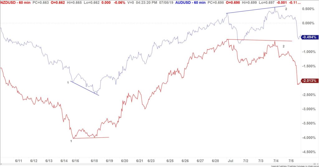
Above is a percent comparison chart on the NZDUSD pair (in red) and the AUDUSD pair (in blue). When looking at the massive difference in the two lines from about June 15-June 18, you can plainly see that the red line marked 1 is pointing up-bullish! At the same lows, the blue line marked 1 is pointing down-still bearish! But since the NZDUSD (red) usually leads the AUDUSD (blue), a trader could have started to look for a long trade in the AUDUSD as the NZDUSD was leading the way! By using this divergence as a clue to buy the AUDUSD, you could have entered your long position at about .6838, from a demand zone that dates all the way back to 2016.
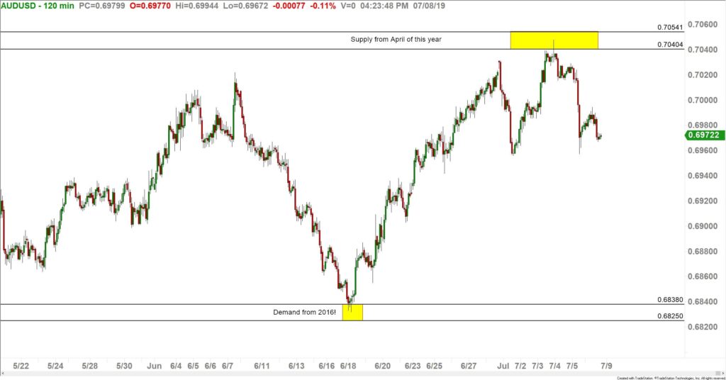
Now, using this same technique, look back at the above chart. Using the red line marked 2, you can see that the NZDUSD has a lower high-bearish!, while the AUDUSD has a higher high at the blue line marked 2-bullish! Again, since the red line often tells us what the blue line will do; if you were still long the AUDUSD (for over 120 pips so far) you could consider exiting that position. If you were looking for a short, the red line gave you a hint that it could work out. As of the time of this writing, that short would be up about 65 pips. These trade opportunities can be seen in the chart below.
A couple of extra tips:
- Nothing works every time! Always use a stop loss in case the smaller economy doesn’t lead on the next move.
- I only use this technique with similar currencies/economies. Just like I wouldn’t watch Nvidia (a semiconductor company) to help me trade wheat futures, I stick with the commodity currency economies to help with my decision process-the AUD, NZD, and CAD. The previous charts were only against the USD, yet similar comparisons can be done against other currencies-AUDJPY, NZDJPY, CADJPY, etc.
Rick Wright can be contacted on this link: Rick Wright