One of the more interesting and helpful tools we have as traders is to use the correlation of the dollar index ($DXY) with our US dollar currency pairs. However, since non USD currencies don’t have their own index, we’ll have to make one. Let’s dive in!
First of all, the dollar index is basically showing the strength or weakness of the US dollar vs. a basket of currencies. Kind of like the S&P 500 is used to measure the direction (strength or weakness) of the average stock, we can use the dollar index in the same way for US dollar currency pair trades. Currently, the dollar index is vs. the basket of: EUR, JPY, GBP, CAD, SEK, and the CHF. The weighting will vary slightly over time, but right now the EUR is approximately 57%, the Yen about 14%, and the Pound about 10%. Here is how it looks on a chart:

Fig 1
On this chart, I’ve marked in the high point on the dollar index going back to the beginning of the year, as well as the low so far this year. Notice how the USDJPY peaked within a few candles of the $DXY peak, and bottomed out in the exact same week. Because the USD is the base in the USDJPY currency pair, we expect the chart of the USDJPY and the $DXY to correlate pretty closely – a direct correlation. Now take a look at the EURUSD pair. The EURUSD bottomed out when the $DXY peaked, and the EURUSD peaked when the $DXY bottomed out. This is an inverse correlation, meaning it does the opposite.
For the sake of clarity on this chart, I did not mark in the supply and demand zones along the way to help us enter our trades, but the basic rules are as follows:
1. If USD is the BASE currency, look to buy when both $DXY and currency pair is in demand.
2. If USD is the QUOTE currency, look to buy the currency pair when it is in demand and the $DXY is in supply; look to sell the currency pair when it is in supply and the $DXY is in demand.
So, now that we know how to use the $DXY for USD pairs, what happens if we are trading something WITHOUT the USD in it? Like the EURJPY?
That is when making your “own” index can be helpful. Now, I’m talking about doing a bunch of math and software programming type stuff. All I’m talking about is comparing several currency pairs, with one currency being the same to deduce the strength or weakness of that one currency. The easiest example is the JPY, because it is always the quote currency. When doing this with something like the GBP, AUD, CAD, etc., you will have to understand the base vs. quote charts and what direction is strength vs. weakness.

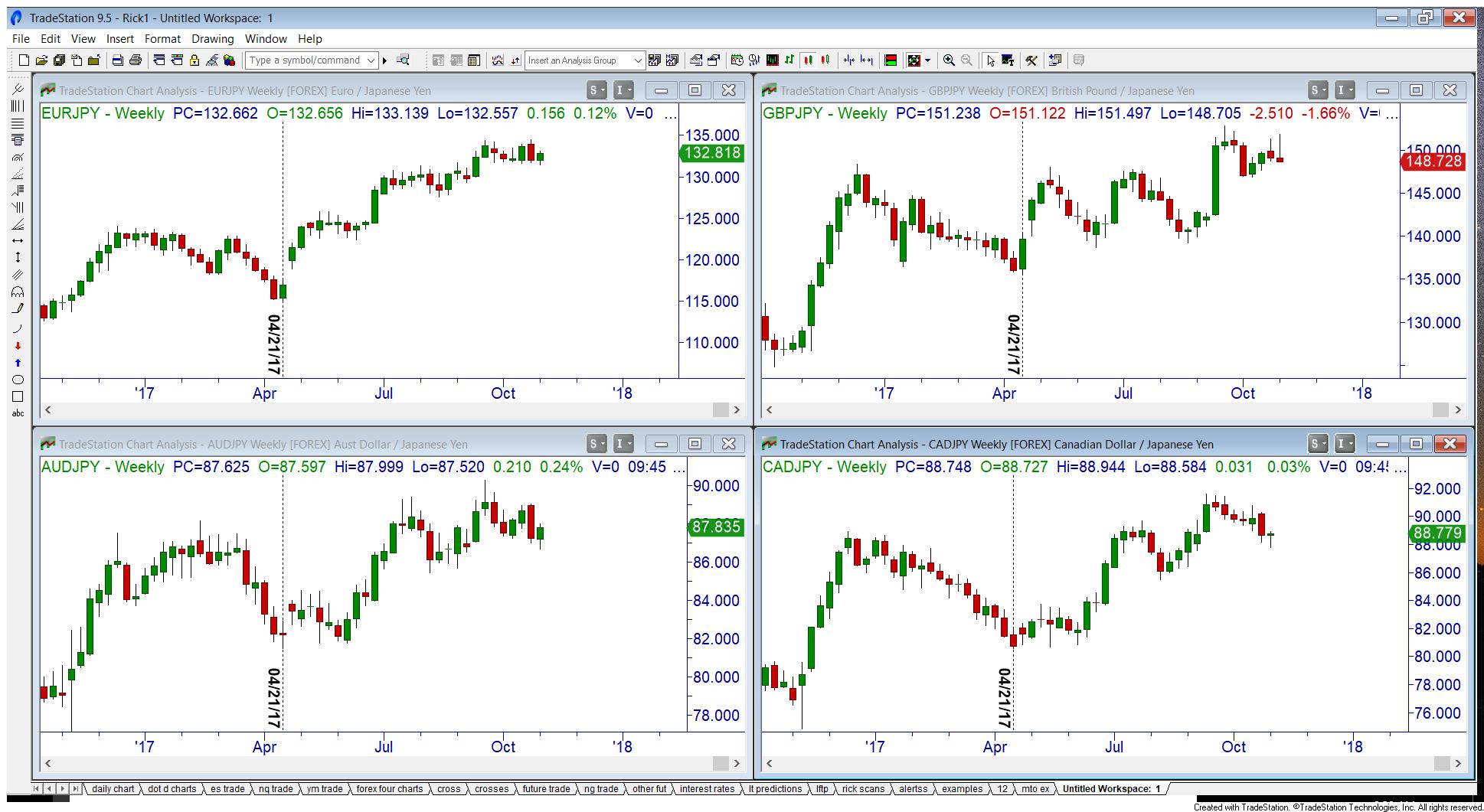
Fig 2
On this screenshot, I’ve inserted four different currency pairs, all with the JPY as the quote. Again, for clarity’s sake, I’ve only marked in the major low on each chart for 2017. As you can see, all four bottomed out in the same week! Please also notice how the major swing highs and lows have very strong correlations. This should be a big clue to us as traders that if all four pairs are in a demand zone, it might be a good time to look to buy; and if all four currency pairs are in supply, it might be a good time to look for a sell.
Before I wrap up, I must make an extremely important point. Notice above, all I said was “buy” and “sell”, not “long” or “short”!! That is because, in my humble opinion, just because you are in a good demand zone DOES NOT mean you automatically go long! (Or short in a good supply zone.) We believe that the trend is just as important as any zone you see. The point is this: in an uptrend we look to go long in a good demand zone. In a downtrend we look to go short in a good supply zone. In an uptrend, supply is used for profit targets; in a downtrend, demand is used for profit targets.
Rick Wright can be contacted on this link: Rick Wright
First of all, the dollar index is basically showing the strength or weakness of the US dollar vs. a basket of currencies. Kind of like the S&P 500 is used to measure the direction (strength or weakness) of the average stock, we can use the dollar index in the same way for US dollar currency pair trades. Currently, the dollar index is vs. the basket of: EUR, JPY, GBP, CAD, SEK, and the CHF. The weighting will vary slightly over time, but right now the EUR is approximately 57%, the Yen about 14%, and the Pound about 10%. Here is how it looks on a chart:

Fig 1
On this chart, I’ve marked in the high point on the dollar index going back to the beginning of the year, as well as the low so far this year. Notice how the USDJPY peaked within a few candles of the $DXY peak, and bottomed out in the exact same week. Because the USD is the base in the USDJPY currency pair, we expect the chart of the USDJPY and the $DXY to correlate pretty closely – a direct correlation. Now take a look at the EURUSD pair. The EURUSD bottomed out when the $DXY peaked, and the EURUSD peaked when the $DXY bottomed out. This is an inverse correlation, meaning it does the opposite.
For the sake of clarity on this chart, I did not mark in the supply and demand zones along the way to help us enter our trades, but the basic rules are as follows:
1. If USD is the BASE currency, look to buy when both $DXY and currency pair is in demand.
2. If USD is the QUOTE currency, look to buy the currency pair when it is in demand and the $DXY is in supply; look to sell the currency pair when it is in supply and the $DXY is in demand.
So, now that we know how to use the $DXY for USD pairs, what happens if we are trading something WITHOUT the USD in it? Like the EURJPY?
That is when making your “own” index can be helpful. Now, I’m talking about doing a bunch of math and software programming type stuff. All I’m talking about is comparing several currency pairs, with one currency being the same to deduce the strength or weakness of that one currency. The easiest example is the JPY, because it is always the quote currency. When doing this with something like the GBP, AUD, CAD, etc., you will have to understand the base vs. quote charts and what direction is strength vs. weakness.

Fig 2
On this screenshot, I’ve inserted four different currency pairs, all with the JPY as the quote. Again, for clarity’s sake, I’ve only marked in the major low on each chart for 2017. As you can see, all four bottomed out in the same week! Please also notice how the major swing highs and lows have very strong correlations. This should be a big clue to us as traders that if all four pairs are in a demand zone, it might be a good time to look to buy; and if all four currency pairs are in supply, it might be a good time to look for a sell.
Before I wrap up, I must make an extremely important point. Notice above, all I said was “buy” and “sell”, not “long” or “short”!! That is because, in my humble opinion, just because you are in a good demand zone DOES NOT mean you automatically go long! (Or short in a good supply zone.) We believe that the trend is just as important as any zone you see. The point is this: in an uptrend we look to go long in a good demand zone. In a downtrend we look to go short in a good supply zone. In an uptrend, supply is used for profit targets; in a downtrend, demand is used for profit targets.
Rick Wright can be contacted on this link: Rick Wright
Last edited by a moderator:
