Introduction
In his 1978 book “New Concepts in Technical Trading Systems” J. Welles Wilder Jr. presented several methods and trading techniques which became classic. In that book Mr., Wilder introduced one of the most widely used technical oscillators today: The Relative Strength Index (RSI for short). Nowadays all kinds of technical analysis software offer the RSI as a build-in oscillator.
This is an enhanced and extended version of my article "Dissecting the RSI" which first appeared in the Technical Analyst publication and later in the Hispatrading magazine.
The actual rsi formula
According to Welles Wilder, the RSI of k periods is defined as:

where AUC(k) is the (2k-1) exponential moving average of UC and ADC(k) is the (2k-1) exponential moving average of DC.
UC and DC are defined as follows:
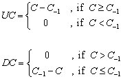
where, C and C-1 are the closing price of a price bar and the closing price of the previous bar respectably.
Tweaking the formulas for better comprehension
Let’s first rewrite the formulas of UC and DC in a more convenient way:
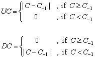
(Where |x| stands for the absolute value of x and it is always a non negative number). Since |x-y| measures the distance between two numbers x, y, it is obvious that UC is designed to track only the distance covered by the upward movements of the closing price while DC is designed to track only the distance covered by the downward movements of the closing price. It is also easy to see that in all cases:
From now on, the term “up-moves” will be used to refer to the values of UC and the term “down-moves” will be used to refer to the values of DC.
The initial formula of the RSI can be simplified as:
 Although smoothing is used, the RSI actually evaluates the percentage of up-moves relative to all moves. This can be shown more clearly if a simple smoothing method is used instead of exponential.
Exponential vs. simple smoothing
At first it seems that the main reason behind the use of exponential moving averages for smoothing the UC and DC by Mr. Wilder was the fact that back in seventies the computers were not as popular, cheap and powerful as today. When the original formulas of the exponential and simple smoothing techniques are applied, the exponential smoothing excels the simple smoothing in calculation time and requires no historical data keeping. On the other hand, this was perhaps not the only reason for the choice of the exponential smoothing versus the simple one for two reasons:
First, almost every system and technique presented in Mr. Wilder’s book was accompanied by a hand written work sheet (like the sheets of Microsoft Excel) containing historical prices so that the historical data keeping didn’t seem to bother.
Second, the simple smoothing method can be reformulated using elementary mathematics so that the number of required calculations for its determination does not differ much from the number of required calculations for the determination of the exponential smoothing.
As far as the essential difference between exponential smoothing and simple smoothing is concerned, a k-period simple smoothing assigns equal weights to all k-period recent data whereas the exponential smoothing applies a front weighting scheme to all historical data thus giving more weight to the recent data relative to the past.
The exponential smoothing is not so helpful for inspecting the RSI in visual terms for the first time so, for educational purpose a study for the simple smoothing case will be done first.
The simple smoothing case
Let’s use the 3-period simple moving average method for smoothing UC and DC. The simple moving average of 3 periods for today of the UC is:
and the simple moving average of 3 periods for today of the DC is:
where UC-n and DC-n are the values n bars ago of UC and DC respectively. Using elementary math it is clear that a Relative Strength Index of 3 periods using simple smoothing is:

The last formula clearly shows that the SimpleRSI actually measures the percentage of up-moves relative to all moves.
The use of the 3-period simple smoothing above was just for educational purposes and it does not alter the main idea behind the construction of the original RSI which is to separate the up-moves from down-moves and to express the percentage of the up-moves relative to all moves (up and down). In figure 1 you may visually comprehend what the SimpleRSI measures using a 7 period simple average smoothing.
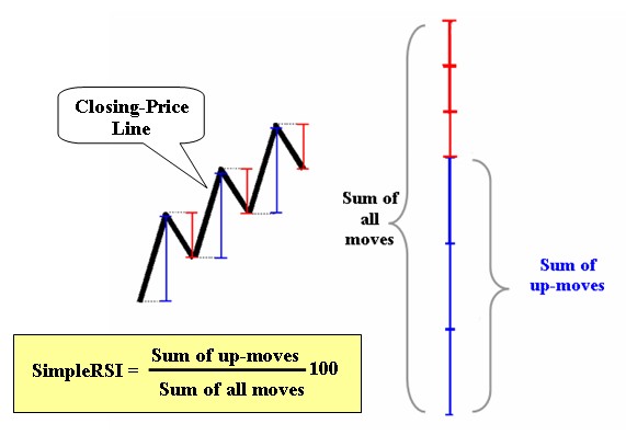
Fig 1
Visual comprehension of the original rsi
Let’s now go back to Wilder’s RSI which uses exponential smoothing. The exponential smoothing gives different weights in each price movement. The weights lie between 0 and 1 and vary gradually from the recent data to the past ones by a geometric progression so that the more recent a price move is, the more weight it is been given. From a visual point of view (and with out going into detailed math.) this is equivalent to contracting the segments of the closing price line in such a way that the recent segments are contracted less than the past ones. The Wilder’s RSI then expresses the percentage of the up-moves relative to all moves (much like the simpleRSI above) using the contracted segments instead of the actual segments. In figure 2 you may visually comprehend what the RSI measures.
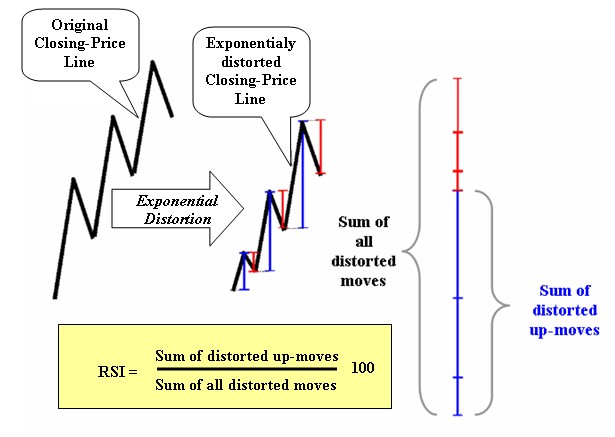
Fig 2
The “meat”
Very high value of the RSI means that recently the percentage of the distance covered by the closing price during its up-moves in relation to all its moves is very high. Simply stated, the closing price moved upward with very few and weak downward corrections or there were past downward corrections but the most resent upward movements were much more powerful.
On the other, very low value of the RSI means that recently the percentage of the distance covered by the closing price during its down-moves in relation to all its moves is very high. In other words, the closing price moved downward with very few and weak upward corrections or there were past upward corrections but the most resent downward movements were much more powerful.
The term “recent” is of course relative to (and depends on) the period of the RSI used.
Moreover, the more time consuming and severe the corrections of a bullish trend are, the lower the percentage of the up-moves relative to all moves is and the less high the RSI is. And of course, the more time consuming and stronger the corrections of a bearish trend are, the higher the percentage of the up-moves relative to all moves is and the less low the RSI is.
In short,
When CP is the value of the closing price of a bar, the value of the RSI for that bar depends on the path the daily closing price traced to reach CP with respect to corrections with more weight given to the recent price movement.
Pictorial examples
Let's see a comparison of the expected RSI values in nine pictorial cases. A careful study of these cases helps understand how the RSI evaluates the price movements. In figure 3 there are nine cases (cases A through H and case I) of pictorial price formations. Each formation represents six closing price movements (black line segments) based on seven closing prices (cyan and red dots). In all cases, the red dot is the last closing price of the formation. We will try to compare the expected values of the RSI (using exponential smoothing) based on the closing prices in each case.
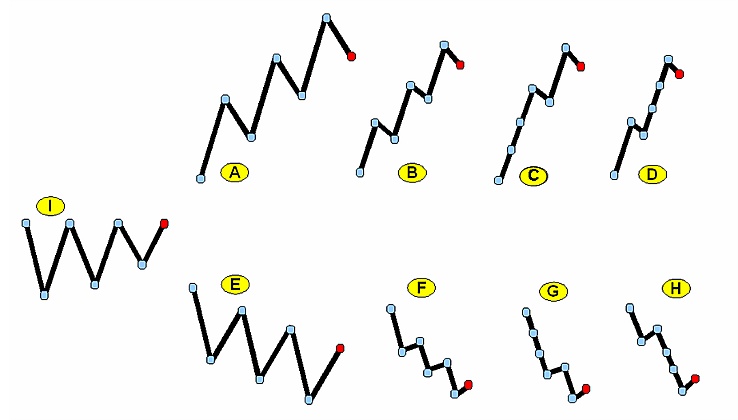
Fig 3
Starting with formation I, we expect the value of the RSI at the red dot to be slightly above 50. This is due to the fact that though the up-moves and the down-moves are equal in number and magnitude, the RSI distorts the price exponentially so that the recent moves are given more weight than the old moves and the last move is up in formation I.
Moving on to formation A we expect the value of the RSI to be above 50 but not too much since this is a formation where there is a pronounced up trend with significant corrections and the last price movement is downward.
Continuing with formation B we expect the value of the RSI to be well above 50 and greater than the value of the RSI of formation A since formation B exhibits strong up trend with small corrections.
The case of formation C undoubtedly shows a very strong up trend. The absent of many corrections in formation C indicates that the expected value of the RSI in the red dot is above the expected value of the RSI for the formation B.
Finally, in formation D we expect a value of the RSI higher than the one in the case of formation C because there are no downward corrections close to the red dot. Though the price distance covered by formation D seems to be lesser than the distance covered by formation C, the fact that we deal with an RSI employing exponential smoothing induces that the position of the downward corrections in the formations plays an important role. In formation D there is no correction near the two last dots contrary to the formation C where there is a correction near the last two dots.
The formations E through H can now be easily studied under the above rationale. One thing that must be mentioned is that all these cases are completely pictorial and serve comprehension purposes. The reported expected values of the RSI for each case are not rigid but depend upon observation since the goal of this article is to provide a visual clue of the mechanism of the RSI and to compare cases.
Overbought/oversold
Based on the analysis above, the motive behind the categorization of the RSI as an overbought/oversold indicator is obvious. A situation where there are forceful directional price movements accompanied by few (if any) and weak corrections is what creates a tensed situation and pushes the RSI to its extremes. Since the prices of all trading vehicles are moving in zigzags, such a tensed situation is often interpreted as a forewarning of a countertrend appeasement and that is why extreme values of the RSI are commonly interpreted as a countertrend signal.
How "relative" is the rsi?
The term "Relative Strength Index" for the Winder's RSI is now broadly considered a misnomer since, traditionally, the term "relative strength" is used when comparing the percent (or absolute) performance of a tradable to the percent (or absolute) performance of some other tradable or the whole market. But the RSI too indicates relativity in the same sense the relative frequencies indicate relativity in descriptive statistics.
Consider two groups of animals. Group A consists of 3 bulls and 1 bear. Group B consists of 1 bull and 3 bears. The relative frequency of bulls in group A is 75% and the relative frequency of bulls in group B is 25%. If bulls represent the up-moves of a price and bears represent the down-moves of the price then the RSI resembles the relative frequencies of bulls in these groups.
So, while the traditional relative strength deals with the comparative performance between different tradables, the RSI deals with the comparative performance between the up and down moves of the same tradable. In effect, both the traditional relative strength and the RSI show relativity but the former expresses "outer" relativity whereas the latter expresses "inner" relativity.
Moreover, the traditional relative strength cares only about the gains/losses of the tradables whereas the RSI cares about the way these gains/losses were attained. In figure 4 you can see two pictorial examples of closing price evolution starting at the same point A at time t1. If the traditional relative strength and the RSI evaluate the bullishness of the two lines for the time span between t1 and t2 then the traditional relative strength would indicate that the blue line is more bullish than the red simply because it has gone higher. The RSI on the other hand would indicate that the red line is more bullish (and overbought) than the blue because the red has only up-moves and no down-moves.
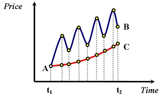
Fig 4
A real example
Let’s take a look now at a real chart to make our discussion more practical. In figure 5 the daily line chart of ADCT (ADC TELECOMMUN NE) is shown. Below the price line there is a sub chart with Wilder’s RSI(14) plotted. (the 14-period RSI is the most commonly used by technical analysts.)
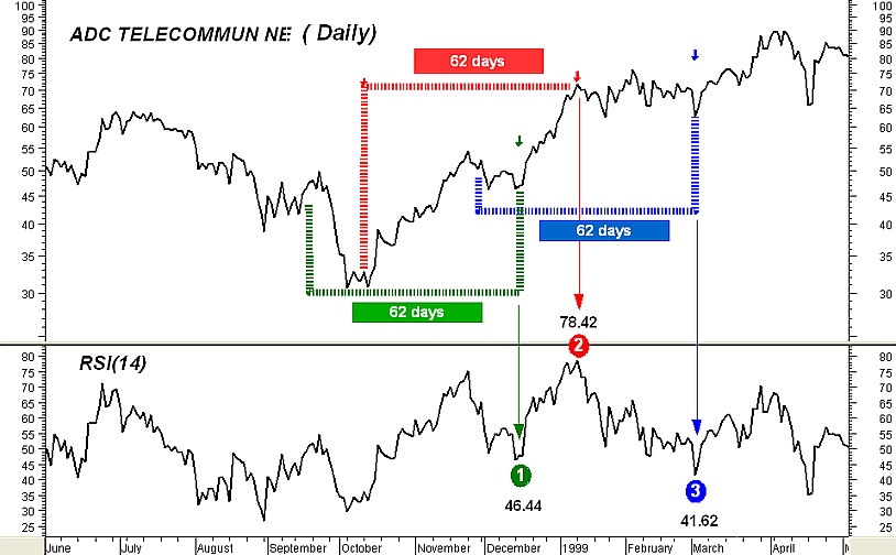
Fig 5
Notwithstanding that the actual formula of the RSI uses exponential smoothing (which means that all past values are taken into account), very old RSI values take extremely low weights and they do not contribute much to the very recent RSI values so, the period of the RSI defines a moving window of fixed time length used for feeding the formula of the RSI with the inputs. As a simple rule, of the value of an n-period exponential average of an indicator depends upon the past

values of that indicator (where [x] stands for the integral part of x). For example, 99% of the value of a 27-period exponential average of an indicator depends upon the past 62 values of that indicator.
With this in mind, we will take a look at three values of the RSI(14) in our example in conjunction with the price plot contained in a 62-day window (Note that the Wilder’s 14-period RSI actually uses 27-period exponential smoothing).
The point 1 in the plot of the RSI(14) is at the 46.44 level. The 46.44 value is determined by 99% from the 62 daily closing prices encompassed by the green brackets but with more weight given to the prices in the right hand of the brackets. The point 2 is at the 78.42 level. The 78.42 value is determined by 99% from the 62 daily closing prices encompassed by the red brackets but with more weight given to the prices lied in the right hand of the brackets. Finally, the point 3 is at the 41.62 level and the 41.62 value is determined by 99% from the 62 daily closing prices encompassed by the blue brackets but with more weight given to the prices in the right hand of the brackets.
It is clear that the price movement encompassed by the red brackets has more “bullish” characteristics than the price movement encompassed by the green brackets as well as the price movement encompassed by the blue brackets. Also, the reason why point 3 is lower than point 1 is that the Wilder’s RSI uses exponential smoothing thus giving more weight to the recent price moves. In effect, though the price decline in the left hand of the green bracket is severe it does not contribute much to the RSI value at point 1. On the opposite, the almost flat oscillating price behavior at the right of the blue brackets was enough to drop the RSI value of point 3 at 41.62.
Interpreting an rsi feature
Since we now know how the values of the RSI are constructed and what they represent, we are able to interpret specific movements of the RSI in conjunction with the corresponding movement of the price and give a logical explanation for them. As an example we will study a case where the RSI moves in one direction whereas the price consolidates, fails to move in the same direction and seems like “fighting” the movement of the oscillator all the way. This is maybe the most embarrassing situation for many technical analysts as it is something that they cannot understand or feel why this happens.
Figure 6 shows the daily chart of the ADCT again along with the subchart of the Wilder’s RSI(14). We will explain the transition of the RSI(14) from point 2 to point 3 so another point (point 4) is added between points 2 and 3. The value of point 4 is based by 99% upon the 62 price data prior to it which are covered by the magenta curve. The red and blue curves determine 62-days price movements too. Points A and B of the price plot correspond to points 2 and 3 respectively.
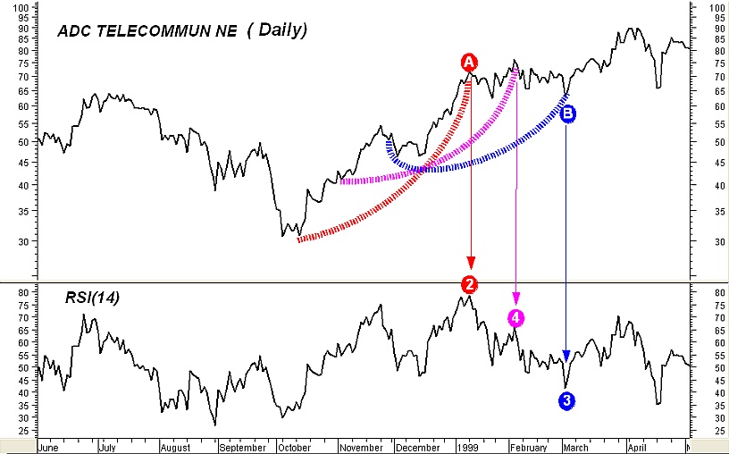
Fig 6
Notice that as the price data from point A to point B unfold, the 62-day time span curves cover less and less bullish price movements. The magenta curve encompasses less bullish price movements than the red curve and more bullish price movements than the blue curve. The terminology “bullish price movements” means either large up-moves accompanied by small down-moves or too many small up-moves and almost absent down-moves. This transition from a strong bullish situation to a lesser bullish is what makes the RSI drop from the high level of point 2 to the level of point 3. What did the RSI indicate by a choppy fall from point 2 to point 3 accompanied by a price consolidation in our example? It indicated that some kind of continuation pattern may be forming between points A and B.
One of course can say: “this is obvious!. The price plot itself shows a horizontal movement between points A and B”. Well, yes this is true but the RSI gave us a way of quantifying the magnitude of the correction of the previous bullish trend. Quantification is what gives the technical trader the opportunity to thoroughly compare situations and plan rigid strategies. In our example the fact that point 3 is at 41.62 level gives us the opportunity to compare this situation to other similar situations and provides us with hints of what to expect. Usually, medium-term bullish continuation patterns are accompanied by RSI values no less than approximately 40 as this indicates that the downward price movements inside the patterns are not overwhelmingly stronger than the upward ones.
Failed top divergences
Figure 6 helps explain why many top divergences between the RSI and the price fail to reverse the trend especially when the consecutive tops of the RSI are far apart. If you look at points 2 and 4 in the RSI graph and then look at the corresponding tops in the price you will notice a classic top divergence which failed to reverse the previous uptrend.
With respect to divergences, traders who extensively use them in simple momentum or trend oscillators (like ROC and MACD) can take a look at my December 2003 article "Divergence Bias" in the Stocks & Commodities magazine where I discuss the inherent differences between the additive and fractional types of such indicators.
The "bow" parallelism
As a way to remember the behavior of the RSI we just explored and its possible consequences it is convenient to parallel the visual perception of the RSI to the effects of straining a bow. Imagine the RSI movement from points 2 to 3 in figure 6 as straining an upwards heading bow. When the appropriate strain and time is given, the arrow (price) will be launched in the desired direction; but, when the strain exits some length or time limits the bow may… break and the arrow will fall. The cyan eclipses in figure 7 give an example of a “bow break”. Simply stated, the “bow break” is the manifestation of a sideways formation which fails to continue the previous uptrend.
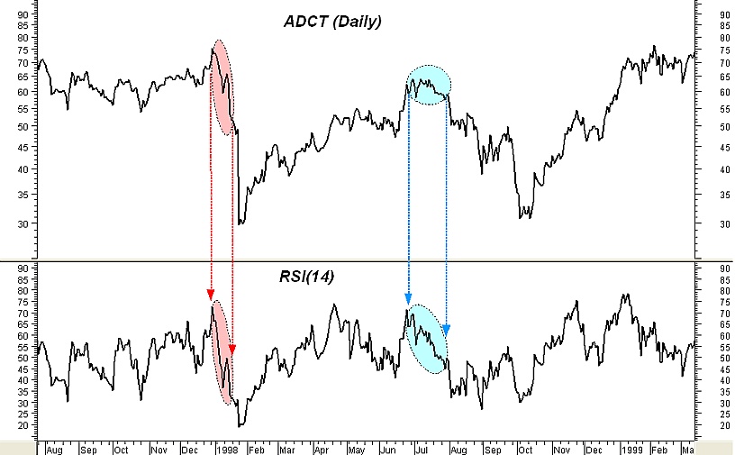
Fig 7
Ascending wedges and upward sloping rectangles
How about the rare divergence case where the RSI drops swiftly from very high levels whereas the price keeps moving upward in a choppy fashion? This is related to ascending wedges or upward-sloping rectangle formations after a strong uptrend and so it is prone to stall the previous rapid trend or reverse it rather than continue it. This is especially true if the divergence is short, takes place after a prolonged bullish trend and the RSI fall during the pattern is steep and starts from very high values.
As an example, in figure 8 the daily chart of Alcoa Inc is shown along with a sub chart of RSI(14). The cyan filled rectangles show a type of such divergence where the RSI(14) declines but the price keeps moving upwards in a somehow oscillating fashion. Andrew Cardwell's disciples may recognize that this type of divergence is usually accompanied by a group of short term repeated positive reversals which at some point fail to meet their targets thus showing market weakness. For comparison purposes, the red filled rectangles show the case where the price consolidates while the RSI(14) declines from a high level.
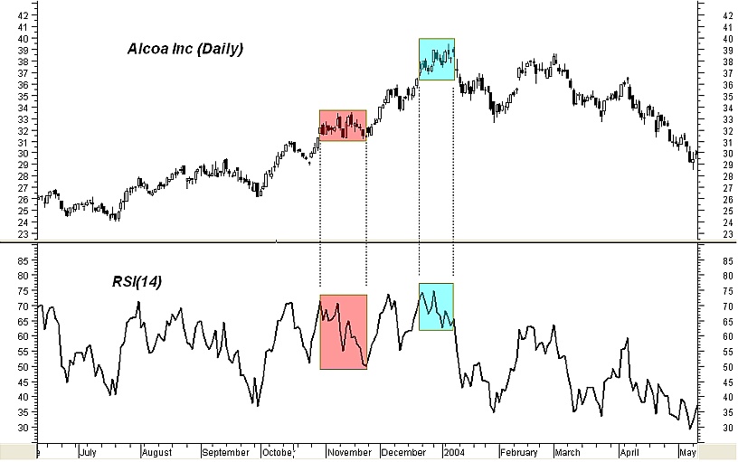
Fig 8
When rsi and price turn together
Not all cases where the RSI drops from high levels indicate that a continuation pattern or an ascending wedge is forming. Such drop may occur during the initial phase of a downtrend as shown in the red eclipses of figure 7. In a case like this, the fall of the RSI will be stronger and straighter than the choppy one appeared in the example of figure 4 and it will also be accompanied by a significant price decline. Such severe decline in both the RSI and the price is indicative of very weak market with slack (if any) upward retracements especially if the RSI falls well below the 40 level.
Review and completions
The RSI movements we studied showed a relation between RSI and price formations. In the example presented in figure 6 we connected the consolidation of the price accompanied by a choppy fall of the RSI from a high level to the bullish continuation price formations thus explaining the fact that this behavior of the RSI is interpreted by some technical analysts as a continuation of the bullish trend.
As an educational (and valuable) exercise you can study and explain how the RSI behaves in bearish price trends using the information given here. As an additional exercise, try to understand why the 30/70 levels are not the best global oversold/overbought thresholds to use with the RSI (a fact first discovered and taught by Andrew Cardwell).
Epiloue
The aim of the present article was to not only relate the RSI with price formations but also show that the oscillator's analysis in general is not totally independent from price formation analysis and that when the formula of an oscillator is studied in detail using visual aid many “weird” habits of the oscillator may revealed and demystified. This doesn't mean that oscillators are of no value. On the contrary, they complement chart analysis by providing quantification of price formations and giving the technical trader the opportunity to thoroughly compare situations and plan rigid strategies. As an example, take a look at the classic illusion example shown in figure 9. Even though the blue line segment is shorter than the red and the red is shorter than the green, they appear as if they are of equal length when put in the appropriate illusionary context. While our eyes are fooled, an indicator which would measure the lengths of the colored line segments would tell the truth.
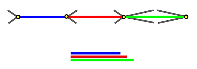
Fig 9
Giorgos Siligardos Can be contacted by email at Giorgos Siligardos
In his 1978 book “New Concepts in Technical Trading Systems” J. Welles Wilder Jr. presented several methods and trading techniques which became classic. In that book Mr., Wilder introduced one of the most widely used technical oscillators today: The Relative Strength Index (RSI for short). Nowadays all kinds of technical analysis software offer the RSI as a build-in oscillator.
This is an enhanced and extended version of my article "Dissecting the RSI" which first appeared in the Technical Analyst publication and later in the Hispatrading magazine.
The actual rsi formula
According to Welles Wilder, the RSI of k periods is defined as:

where AUC(k) is the (2k-1) exponential moving average of UC and ADC(k) is the (2k-1) exponential moving average of DC.
UC and DC are defined as follows:

where, C and C-1 are the closing price of a price bar and the closing price of the previous bar respectably.
Tweaking the formulas for better comprehension
Let’s first rewrite the formulas of UC and DC in a more convenient way:

(Where |x| stands for the absolute value of x and it is always a non negative number). Since |x-y| measures the distance between two numbers x, y, it is obvious that UC is designed to track only the distance covered by the upward movements of the closing price while DC is designed to track only the distance covered by the downward movements of the closing price. It is also easy to see that in all cases:
UC+DC = |C – C-1|.
From now on, the term “up-moves” will be used to refer to the values of UC and the term “down-moves” will be used to refer to the values of DC.
The initial formula of the RSI can be simplified as:

Exponential vs. simple smoothing
At first it seems that the main reason behind the use of exponential moving averages for smoothing the UC and DC by Mr. Wilder was the fact that back in seventies the computers were not as popular, cheap and powerful as today. When the original formulas of the exponential and simple smoothing techniques are applied, the exponential smoothing excels the simple smoothing in calculation time and requires no historical data keeping. On the other hand, this was perhaps not the only reason for the choice of the exponential smoothing versus the simple one for two reasons:
First, almost every system and technique presented in Mr. Wilder’s book was accompanied by a hand written work sheet (like the sheets of Microsoft Excel) containing historical prices so that the historical data keeping didn’t seem to bother.
Second, the simple smoothing method can be reformulated using elementary mathematics so that the number of required calculations for its determination does not differ much from the number of required calculations for the determination of the exponential smoothing.
As far as the essential difference between exponential smoothing and simple smoothing is concerned, a k-period simple smoothing assigns equal weights to all k-period recent data whereas the exponential smoothing applies a front weighting scheme to all historical data thus giving more weight to the recent data relative to the past.
The exponential smoothing is not so helpful for inspecting the RSI in visual terms for the first time so, for educational purpose a study for the simple smoothing case will be done first.
The simple smoothing case
Let’s use the 3-period simple moving average method for smoothing UC and DC. The simple moving average of 3 periods for today of the UC is:
SimpleUC(3)=(UC-2 +UC-1+UC0)/3
and the simple moving average of 3 periods for today of the DC is:
SimpleDC(3)=(DC-2 +DC-1+DC0)/3
where UC-n and DC-n are the values n bars ago of UC and DC respectively. Using elementary math it is clear that a Relative Strength Index of 3 periods using simple smoothing is:

The last formula clearly shows that the SimpleRSI actually measures the percentage of up-moves relative to all moves.
The use of the 3-period simple smoothing above was just for educational purposes and it does not alter the main idea behind the construction of the original RSI which is to separate the up-moves from down-moves and to express the percentage of the up-moves relative to all moves (up and down). In figure 1 you may visually comprehend what the SimpleRSI measures using a 7 period simple average smoothing.

Fig 1
Visual comprehension of the original rsi
Let’s now go back to Wilder’s RSI which uses exponential smoothing. The exponential smoothing gives different weights in each price movement. The weights lie between 0 and 1 and vary gradually from the recent data to the past ones by a geometric progression so that the more recent a price move is, the more weight it is been given. From a visual point of view (and with out going into detailed math.) this is equivalent to contracting the segments of the closing price line in such a way that the recent segments are contracted less than the past ones. The Wilder’s RSI then expresses the percentage of the up-moves relative to all moves (much like the simpleRSI above) using the contracted segments instead of the actual segments. In figure 2 you may visually comprehend what the RSI measures.

Fig 2
The “meat”
Very high value of the RSI means that recently the percentage of the distance covered by the closing price during its up-moves in relation to all its moves is very high. Simply stated, the closing price moved upward with very few and weak downward corrections or there were past downward corrections but the most resent upward movements were much more powerful.
On the other, very low value of the RSI means that recently the percentage of the distance covered by the closing price during its down-moves in relation to all its moves is very high. In other words, the closing price moved downward with very few and weak upward corrections or there were past upward corrections but the most resent downward movements were much more powerful.
The term “recent” is of course relative to (and depends on) the period of the RSI used.
Moreover, the more time consuming and severe the corrections of a bullish trend are, the lower the percentage of the up-moves relative to all moves is and the less high the RSI is. And of course, the more time consuming and stronger the corrections of a bearish trend are, the higher the percentage of the up-moves relative to all moves is and the less low the RSI is.
In short,
When CP is the value of the closing price of a bar, the value of the RSI for that bar depends on the path the daily closing price traced to reach CP with respect to corrections with more weight given to the recent price movement.
Pictorial examples
Let's see a comparison of the expected RSI values in nine pictorial cases. A careful study of these cases helps understand how the RSI evaluates the price movements. In figure 3 there are nine cases (cases A through H and case I) of pictorial price formations. Each formation represents six closing price movements (black line segments) based on seven closing prices (cyan and red dots). In all cases, the red dot is the last closing price of the formation. We will try to compare the expected values of the RSI (using exponential smoothing) based on the closing prices in each case.

Fig 3
Starting with formation I, we expect the value of the RSI at the red dot to be slightly above 50. This is due to the fact that though the up-moves and the down-moves are equal in number and magnitude, the RSI distorts the price exponentially so that the recent moves are given more weight than the old moves and the last move is up in formation I.
Moving on to formation A we expect the value of the RSI to be above 50 but not too much since this is a formation where there is a pronounced up trend with significant corrections and the last price movement is downward.
Continuing with formation B we expect the value of the RSI to be well above 50 and greater than the value of the RSI of formation A since formation B exhibits strong up trend with small corrections.
The case of formation C undoubtedly shows a very strong up trend. The absent of many corrections in formation C indicates that the expected value of the RSI in the red dot is above the expected value of the RSI for the formation B.
Finally, in formation D we expect a value of the RSI higher than the one in the case of formation C because there are no downward corrections close to the red dot. Though the price distance covered by formation D seems to be lesser than the distance covered by formation C, the fact that we deal with an RSI employing exponential smoothing induces that the position of the downward corrections in the formations plays an important role. In formation D there is no correction near the two last dots contrary to the formation C where there is a correction near the last two dots.
The formations E through H can now be easily studied under the above rationale. One thing that must be mentioned is that all these cases are completely pictorial and serve comprehension purposes. The reported expected values of the RSI for each case are not rigid but depend upon observation since the goal of this article is to provide a visual clue of the mechanism of the RSI and to compare cases.
Overbought/oversold
Based on the analysis above, the motive behind the categorization of the RSI as an overbought/oversold indicator is obvious. A situation where there are forceful directional price movements accompanied by few (if any) and weak corrections is what creates a tensed situation and pushes the RSI to its extremes. Since the prices of all trading vehicles are moving in zigzags, such a tensed situation is often interpreted as a forewarning of a countertrend appeasement and that is why extreme values of the RSI are commonly interpreted as a countertrend signal.
How "relative" is the rsi?
The term "Relative Strength Index" for the Winder's RSI is now broadly considered a misnomer since, traditionally, the term "relative strength" is used when comparing the percent (or absolute) performance of a tradable to the percent (or absolute) performance of some other tradable or the whole market. But the RSI too indicates relativity in the same sense the relative frequencies indicate relativity in descriptive statistics.
Consider two groups of animals. Group A consists of 3 bulls and 1 bear. Group B consists of 1 bull and 3 bears. The relative frequency of bulls in group A is 75% and the relative frequency of bulls in group B is 25%. If bulls represent the up-moves of a price and bears represent the down-moves of the price then the RSI resembles the relative frequencies of bulls in these groups.
So, while the traditional relative strength deals with the comparative performance between different tradables, the RSI deals with the comparative performance between the up and down moves of the same tradable. In effect, both the traditional relative strength and the RSI show relativity but the former expresses "outer" relativity whereas the latter expresses "inner" relativity.
Moreover, the traditional relative strength cares only about the gains/losses of the tradables whereas the RSI cares about the way these gains/losses were attained. In figure 4 you can see two pictorial examples of closing price evolution starting at the same point A at time t1. If the traditional relative strength and the RSI evaluate the bullishness of the two lines for the time span between t1 and t2 then the traditional relative strength would indicate that the blue line is more bullish than the red simply because it has gone higher. The RSI on the other hand would indicate that the red line is more bullish (and overbought) than the blue because the red has only up-moves and no down-moves.

Fig 4
A real example
Let’s take a look now at a real chart to make our discussion more practical. In figure 5 the daily line chart of ADCT (ADC TELECOMMUN NE) is shown. Below the price line there is a sub chart with Wilder’s RSI(14) plotted. (the 14-period RSI is the most commonly used by technical analysts.)

Fig 5
Notwithstanding that the actual formula of the RSI uses exponential smoothing (which means that all past values are taken into account), very old RSI values take extremely low weights and they do not contribute much to the very recent RSI values so, the period of the RSI defines a moving window of fixed time length used for feeding the formula of the RSI with the inputs. As a simple rule, of the value of an n-period exponential average of an indicator depends upon the past

values of that indicator (where [x] stands for the integral part of x). For example, 99% of the value of a 27-period exponential average of an indicator depends upon the past 62 values of that indicator.
With this in mind, we will take a look at three values of the RSI(14) in our example in conjunction with the price plot contained in a 62-day window (Note that the Wilder’s 14-period RSI actually uses 27-period exponential smoothing).
The point 1 in the plot of the RSI(14) is at the 46.44 level. The 46.44 value is determined by 99% from the 62 daily closing prices encompassed by the green brackets but with more weight given to the prices in the right hand of the brackets. The point 2 is at the 78.42 level. The 78.42 value is determined by 99% from the 62 daily closing prices encompassed by the red brackets but with more weight given to the prices lied in the right hand of the brackets. Finally, the point 3 is at the 41.62 level and the 41.62 value is determined by 99% from the 62 daily closing prices encompassed by the blue brackets but with more weight given to the prices in the right hand of the brackets.
It is clear that the price movement encompassed by the red brackets has more “bullish” characteristics than the price movement encompassed by the green brackets as well as the price movement encompassed by the blue brackets. Also, the reason why point 3 is lower than point 1 is that the Wilder’s RSI uses exponential smoothing thus giving more weight to the recent price moves. In effect, though the price decline in the left hand of the green bracket is severe it does not contribute much to the RSI value at point 1. On the opposite, the almost flat oscillating price behavior at the right of the blue brackets was enough to drop the RSI value of point 3 at 41.62.
Interpreting an rsi feature
Since we now know how the values of the RSI are constructed and what they represent, we are able to interpret specific movements of the RSI in conjunction with the corresponding movement of the price and give a logical explanation for them. As an example we will study a case where the RSI moves in one direction whereas the price consolidates, fails to move in the same direction and seems like “fighting” the movement of the oscillator all the way. This is maybe the most embarrassing situation for many technical analysts as it is something that they cannot understand or feel why this happens.
Figure 6 shows the daily chart of the ADCT again along with the subchart of the Wilder’s RSI(14). We will explain the transition of the RSI(14) from point 2 to point 3 so another point (point 4) is added between points 2 and 3. The value of point 4 is based by 99% upon the 62 price data prior to it which are covered by the magenta curve. The red and blue curves determine 62-days price movements too. Points A and B of the price plot correspond to points 2 and 3 respectively.

Fig 6
Notice that as the price data from point A to point B unfold, the 62-day time span curves cover less and less bullish price movements. The magenta curve encompasses less bullish price movements than the red curve and more bullish price movements than the blue curve. The terminology “bullish price movements” means either large up-moves accompanied by small down-moves or too many small up-moves and almost absent down-moves. This transition from a strong bullish situation to a lesser bullish is what makes the RSI drop from the high level of point 2 to the level of point 3. What did the RSI indicate by a choppy fall from point 2 to point 3 accompanied by a price consolidation in our example? It indicated that some kind of continuation pattern may be forming between points A and B.
One of course can say: “this is obvious!. The price plot itself shows a horizontal movement between points A and B”. Well, yes this is true but the RSI gave us a way of quantifying the magnitude of the correction of the previous bullish trend. Quantification is what gives the technical trader the opportunity to thoroughly compare situations and plan rigid strategies. In our example the fact that point 3 is at 41.62 level gives us the opportunity to compare this situation to other similar situations and provides us with hints of what to expect. Usually, medium-term bullish continuation patterns are accompanied by RSI values no less than approximately 40 as this indicates that the downward price movements inside the patterns are not overwhelmingly stronger than the upward ones.
Failed top divergences
Figure 6 helps explain why many top divergences between the RSI and the price fail to reverse the trend especially when the consecutive tops of the RSI are far apart. If you look at points 2 and 4 in the RSI graph and then look at the corresponding tops in the price you will notice a classic top divergence which failed to reverse the previous uptrend.
With respect to divergences, traders who extensively use them in simple momentum or trend oscillators (like ROC and MACD) can take a look at my December 2003 article "Divergence Bias" in the Stocks & Commodities magazine where I discuss the inherent differences between the additive and fractional types of such indicators.
The "bow" parallelism
As a way to remember the behavior of the RSI we just explored and its possible consequences it is convenient to parallel the visual perception of the RSI to the effects of straining a bow. Imagine the RSI movement from points 2 to 3 in figure 6 as straining an upwards heading bow. When the appropriate strain and time is given, the arrow (price) will be launched in the desired direction; but, when the strain exits some length or time limits the bow may… break and the arrow will fall. The cyan eclipses in figure 7 give an example of a “bow break”. Simply stated, the “bow break” is the manifestation of a sideways formation which fails to continue the previous uptrend.

Fig 7
Ascending wedges and upward sloping rectangles
How about the rare divergence case where the RSI drops swiftly from very high levels whereas the price keeps moving upward in a choppy fashion? This is related to ascending wedges or upward-sloping rectangle formations after a strong uptrend and so it is prone to stall the previous rapid trend or reverse it rather than continue it. This is especially true if the divergence is short, takes place after a prolonged bullish trend and the RSI fall during the pattern is steep and starts from very high values.
As an example, in figure 8 the daily chart of Alcoa Inc is shown along with a sub chart of RSI(14). The cyan filled rectangles show a type of such divergence where the RSI(14) declines but the price keeps moving upwards in a somehow oscillating fashion. Andrew Cardwell's disciples may recognize that this type of divergence is usually accompanied by a group of short term repeated positive reversals which at some point fail to meet their targets thus showing market weakness. For comparison purposes, the red filled rectangles show the case where the price consolidates while the RSI(14) declines from a high level.

Fig 8
When rsi and price turn together
Not all cases where the RSI drops from high levels indicate that a continuation pattern or an ascending wedge is forming. Such drop may occur during the initial phase of a downtrend as shown in the red eclipses of figure 7. In a case like this, the fall of the RSI will be stronger and straighter than the choppy one appeared in the example of figure 4 and it will also be accompanied by a significant price decline. Such severe decline in both the RSI and the price is indicative of very weak market with slack (if any) upward retracements especially if the RSI falls well below the 40 level.
Review and completions
The RSI movements we studied showed a relation between RSI and price formations. In the example presented in figure 6 we connected the consolidation of the price accompanied by a choppy fall of the RSI from a high level to the bullish continuation price formations thus explaining the fact that this behavior of the RSI is interpreted by some technical analysts as a continuation of the bullish trend.
As an educational (and valuable) exercise you can study and explain how the RSI behaves in bearish price trends using the information given here. As an additional exercise, try to understand why the 30/70 levels are not the best global oversold/overbought thresholds to use with the RSI (a fact first discovered and taught by Andrew Cardwell).
Epiloue
The aim of the present article was to not only relate the RSI with price formations but also show that the oscillator's analysis in general is not totally independent from price formation analysis and that when the formula of an oscillator is studied in detail using visual aid many “weird” habits of the oscillator may revealed and demystified. This doesn't mean that oscillators are of no value. On the contrary, they complement chart analysis by providing quantification of price formations and giving the technical trader the opportunity to thoroughly compare situations and plan rigid strategies. As an example, take a look at the classic illusion example shown in figure 9. Even though the blue line segment is shorter than the red and the red is shorter than the green, they appear as if they are of equal length when put in the appropriate illusionary context. While our eyes are fooled, an indicator which would measure the lengths of the colored line segments would tell the truth.

Fig 9
Giorgos Siligardos Can be contacted by email at Giorgos Siligardos
Last edited by a moderator:
