diogenes13
Newbie
- Messages
- 3
- Likes
- 2
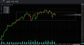
as of this posting the attached image is a current 4 hour candle chart of the ES ... i have marked out on the chart the 1. Preliminary Supply 2. Buying Climax 3. Automatic Reaction 4. Secondary Test . it appears as though the bars as it breaks through the top of the trading range that it is an UTAD or an upthrust after distribution ... the UTAD is far above the distribution channel. i have used the extremes of the buying climax and the automatic reaction as anchor points for the top and bottom of the distribution ranges which seems to extreme. the range doesnt seem to have a SOW after the secondary test and because i expect the market to continue upwards for "insert your reason" how would i be able to tell that this distribution range has become an accumulation range?
also in terms of Wyckoff or not, how do you deal with Ranges inside Ranges ... i can find a near unlimited number of them and with them all marked out at this range the chart becomes far too cluttered with over half a dozen support and resistance lines inside the main range. any suggestions on what can be ignored?
also in terms of Wyckoff or not, how do you deal with Ranges inside Ranges ... i can find a near unlimited number of them and with them all marked out at this range the chart becomes far too cluttered with over half a dozen support and resistance lines inside the main range. any suggestions on what can be ignored?