There may be an unlimited number of approaches to the markets and their usefulness may be both obvious and questionable. As mass psychology is a basic engine which drives markets forward, so the analysis is derived from market psychology and as such it may seem more attractive than it actually is. On the other hand sound analytical methods do not get significant attention at times, as they are effective but not necessarily "promising" and give traders the truth, which sometimes may be hard to accept.
In the March 2005 edition of "Futures" magazine the ODI (Option Deviation Index) was presented, which takes measure of market fluctuations based on the entry point (Fig.1). The result is calculated as a percentage of entry value divided into negative, positive and closing series. Based on this assumption we can create various time models showing statistical dispersion of the index readings.
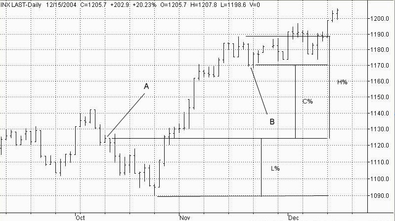
In the previously described example we used the ODI concept in calculating the Total Periodical Deviation (TPD) obtained as:
TPD = H% + L% + C%
Where:
A - beginning of the measured period of time
B - end of the measured period (expiration day)
H% - the percentage difference between the highest price and the starting (point A) price
L% - the percentage difference between the starting (point A) price and the lowest price
C% - the percentage difference between the starting (point A) price and close of the measured period (close on the expiration day)
and the result was smoothed out with simple moving average (we used MA's length of 9 in this example) and drawn as a single line chart (the ODI line).
Since then the markets have gone through a rough period reaching an all time volatile point during the financial meltdown of 2008. In this article we are reviewing the ODI concept 5 years later after its inception and showing other ideas of applying this technique to market analysis.
The ODI concept has successfully survived the market crash of 2008. In fact, it turned out to be a helpful tool during periods of extremely high volatility, when commonly known techniques had very limited use.
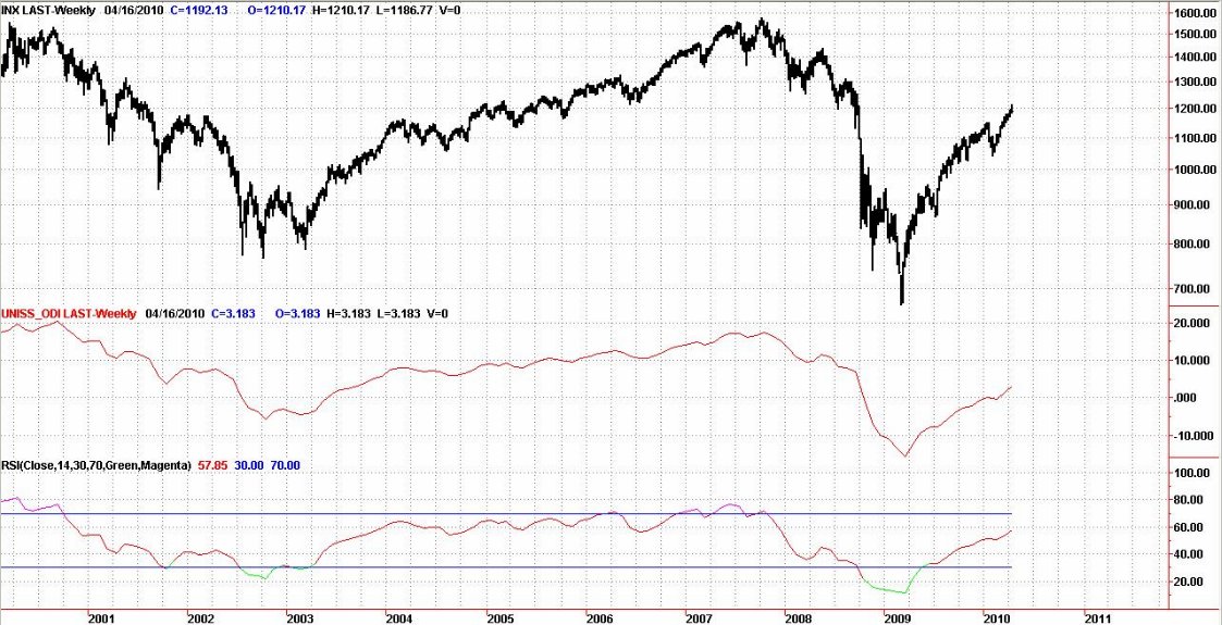
There are many ways of using the ODI concept. The most basic is to analyze Option Deviation Index using classical technical tools such as MACD or RSI. As the ODI filters a lot of market noise, applying these simple methods to the ODI drawn as a single line can give us a clearer picture of the present market condition.
The simple example of this technique is shown in Figure 2. To achieve better long term results we used the ODI calculation for periods starting on the first session of the month and ending on the following month's expiration day drawn as a single line with Relative Strength Index (with classical length input of 14) applied to the chart. Both bear markets of the last decade were clearly recognized by the study. In addition, this picture allows for a clear identification of divergences between the ODI line and RSI oscillator both in the years 2000 and 2007, early enough to be prepared for the downturns which followed these turning points.
However, the biggest advantage of using analysis based on the ODI concept is in forecasting the range of the underlying index (S&P500) in separate time segments. For illustration of this ODI usage, we chose a model period between option`s monthly expiration dates, although any other length may be used as long as entry and exit points follow the same selection rule through analyzed data.
As our model needs to be engineered to work on the S&P500 futures options our periods start at the opening of the first session following expiration day, which is every third Friday of the month and end on the close of the next month`s expiration day session. By using calculations shown in Figure 1 we can simply draw a bar chart of analyzed periods to create a statistical picture of market activity (Fig. 3).
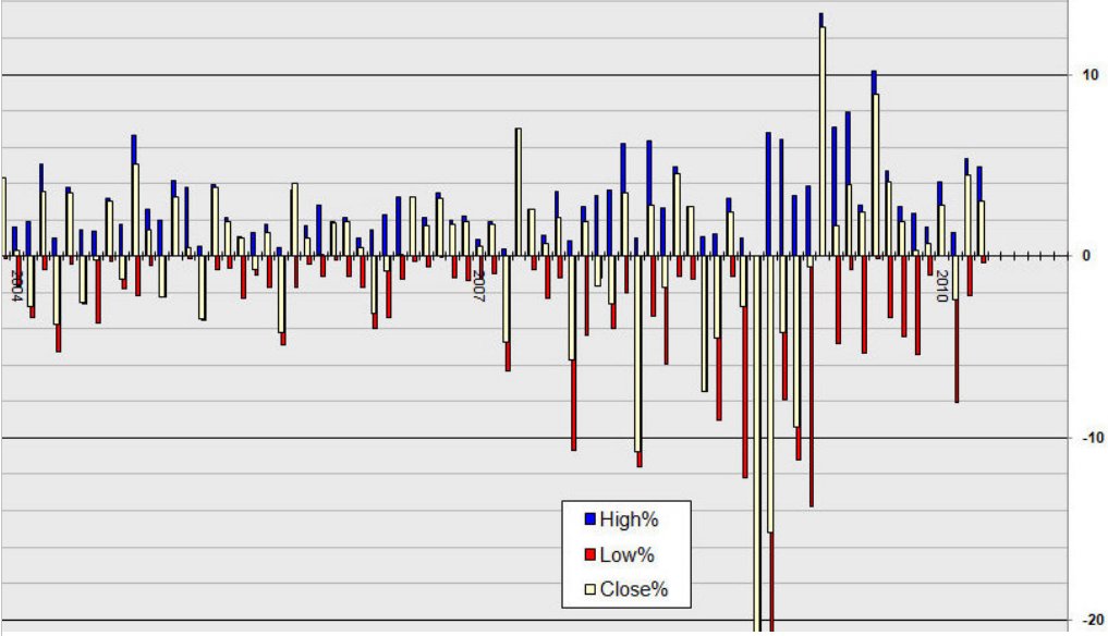
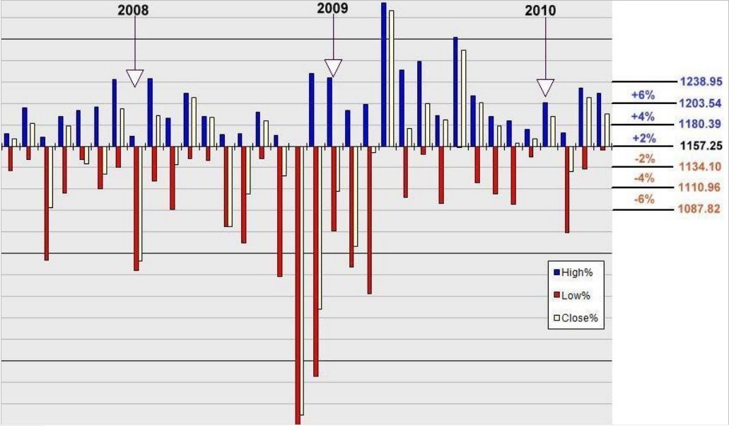
Even a preliminary observation without performing complex calculations would give us some idea about projected market range e.g. it is not so difficult to analyze general probability of the market reaching the 6% percent level up from the starting point during the single analyzed period (expiration to expiration in this case), which for the period between April, 19th and May, 21st 2010 equals approximately 1203.54, neither projecting chances for the market drop to 1110.96 level (4% down respectively). This is all calculated on entry point basis, which equals the open price on April, 19th session (1157.25).
This approach to the market activity analysis was named Option Deviation Index Diagram for many reasons, such as:
Another advantage of market activity presentation in a form of a diagram is volatility projection. As we analyze market activity during the defined time, the diagram gives us an additional sense of market velocity. For example we can see how the market overreacted in the year 2008, followed by reverse action in 2009.
Application of the ODI concept to the diagram results in "Percentage levels tree" as shown in Fig.4. The "Tree" would show possible scenarios of market action during the "life" of a particular option starting from the entry point, the opening price on the Monday following the third Friday of the month, April 19th, 2010 in this example. By calculating percentage range taken from the starting point we obtain a "map" of strike prices which may be used for a specific option strategy. And if we trade directional strategy and want to use options for hedging our position, the "Tree" may help as well.
The examples presented here refer to the S&P500 index; however the concept may be used for any other instrument. We have successfully applied this technique to other markets, such as currencies receiving similar results and helping us greatly in the preliminary selection of prevailing trending and moving sideways markets, as well as in projecting profit windows for our strategies. Actual opportunities of using this concept are not only limited to the above techniques, they are rather examples and guidelines for further studies.
Chris Marczak can be contacted at Unisystems
In the March 2005 edition of "Futures" magazine the ODI (Option Deviation Index) was presented, which takes measure of market fluctuations based on the entry point (Fig.1). The result is calculated as a percentage of entry value divided into negative, positive and closing series. Based on this assumption we can create various time models showing statistical dispersion of the index readings.
In the previously described example we used the ODI concept in calculating the Total Periodical Deviation (TPD) obtained as:
TPD = H% + L% + C%
Where:
A - beginning of the measured period of time
B - end of the measured period (expiration day)
H% - the percentage difference between the highest price and the starting (point A) price
L% - the percentage difference between the starting (point A) price and the lowest price
C% - the percentage difference between the starting (point A) price and close of the measured period (close on the expiration day)
and the result was smoothed out with simple moving average (we used MA's length of 9 in this example) and drawn as a single line chart (the ODI line).
Since then the markets have gone through a rough period reaching an all time volatile point during the financial meltdown of 2008. In this article we are reviewing the ODI concept 5 years later after its inception and showing other ideas of applying this technique to market analysis.
The ODI concept has successfully survived the market crash of 2008. In fact, it turned out to be a helpful tool during periods of extremely high volatility, when commonly known techniques had very limited use.
There are many ways of using the ODI concept. The most basic is to analyze Option Deviation Index using classical technical tools such as MACD or RSI. As the ODI filters a lot of market noise, applying these simple methods to the ODI drawn as a single line can give us a clearer picture of the present market condition.
The simple example of this technique is shown in Figure 2. To achieve better long term results we used the ODI calculation for periods starting on the first session of the month and ending on the following month's expiration day drawn as a single line with Relative Strength Index (with classical length input of 14) applied to the chart. Both bear markets of the last decade were clearly recognized by the study. In addition, this picture allows for a clear identification of divergences between the ODI line and RSI oscillator both in the years 2000 and 2007, early enough to be prepared for the downturns which followed these turning points.
However, the biggest advantage of using analysis based on the ODI concept is in forecasting the range of the underlying index (S&P500) in separate time segments. For illustration of this ODI usage, we chose a model period between option`s monthly expiration dates, although any other length may be used as long as entry and exit points follow the same selection rule through analyzed data.
As our model needs to be engineered to work on the S&P500 futures options our periods start at the opening of the first session following expiration day, which is every third Friday of the month and end on the close of the next month`s expiration day session. By using calculations shown in Figure 1 we can simply draw a bar chart of analyzed periods to create a statistical picture of market activity (Fig. 3).
Even a preliminary observation without performing complex calculations would give us some idea about projected market range e.g. it is not so difficult to analyze general probability of the market reaching the 6% percent level up from the starting point during the single analyzed period (expiration to expiration in this case), which for the period between April, 19th and May, 21st 2010 equals approximately 1203.54, neither projecting chances for the market drop to 1110.96 level (4% down respectively). This is all calculated on entry point basis, which equals the open price on April, 19th session (1157.25).
This approach to the market activity analysis was named Option Deviation Index Diagram for many reasons, such as:
- The ODI Diagram is a better tool for projecting market range rather than particular values or levels, because it corresponds more accurately with option trading strategies than commonly used charts
- The Diagram gives a better perspective for option trading as it separates periods of times equal to options? "lives", which eventually end on the expiration day. Instead of the sample period (expiration-to-expiration) used in the study, it can be tailored for any other time frame corresponding with the employed strategy.
- The ODI analysis diagram takes a significant part of the "chart psychology" out. For any experienced trader the commonly used price charts e.g. bar chart, candlestick chart etc. bring a lot of information per se, as it is related to the trader's professional knowledge such as technical analysis patterns and formations processed with one's own personal experience. This amount of information creates significant psychological pressure affecting the chartist, whose primary goal is still to analyze and forecast market direction. As most option strategists are rather interested in measuring market range and/or volatility projection, the ODI Diagram can work better for them by creating a clearer picture of what may be expected in the markets.
- The concept is very simple, and for the same reason it is reliable. The ODI diagram does not attempt to claim any technical formations and because of that it simply projects the market's range, which in turn shows certain regularities.
Another advantage of market activity presentation in a form of a diagram is volatility projection. As we analyze market activity during the defined time, the diagram gives us an additional sense of market velocity. For example we can see how the market overreacted in the year 2008, followed by reverse action in 2009.
Application of the ODI concept to the diagram results in "Percentage levels tree" as shown in Fig.4. The "Tree" would show possible scenarios of market action during the "life" of a particular option starting from the entry point, the opening price on the Monday following the third Friday of the month, April 19th, 2010 in this example. By calculating percentage range taken from the starting point we obtain a "map" of strike prices which may be used for a specific option strategy. And if we trade directional strategy and want to use options for hedging our position, the "Tree" may help as well.
The examples presented here refer to the S&P500 index; however the concept may be used for any other instrument. We have successfully applied this technique to other markets, such as currencies receiving similar results and helping us greatly in the preliminary selection of prevailing trending and moving sideways markets, as well as in projecting profit windows for our strategies. Actual opportunities of using this concept are not only limited to the above techniques, they are rather examples and guidelines for further studies.
Chris Marczak can be contacted at Unisystems
Last edited by a moderator: