There are a large number of traders who look at Point & Figure charts, with "look" being the operative word. That is, for most traders, once the market data gets represented as a P&F chart, they are at the end game. If the last x entered is in one box higher than x's in other columns, you've got a "buy signal".
Why is that so? Because someone eons ago said so. What's the proof? There is none; that's just the way it is. Now, don't go thinking that I am going to trash P&F. Au contraire. I'm going to show you why it's a great tool, how to test its efficacy and use it more effectively.
Before I really get started, let me explain that not everyone considers P&F charts as something only to look at. One extremely respected investment advisor counts the P&F buy and sell signals of each one of the NYSE stocks and creates an index out of those signals. And he has built a very good record managing hundreds of millions of dollars with that as his market index. Another very successful fund manager says that his confessions to using P&F usually get comments like, "How quaint", as though he was left over from the Paleolithic. But when he tells them he uses P&F-smoothed data as a neural net input, they're quiet with incredulity. So P&F data does not have to be the end game. It's just that most traders are not aware of the benefits of using P&F. And as we all know, the ignorance of something in the trading arena can cost you money.
Why P&F is a Great Tool
As a trader, you have developed a set of tools that work for you. And let's say that they work most of the time - except when the market goes flat and boring. How do you ignore flat and boring? Point & Figure! P&F is always active when the market is active, and does not register when the market is quiet. That is, only market movement beyond a certain noise level counts, making the filter non-linear. Additionally, many P&F chartists change their box heights depending on the price level, making it adaptive. Would you have ever expected Charles Dow to invent an adaptive non-linear smoother?
It gets better: P&F is asymmetric. As you are rising, you keep making x's each time you achieve a new box level. But you don't start a down column (making o's) until the price goes down by your pre-determined reversal level (traditionally 3 boxes). That is, at a given point in an up move you only need 1 up-box to make another x, but 3 down-boxes to make an o. The combined effect of the noise filtration and the asymmetry is that if the market moves in trends, a P&F trading tool should make you money. That helps to explain its popularity and longevity.
Because P&F eliminates time periods, time is no longer relevant. That's why the bottom scale (the x-axis) is frequently left blank or numbered with ordinals (1, 2, 3...). Time compression is not a problem; many traders look at weekly data in addition to their daily charts. P&F just compresses the data according to activity instead of the calendar.
How can you put P&F data to use?
First, let's look at what P&F data really is. Start out with your normal P&F chart as presented in Figure 1.
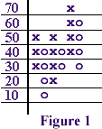
caption: Figure 1
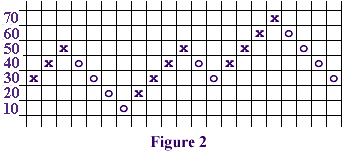
caption: Figure 2
Then look at Figure 2. The price activity in Figure 2 is identical to that in Figure 1, except that instead of keeping our x's and o's in columns, we have placed each new figure in a subsequent column. Next, move on to Figure 3, where we have replaced the x's and o's with a line.
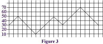
caption: Figure 3
Now that you have freed your data from its graph, it becomes a time series just like any other. You can now smooth it with a moving average, calculate relative strength, cyclic analysis, whatever. We have even created neural net forecasts based entirely on P&F data, and more interestingly on P&F data commingled with bar chart data. That is, you have removed the mysticism from P&F data, and see it for what it really is: a high-tech smoothing tool (adaptive, non-linear and asymmetric).
PF Line vs. PF Time-Extended
There are two ways to work with the reconfigured data: time-compressed, or time-extended. With the time-compressed version you are just using the data as illustrated above. That is, your data is a point & figure line, where each new point on the line represents a movement of the P&F data, rather than a new date or time period. Figure 4 shows a standard P&F chart of the Dow Jones Industrials.
caption: Figure 4.The Classic Point & Figure Chart. DJIA
Figure 5 shows the same market index plotted as a line, with a 10-period exponential average applied to the data, and with a 25 period moving slope plotted as an oscillator. Notice the dated horizontal scale: some months have a lot of activity and some not. That's the time compression.
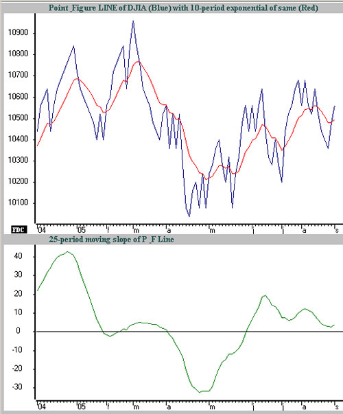
caption: Figure 5. Reconfiguring the P&F data makes it usable
Suppose that you're an eclectic sort of trader who mixes and matches his signals to "confirm" his opinion. Some people do that by looking at daily and weekly charts, but you want to mix P&F signals with bar chart data. The two have different time scales, so you have to extend your point & figure lines horizontally across a bar chart until you get another P&F price change. Figure 6 shows a bar chart for the DJIA over the same period with the P&F time extended line superimposed.
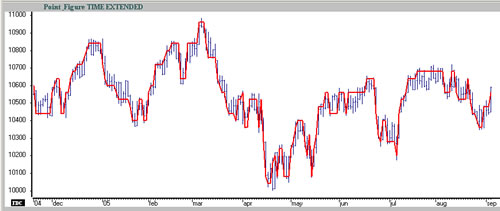
caption: Figure 6. P&F Time-Extended
The chart is interesting because it shows you the smoothing effect of P&F, but more importantly, you now have the capability for testing various P&F parameters. For example, the "classic" P&F format such as the chart illustrated uses price highs and lows, and 3-box reversals. But some traders construct their P&F charts from closing data, and others use 2-box reversals, to name a few preferences. In total there are four parameters: box height, box reversal amount, data input (e.g. close vs. high/low), and scale (i.e. linear, log or adaptive). With the data in this digital format you can run trading simulations to see which works best.
The Proof is Always in the Trading
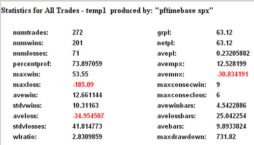
Let me give you an example. I started out with the S&P 500 index (SPX) from 1996 through the present; 9 years and 8 months of data. I smoothed the closing price with a 25-day exponential and then initiated a trade every time the close made an excursion through the 25 exponential smoother. The beginning price of SPX was about 600, and over the time period the system made 60 points in profit. Nothing to get excited about; I just needed a base for comparison.
Next I took my original SPX data, and created two P&F lines. They were identical in all parameters except one: The first was based on the "classic method" of using the high and low, whereas the second was based on using the closing prices only to create the P&F data. I then applied the same 25-day exponential smoother to each P&F line. Lastly I made two trade simulations of the SPX, this time using the P&F data to generate the signals: one using the high/low method, and the other using the close-only method. Here's the quick summary:
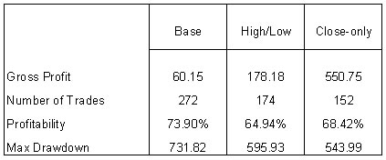
Wow! Using classic high/low P&F as a filter increased gross profits from 60 to 178. And switching the P&F price input to close-only ratcheted gross profits up to 550. That's a whopping difference, and the summary statistics at the end of this article are worth your review. Now, note that the best system shown here is still not worth trading. It made almost 100% in the 9-plus years, about an 8% compounded rate per annum, but the maximum drawdown that you had to endure was almost equal to the eventual profit.
My purpose here is not to give you a winning system, but to show you that Point & Figure can be a very effective tool, and not just something to stare at. Also, you can see that it makes a big difference which P&F parameters you use. Once you open your eyes to see what P&F really is (an adaptive, non-linear, asymmetric smoother), you can pick the best parameters and start generating profits. If you are going to use P&F, either for charting or digital data smoothing, wouldn't you prefer using the best parameters?
Summaries of Trading Results
caption: Trading results - 25-day exponential
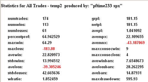
caption: Trading results - 25-day exponential of "Classic" P&F based on Highs, Lows
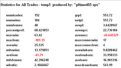
caption: Trading results - 25-day exponential of P&F based on Close-only
Why is that so? Because someone eons ago said so. What's the proof? There is none; that's just the way it is. Now, don't go thinking that I am going to trash P&F. Au contraire. I'm going to show you why it's a great tool, how to test its efficacy and use it more effectively.
Before I really get started, let me explain that not everyone considers P&F charts as something only to look at. One extremely respected investment advisor counts the P&F buy and sell signals of each one of the NYSE stocks and creates an index out of those signals. And he has built a very good record managing hundreds of millions of dollars with that as his market index. Another very successful fund manager says that his confessions to using P&F usually get comments like, "How quaint", as though he was left over from the Paleolithic. But when he tells them he uses P&F-smoothed data as a neural net input, they're quiet with incredulity. So P&F data does not have to be the end game. It's just that most traders are not aware of the benefits of using P&F. And as we all know, the ignorance of something in the trading arena can cost you money.
Why P&F is a Great Tool
As a trader, you have developed a set of tools that work for you. And let's say that they work most of the time - except when the market goes flat and boring. How do you ignore flat and boring? Point & Figure! P&F is always active when the market is active, and does not register when the market is quiet. That is, only market movement beyond a certain noise level counts, making the filter non-linear. Additionally, many P&F chartists change their box heights depending on the price level, making it adaptive. Would you have ever expected Charles Dow to invent an adaptive non-linear smoother?
It gets better: P&F is asymmetric. As you are rising, you keep making x's each time you achieve a new box level. But you don't start a down column (making o's) until the price goes down by your pre-determined reversal level (traditionally 3 boxes). That is, at a given point in an up move you only need 1 up-box to make another x, but 3 down-boxes to make an o. The combined effect of the noise filtration and the asymmetry is that if the market moves in trends, a P&F trading tool should make you money. That helps to explain its popularity and longevity.
Because P&F eliminates time periods, time is no longer relevant. That's why the bottom scale (the x-axis) is frequently left blank or numbered with ordinals (1, 2, 3...). Time compression is not a problem; many traders look at weekly data in addition to their daily charts. P&F just compresses the data according to activity instead of the calendar.
How can you put P&F data to use?
First, let's look at what P&F data really is. Start out with your normal P&F chart as presented in Figure 1.
caption: Figure 1
caption: Figure 2
Then look at Figure 2. The price activity in Figure 2 is identical to that in Figure 1, except that instead of keeping our x's and o's in columns, we have placed each new figure in a subsequent column. Next, move on to Figure 3, where we have replaced the x's and o's with a line.
caption: Figure 3
Now that you have freed your data from its graph, it becomes a time series just like any other. You can now smooth it with a moving average, calculate relative strength, cyclic analysis, whatever. We have even created neural net forecasts based entirely on P&F data, and more interestingly on P&F data commingled with bar chart data. That is, you have removed the mysticism from P&F data, and see it for what it really is: a high-tech smoothing tool (adaptive, non-linear and asymmetric).
PF Line vs. PF Time-Extended
There are two ways to work with the reconfigured data: time-compressed, or time-extended. With the time-compressed version you are just using the data as illustrated above. That is, your data is a point & figure line, where each new point on the line represents a movement of the P&F data, rather than a new date or time period. Figure 4 shows a standard P&F chart of the Dow Jones Industrials.
caption: Figure 4.The Classic Point & Figure Chart. DJIA
Figure 5 shows the same market index plotted as a line, with a 10-period exponential average applied to the data, and with a 25 period moving slope plotted as an oscillator. Notice the dated horizontal scale: some months have a lot of activity and some not. That's the time compression.
caption: Figure 5. Reconfiguring the P&F data makes it usable
Suppose that you're an eclectic sort of trader who mixes and matches his signals to "confirm" his opinion. Some people do that by looking at daily and weekly charts, but you want to mix P&F signals with bar chart data. The two have different time scales, so you have to extend your point & figure lines horizontally across a bar chart until you get another P&F price change. Figure 6 shows a bar chart for the DJIA over the same period with the P&F time extended line superimposed.
caption: Figure 6. P&F Time-Extended
The chart is interesting because it shows you the smoothing effect of P&F, but more importantly, you now have the capability for testing various P&F parameters. For example, the "classic" P&F format such as the chart illustrated uses price highs and lows, and 3-box reversals. But some traders construct their P&F charts from closing data, and others use 2-box reversals, to name a few preferences. In total there are four parameters: box height, box reversal amount, data input (e.g. close vs. high/low), and scale (i.e. linear, log or adaptive). With the data in this digital format you can run trading simulations to see which works best.
The Proof is Always in the Trading
Let me give you an example. I started out with the S&P 500 index (SPX) from 1996 through the present; 9 years and 8 months of data. I smoothed the closing price with a 25-day exponential and then initiated a trade every time the close made an excursion through the 25 exponential smoother. The beginning price of SPX was about 600, and over the time period the system made 60 points in profit. Nothing to get excited about; I just needed a base for comparison.
Next I took my original SPX data, and created two P&F lines. They were identical in all parameters except one: The first was based on the "classic method" of using the high and low, whereas the second was based on using the closing prices only to create the P&F data. I then applied the same 25-day exponential smoother to each P&F line. Lastly I made two trade simulations of the SPX, this time using the P&F data to generate the signals: one using the high/low method, and the other using the close-only method. Here's the quick summary:
Wow! Using classic high/low P&F as a filter increased gross profits from 60 to 178. And switching the P&F price input to close-only ratcheted gross profits up to 550. That's a whopping difference, and the summary statistics at the end of this article are worth your review. Now, note that the best system shown here is still not worth trading. It made almost 100% in the 9-plus years, about an 8% compounded rate per annum, but the maximum drawdown that you had to endure was almost equal to the eventual profit.
My purpose here is not to give you a winning system, but to show you that Point & Figure can be a very effective tool, and not just something to stare at. Also, you can see that it makes a big difference which P&F parameters you use. Once you open your eyes to see what P&F really is (an adaptive, non-linear, asymmetric smoother), you can pick the best parameters and start generating profits. If you are going to use P&F, either for charting or digital data smoothing, wouldn't you prefer using the best parameters?
Summaries of Trading Results
caption: Trading results - 25-day exponential
caption: Trading results - 25-day exponential of "Classic" P&F based on Highs, Lows
caption: Trading results - 25-day exponential of P&F based on Close-only
Last edited by a moderator: