You are using an out of date browser. It may not display this or other websites correctly.
You should upgrade or use an alternative browser.
You should upgrade or use an alternative browser.
Is it Sour?
The price dropped to 37 pence. The Equivolume chart shows volume is small and the last 2 boxes are long and narrow.
Depending on whether I use a 1x3 log chart or a 1x3 arithmetic chart I get conflicting signals with the Parabolic SAR. The arithmetic chart indicates I should remain in the trade but the log chart is firmly negative. Indeed I should not have taken the trade in the 1st place!
Anecdotally, if I get out now the price is bound to shoot up. How many times have you read reports of people getting out only to see the price shoot away from them?
If i stay in will the price continue down?
The current active price target gives a negative count of 22 pence. This became active on the 1x3 arithmetic chart when the price dropped below 42 pence. The SAR is positive. Both charts are above the next stop of 33 which is my the maximum loss I am prepared to take.
Times like this test your strength of will.
I think I will let my last ditch stop stand and sit on my hands over the Easter holiday.
More Like a Campaign
What began as a raid is turning into a campaign. It is my own fault of course for missing the price target.
The trade is still on because the chart and indicators tell me so. Volume was up yesterday and negative; even so the low ended up higher by 1 penny than before Easter.
You can see that there is now a column of Xs and the SAR is positive. The resistance is holding.
Bobbing Along
Well i went to Shikoku for a short holiday to view the Cherry blossom. It was in perfect condition at Ritsurin park and Kochi. There is a wonderful 17th century castle in Kochi which is well worth a visit.
I came back to find my stock still bobbing along and with no new signals indicating a sell or buy.
Now is the time for patience!
A Change in the Wind?
The price has been hovering above the trend line and my stop. There is a hint that the downward direction has halted.

Notice how the equivolume box for yesterday has turned positive and how the price range has been narrowing steadily.
Here is the P&F chart. The SAR is still telling me to hold and the price hasn't broken through the support line yet.
The price has been hovering above the trend line and my stop. There is a hint that the downward direction has halted.
Notice how the equivolume box for yesterday has turned positive and how the price range has been narrowing steadily.
Here is the P&F chart. The SAR is still telling me to hold and the price hasn't broken through the support line yet.
Attachments
Change in the Air
The chart has been on the edge of stopping the trade out but has just hung on. Yesterday saw the first step back from that and so the trade is still on. I think the downside count of 33 can be cancelled which makes 49 the lowest upside count a price target.
The chart has been on the edge of stopping the trade out but has just hung on. Yesterday saw the first step back from that and so the trade is still on. I think the downside count of 33 can be cancelled which makes 49 the lowest upside count a price target.
Just 1 Equity Left
It's been a long time since I made an entry here. I got out of AZM with a loss and now I have just 1 equity left in my portfolio which has become a buy and hold stock. All the rest is in short term government bonds. As they mature I'll review whether to re-enter the stock market or roll over into more bonds.
It's been a long time since I made an entry here. I got out of AZM with a loss and now I have just 1 equity left in my portfolio which has become a buy and hold stock. All the rest is in short term government bonds. As they mature I'll review whether to re-enter the stock market or roll over into more bonds.
A Long Time
My old computer went down and it has taken a while to get round to this blog. I am happy to say I am still trading though the environment is tough.
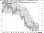
I have supplemented the point and figure charts with multiple moving averages overlaid on Bollinger Bands. This has helped identify market direction.
There is an example attached of the FTSE 350. You can see how the blue, short term averages have begun moving off the lows in the last few days. No turn around for the long term averages.
My old computer went down and it has taken a while to get round to this blog. I am happy to say I am still trading though the environment is tough.
I have supplemented the point and figure charts with multiple moving averages overlaid on Bollinger Bands. This has helped identify market direction.
There is an example attached of the FTSE 350. You can see how the blue, short term averages have begun moving off the lows in the last few days. No turn around for the long term averages.
Attachments
Are the Changes Real?
Over the last few weeks I have noticed many stocks beginning to move up. Short term averages are becoming positive and even some long term averages are seeing a steady drift into positive territory.
The question is whether or not all this can be maintained so that we can consider some decent trends are there. With deflation being a real possibility trading for 5% or 6% net profit is very do-able.
Happy to be Stopped Out
I was stopped out yesterday and felt good about it. Although it meant a loss on the trade I am up overall.
I have begun tightening stops now to take profits or minimise losses as fast moving averages bend over a little.
So far it's just froth on the surface but who knows...?
I was stopped out yesterday and felt good about it. Although it meant a loss on the trade I am up overall.
I have begun tightening stops now to take profits or minimise losses as fast moving averages bend over a little.
So far it's just froth on the surface but who knows...?
Metaphors
When I first began trading I wanted to find a strong metaphor than would hep me understand the market. Using metaphors is a powerful way to learn and internalise information. A good metaphor will be strng enough to adapt and incorporate additional knowledge as you become more skillful.
My favourite metaphor of trading is the angling metaphor. Imagine a river flowing along. Somewhere under th brown waters are fish. Occasionally we see them rise for flies. Fish, small and darting in shoals or big and solitary bottom feeders. These are our prey and each species needs different tackle and methods to catch them.
The water is sometimes fast and shallow and at other times deep, with slow eddies. Are you a match angler? Do you go for trying to catch many fish which adds up the weight? Are you the solitary angler, stalking the deep swimming giants?
If you read the water wrong or use the wrongtackle likely you will get broken and costs will mount, but with the right tackle you can play your fish right into that keep net.
What metaphor do you like?
Standard Advice
One piece of standard advice is to spread your risk. This is often translated to mean diversify your holdings. I disagree with this.
When you diversify you are not lowering risk you are merely spreading it thinner. Imagine a lump of butter on a slice of bread; now imagine the same amount of butter spread evenly over the surface. Have you reduced the amount of butter on the bread?
Diversification also indicates a lack of faith in your trading method. Surely, far from spreading your capital thinly by diversifying you want to weight your winners with as much capital as you can and ride its growth as long as you can. If you have faith in your method you should back it up to the hilt. How often do you spread things out because you still doubt your method?
This means accepting a wider stop perhaps but the potential for gain by concentrating effort into a few winners is far greater than hoping diversified capital will aggregate to the same amount.
Another advantage of not diversifying is that there are the hidden benefits of lower transaction costs and the loan from the government in taxes you don't have to pay.
Excess Profits
"Make excess profits'', "beat the market". These phrases and many like them occur with boring regularity in trading books, blogs and articles. Are these reasonable things to say and is some market average a reasonable measure to judge profits? I do not see much questioning of these trading articles of faith.
Recently I have moved towards inflation as a better measure of making profits. More importantly I want to beat my inflation rate which is much more important than any national rate.
My inflation rate at the moment is just above zero percent. My trading target bottom line is 10%. Now I have an individually tailored measure that actually means something.
It is time for an update I think. Since I began trading with Point and figure charts I have maintained a small profit. Now I am using Guppy Multiple Averages alongside my P&F charts.
The P&F charts are now my main buy signal after the Guppy Moving averages indicate a high probability trade. Once the trade is open I use the P&F chart to determine a stop loss. Occasionally I also apply a stop loss using the ATR.
When the long term Guppy Moving Averages begin to turn over I get out, irrespective of the stop loss point.
I feel more and more comfortable using the Guppy moving averages. I think of each average as a poll on the health of an equity. When the averages are moving in concert there is general agreement about the state of the equity. When the averages begin to diverge in their behaviour then some disagreement exists about the price and value. I watch the gap between the short and long term averages. I want to see a healthy wide gap between them but they must be running parrallel to each other. When that gap begins to narrow I begin to get nervous. When the averages begin to knot up I get nervous. These are critical times when the stop loss is set tighter.
Re: End of Year Assessment
As the year comes to a close it is time to assess my trading. Most importantly, I am still trading. I had one bad trade that took out quite a chunk of capital. The company went bust and stops were no use when the price plunged 90% overnight.
Fortunately it was virtually balanced by a good win later in the year. I will end up by about 3% on the year.
Overall I am pleased with the way I have managed my trades and trading activity. I am still using P&F charts but have added more to increase the kind of trades I can do.
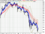
I now overlay an Ichimoku Cloud chart over the P&F price data:
 This is a chart of Mothercare. You can see how the green cloud shows support and that the stock is healthily above it. There is an active profit target of 810.
I am now also using Guppy Moving averages with Equivolume:
 It is interesting how the long term averages mirror the cloud of the Ichimoku chart.
Finally I have found an Ease of Movement chart a useful adjunct to the Equivolume chart:
 The different displays let me evaluate potential stocks over a wider span of trade types, from potential trend trades to sharper swing trades. I use the most appropriate chart to manage the trade but usually if a stock is running higher than the long term Guppy averages or the Ichimoku cloud I let the trade run.
As the year comes to a close it is time to assess my trading. Most importantly, I am still trading. I had one bad trade that took out quite a chunk of capital. The company went bust and stops were no use when the price plunged 90% overnight.
Fortunately it was virtually balanced by a good win later in the year. I will end up by about 3% on the year.
Overall I am pleased with the way I have managed my trades and trading activity. I am still using P&F charts but have added more to increase the kind of trades I can do.
I now overlay an Ichimoku Cloud chart over the P&F price data:
I am now also using Guppy Moving averages with Equivolume:
Finally I have found an Ease of Movement chart a useful adjunct to the Equivolume chart:
Similar threads
- Replies
- 18
- Views
- 11K