Best Thread learning to read price action with p/f charts

malaguti
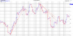
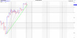
subjective trendlines...not really subjective
place them on the right hand side of semi catapults/one box reversal
so really they are not too subjective
if you are trading and using one box reversal,then you might be living too dangerously without them
only needs a tiny bit of practice ..imho
others.ie..connecting 2 highs or lows..well if you confirm with a bullish supp line /bearish res line and internal trendlines,then it all falls into place
p/f is all about the trend..the trend is defined by price change per reversal.the signals are just who has control,the bears or the bulls
so,any trend mark the bullish supp line/bearish res line first...then put in internals...then subjective..by doing this it will split the range into bullish and bearish sections
 
Last edited:
I'm listening mate but if you can draw a line, that differs from mine its subjective.

an example..now this is really hard to describe, because you can see the whole chart, so in hindsight a trend line is great..without hindsight here are the issues.
Take a look at the chart..in grey are my 45s, in red are the first few subjective lines I might have been able to draw..at 1 as my price is moving up, i have a subjective trendline...it gets broken, so I could redraw it at 2, that gets broken and I redraw it again at 3...so out of these only 3 would have been a good trend line ...but i dont know this because I am already out of the trade..not with the 45

on the way down, i have 4 which is not broken, and then I can dray 5..this turn out to be a good line, gets me out and saves my profit...but what about my 45, where is that..in between 4 and 5..not bad

now lets go back to 1, 2 and 3...i have no subjectives now, just a good old fashioned 45, and I use my judgement to say that that at that 1400 mark i actually have a recognisable reversal..but my 45 has kept me in long enough i would have been out at 1, or 2 prior..

Like I say this is hard to explain, because we can see the whole chart..but these lines could have been drawn. Of course you can say that 1 is too steep, that 2 is too steep..so whats not too steep?
This is where Gann is useful..he uses the 1x1 and the 2x1 lines (amongst others). There is no subjectivity with these, so if I were to use any lines, it would be gann or it would be the 45. Unfortunately you need specific software to square the chart in order to draw correct gann angles but thats another topic. This is a specific example but the debate is exactly the same on any chart you give.
what we will need to do is use a real life example and see what gives but my 45s haven't lost me any profit, but would have done me a big favour in 1,2 and 3

Its because of this very subjectivity with regard to trend lines that makes people ask, is this the end of the trend? So when it gets broken and price goes back in your favour you are out thinking if only I was still in...this is where P&F has changed the way i can look at a chart and identify the bullish/bearish support lines objectively and now when I should be looking at getting in or out or going long or short. You add subjective lines, I might as well go back to line charts.
 

Attachments

  • subjective.jpg
    subjective.jpg
    1.3 MB · Views: 225
hi malaguti & abnash
finally,this thread comes alive...great stuff
comments/thoughts
1.abnash
the charts you posted are too noisy..imho
they are not too clear cut
my own opinion is that you move around box sizes and reversals to analyse the trend
what i usually do is just look at the line chart first.define the trends from that i want to analyse
so for intraday fx i will look at the last 2-3 trends on the line chart.when they started and what levels
i will then go down to 60 min/30 and 15 min to pick up any minor trends..note these down as above
the line chart is close...no candles
we can then look at these trends in p/f format
with p/f...trendlines are constant price change per reversal/whereas on candles...trendlines are constant price change per unit of time..there is a big difference
hence trendlines are placed on the chart first
by moving around box sizes and reversals,we can pinpoint support and res for that particular time input
we can then divide the chart into bullish and bearish sections using the trendlines
on the charts i post i usually only display one or two trends...dont need any more
candlestick traders are too busy calling out levels and divergences..we have the advantage,that we can define trend arithmetically
so trendlines are 45 degree.or drawn on the right hand side of semi catapults/one box..subjective...min 2 touches
2.malaguti
dont be too specific with box sizes..they can change from week to week..
so 1.00 by 1 reversal/close could be 1.2 by 1 reversal hilo next week or next month
subjective trendlines..you must put in...45 degree lines can be clumsy in a fast market
does that all make sense ??

Hi Dentist,

Yes, you are right, the current charts are a bit noisy, so I did some work with larger box size and that gives patterns which are easier to analyse. I will post some examples of that.

Thanks for suggesting a structured approach to using the trends. I will test the approach you suggested, as I, coincidentally, use line charts as part of my standard analysis. (instead of close, you may also try (open+close)/2 as a variation).

Here is another observation, though. It is possible to look at the higher level trends in PnF itself. I will show you a good example of that, as then one can focus on one platform itself. Maybe this is aided by the ability to flexibly view the data.

But lets keep this discussion going.

Malaguti, thanks for your comments; I have read Duplessis' book, before I embarked on the PnF journey that I am on. I dont claim to be an expert on PnF, and am here to learn.
 
Here is Nifty futures data represented in different chart configurations for discussion. The period is Feb-March 2012.

Wyckoff 1 box reversal seems to give smoother data for analysis - up for discussion.

68805865.png


11291634.png
 
And now the same data in 20 min output. The label on the second chart should have read 20 min x 12 x 3 ..
For the same box setup, the Wyckoff chart shows a smoother view of the trend. One more box size and then we look at the charts to trade with.

21145041.png


57444452.png
 
Last edited:
And finally the charts to trade with 2 min data bars as input to the PnF platform with both Wyckoff and 3 box reversals.

23110740.png

14346605.png


57272656.png
 
To wrap up my views, here are the line and higher level PnF charts as well. Dentists point about using the line charts does make sense, as they appear to be easier to comprehend. The Wyckoff chart appears to track the line chart more intuitively in shape and size from my perspective. (others may be more comfortable with just the 45 degree trend lines on the 3 box reversals). It also appears to display trend in a more usable manner, but then this is an individual opinion.

You may also notice that a smaller box size makes more sense for 3 box reversal charts when compared with Wyckoff charts of the same box size(see the last chart here which appears too condensed).

This analysis and the earlier comments are certainly helping to shape my understanding on using PnF charts in a more productive manner. However, looking forward to what others say about these charts - and most certainly Dentist.

90051522.png

28424857.png

88914601.png

12375271.png
 
Last edited:
Hi Malaguti
lloyds/3 day close line chartrack the price in the latest uptrend imho/yellow line
trend started on july 20th at 28.50..so 1 month ago..track it ,say on 60,30 or even 90 min
failure of this trend=consolidation,then a new trend

346orhi.gif
 
Bingo, I'm looking at exactly the same, but on 5min
My trusted 45 has been broken but the price is going back up into the pattern, so no confirmed sell yet..its coming though with a fresh push from the bears
Just for good measure and to play devil's advocate, I also have your 10min..but which trend line was that again ;)...
 

Attachments

  • S&P 5 min with 45.jpg
    S&P 5 min with 45.jpg
    867 KB · Views: 184
  • S&P 10min different trend lines.jpg
    S&P 10min different trend lines.jpg
    914.5 KB · Views: 202
Hi malaguti..great stuff
look at the hourly..a bigger supp there/trendline 45deg..to be watched..imho

52i5gx.gif
 
nas 100/30 minute data
avery intense trend/green line/subjective
these cannot be maintained for too long
p/b areas in light blue/45 degree
16qkaw.gif
 
spx 1 min data
note the reaction over the last 2 days
trends marked with some trading signals put on
trend failure spotted

ekpybm.gif
 
I would like to hear more about them. I am very happy with the way I trade, and have been studying options for a long time now, which takes up most of my time. I am definitely interested in learning more. I recently started using P/F charts and so far it has helped me become more consistent in intraday trading.
 
Top