Similarly, we know that resistance is a price level above which a stock has difficulty climbing. This is where a lot of buyers take profits and shorts enter. Typically, a stock's price will range between these levels until it breaks out or breaks down. Hundreds of different methods can be used to locate these areas of support and resistance, but one of the most underrated methods is simply using price by volume, or PBV, charts.
In this article, we explain what PBV charts are and explore techniques that you can use to make effective trades using these charts. Trendlines, chart patterns, pivot points, Fibonacci lines and Gann lines are among the most popular methods used to identify areas of support and resistance. But the less commonly used PBV charts, which illustrate volume using a vertical volume histogram, can be invaluable when determining not only the location of key support and resistance levels, but also the strength of these levels.
What Are PBV Charts?
A PBV chart is simply the standard volume histogram reapplied to price instead of time (price is seen on the Y axis and time on the X axis). So, instead of being able to determine when a stock is going in and out of favor (indicated by increasing volume levels over time), PBV enables you to determine the level of buying or selling interest at a given price level. PBV charts can be created in many different charting applications, as well as by using free online charting services from websites like BigCharts.com and StockCharts.com.
Using PBV Charts
PBV charts are relatively easy to use and understand. There are three major elements involved:
- Volume strength indicates the amount of shares that traded at the given price level. This is indicated by the horizontal length of the PBV histogram.
- Volume type refers to the number of shares sold compared to the number of shares bought. This is indicated by the two different colors seen on each bar.
- Successful reactions or tests means the number of times a stock successfully tests and "bounces off" a given level.
Together, these three factors will allow you to determine the strength of a particular price level. Once you have a good idea of price strength, you can combine this information with trendlines and other studies to determine support and resistance levels, find support bases and even play gaps.
Finding Support Bases
Support bases are simply instances in which a stock ranges before continuing a trend or reversing. To determine when a stock is basing, simply follow these steps:
- Draw two parallel, horizontal lines that connect parallel highs and lows in a trading range after a trending move.
- Then, use the PBV histogram to see if these parallel lines are located near key price levels.
- Finally, note the buying or selling pressure (colors) as well as the total volume to determine in which direction a breakout is likely to occur.
Figure 1 shows the now-absorbed Hudson City Bancorp along with the PBV histogram. Looking at this chart, we can see that the longer blue bars indicate buying pressure or support, while a longer red bar indicates selling pressure or resistance. Meanwhile, the larger overall bar indicates that that particular price level is of interest to traders. In this case, we note that $12.50 appears to be a level at which we can watch for a breakout to the upside.
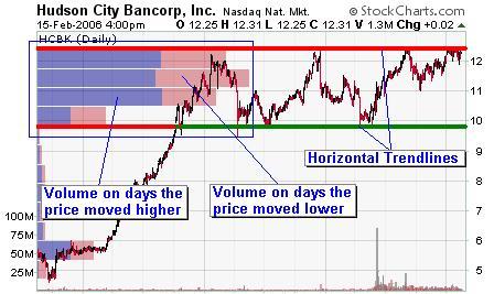
Fig1 Source - StockCharts.com
Locating Support and Resistance Levels
Support and resistance levels are simply areas beyond which the price has difficulty moving due to large buying or selling interests. To determine areas of support or resistance, simply do the following:
- Identify areas where the PBV histogram shows significant buying or selling interest.
- Determine whether these large interests are buying or selling interests.
- Draw horizontal trendlines parallel to these PBV bars, giving preference to those that also connect highs and lows on the chart.
Let's take a look at this old chart of Google (now Alphabet Inc.) for an example:
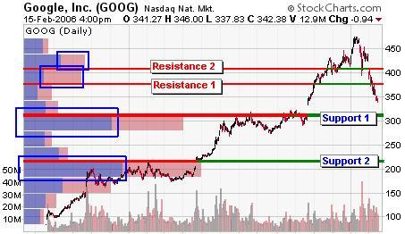
Fig2 Source - StockCharts.com
Trending between these support and resistance levels should be immediately apparent. These areas are known as "soft areas," where only short volume bars exist between two long bars. One common strategy is to buy and sell based on the trends between these "soft areas." In the chart for Google (Figure 2), for example, we'd look to short the stock when it breaks Support 1 and cover when it hits Support 2.
Playing Gaps
Gaps occur when an asset's price rapidly moves from one point to another, creating a visible gap or break between prices in the chart. You can use PBV charts to help predict when a gapping stock will find support simply by looking for an area where there was a lot of prior interest. Also, gaps themselves can produce areas of future support or resistance, which can be reinforced by the PBV histogram. Let's take a look at a few examples:
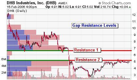
Fig3 Source - StockCharts.com
In the case of now-absorbed DHB Industries (Figure 3), a PBV trader would look to buy a breakout from Resistance 2 and sell when Resistance 1 is reached. Notice that the gap down creates an area of very little resistance to upward movement – this tells us it is likely that the second target will be reached.
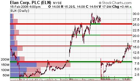
Fig4 Source - StockCharts.com
In the case of now-absorbed Elan Corp. plc (Figure 4), we can see that a trader who bought on a break above $7.60 (the long PBV bar) would have already realized a gain of nearly 100%. Notice that, once the key resistance was broken, there was very little resistance to the upside.
Clearly, PBV can be extremely useful when combined with gaps if you are attempting to buy rebounds or retracements after gaps occur.
In Summary
PBV charts can be an invaluable tool in your stock analysis arsenal. When you combine PBV with other methods such as trendline analysis and Fibonacci, it is easy to see how much additional insight can be gained from this charting method. Here are some key points to remember:
- The first color represents volume on days when the price moved higher.
- The second color represents volume on days when the price moved lower.
- When one color of the bar is significantly longer than the other, strong support or resistance is present.
- Horizontal trendlines connect the top of the PBV bar for resistance and the bottom of the PBV bar for support.
- PBV bars are used for support and resistance levels, trading bases and gap areas.
Justin Kuepper can be contacted at Internationalinvest
Last edited by a moderator: