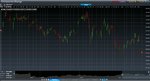
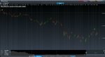
Recently, I have been trading with CMC. However, I observed that their chart patterns were quite different from the real market charts. It wasn't because of the spreads. The difference was gross and unexplainable. I have attached the links to two examples. I hope investors and traders can take this 2 cases as a warning before trading with CMC markets.
Please see the case of Neptune Orient lines, a company in Singapore
Alex Lew Yan Liang
Please see the case of Neptune Orient lines, a company listed in the U.S
Alex Lew Yan Liang
Please see the case of Neptune Orient lines, a company in Singapore
Alex Lew Yan Liang
Please see the case of Neptune Orient lines, a company listed in the U.S
Alex Lew Yan Liang