Candlestick charts are widely used by traders around the world, as superficial demarcations between East and West are thankfully fading away. While bar charts are still more popular because of sheer inertia, there is little doubt that candles provide much more information, even though both types of charts are based on the same prices. Let's take a look at the advantages of using candles when gauging the validity of intersections.
Traders make a big deal about prices breaking support and resistance lines, trendlines, moving averages and retracement or extension levels. However, intersecting these lines on an intraday basis and closing outside them are two very different ball games.
Benefits for Using Candlesticks
Let's quickly review the reasons why traders should use candlestick charts for daily, weekly and hourly charts:
Traders always like clear directions, and currency dealers will be equally happy with both bullish and bearish signals. However, whether we like it or not, there will be many times when the markets will be quite unclear. Candlestick charts will provide these "wait-and-see" signals, such as harami, to warn you to slow down considerably or even temporarily stop trading because you do not have sufficient information.
Candlestick charts consist of opening, high, low, and closing prices, just like bar charts, but the significance of the closing price, along with the opening price, is clearly emphasized. There are two important elements to consider in chasing the above benefits:
The body of the candlestick is formed by the difference between the opening and closing prices. Traditionally, a red body indicates that the currency closed higher than it opened, and a black body shows that the currency closed lower than it opened. Of course, select the color scheme of your choice, for as long as they are different and you remember which color is up and which one is down. A long body adds strength to that direction, while a small body indicates lack of confidence. Figure 1 shows a series of mostly bullish daily candles of euro/dollar, which have different body lengths
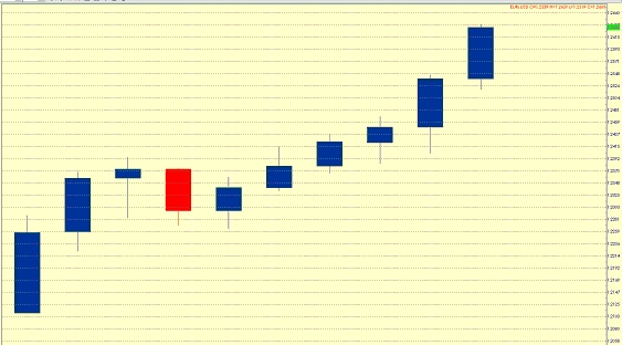
caption: Figure 1. A series of euro/dollar prices with mostly bullish daily candles, which have different body lengths.
On the one hand, short tails, or shadows, have no bearing on the significance of the candlestick. On the other hand, long shadows will point to failure in the direction of the shadow. Figure 2 shows several attempts to extend the euro/dollar rally seen in the first candle. However, while the third candle hits the highest level of this move, the attack is very tentative and the euro/dollar pulls back by the close. More of the same is seen in the next candle. Eventually it becomes clear that the market doesn't have what it takes to break any higher and the euro/dollar came down hard.
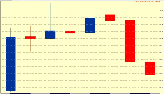
caption: Figure 2. The long shadows seen in the third and fourth candles indicate that the attack is very tentative and then the euro/dollar came down hard to give up most of its gains.
Intersections with Resistance Lines
Support and resistance lines are supposed to repel sell-offs and rallies, but eventually they give way. Figure 3 shows the euro/dollar engineering a breakout of a rising resistance line, which happens to be a channel line as well. While the strength of the uptrend is undeniable and the bullish momentum is clear to the naked eye, the euro/dollar made several attempts before succeeding its breakout. The third candle from right to left (see the red arrow) managed to break above the channel line on an intraday basis but failed to close above it. However, the subsequent decline is small and the pair closed just below that line. This behavior denotes the market is only a minor pause before making its next attack higher. The next day euro/dollar reverses early losses and makes a spectacular break on the upside (see the blue arrow).
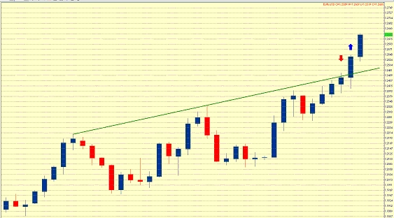
caption: Figure 3. Euro/dollar breaks above a rising resistance line, which happens to be a channel line as well. The third candle from right to left (the red arrow) managed to break above the channel line on an intraday basis but failed to close above it. The next day euro/dollar reverses early losses and makes a spectacular break on the upside (the blue arrow).
The Relationship with Moving Averages
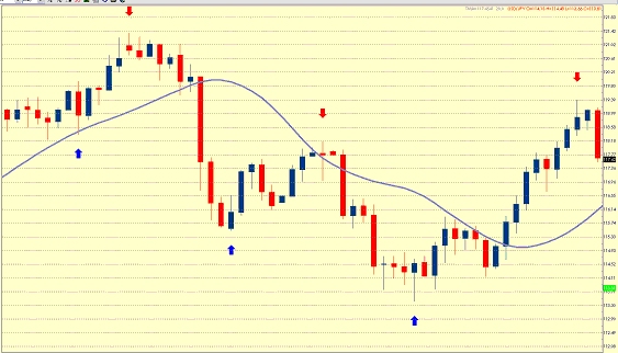
Shorter moving averages act as flexible support and resistance lines. In Figure 4 there are three areas: uptrend, downtrend and uptrend again. The combination of candlesticks and moving average makes it easier to identify both the strength of the trends and the overbought and oversold areas. The first blue line shows that the test of the support from the moving average was tentative and the euro/dollar quickly resumed its uptrend. The first red arrow, which points down, identifies an overbought area and the long shadows of three candlesticks in that area adds to expectations for a more significant decline. The subsequent downward breakout of the 20-day exponential moving average was very powerful and the euro/dollar quickly entered oversold territory. The oversold area is pointed by the second blue arrow. The euro/dollar alleviated this pressure by climbing up to the average. However, the pair closed only marginally above the moving average and formed an inter-trend doji, a one-day reversal formation, so the downtrend quickly reasserted itself. The euro/dollar plunged again and sank into oversold territory. The third blue line points out that area, which is further emphasized by long lower shadows, and the pair then started its difficult recovery. Eventually it managed to break above the average on a closing basis and the euro/dollar was on its way up again. The last red arrow identifies another overbought area and the long upper shadow adds to expectations for a sell-off. Two days later, the euro/dollar tumbled aggressively.

caption: Figure 4. The combination of candlesticks and moving average makes it easier to identify both the strength of the trends and the overbought and oversold areas.
The Relationship with Retracement Levels
Retracements levels, while Fibonacci or Gann, horizontal, angled or arcs, should be treated as magnet levels. Magnet levels attract or repel. The relationship between prices and these lines are best gauged with candles. In Figure 5 you can see an uptrend in euro/Swiss franc, whose peak is marked by long shadows within an overbought market. After struggling with the support of a rising 20-day exponential moving average, the cross finally started of a more sustained correction. It tentatively broke the support from the 38.2 percent Fibonacci retracement level. The euro/Swiss then tested the 50 percent retracement, but the long downside shadow, which was generated by the failure to penetrate that level, pointed to the upside. That signal was good for a six-day rally.
caption: Figure 5. The uptrend in euro/Swiss franc peaked with a long shadowed candlestick within an overbought market. The cross then started a more sustained correction. After tentatively breaking the support from the 38.2 percent Fibonacci retracement level, the euro/Swiss briefly tested the 50 percent retracement. The long downside shadow, which was generated by the failure to penetrate that level, pointed correctly to a rally.
Traders make a big deal about prices breaking support and resistance lines, trendlines, moving averages and retracement or extension levels. However, intersecting these lines on an intraday basis and closing outside them are two very different ball games.
Benefits for Using Candlesticks
Let's quickly review the reasons why traders should use candlestick charts for daily, weekly and hourly charts:
- Candles make it easy to separate bullish periods from bearish periods.
You can easily do that by looking at the different colors of the candles.
- They make it easy to separate truly bullish and bearish periods from failed bullish and bearish. Traders achieve that by avoiding bar charts. The lowest bar in a downtrend may look like a bearish continuation on a regular bar chart, but it may show just the opposite on the candlestick chart under special conditions.
- Candlestick charts provide specific bullish and bearish reversal patterns that are not seen with bar charts. In addition to the standard head-and-shoulders or flag formations, candlestick charts provide one-day or two-day reversals, such as dark cloud cover or hammers. These are powerful tools that should be used by all traders.
- They also provide "wait-and-see" patterns.
Traders always like clear directions, and currency dealers will be equally happy with both bullish and bearish signals. However, whether we like it or not, there will be many times when the markets will be quite unclear. Candlestick charts will provide these "wait-and-see" signals, such as harami, to warn you to slow down considerably or even temporarily stop trading because you do not have sufficient information.
Candlestick charts consist of opening, high, low, and closing prices, just like bar charts, but the significance of the closing price, along with the opening price, is clearly emphasized. There are two important elements to consider in chasing the above benefits:
- the distance between the close and the open
- the amount of trading noise
The body of the candlestick is formed by the difference between the opening and closing prices. Traditionally, a red body indicates that the currency closed higher than it opened, and a black body shows that the currency closed lower than it opened. Of course, select the color scheme of your choice, for as long as they are different and you remember which color is up and which one is down. A long body adds strength to that direction, while a small body indicates lack of confidence. Figure 1 shows a series of mostly bullish daily candles of euro/dollar, which have different body lengths
caption: Figure 1. A series of euro/dollar prices with mostly bullish daily candles, which have different body lengths.
On the one hand, short tails, or shadows, have no bearing on the significance of the candlestick. On the other hand, long shadows will point to failure in the direction of the shadow. Figure 2 shows several attempts to extend the euro/dollar rally seen in the first candle. However, while the third candle hits the highest level of this move, the attack is very tentative and the euro/dollar pulls back by the close. More of the same is seen in the next candle. Eventually it becomes clear that the market doesn't have what it takes to break any higher and the euro/dollar came down hard.
caption: Figure 2. The long shadows seen in the third and fourth candles indicate that the attack is very tentative and then the euro/dollar came down hard to give up most of its gains.
Intersections with Resistance Lines
Support and resistance lines are supposed to repel sell-offs and rallies, but eventually they give way. Figure 3 shows the euro/dollar engineering a breakout of a rising resistance line, which happens to be a channel line as well. While the strength of the uptrend is undeniable and the bullish momentum is clear to the naked eye, the euro/dollar made several attempts before succeeding its breakout. The third candle from right to left (see the red arrow) managed to break above the channel line on an intraday basis but failed to close above it. However, the subsequent decline is small and the pair closed just below that line. This behavior denotes the market is only a minor pause before making its next attack higher. The next day euro/dollar reverses early losses and makes a spectacular break on the upside (see the blue arrow).
caption: Figure 3. Euro/dollar breaks above a rising resistance line, which happens to be a channel line as well. The third candle from right to left (the red arrow) managed to break above the channel line on an intraday basis but failed to close above it. The next day euro/dollar reverses early losses and makes a spectacular break on the upside (the blue arrow).
The Relationship with Moving Averages
Shorter moving averages act as flexible support and resistance lines. In Figure 4 there are three areas: uptrend, downtrend and uptrend again. The combination of candlesticks and moving average makes it easier to identify both the strength of the trends and the overbought and oversold areas. The first blue line shows that the test of the support from the moving average was tentative and the euro/dollar quickly resumed its uptrend. The first red arrow, which points down, identifies an overbought area and the long shadows of three candlesticks in that area adds to expectations for a more significant decline. The subsequent downward breakout of the 20-day exponential moving average was very powerful and the euro/dollar quickly entered oversold territory. The oversold area is pointed by the second blue arrow. The euro/dollar alleviated this pressure by climbing up to the average. However, the pair closed only marginally above the moving average and formed an inter-trend doji, a one-day reversal formation, so the downtrend quickly reasserted itself. The euro/dollar plunged again and sank into oversold territory. The third blue line points out that area, which is further emphasized by long lower shadows, and the pair then started its difficult recovery. Eventually it managed to break above the average on a closing basis and the euro/dollar was on its way up again. The last red arrow identifies another overbought area and the long upper shadow adds to expectations for a sell-off. Two days later, the euro/dollar tumbled aggressively.
caption: Figure 4. The combination of candlesticks and moving average makes it easier to identify both the strength of the trends and the overbought and oversold areas.
The Relationship with Retracement Levels
Retracements levels, while Fibonacci or Gann, horizontal, angled or arcs, should be treated as magnet levels. Magnet levels attract or repel. The relationship between prices and these lines are best gauged with candles. In Figure 5 you can see an uptrend in euro/Swiss franc, whose peak is marked by long shadows within an overbought market. After struggling with the support of a rising 20-day exponential moving average, the cross finally started of a more sustained correction. It tentatively broke the support from the 38.2 percent Fibonacci retracement level. The euro/Swiss then tested the 50 percent retracement, but the long downside shadow, which was generated by the failure to penetrate that level, pointed to the upside. That signal was good for a six-day rally.
caption: Figure 5. The uptrend in euro/Swiss franc peaked with a long shadowed candlestick within an overbought market. The cross then started a more sustained correction. After tentatively breaking the support from the 38.2 percent Fibonacci retracement level, the euro/Swiss briefly tested the 50 percent retracement. The long downside shadow, which was generated by the failure to penetrate that level, pointed correctly to a rally.
Last edited by a moderator: