The Ichimoku Kinkou-Hyo is a technical study that was developed by a Tokyo newspaper writer, Goichi Hosoda, before World War II as a self-standing forecasting method for all financial markets. The name is a bit of a mouth-full, so many traders only call it Ichimoku, but in loose translation the full name means "One-look at the equilibrium prices." The name originated with Hosoda's pen name "Ichimoku Sanjin," which means a glance of a mountain man. This technical study consists of gauging midpoints of historical highs and lows at different lengths of time and several time lengths matched those used in the MACD's moving averages. Ichimoku provides another method of analyzing trends and brings additional points to retracement/extension analysis, and support and resistance from moving averages.
Ichimoku Kinkou-Hyo
The Ichimoku system consists of five lines: Kijun, Tenkan, Chiku, Senkou Span A and Span B. (See an application of this method as applied on the daily euro/dollar chart in Figure 1)
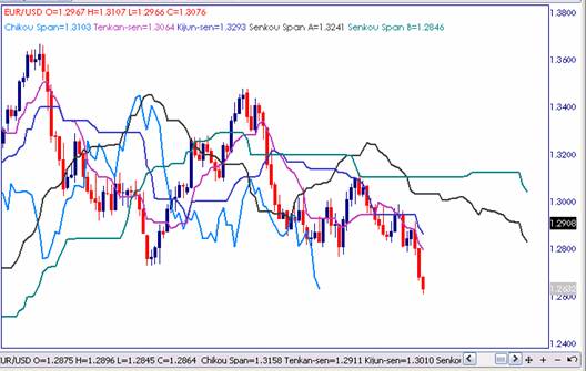
caption: Figure 1. Example of the complete Ichimoku system and its five lines: Kijun, Tenkan, Chiku, Senkou Span A and Span B as applied to the daily euro/dollar chart.
Kijun (Trend Line)
Kijun means trend in Japanese. Consequently, if the trend line is heading down, then this gives a selling signal and if the kijun line is advancing, then this suggests a buying signal. See only the trend line plotted on the daily euro/dollar chart in Figure 2.
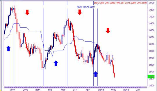
caption: Figure 2. Application of the Ichimoku's trend line (Kijun) on the daily euro/dollar chart.
The formula for the Kijun line is calculated as follows:
Trend (Kijun) Line = (highest high+ lowest low)/2 for the past 26 days.
If using only this trend line, the results tend to be mixed at best. There are three areas of strength on this chart and they are identified by blue rising arrows and three declines are marked with red declining arrows. The main direction on the entire daily chart is a down, but the width of the channel is very wide.
Let's focus first on the three rising periods. In the first one, the trend line is positioned under the currency pair, just as it should be, and is rising, exactly as the definition says, and providing clear support and confidence that the upmove will continue. See Figure 3.
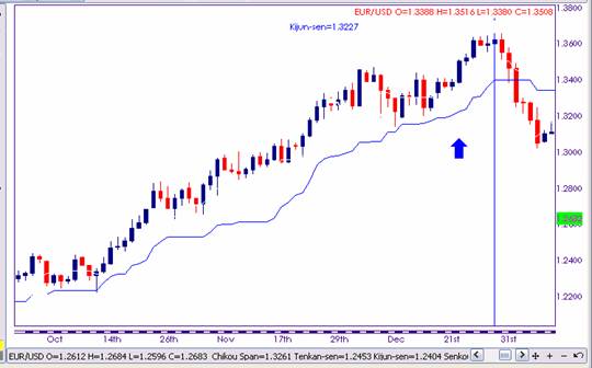
caption: Figure 3. Application of the Ichimoku's trend line (Kijun) on the daily euro/dollar chart - perfect application.
In the second period, which is displayed in Figure 4, the euro/dollar started its uptrend from beneath the trend line and it took it six days from bottoming before closing above this line. Influenced by the sideways market that can be seen in the middle of the rising area, the trend line provided two fairly insignificant buy signals, which were both difficult to use.
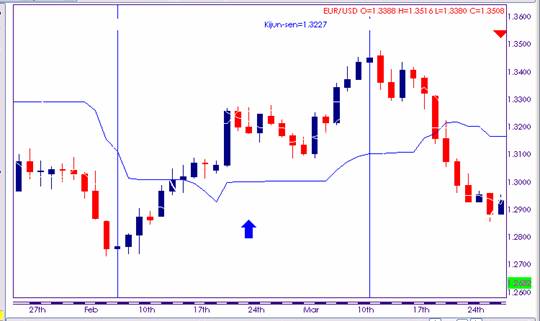
caption: Figure 4. Application of the Ichimoku's trend line (Kijun) on the daily euro/dollar chart - a less perfect application.
Finally, the Kijun line acted as a resistance line during the short-lived recovery within the euro/dollar's downtrend. See Figure 5.
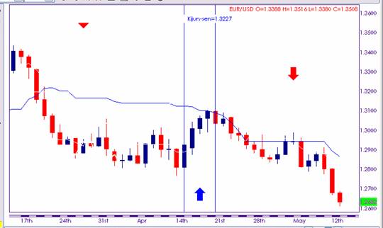
caption: Figure 5. Application of the Ichimoku's trend line (Kijun) - the Kijun line acted as a resistance line during the short-lived recovery within the euro/dollar's downtrend.
Let's know take a look at the three areas of decline within the downtrend.
In the first area there are three decline areas, which are separated by a three-day recovery and by a 10-day sideways market (see Figure 6). The Kijun line hangs above the prices, just as a resistance line should, but provides generally mixed trading signals: slow in the first two periods, but timely in the last period.
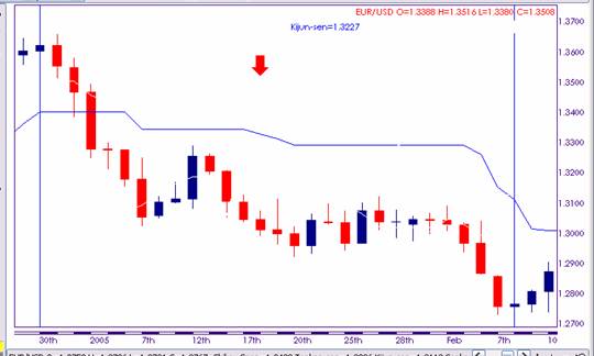
caption: Figure 6. Application of the Ichimoku's trend line (Kijun). The Kijun line acted as a resistance line but provided mixed selling signals.
The second decline area consists of a clear downmove in the first half and of a choppy and low angled decline in the second half. As Figure 7 shows, the Kijun line acted initially as a support level and then turned into a resistance line in the latter part of the move but provided only mixed selling signals.
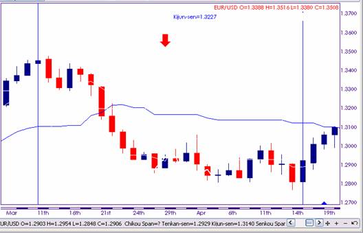
caption: Figure 7. Application of the Ichimoku's trend line (Kijun). The Kijun line acted as a resistance line in the latter part of the move but provided only mixed selling signals.
Finally, in the third phase of the downtrend, the Kijun line acted more its role.
Figure 8 shows it declining in line with the euro/dollar in the beginning and the end of the move and providing a strong barrier during the sideways trading area in the middle of the chart.
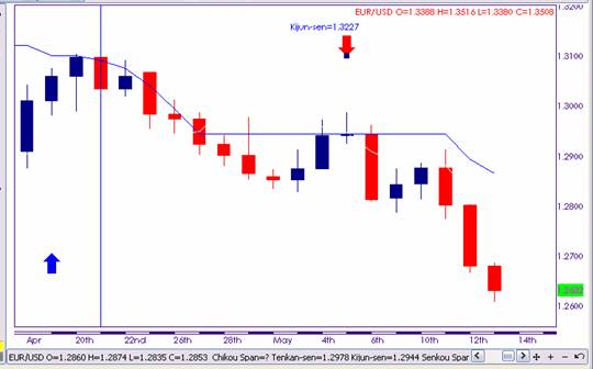
caption: Figure 8. Application of the Ichimoku's trend line (Kijun). The Kijun line fell in line with the euro/dollar in the beginning and the end of the move and provided a strong barrier during the sideways area in the middle of the chart.
In conclusion, the Kijun line should not be used on its own for direction symmetry with the currency. When used independently, this line works best for identifying overbought and oversold conditions. In Figure 9, you can see four overbought conditions, marked with red arrows, in which the euro/dollar had moved up too much above the Kijun line, and three oversold conditions, emphasized by blue arrows, in which the currency pair slipped too much below the trend line.
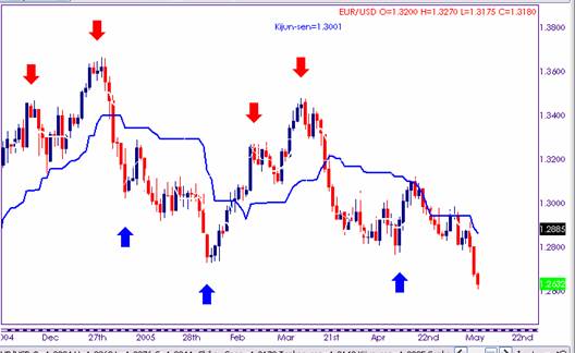
caption: Figure 9. Example of overbought and oversold conditions between the euro/dollar and the Kijun line. There are four overbought conditions (red arrows) and three oversold conditions (blue arrows).
Tenkan (Signal Line)
The Tenkan line is a signal line that works in conjunction with the trend line (kijun). A crossover above the trend line gives a buy signal and a cross over below the selling line provides a sell signal. Figure 10 shows a combination of the Tenkan and Kijun lines.
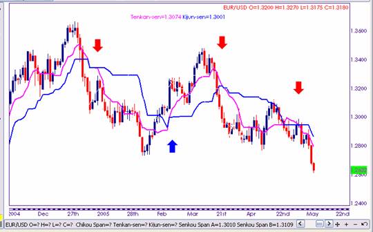
caption: Figure 10. Application of the Ichimoku's Tenkan and Kijun lines.
The formula for the Signal Line (Tenkan) is calculated as follows:
Signal Line (Tenkan) = (highest high+ lowest low)/2 for the past 9 days.
Figure 11 displays three selling signals, which are marked with red downward arrows and one buying signal, which is pointed by a blue rising arrow. With no exception, the signals to sell and to buy are late relative to the start of the downward and upward moves. Why? For the same reason why crossovers between exponential moving averages on 9 and 12 days, the same periods used in these two Ichimoku lines, would be late to signal the trading points. You can see a comparison between the crossovers of the Ichimoku's Tenkan and Kijun lines and the 9 and 26-day exponential moving averages in Figure 10.
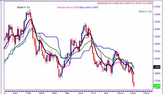
caption: Figure 11. A comparison between the crossovers of the Ichimoku's Tenkan and Kijun lines and the 9 and 12-day exponential moving averages.
Chiku (Lagging Line)
The Chiku line, or the lagging line, is very important for the entire Ichimoku outlook. The lagging line is simply the current close plotted 26 periods behind.
If both the Chiku line and the market are in an uptrend, then this is a buy signal, and vice versa. Figure 12 adds the Chiku line to the Ichimoku's Tenkan and Kijun lines. In this example, the euro/dollar daily prices are falling in sync with the Chiku line and this suggests further weakness for the pair.
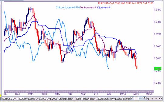
caption: Figure 12. Ichimoku's Chiku, Tenkan and Kijun lines applied to the euro/dollar daily prices. This chart suggests further weakness for the pair.
In addition, if a selling signal occurs while the lagging line is plotted below the current closing price, then this signal gains more technical strength. The opposite applies to a bullish market: if a bullish signal is formed while the Chiku line floats above the closing line, then this signal is more important.
Senkou Spans A and B (Cloud)
The two Senkou, or leading lines, create a Cloud-like formation, Kumo in Japanese, and this is an area of support or resistance. The market must break above the Cloud to give a buy signal or below the Cloud to give a sell signal. The Senkou lines are used in a similar manner as the standard support and resistance levels.
The Kumo formulas are as follows:
The leading line A = (Tenkan line + Kijun line)/2, plotted 26 periods ahead
The leading line B = (Highest high + Lowest low)/2 for the past 52 periods, plotted 26 days ahead
Let's take a look only at the Cloud on the euro/dollar in Figure 13. The pair attacked and successfully penetrated the support of the Cloud in the two instances pointed by the red arrows. Euro/dollar also managed to smash the resistance of the Cloud in the first instance, which is shown by the initial blue arrow. However, the failure to surpass the Cloud resistance in the second situation translated into a severe sell-off.
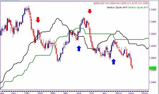
caption: Figure 13. The Cloud (Kumo) is formed by two Senkou, or leading lines, and they act as standard support and resistance levels.
As Figure 13 shows, the Cloud has different levels of thickness. Overall, a thick Cloud means good support or resistance and increased volatility. Conversely, a thin Cloud, as seen to the left of the blue arrows, for instance, signals a period of low volatility, so the market should trade sideways.
Relative Strength Signals
In addition to the intersection between the currency price and one or two of the individual lines, in sync moves and overbought/oversold conditions, the Ichimoku system provides more trading signals, known as Relative Strength Signals.
For instance, a bullish crossover that occurs above the Cloud formation is becoming a very strong buying signal, while a bearish crossover forming below the Cloud is turning into a very bearish signal.
If the crossover occurs within the Cloud, then the buy or sell signal is normal in significance.
Finally, a bullish crossover becomes a weak buy signal if formed below the Cloud formation. Conversely, a bearish intersection looses technical significance if it occurs above the Kumo.
The fact that leading span lines are plotted ahead of the market development, they provide support and resistance in advance, and possibly direction as well. Of course, markets above the Cloud are generally in an uptrend, while those below the Cloud are typically in a downtrend.
In Figure 14 you can see examples of Relative Strength Signals on the daily sterling/dollar chart. The first red arrow indicates a strong sell signal above the Cloud. Finally, the blue arrow points to a normal buy signal, which occurred within the cloud.
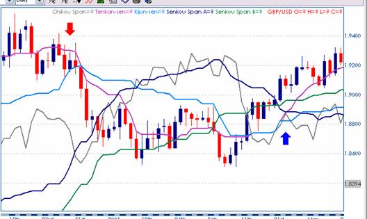
caption: Figure 14. Examples of Relative Strength Signals on the daily sterling/dollar chart. The first red arrow indicates a strong sell signal and the blue arrow points to a normal buy signal.
Ichimoku Kinkou-Hyo
The Ichimoku system consists of five lines: Kijun, Tenkan, Chiku, Senkou Span A and Span B. (See an application of this method as applied on the daily euro/dollar chart in Figure 1)

caption: Figure 1. Example of the complete Ichimoku system and its five lines: Kijun, Tenkan, Chiku, Senkou Span A and Span B as applied to the daily euro/dollar chart.
Kijun (Trend Line)
Kijun means trend in Japanese. Consequently, if the trend line is heading down, then this gives a selling signal and if the kijun line is advancing, then this suggests a buying signal. See only the trend line plotted on the daily euro/dollar chart in Figure 2.

caption: Figure 2. Application of the Ichimoku's trend line (Kijun) on the daily euro/dollar chart.
The formula for the Kijun line is calculated as follows:
Trend (Kijun) Line = (highest high+ lowest low)/2 for the past 26 days.
If using only this trend line, the results tend to be mixed at best. There are three areas of strength on this chart and they are identified by blue rising arrows and three declines are marked with red declining arrows. The main direction on the entire daily chart is a down, but the width of the channel is very wide.
Let's focus first on the three rising periods. In the first one, the trend line is positioned under the currency pair, just as it should be, and is rising, exactly as the definition says, and providing clear support and confidence that the upmove will continue. See Figure 3.

caption: Figure 3. Application of the Ichimoku's trend line (Kijun) on the daily euro/dollar chart - perfect application.
In the second period, which is displayed in Figure 4, the euro/dollar started its uptrend from beneath the trend line and it took it six days from bottoming before closing above this line. Influenced by the sideways market that can be seen in the middle of the rising area, the trend line provided two fairly insignificant buy signals, which were both difficult to use.

caption: Figure 4. Application of the Ichimoku's trend line (Kijun) on the daily euro/dollar chart - a less perfect application.
Finally, the Kijun line acted as a resistance line during the short-lived recovery within the euro/dollar's downtrend. See Figure 5.

caption: Figure 5. Application of the Ichimoku's trend line (Kijun) - the Kijun line acted as a resistance line during the short-lived recovery within the euro/dollar's downtrend.
Let's know take a look at the three areas of decline within the downtrend.
In the first area there are three decline areas, which are separated by a three-day recovery and by a 10-day sideways market (see Figure 6). The Kijun line hangs above the prices, just as a resistance line should, but provides generally mixed trading signals: slow in the first two periods, but timely in the last period.

caption: Figure 6. Application of the Ichimoku's trend line (Kijun). The Kijun line acted as a resistance line but provided mixed selling signals.
The second decline area consists of a clear downmove in the first half and of a choppy and low angled decline in the second half. As Figure 7 shows, the Kijun line acted initially as a support level and then turned into a resistance line in the latter part of the move but provided only mixed selling signals.

caption: Figure 7. Application of the Ichimoku's trend line (Kijun). The Kijun line acted as a resistance line in the latter part of the move but provided only mixed selling signals.
Finally, in the third phase of the downtrend, the Kijun line acted more its role.
Figure 8 shows it declining in line with the euro/dollar in the beginning and the end of the move and providing a strong barrier during the sideways trading area in the middle of the chart.

caption: Figure 8. Application of the Ichimoku's trend line (Kijun). The Kijun line fell in line with the euro/dollar in the beginning and the end of the move and provided a strong barrier during the sideways area in the middle of the chart.
In conclusion, the Kijun line should not be used on its own for direction symmetry with the currency. When used independently, this line works best for identifying overbought and oversold conditions. In Figure 9, you can see four overbought conditions, marked with red arrows, in which the euro/dollar had moved up too much above the Kijun line, and three oversold conditions, emphasized by blue arrows, in which the currency pair slipped too much below the trend line.

caption: Figure 9. Example of overbought and oversold conditions between the euro/dollar and the Kijun line. There are four overbought conditions (red arrows) and three oversold conditions (blue arrows).
Tenkan (Signal Line)
The Tenkan line is a signal line that works in conjunction with the trend line (kijun). A crossover above the trend line gives a buy signal and a cross over below the selling line provides a sell signal. Figure 10 shows a combination of the Tenkan and Kijun lines.

caption: Figure 10. Application of the Ichimoku's Tenkan and Kijun lines.
The formula for the Signal Line (Tenkan) is calculated as follows:
Signal Line (Tenkan) = (highest high+ lowest low)/2 for the past 9 days.
Figure 11 displays three selling signals, which are marked with red downward arrows and one buying signal, which is pointed by a blue rising arrow. With no exception, the signals to sell and to buy are late relative to the start of the downward and upward moves. Why? For the same reason why crossovers between exponential moving averages on 9 and 12 days, the same periods used in these two Ichimoku lines, would be late to signal the trading points. You can see a comparison between the crossovers of the Ichimoku's Tenkan and Kijun lines and the 9 and 26-day exponential moving averages in Figure 10.

caption: Figure 11. A comparison between the crossovers of the Ichimoku's Tenkan and Kijun lines and the 9 and 12-day exponential moving averages.
Chiku (Lagging Line)
The Chiku line, or the lagging line, is very important for the entire Ichimoku outlook. The lagging line is simply the current close plotted 26 periods behind.
If both the Chiku line and the market are in an uptrend, then this is a buy signal, and vice versa. Figure 12 adds the Chiku line to the Ichimoku's Tenkan and Kijun lines. In this example, the euro/dollar daily prices are falling in sync with the Chiku line and this suggests further weakness for the pair.

caption: Figure 12. Ichimoku's Chiku, Tenkan and Kijun lines applied to the euro/dollar daily prices. This chart suggests further weakness for the pair.
In addition, if a selling signal occurs while the lagging line is plotted below the current closing price, then this signal gains more technical strength. The opposite applies to a bullish market: if a bullish signal is formed while the Chiku line floats above the closing line, then this signal is more important.
Senkou Spans A and B (Cloud)
The two Senkou, or leading lines, create a Cloud-like formation, Kumo in Japanese, and this is an area of support or resistance. The market must break above the Cloud to give a buy signal or below the Cloud to give a sell signal. The Senkou lines are used in a similar manner as the standard support and resistance levels.
The Kumo formulas are as follows:
The leading line A = (Tenkan line + Kijun line)/2, plotted 26 periods ahead
The leading line B = (Highest high + Lowest low)/2 for the past 52 periods, plotted 26 days ahead
Let's take a look only at the Cloud on the euro/dollar in Figure 13. The pair attacked and successfully penetrated the support of the Cloud in the two instances pointed by the red arrows. Euro/dollar also managed to smash the resistance of the Cloud in the first instance, which is shown by the initial blue arrow. However, the failure to surpass the Cloud resistance in the second situation translated into a severe sell-off.

caption: Figure 13. The Cloud (Kumo) is formed by two Senkou, or leading lines, and they act as standard support and resistance levels.
As Figure 13 shows, the Cloud has different levels of thickness. Overall, a thick Cloud means good support or resistance and increased volatility. Conversely, a thin Cloud, as seen to the left of the blue arrows, for instance, signals a period of low volatility, so the market should trade sideways.
Relative Strength Signals
In addition to the intersection between the currency price and one or two of the individual lines, in sync moves and overbought/oversold conditions, the Ichimoku system provides more trading signals, known as Relative Strength Signals.
For instance, a bullish crossover that occurs above the Cloud formation is becoming a very strong buying signal, while a bearish crossover forming below the Cloud is turning into a very bearish signal.
If the crossover occurs within the Cloud, then the buy or sell signal is normal in significance.
Finally, a bullish crossover becomes a weak buy signal if formed below the Cloud formation. Conversely, a bearish intersection looses technical significance if it occurs above the Kumo.
The fact that leading span lines are plotted ahead of the market development, they provide support and resistance in advance, and possibly direction as well. Of course, markets above the Cloud are generally in an uptrend, while those below the Cloud are typically in a downtrend.
In Figure 14 you can see examples of Relative Strength Signals on the daily sterling/dollar chart. The first red arrow indicates a strong sell signal above the Cloud. Finally, the blue arrow points to a normal buy signal, which occurred within the cloud.

caption: Figure 14. Examples of Relative Strength Signals on the daily sterling/dollar chart. The first red arrow indicates a strong sell signal and the blue arrow points to a normal buy signal.
Last edited by a moderator:
