Steve Nison is a busy man. Ever since his first book "Japanese Candlestick Charting Techniques" was published in 1991 he has run his own advisory business, which gives trade recommendations to institutional investors and hedge funds. He is also one of the most respected teachers on trading the financial markets, and his seminars are always a sell-out wherever he goes. Since the publication of his first book he has written another two best sellers on
Candlestick analysis. His first book is affectionately known as the "modern-day bible" of trading.
Tom Hougaard caught up with Steve Nison during a quiet day in the market.
Steve Nison: 30 years ago I worked for a commodity broker and advisory service. All my work was based around fundamental analysis. Today it is hard to imagine that all investment decisions 30 years ago were based on fundamental research. I knew nothing about technical analysis before I started working in this business and while I studied for my MBA we were not taught anything about charts.
The president of the company however was well frequented with the use of charting. During our meetings with our clients I realised that he used technical analysis to derive his trading recommendations, but he explained the recommendations using fundamental analysis. 30 years ago technical analysis was considered somewhat of a black art that no one with respect for themselves would use.
While fundamental analysis can explain the forces at play in a bull or bear run, psychology will create the volatility. Fundamental analysis can't explain this.
As John Maynard Keynes said: it is extremely dangerous to have a rational investment policy in an irrational world. I think the president of the company knew better than anyone at the time how to integrate technical analysis into fundamental research.
I started studying everything I could find on technical analysis. Back then we used bar charts and line charts to display price action, and it wasn't until I met another commodity broker some 15 years later that I discovered Japanese Candlestick charts.
In 1987 I met a Japanese broker, and while I was in her office discussing the markets she used an expression describing chart patterns that I had never heard before. She used Candlesticks on her own charts, which is the Japanese tradition, and I really got hooked on this tool immediately.
Unfortunately there was no material written in English whatsoever to aid me, and the next 3 years was spent not only translating books but also making it understandable to Western society. That meant spending a lot of time reading about and coming to understand the philosophy of the East, including the principles of Yin and Yang. I ended up learning a whole lot more than just a charting tool.
Technical analysis is the only way to measure the emotional component of the market. We know that many times an ounce of emotion can be worth a pound of facts. How else to explain the sudden shift in the market without a change in the fundamentals?
A fascinating attribute to candle charts is that the names of the candle patterns are a colourful mechanism describing the emotional health of the market at the time these patterns are formed. If you heard the expression "dark-cloud cover," would you think the market is in a healthy emotional state? Of course not! This is a bearish pattern and as the name suggest there is darkness over the market.
TH: Did you begin to apply your new-found knowledge immediately?
SN: At the time I worked at Hutton as a commodity advisor. No-one knew I was using Candlestick charts to derive buy and sell signals, and I was extremely successful in my analysis. This fuelled my desire to learn more and more. I had good help from some fine Japanese traders who had used Candles all their trading life. One such trader was Morihiko Goto who told me that his family had used this form of charting for generations.
The Japanese stock market started back in 1870 but rice trading had been around for long before that. Charting the fluctuations of rice prices on the
Osaka Exchange probably took place more than 100 years before the opening of the stock market. It is hard to pin down exactly when Candlestick charts came to life.
TH: Has Eastern philosophy permeated itself into the terminology of Candlesticks?
SN: The Eastern philosophy of Yin and Yang is at the very base of Japanese Candlestick charting. Yang is bullish and Yin is bearish. The Japanese have a saying that states that when Yang reaches an extreme, we have stillness. The stillness gives rise to Yin.
This has given rise to a candle pattern called an Evening Star. The Japanese have used their understanding of psychology in the candle patterns. The Evening Star is a bullish candle, which is represented by the tall white candle. The next candle is a small real body, which shows that the market has moving momentum or shows stillness, which is then followed by the tall black candle, which is the reversal or the Yin.
Many Japanese Candlestick patterns have their origin in the Japanese warrior society and use military analogies, such as 3 White Soldiers. So although the interpretation of the price action in the market is an art of it own, the Japanese Candlesticks have deep roots in the philosophy of the East.
Back in the 1920's technical analysts in the US began writing about the chart pattern we now know as the Head and Shoulder pattern. This particular pattern consists of 3 rallies of which the middle rally is the longest. However, the same pattern is discussed in material dating back much earlier, but it was called the
3 Buddhas pattern. You will often find 3 statues sitting next to each other in the East. The middle Buddha is the biggest and next to it on either side are two small Buddhas.
TH: Can Candle charts be applied to any market in any time-frame?
SN: The Japanese have a saying, which answers that question: The song of a bird is the same everywhere.
Candles can be used on all time frames. 90% of people who attend my seminars are swing traders. I define a swing trader as someone whose trading time-frame ranges from intra-day to up to 3 weeks. Therefore we focus the seminar work on the hourly and the daily chart.
Our institutional clients often want us to focus on the longer-term charts and we use the weekly candle charts for this purpose. Candlestick analysis is a tool more than a method. I teach traders in the big banks around the world how to read the charts using candles and the use of proper risk management through the use of the candle formations.
All of the candle formations have got an inbuilt money management parameter, in that if a certain pattern is forming in the market, the trader will know what will invalidate this particular pattern. He or she can then put his stop loss at this particular exit point.
TH: What are the advantages of candles over bar charts and line charts?
SN: Candlesticks are superior to bar charts in virtually every conceivable way. Candles will spot reversals before bar charts do. The very nature of the candles is that it will warn you of impending reversals before the reversal has even taken place.
Candles offer razor sharp entry to the market and if you use candles with traditional Western technical analysis you gain a real edge. I call it confluence of technical indicators and I teach this extensively in my seminars. If you for example combine candle pattern with, for example, volume thrusts you get a much better signal than if you use volume alone.
An example of this could be the bullish engulfing pattern, where you have a black candle followed by a white candle. This is a reversal pattern, and I will become bullish if the volume is declining on the black candle and increases on the white candle. This shows me the bulls are in control and I can initiate long positions accordingly.
Another added advantage of candle charts is the colours of the actual candle bars. Visually the candle charts will give the trader an instant indication of the bullish or bearish forces at play. Bar charts will not readily give you this.
At the end of my seminars I always ask the delegates if they will ever go back and look at bar charts. So far I have never had anyone raise his or her hands.
EXAMPLES OF CANDLE PATTERNS
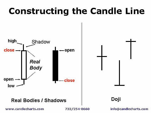
The broad part of the candlestick line in Exhibit 1 is called the real body. The real body represents the range between the session's open and close. If the close of the session is above the open then the real body is white. If the real body is black the close of the session is lower than the open.
The thin lines above and below the real body are the shadows. These are the session's price extremes. The shadow above the real body is called the upper shadow and the peak of the upper shadow is the high of the session. The shadow under the real body is the lower shadow and the bottom of the lower shadow is the session's low.
Candle lines can be drawn for all time-frames, from intra-day to monthly charts. For example, a 60-minute candle line uses the open, high, low and close of that 60-minute period; for a daily chart it would be the open, high, low and close for the day. On a weekly chart the candle would be based on Monday's open, the high and low of the week and Friday's close.
Notice that the candles to the right have no real bodies. These are examples of doji (pronounced doe-gee). A doji is a candle in which the opening and close are the same. Doji represent a market that is in balance between the forces of supply and demand.
While the candlestick line uses the same data as a bar chart, the colour of the candlestick's real body and the length of the candle line's real body and shadows convey an instant x-ray into who's winning the battle between the bulls and the bears.
For instance, when the real body is black, that means the stock closed below its opening price. This gives you an instant picture of a positive or negative close. Those of us who stare at charts for hours at a time find candlesticks are not only easy on the eyes, they convey strong visual signals sometimes missed on bar charts.
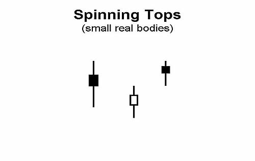
The logo of our firm, which is a spinning top, is "Helping Clients Spot Market Turns Before the Competition". This is because one of the most powerful aspects of candle charts is that they will often provide reversal signals not available with traditional bar charting techniques. Let's take a look at this aspect with a "spinning top."
As mentioned previously, one of the more powerful aspects of candle charts is the quick visual information they relay about the market's heath. For example, a small real body (white or black) indicates a period in which the bulls and bears are more in a tug of war. The Japanese have a nickname for small real bodies - "spinning tops" - because of their resemblance to the tops we had as children. Such small real bodies give a warning that the market's trend may be losing momentum. As the Japanese phrase it, the "market is losing its breath."
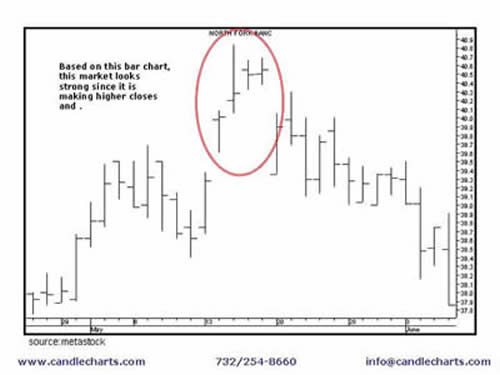
Let's look at an example of how candle charts will often help you preserve capital, a benefit so important in today's volatile environment. In this scenario I will illustrate how a candle chart can help you avoid a potentially losing trade from the long side.
I have two charts below. The chart above is a bar chart . On this chart the stock looks strong since it is making consecutively higher closes. It looks like a stock to buy.
Using the same data as on the bar chart, we now make a candle chart.
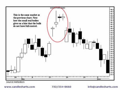
Note the different perspective we get with the candle chart than with the bar chart. On the candle chart, in the same circled area, there are a series of small real bodies?which the Japanese call "Spinning Tops". Small real bodies hint that the prior trend (i.e. the rally) could be losing its breath.
As such, while the bar chart makes it look attractive to buy, the candle chart shows there is indeed a reason for caution about going long - the small real bodies illustrate the bulls are losing force. Thus, by using the candle chart, a trader would likely not buy in the circled area and thus help avoid a losing trade.
This is but one example of how candles shine at helping you preserve capital.
Warren Buffet has two rules:
Candles shine at helping you preserve capital.
The doji is one of the most famous candlestick patterns.
As the real body shrinks we ultimately wind up with a doji. This was shown in the first example. A doji is when the open and close are the same.
The doji indicates a market in complete balance between supply and demand. Since a doji session represents a market at a juncture of indecision, they can often be an early warning that a preceding rally could be losing steam. Indeed, with a doji the Japanese would say, that "the market is tired". (Keep in mind a close over the doji would "refresh" the market).
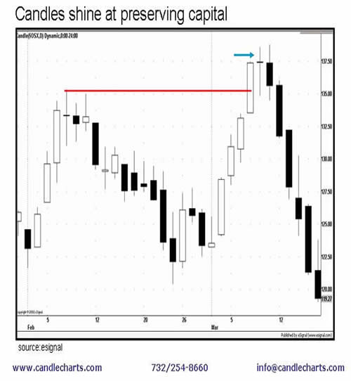
Properly used, candle charts may not only help improve profits, but will assist in preserving capital. They can do this by helping you avoid a potential losing trade or exiting a profitable trade early. The chart above shows an example of this.
This is a chart of the SOX, also known as the
Philadelphia Semiconductor Index, which lists the biggest computer memory producers in the world, such as Intel, Texas Instruments and Motorola.
The horizontal line in this chart shows a resistance area near 135. A tall white candle pierces this resistance in early March. But observe what unfolded the next session?the doji. This doji line hinted that the bulls had lost full control of the market (note: it does not mean that the bears have taken control).
This is a classic example of the power of candle charting techniques. Specifically, within one session we were able to see a visual clue via the doji that while the market was maintaining its highs, the doji shouted that the bulls were not in complete control. So while the market looked healthy from the outside, the internals (as shown by the doji) were relaying the fact that this stock was not as healthy as one would think.
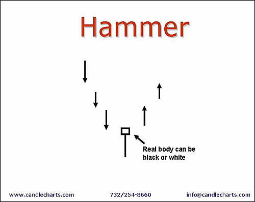
We now look at a specific type of candle line that has a very long lower shadow called a hammer. It is so called because the market is trying to hammer out a base.
The criteria for the hammer are:
1. The real body is at the upper end of the trading range.
2. The colour of the real body can be black or white.
3. A bullish long lower shadow that is at least twice the height of the real body.
4. It should have no, or a very short, upper shadow.
The hammer reflects the market insights obtained from a candle chart?specifically the hammer's extended lower shadow shows that the market rejected lower price levels to close at, or near, the highs of the session. From my experience, most times when there is a hammer the market may not immediately move up, but may rally slightly, or trade laterally, and then, after expanding on a base, rally. If the market closes under the lows of the hammer, longs should be reconsidered.
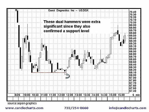
Candle charts can be used in all time frames- from intra-day day to weekly.
In the intra-day chart, there are two back-to-back hammers (denoted by the arrow). These dual hammers took on extra significance since they confirmed a support level shown by the dashed line.
This is a classic example of the power and the ease with which one can combine the insights of candle charts (the hammers) with classic western trading signals (the support line) to increase the likelihood of a market turn. This synergy of candle charts and western technical tools should provide a powerful weapon in your trading arsenal.
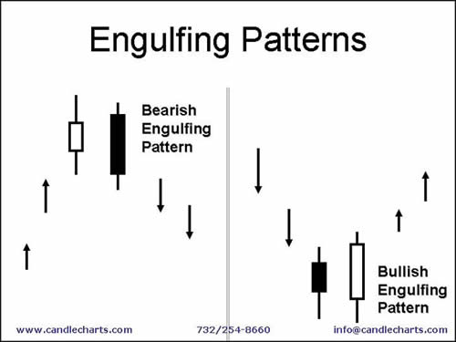
An engulfing pattern is a two-candle pattern.
A bearish engulfing pattern, shown on the left-hand side of the chart, is formed when during a rally a black real body wraps around a white real body. A bullish engulfing pattern, shown on the right-hand side of the chart, is completed when during a descent a white real body envelops the prior black real body.
The engulfing pattern is illustrative of how the candles can help provide greater understanding into the behaviour of the markets. For example, a bullish engulfing pattern reflects how the bulls have wrested control of the market from the bears. A bearish engulfing pattern shows how a superior force of supply has overwhelmed the bulls. The Japanese will say, for instance, that with a bearish engulfing pattern "the bulls are immobilized".
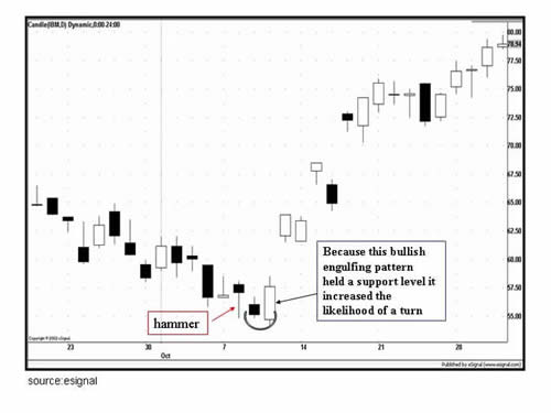
The chart above shows how a bullish engulfing pattern in early October called a reversal at IBM's lows. This bullish engulfing pattern was especially potent because it reinforced a support area set by a hammer.
Candles and the overall technical picture
You must remember a basic principle about the use of candles: candle charting techniques are a tool and not a system. Effective candle charting techniques requires not only an understanding of the candle patterns, but also a policy of using sound, coherent trading strategies and tactics. These include using stops, determining the risk and reward aspect of a potential trade, observing where a candle pattern is in relation to the overall trend, and monitoring the market's action after a trade is placed. By understanding and using these trading principles, you will be in a position to most fully enhance the power of the candles.
This is only a basic introduction to candle charts. There are many more patterns, concepts and trading techniques that must first be considered. But even with these basic concepts, you can see how the candles open new and unique doors of analysis.
Candlestick analysis. His first book is affectionately known as the "modern-day bible" of trading.
Tom Hougaard caught up with Steve Nison during a quiet day in the market.
Tom Hougaard: How did it all start?
Steve Nison: 30 years ago I worked for a commodity broker and advisory service. All my work was based around fundamental analysis. Today it is hard to imagine that all investment decisions 30 years ago were based on fundamental research. I knew nothing about technical analysis before I started working in this business and while I studied for my MBA we were not taught anything about charts.
The president of the company however was well frequented with the use of charting. During our meetings with our clients I realised that he used technical analysis to derive his trading recommendations, but he explained the recommendations using fundamental analysis. 30 years ago technical analysis was considered somewhat of a black art that no one with respect for themselves would use.
While fundamental analysis can explain the forces at play in a bull or bear run, psychology will create the volatility. Fundamental analysis can't explain this.
As John Maynard Keynes said: it is extremely dangerous to have a rational investment policy in an irrational world. I think the president of the company knew better than anyone at the time how to integrate technical analysis into fundamental research.
I started studying everything I could find on technical analysis. Back then we used bar charts and line charts to display price action, and it wasn't until I met another commodity broker some 15 years later that I discovered Japanese Candlestick charts.
In 1987 I met a Japanese broker, and while I was in her office discussing the markets she used an expression describing chart patterns that I had never heard before. She used Candlesticks on her own charts, which is the Japanese tradition, and I really got hooked on this tool immediately.
Unfortunately there was no material written in English whatsoever to aid me, and the next 3 years was spent not only translating books but also making it understandable to Western society. That meant spending a lot of time reading about and coming to understand the philosophy of the East, including the principles of Yin and Yang. I ended up learning a whole lot more than just a charting tool.
Technical analysis is the only way to measure the emotional component of the market. We know that many times an ounce of emotion can be worth a pound of facts. How else to explain the sudden shift in the market without a change in the fundamentals?
A fascinating attribute to candle charts is that the names of the candle patterns are a colourful mechanism describing the emotional health of the market at the time these patterns are formed. If you heard the expression "dark-cloud cover," would you think the market is in a healthy emotional state? Of course not! This is a bearish pattern and as the name suggest there is darkness over the market.
TH: Did you begin to apply your new-found knowledge immediately?
SN: At the time I worked at Hutton as a commodity advisor. No-one knew I was using Candlestick charts to derive buy and sell signals, and I was extremely successful in my analysis. This fuelled my desire to learn more and more. I had good help from some fine Japanese traders who had used Candles all their trading life. One such trader was Morihiko Goto who told me that his family had used this form of charting for generations.
The Japanese stock market started back in 1870 but rice trading had been around for long before that. Charting the fluctuations of rice prices on the
Osaka Exchange probably took place more than 100 years before the opening of the stock market. It is hard to pin down exactly when Candlestick charts came to life.
TH: Has Eastern philosophy permeated itself into the terminology of Candlesticks?
SN: The Eastern philosophy of Yin and Yang is at the very base of Japanese Candlestick charting. Yang is bullish and Yin is bearish. The Japanese have a saying that states that when Yang reaches an extreme, we have stillness. The stillness gives rise to Yin.
This has given rise to a candle pattern called an Evening Star. The Japanese have used their understanding of psychology in the candle patterns. The Evening Star is a bullish candle, which is represented by the tall white candle. The next candle is a small real body, which shows that the market has moving momentum or shows stillness, which is then followed by the tall black candle, which is the reversal or the Yin.
Many Japanese Candlestick patterns have their origin in the Japanese warrior society and use military analogies, such as 3 White Soldiers. So although the interpretation of the price action in the market is an art of it own, the Japanese Candlesticks have deep roots in the philosophy of the East.
Back in the 1920's technical analysts in the US began writing about the chart pattern we now know as the Head and Shoulder pattern. This particular pattern consists of 3 rallies of which the middle rally is the longest. However, the same pattern is discussed in material dating back much earlier, but it was called the
3 Buddhas pattern. You will often find 3 statues sitting next to each other in the East. The middle Buddha is the biggest and next to it on either side are two small Buddhas.
TH: Can Candle charts be applied to any market in any time-frame?
SN: The Japanese have a saying, which answers that question: The song of a bird is the same everywhere.
Candles can be used on all time frames. 90% of people who attend my seminars are swing traders. I define a swing trader as someone whose trading time-frame ranges from intra-day to up to 3 weeks. Therefore we focus the seminar work on the hourly and the daily chart.
Our institutional clients often want us to focus on the longer-term charts and we use the weekly candle charts for this purpose. Candlestick analysis is a tool more than a method. I teach traders in the big banks around the world how to read the charts using candles and the use of proper risk management through the use of the candle formations.
All of the candle formations have got an inbuilt money management parameter, in that if a certain pattern is forming in the market, the trader will know what will invalidate this particular pattern. He or she can then put his stop loss at this particular exit point.
TH: What are the advantages of candles over bar charts and line charts?
SN: Candlesticks are superior to bar charts in virtually every conceivable way. Candles will spot reversals before bar charts do. The very nature of the candles is that it will warn you of impending reversals before the reversal has even taken place.
Candles offer razor sharp entry to the market and if you use candles with traditional Western technical analysis you gain a real edge. I call it confluence of technical indicators and I teach this extensively in my seminars. If you for example combine candle pattern with, for example, volume thrusts you get a much better signal than if you use volume alone.
An example of this could be the bullish engulfing pattern, where you have a black candle followed by a white candle. This is a reversal pattern, and I will become bullish if the volume is declining on the black candle and increases on the white candle. This shows me the bulls are in control and I can initiate long positions accordingly.
Another added advantage of candle charts is the colours of the actual candle bars. Visually the candle charts will give the trader an instant indication of the bullish or bearish forces at play. Bar charts will not readily give you this.
At the end of my seminars I always ask the delegates if they will ever go back and look at bar charts. So far I have never had anyone raise his or her hands.
EXAMPLES OF CANDLE PATTERNS

The broad part of the candlestick line in Exhibit 1 is called the real body. The real body represents the range between the session's open and close. If the close of the session is above the open then the real body is white. If the real body is black the close of the session is lower than the open.
The thin lines above and below the real body are the shadows. These are the session's price extremes. The shadow above the real body is called the upper shadow and the peak of the upper shadow is the high of the session. The shadow under the real body is the lower shadow and the bottom of the lower shadow is the session's low.
Candle lines can be drawn for all time-frames, from intra-day to monthly charts. For example, a 60-minute candle line uses the open, high, low and close of that 60-minute period; for a daily chart it would be the open, high, low and close for the day. On a weekly chart the candle would be based on Monday's open, the high and low of the week and Friday's close.
Notice that the candles to the right have no real bodies. These are examples of doji (pronounced doe-gee). A doji is a candle in which the opening and close are the same. Doji represent a market that is in balance between the forces of supply and demand.
While the candlestick line uses the same data as a bar chart, the colour of the candlestick's real body and the length of the candle line's real body and shadows convey an instant x-ray into who's winning the battle between the bulls and the bears.
For instance, when the real body is black, that means the stock closed below its opening price. This gives you an instant picture of a positive or negative close. Those of us who stare at charts for hours at a time find candlesticks are not only easy on the eyes, they convey strong visual signals sometimes missed on bar charts.

The logo of our firm, which is a spinning top, is "Helping Clients Spot Market Turns Before the Competition". This is because one of the most powerful aspects of candle charts is that they will often provide reversal signals not available with traditional bar charting techniques. Let's take a look at this aspect with a "spinning top."
As mentioned previously, one of the more powerful aspects of candle charts is the quick visual information they relay about the market's heath. For example, a small real body (white or black) indicates a period in which the bulls and bears are more in a tug of war. The Japanese have a nickname for small real bodies - "spinning tops" - because of their resemblance to the tops we had as children. Such small real bodies give a warning that the market's trend may be losing momentum. As the Japanese phrase it, the "market is losing its breath."

Let's look at an example of how candle charts will often help you preserve capital, a benefit so important in today's volatile environment. In this scenario I will illustrate how a candle chart can help you avoid a potentially losing trade from the long side.
I have two charts below. The chart above is a bar chart . On this chart the stock looks strong since it is making consecutively higher closes. It looks like a stock to buy.
Using the same data as on the bar chart, we now make a candle chart.

Note the different perspective we get with the candle chart than with the bar chart. On the candle chart, in the same circled area, there are a series of small real bodies?which the Japanese call "Spinning Tops". Small real bodies hint that the prior trend (i.e. the rally) could be losing its breath.
As such, while the bar chart makes it look attractive to buy, the candle chart shows there is indeed a reason for caution about going long - the small real bodies illustrate the bulls are losing force. Thus, by using the candle chart, a trader would likely not buy in the circled area and thus help avoid a losing trade.
This is but one example of how candles shine at helping you preserve capital.
Warren Buffet has two rules:
- Rule 1- Don't lose money.
- Rule 2- Don't forget rule 1.
Candles shine at helping you preserve capital.

The doji is one of the most famous candlestick patterns.
As the real body shrinks we ultimately wind up with a doji. This was shown in the first example. A doji is when the open and close are the same.
The doji indicates a market in complete balance between supply and demand. Since a doji session represents a market at a juncture of indecision, they can often be an early warning that a preceding rally could be losing steam. Indeed, with a doji the Japanese would say, that "the market is tired". (Keep in mind a close over the doji would "refresh" the market).
Properly used, candle charts may not only help improve profits, but will assist in preserving capital. They can do this by helping you avoid a potential losing trade or exiting a profitable trade early. The chart above shows an example of this.
This is a chart of the SOX, also known as the
Philadelphia Semiconductor Index, which lists the biggest computer memory producers in the world, such as Intel, Texas Instruments and Motorola.
The horizontal line in this chart shows a resistance area near 135. A tall white candle pierces this resistance in early March. But observe what unfolded the next session?the doji. This doji line hinted that the bulls had lost full control of the market (note: it does not mean that the bears have taken control).
This is a classic example of the power of candle charting techniques. Specifically, within one session we were able to see a visual clue via the doji that while the market was maintaining its highs, the doji shouted that the bulls were not in complete control. So while the market looked healthy from the outside, the internals (as shown by the doji) were relaying the fact that this stock was not as healthy as one would think.

We now look at a specific type of candle line that has a very long lower shadow called a hammer. It is so called because the market is trying to hammer out a base.
The criteria for the hammer are:
1. The real body is at the upper end of the trading range.
2. The colour of the real body can be black or white.
3. A bullish long lower shadow that is at least twice the height of the real body.
4. It should have no, or a very short, upper shadow.
The hammer reflects the market insights obtained from a candle chart?specifically the hammer's extended lower shadow shows that the market rejected lower price levels to close at, or near, the highs of the session. From my experience, most times when there is a hammer the market may not immediately move up, but may rally slightly, or trade laterally, and then, after expanding on a base, rally. If the market closes under the lows of the hammer, longs should be reconsidered.

Candle charts can be used in all time frames- from intra-day day to weekly.
In the intra-day chart, there are two back-to-back hammers (denoted by the arrow). These dual hammers took on extra significance since they confirmed a support level shown by the dashed line.
This is a classic example of the power and the ease with which one can combine the insights of candle charts (the hammers) with classic western trading signals (the support line) to increase the likelihood of a market turn. This synergy of candle charts and western technical tools should provide a powerful weapon in your trading arsenal.

An engulfing pattern is a two-candle pattern.
A bearish engulfing pattern, shown on the left-hand side of the chart, is formed when during a rally a black real body wraps around a white real body. A bullish engulfing pattern, shown on the right-hand side of the chart, is completed when during a descent a white real body envelops the prior black real body.
The engulfing pattern is illustrative of how the candles can help provide greater understanding into the behaviour of the markets. For example, a bullish engulfing pattern reflects how the bulls have wrested control of the market from the bears. A bearish engulfing pattern shows how a superior force of supply has overwhelmed the bulls. The Japanese will say, for instance, that with a bearish engulfing pattern "the bulls are immobilized".

The chart above shows how a bullish engulfing pattern in early October called a reversal at IBM's lows. This bullish engulfing pattern was especially potent because it reinforced a support area set by a hammer.
Candles and the overall technical picture
You must remember a basic principle about the use of candles: candle charting techniques are a tool and not a system. Effective candle charting techniques requires not only an understanding of the candle patterns, but also a policy of using sound, coherent trading strategies and tactics. These include using stops, determining the risk and reward aspect of a potential trade, observing where a candle pattern is in relation to the overall trend, and monitoring the market's action after a trade is placed. By understanding and using these trading principles, you will be in a position to most fully enhance the power of the candles.
This is only a basic introduction to candle charts. There are many more patterns, concepts and trading techniques that must first be considered. But even with these basic concepts, you can see how the candles open new and unique doors of analysis.
Last edited by a moderator:
