One of the most common areas of confusion for the new trader is chart reading. For example, I had a trader who had been trading for years, but he did not know the difference between the two types of candlestick charts. As we were going through the technical analysis material, it was clear that he understood the basic candlestick concept, but nothing more.
The basic candlestick concept is in all of Steve Nison's books and similar books on conventional technical analysis. Yet the info presented there is somewhat single dimensional because it focuses only on a single trading session. For instance, every candle has four points which are well-known. They are the (H) high, (L) low, (O) open and (C) close. The range is the distance between the high and low; whereas, the real candle body is the measurement between the open and the close. Usually, there are two common ways of coloring. The bullish candles use either green or white, while the bearish candles use red or black, depending on the software. Once again, bullish candles are the ones where price action opens at the lower end and closes at the higher end, sometimes even at the high of the session, sometimes not. Conversely, bearish candles open at the higher end, or at the high and close at the lower range, sometimes even at the lowest point.
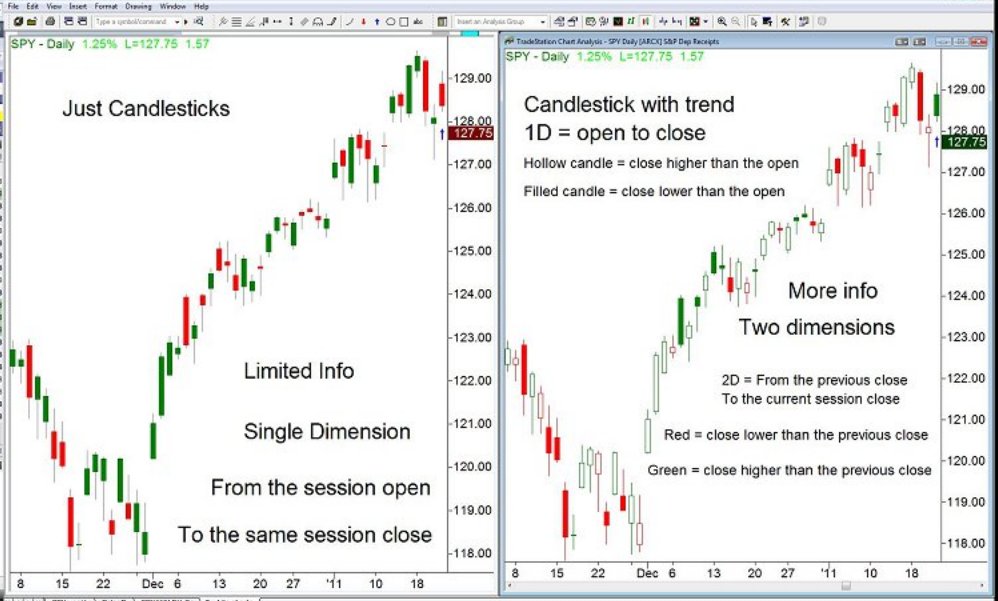
Figure 1
Knowing that most of the readers love visuals, I have included two charts in Figure 1 to emphasize this point. The chart on the left uses just a conventional technical analysis method of measuring a single dimension. I even spelled out on the chart the limitations of it. The left chart does not care what has taken place in the previous session, for its sole concern is with what the current session is doing. Are the prices opening and closing higher or lower for that particular session? Personally, I dislike limitations because I love to have more choices rather than fewer choices. Most option traders, by their nature, love to have more choices in any walk of life (trading or not) than less choices. The left chart offers me no choice but Steve Nison's oversimplification; red candles versus green ones. I tend to compare that green-red concept to driving an automatic car instead of a stick-shift. Those accustomed to driving both types of vehicles don't care because they can drive both. However, those who know how to drive just automatics may find themselves stranded in some other country where the car rental place offers only stick-shift cars because that is the only game in town. Then, at those rare moments, they wish that they had learned how to drive a stick-shift.
Back to the candles; the right chart of Figure 1 shows candlesticks with trend, which in my opinion are much more valuable. It no longer measures only a session's relationship from open to close, but it also includes its relationship to the close from the previous session. Now, on the previous session there are four points; H, L, O & C. The most important one being the (C) close; hence, when looking at the last candle on both charts, we have a conflict. Observe that there is a blue arrow just below that last candle on the left and the right chart. On the candlestick only side (left chart), the candle is red; whereas, on the right chart, the same candle is green.
So, how can that be possible? There must be something wrong with the TradeStation data feed, right? No, there is something wrong with those who do not know how to drive a stick-shift. They are too focused on just putting it into gear, applying the gas pedal to the metal and expecting acceleration. They are completely unaware of the fact that the engine usually makes a certain sound with the speed increase as the gears are automatically changing. Meanwhile, those who know how to drive a stick-shift remember that as the engine struggles to change gears from, let's say third into fourth, that is the precise moment when the driver should release the gas pedal and temporarily step on the clutch pedal just to shift the gear from 3rd to 4th. This whole experience of shifting gears and being aware of what the engine is doing is also obvious on the right chart.
Comparatively, 4th gear is the current trading session, and 3rd gear was the previous one. How did the transition take place? Was it smooth (meaning no gaps)? Was it bumpy with push and pull because the clutch was too suddenly released? On the chart, the transition can be observed by looking at the close of the previous bar versus the opening of the current one. For example, the candle before the one with the blue arrow was nothing else but a doji. On the left it is a green spinning-top doji, while on the right chart it is a hollow white candle outlined in red. The approximate closing price on the doji was around $128. The very next day (candles with the blue arrows), the opening price gapped up almost to $129. It then closed lower for that candle.
Steve Nison (left chart) accounts for that price action single dimensionally as a red bar; whereas, the Candlestick with trend (right chart) colors it in green. Which one of these two is correct?
The answer to that question is not either/or, but both. So, a more intelligent inquiry needs to be made and that would ask the following question: Which of these two charts is more accurate? The chart that gives more information – Candlestick with the trend - is the more accurate. After all, when trading, the most important piece of information is: Where did the price action close relative to yesterday's close? In the case of the red candle (left chart), it appears to be a red day. But in fact when compared to the previous session's close, it was a green day. This is obvious in the case of the green candle (right chart) because the fact that the candle is green means that it closed higher than the previous day's close, even though it is filled in signifying that it closed lower than its own open. See Figure 1 for the explanation of how to read the candles on the candlesticks with trend charts.
In conclusion, one could argue that candlesticks are the best way to look at the charts. Yet all of those who have skipped studying the Western bars are virtually short-changed. They completely miss the trend unless they specifically change the settings on their platforms to the candlestick with trend. More info is better than mere oversimplification.
The basic candlestick concept is in all of Steve Nison's books and similar books on conventional technical analysis. Yet the info presented there is somewhat single dimensional because it focuses only on a single trading session. For instance, every candle has four points which are well-known. They are the (H) high, (L) low, (O) open and (C) close. The range is the distance between the high and low; whereas, the real candle body is the measurement between the open and the close. Usually, there are two common ways of coloring. The bullish candles use either green or white, while the bearish candles use red or black, depending on the software. Once again, bullish candles are the ones where price action opens at the lower end and closes at the higher end, sometimes even at the high of the session, sometimes not. Conversely, bearish candles open at the higher end, or at the high and close at the lower range, sometimes even at the lowest point.
Figure 1
Knowing that most of the readers love visuals, I have included two charts in Figure 1 to emphasize this point. The chart on the left uses just a conventional technical analysis method of measuring a single dimension. I even spelled out on the chart the limitations of it. The left chart does not care what has taken place in the previous session, for its sole concern is with what the current session is doing. Are the prices opening and closing higher or lower for that particular session? Personally, I dislike limitations because I love to have more choices rather than fewer choices. Most option traders, by their nature, love to have more choices in any walk of life (trading or not) than less choices. The left chart offers me no choice but Steve Nison's oversimplification; red candles versus green ones. I tend to compare that green-red concept to driving an automatic car instead of a stick-shift. Those accustomed to driving both types of vehicles don't care because they can drive both. However, those who know how to drive just automatics may find themselves stranded in some other country where the car rental place offers only stick-shift cars because that is the only game in town. Then, at those rare moments, they wish that they had learned how to drive a stick-shift.
Back to the candles; the right chart of Figure 1 shows candlesticks with trend, which in my opinion are much more valuable. It no longer measures only a session's relationship from open to close, but it also includes its relationship to the close from the previous session. Now, on the previous session there are four points; H, L, O & C. The most important one being the (C) close; hence, when looking at the last candle on both charts, we have a conflict. Observe that there is a blue arrow just below that last candle on the left and the right chart. On the candlestick only side (left chart), the candle is red; whereas, on the right chart, the same candle is green.
So, how can that be possible? There must be something wrong with the TradeStation data feed, right? No, there is something wrong with those who do not know how to drive a stick-shift. They are too focused on just putting it into gear, applying the gas pedal to the metal and expecting acceleration. They are completely unaware of the fact that the engine usually makes a certain sound with the speed increase as the gears are automatically changing. Meanwhile, those who know how to drive a stick-shift remember that as the engine struggles to change gears from, let's say third into fourth, that is the precise moment when the driver should release the gas pedal and temporarily step on the clutch pedal just to shift the gear from 3rd to 4th. This whole experience of shifting gears and being aware of what the engine is doing is also obvious on the right chart.
Comparatively, 4th gear is the current trading session, and 3rd gear was the previous one. How did the transition take place? Was it smooth (meaning no gaps)? Was it bumpy with push and pull because the clutch was too suddenly released? On the chart, the transition can be observed by looking at the close of the previous bar versus the opening of the current one. For example, the candle before the one with the blue arrow was nothing else but a doji. On the left it is a green spinning-top doji, while on the right chart it is a hollow white candle outlined in red. The approximate closing price on the doji was around $128. The very next day (candles with the blue arrows), the opening price gapped up almost to $129. It then closed lower for that candle.
Steve Nison (left chart) accounts for that price action single dimensionally as a red bar; whereas, the Candlestick with trend (right chart) colors it in green. Which one of these two is correct?
The answer to that question is not either/or, but both. So, a more intelligent inquiry needs to be made and that would ask the following question: Which of these two charts is more accurate? The chart that gives more information – Candlestick with the trend - is the more accurate. After all, when trading, the most important piece of information is: Where did the price action close relative to yesterday's close? In the case of the red candle (left chart), it appears to be a red day. But in fact when compared to the previous session's close, it was a green day. This is obvious in the case of the green candle (right chart) because the fact that the candle is green means that it closed higher than the previous day's close, even though it is filled in signifying that it closed lower than its own open. See Figure 1 for the explanation of how to read the candles on the candlesticks with trend charts.
In conclusion, one could argue that candlesticks are the best way to look at the charts. Yet all of those who have skipped studying the Western bars are virtually short-changed. They completely miss the trend unless they specifically change the settings on their platforms to the candlestick with trend. More info is better than mere oversimplification.
Last edited by a moderator: