Just a premise.
Sorry for my bad english.
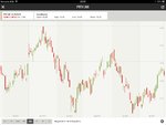
I've a weak knowledge of the tecnical analyst but when im look the chart with candlestick and trying to apply the basics of TA I find downtrend pattern very more easy than upside pattern.
For example when i look a high up excursion price with the classic long thin line that spread from the close high price i can't tell if the next day the price will close up or down (down with a red candle I mean), but if i saw i low thin line that spread downside from the close price i can tell with a certain trust that the next day the price will close down.
I admit that my prediction probably don't have a360 degrees of informations, but what it look to me is that the downtrend is easy to identify, isn't it?
Ps: any correction to my test is welcomed.
Sorry for my bad english.
I've a weak knowledge of the tecnical analyst but when im look the chart with candlestick and trying to apply the basics of TA I find downtrend pattern very more easy than upside pattern.
For example when i look a high up excursion price with the classic long thin line that spread from the close high price i can't tell if the next day the price will close up or down (down with a red candle I mean), but if i saw i low thin line that spread downside from the close price i can tell with a certain trust that the next day the price will close down.
I admit that my prediction probably don't have a360 degrees of informations, but what it look to me is that the downtrend is easy to identify, isn't it?
Ps: any correction to my test is welcomed.