Am i the only who think it?

Esta

Newbie
Messages
7
Likes
0
Just a premise.
Sorry for my bad english.
I've a weak knowledge of the tecnical analyst but when im look the chart with candlestick and trying to apply the basics of TA I find downtrend pattern very more easy than upside pattern.
For example when i look a high up excursion price with the classic long thin line that spread from the close high price i can't tell if the next day the price will close up or down (down with a red candle I mean), but if i saw i low thin line that spread downside from the close price i can tell with a certain trust that the next day the price will close down.
I admit that my prediction probably don't have a360 degrees of informations, but what it look to me is that the downtrend is easy to identify, isn't it?


Ps: any correction to my test is welcomed.
 
Hi Esta,
Welcome to T2W.

Could you post a chart that illustrates what you describe please? Perhaps it's just me, but I'm not entirely sure what it is that you're describing.
Tim.
 
Just a premise.
Sorry for my bad english.
I've a weak knowledge of the tecnical analyst but when im look the chart with candlestick and trying to apply the basics of TA I find downtrend pattern very more easy than upside pattern.
For example when i look a high up excursion price with the classic long thin line that spread from the close high price i can't tell if the next day the price will close up or down (down with a red candle I mean), but if i saw i low thin line that spread downside from the close price i can tell with a certain trust that the next day the price will close down.
I admit that my prediction probably don't have a360 degrees of informations, but what it look to me is that the downtrend is easy to identify, isn't it?


Ps: any correction to my test is welcomed.
I think that I understand what you mean but came to the conclusion, early on, that topside patterns cannot be associated with patterns that suggest upward movement. They are different animals.

Probably, the fear factor comes in much more quickly and buyers , especially ones that got caught on the downside, are more cautious coming in---they like confirmation. My experience is that, if I am looking to sell a profitable long trade, waiting for confirmation loses me money. :)

That said, the patterns, although slower, are still there.

Try a higher time frame when buying. That might work for you. A line chart gives me a better idea of patterns, too.
 
Hi Esta,
Welcome to T2W.

Could you post a chart that illustrates what you describe please? Perhaps it's just me, but I'm not entirely sure what it is that you're describing.
Tim.

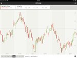
It is a daily chart with six month of time range.
The thin low line i mean is as the pattern that you can see on 26 july, (27 is the last candlestick).
 

Attachments

  • image.jpg
    image.jpg
    240.1 KB · Views: 349
To me it seems as the downtrend had more evidence, although only when the thin line is long with a red candle i can have a some certain that the next day the close will be down.
But i wondering if this pattern that i use had a sense or is just a coincidence that mistake me because i haven't see many chart.
 
It is a daily chart with six month of time range.
The thin low line i mean is as the pattern that you can see on 26 july, (27 is the last candlestick).

Actually, we are pretty much bang on 50% in the range (18.00 -13.00) now about 15.50ish.

So it shows how we all look at charts differently, you place a greater importance on the peaks, hence see a downtrend.

A lot of action occurred on the 26th, with the result being; we will need to drop to the 14.50 area first (next 2-3 days). Then we can look at this and see where the "trend" will take us.
 
To me it seems as the downtrend had more evidence, although only when the thin line is long with a red candle i can have a some certain that the next day the close will be down.
Hi Esta,
Thanks for posting the chart.

As 'wallstreetwarrior87' points out, we all look at charts differently. If the candle you're referring to is the penultimate one on the chart, many T2W members would identify it as a 'pin bar'. In this context, many would interpret it as being fairly bullish. The logic being that price has been in an uptrend since about June 24th, and after 6 bull (green) candles in a row, sellers were tempted in to test the resolve of the bulls. This forced price a long way down (the thin line of the candle is called the 'wick', the thick part is called the 'body'), whereupon it went all the way back up again and almost closed at the same level as the open. In other words, the bulls supported the price and buying pressure overwhelmed selling pressure. To some traders, this suggests that there is still more upside potential to come, i.e. it's probable that the uptrend will continue.

However, and this is important, that's not to say you should interpret price in the same way! In fact, it's much better that you make your own observations and draw your own conclusions and take the views expressed by anyone here with a pinch of salt! If you view the 'pin bar' as being a bearish signal - that's absolutely fine.

That said, if you're interested to see how some traders use pin bars, then this thread might be of interest: Pin Bar System
Tim.
 
Top