Addressing the issue of time frames

The day after the night before

Well, the day after the night the fed cut interest rates and you can see the small time frame chart is a mess. You can see the slight downtrend AFTER the fact. So very hard to trade this in reality, and I haven't traded this frame today. Much too risky. There is a trade there at 7.48 with a cross of both cycles but a few minutes later 8.02 an opposite both cycle cross down move that would probably lost you money.

LESSON NO 1. Do not trade short frames after major news releases or major moves. The market tends to go sideways while everyone figures out which way to go. Trading at these times is a no no. Your bottom (see, I'm being good mods, I didn't say ****). will be handed to you on a plate.
 

Attachments

  • day after 1.JPG
    day after 1.JPG
    104.8 KB · Views: 217
15 min and no prizes for guessing where the announcement was.
You can see the overnight range now and how a market will tend to consolidate after news.

There is actually a two cycle cross at 12.15 earlier in the afternoon. Had you taken that and put in a stop under the price and walked away you would have been laughing.

Would I have got that? Probably not. There was a dip a little later on that would have had me out for a tiny profit, and I wouldn't have gone in again so close to the news. So the market would have spooked me out of it. Now where have I heard that before.

Something to said then for putting the trade on and walking away from the screen. Great when you get a trade like this. But when it goes up150 odd and then reverses down past your stop it's a bit of a bugger. So on the other hand...
 

Attachments

  • day after 2.JPG
    day after 2.JPG
    99.8 KB · Views: 184
Last edited:
Hour chart and the best trade was at the highlighted point. You would have needed an 80 point stop and the patience (nerve) to just leave it. But the trade ran to the top for around 920 pips over 4 days.

Even getting in there and getting out on the first cycle would have given around 140 pips for just over a days work.
 

Attachments

  • day after 3.JPG
    day after 3.JPG
    102.7 KB · Views: 203
8 hr chart still going up. Even missing the pin and taking the next clear entry is good for around 950 to the top. Stop placed at the previous bar bottom would have kept you safe for a six day trade.
 

Attachments

  • day after 4.JPG
    day after 4.JPG
    106.9 KB · Views: 189
Daily charts showing entry and exit with the arrows. Taking the drop and holding for two and a half months would have given you around 2759 pips. Add to that on the way down, up the stakes as you go and for a couple of months work you end up with a nice wage.

The daily chart also shows that the recent shout about the bulls are back is nothing more than people trying to talk the market up. If fact the up run of late could be over. It has a lot to do at this moment in time to get any higher. Is it looking like a roll over is about to happen?

Well each day as it comes and a up move was signalled on the 15th and is currently good at around 400 pips. But it is coming back down...hold it, close it, decisions, decisions.
I would have a stop at 15270. But certainly look to manage it on at the very least the hour chart.
People say enter and exit on the same chart. Not sure I agree with that.
 

Attachments

  • day after 5.JPG
    day after 5.JPG
    98.9 KB · Views: 198
  • day after 6.JPG
    day after 6.JPG
    102.7 KB · Views: 181
Donovans double cross

Think I will rename the cycle indicator and call it as the title.
Donovans double cross.

Oh, there's irony in there; and a story. Shame only I know it.
 
Talk about the chart calling you a liar. Once it had sorted itself out, there was a double cross for a nice short as marked on chart.

Missed it, because I was busy posting the the other charts. :cry::eek::(
 

Attachments

  • day after 7.JPG
    day after 7.JPG
    108.9 KB · Views: 209
People say enter and exit on the same chart. Not sure I agree with that.

Me neither.

Depends on general conditions though.

Eg before the choppiness started after this financial mess I'd often enter on a lower time frame, and then maximise the potential by exiting off a higher time frame.

At the moment I'm far more hit and run, taking what I can get, but if the new year sees a return to some more trendiness and less chop - IF - I'll probably go back to that.

Great stuff you're doing here mate.
 
Early Bird

Early bird catches the worm they say. And a few charts showing the o'night range developing, and what a difference a day makes to a chart. The small time frame chart was lovely this morning, With the hour (on the left) being the chart that was harder to read.

Cycles have been colour coded and thinned slightly so it is easier to see its pivots.
Your looking at the middle chart mainly to see how even though price tells the whole story it doesn't hurt to get another view. The middle chart shows clearly the cycles going against each other then starting to 'mesh up' and work together.

Even though the bottom cycle in the middle chart doesn't raise above its centre pivotal point on the way down. (Near the first try at the pivot lines on the charts (no7 & 8 chart)).
The subsequent bounce which isn't really visible on the hour chart is good for a near 60 pip scare.

I took an entry at the vertical line on the no 6 chart from around 526 and exited at around 433 good for 93 pips before 8am and before the hour chart had picked it up.
It would have been possible to take the very early signal on the small frame chart at 5.46am on the first fall through of the main cycle with the blue line, There was even a valid signal from the bottom cycle as it too fell through its top line. Would have given 53 to the first exit signal. Holding to the bottom. 224 approx. Probably not possible to do on the smaller frame but by moving out to the bigger frames it would have given more chance to 'manage' the trade.

I didn't take that first short because it wasn't a 'double cross' and even I was still in bed at that time. Unusual I have admit. But it's getting darker over here now and I am normally up well before the alarm. What did get me up was some twat ringing up about the car!
 

Attachments

  • 18dec1.JPG
    18dec1.JPG
    107.4 KB · Views: 252
  • 18dec2.JPG
    18dec2.JPG
    107.8 KB · Views: 204
  • 18dec3.JPG
    18dec3.JPG
    107.7 KB · Views: 184
  • 18dec4.JPG
    18dec4.JPG
    108.9 KB · Views: 193
  • 18dec5.JPG
    18dec5.JPG
    108.8 KB · Views: 216
  • 18dec6.JPG
    18dec6.JPG
    108.4 KB · Views: 205
  • 18dec7.JPG
    18dec7.JPG
    112.3 KB · Views: 205
  • 18dec8.JPG
    18dec8.JPG
    112.4 KB · Views: 215
A little while later and the low time frame chart is a mess. There is a signal highlighted for an up move, but taking it may have been harder. The unequal 'pups' have put in an appearance giving a further clue. But before they came out to play the were one or two double crosses that actually were just that. Double crosses.

So, small chart in a clear side move and a no go trading area. Look at the middle chart and the cycles between the black vertical lines show the 'fight' going on with the price, the good old bulls and the bears. top cycles going up, bottom cycle going down. No 'mesh up' from them and a very clear stay out of the market until better service is resumed signal.

It did look as the next move was going to be up but it has all changed as I type, 2 nd chart shows there is still very much indecision at the moment. The bulls are trying their damnedest to win!
 

Attachments

  • 18dec9.JPG
    18dec9.JPG
    113.5 KB · Views: 215
  • 18dec10.JPG
    18dec10.JPG
    111.5 KB · Views: 206
Well the chart that Mr Dent told me about likes a bit of a lie in in the morning, just 'cause it has the answer to the universe it thinks it can do what it likes I suppose. Its sister chart that has both the question and the answer to the secret of the universe is the worker here. She really can move mountains, or bits of it anyway. Even if the answer took seven and a half million years to come up with. The question which hasn't really been asked yet and would take a further ten million years to come up with, is far removed from Mr Dent but related by magnetic fields.
 

Attachments

  • answer.JPG
    answer.JPG
    112.3 KB · Views: 188
  • answer1.JPG
    answer1.JPG
    111.9 KB · Views: 206
  • answer2.JPG
    answer2.JPG
    111.7 KB · Views: 181
Me neither.

Depends on general conditions though.

Eg before the choppiness started after this financial mess I'd often enter on a lower time frame, and then maximise the potential by exiting off a higher time frame.

At the moment I'm far more hit and run, taking what I can get, but if the new year sees a return to some more trendiness and less chop - IF - I'll probably go back to that.

Great stuff you're doing here mate.

I tottaly agree that entering the trade and exiting on the same chart will give you lagg, and cause all indicator are lagging. There is a simple solution, trade on a 3min chart and enter the trade with a 2min chart, and exit with a 2 minchart. U will get the signal at the perfect time as the 2min will be quicker, and get in fast and out at the point where price changes direction . If this was all done a 3min chart, entry would be late and when you exit then alot ofthe move would have been given back .The main funktion of the 3min would be to have some other indicator that indicates a short or long coming, but it should not work as a entry chart.


I have been a big fan of timecycles and how they work in combination and i think its a great thread and i will for sure keep a close eye one it.


Keep up the great work.

With kind regards
Bashir Naimy
 
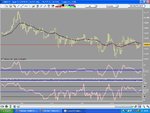
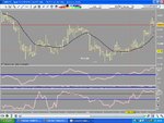
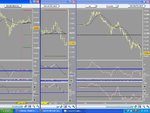
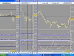
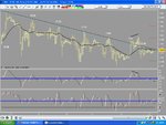
A chart from the ftse
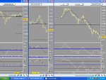
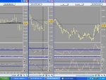
(Apologies. The 2nd chart should be the first(?) Given the amount of alcohol consumed and the fact that it is a time of year when we are encouraged to drink to excess, ((like anyone needs a reason)) The charts are in reverse order).
The blue trend line is the original, drawn from the first two points. The actual bounce back down turning points are along that trend line and uncannily hits the turns spot on, the 'heads' above the line is just excess 'noise' where the market is deciding if it's going to turn or not. (The 20.00. is meant to go above the the line but there was no room).

There is a pattern there. Once the trend line was drawn the subsequent 'hits' of the trend line were ideal spots to either enter or add to.

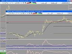
There is also a hint there of a new cycle about to start, first down, then sideways, and now starting up? Too soon to jump in with both feet, but certainly worth keeping an eye on.

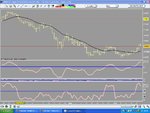
Draw a trend line upwards from the last two down spikes and keep an eye on them. The main cycle indicator is steadily creeping up.
The current recession caused by the banks and mortgage companies will end. Nothing smacks more than a stage managed 'credit crunch' than this one, and implemented by our lords and masters who you would think and hope that they would have seen it coming. Why didn't they? The supposed brightest brains amongst us. Was it all really down to just greed?

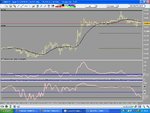
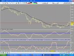
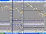
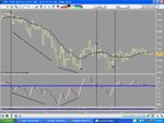
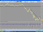
The next chart shows a daily cycle with the entries and stops highlighted. The first move is classic. Entry around 5510 with a stop 2 bars back at just above the high would have given approx 1,271 pips. With no danger to the stop being hit. If you only use one bar back for your stop, then as the 2nd trade shows you have problems. You have profit but then it is taken away again.
Stops I think are another thread altogether!
You could deal with this with either a fixed stop or a trailing stop. There is nothing worse than seeing a healthy profit vanish.
But it shows that when the trend is in place, all is fine, but like a sea as the waves roll in on a tide, it has to roll out again.

The action underneath the wave is something that is not always apparent, but is always there, is always in action. It is stronger than the 'wave' itself but often you cannot see it.
IT IS THE CHRYSALIS BEHIND EVERY MOVE.

When the 'under current' moves against the 'wave' you have sideways action as the battle changes tract. The undercurrent will always win because it precedes the wave and has more power than the wave which is more a visual 'pretty picture' This is why your trades always go wrong. You are getting in on the top picture when in fact the opposite is true and the current has already moved against you.

This happens on all time frames and the further out you go the more chance you have of catching a Tsunami.

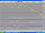
At the moment the ebb and flow have equal power. The end of the chart looks like we are headed down. But given the time of year, lack of interest in trading. (Yes, I know you want to trade, but there is no point trading until you catch a ride with the big boys)
(Your money will not move the market). This current down cycle (please don't call it a crash or recession. Look at your charts not the newspapers), will end.

YOU have to surf the undercurrent not the wave. (Get a aqualung).

Thanks to BSD and bnaimy. Your comments are spot on.
 

Attachments

  • cyclical overview 29.JPG
    cyclical overview 29.JPG
    98.3 KB · Views: 244
  • baby9.JPG
    baby9.JPG
    101.1 KB · Views: 232
Last edited:
Look back at 2008 and the cable ride

Boxing day and nothing better to do other than browse through charts.
A look back at the year on the cable shows how patience is rewarded and is giving clues to when we arrive at the turnaround point.

Someone asked me the other day when was the 'crisis' going to end?
My first thoughts were, I might have a cushion on my chair, but I haven't got crystal balls.

I did mention though that it was coming to an end. People are buying now, but it is being done on the quiet. Good time to start selectively buying banks as well.

You know when someone looks at you and is thinking that you are a complete moron? Well that is the look I got.

"Are you nuts? The banks are in a terrible state. You'd have to be an idiot to put your money in them". Then he chuckled at his own terrible pun.

"Well. Do you think the banks will go out of business and fold up? That would bring complete and utter carnage world wide. It would literally put us back into the dark ages. Councils and governments would crash. If the monetary system ended, we would be back to bartering for everything. Those in power would not get paid. It is that simple. It just will not happen. There may be just one central bank in time, and the recent events could even have been a push towards that. It sure seems like they want parity on the pound and the euro. Imagine just one central bank across Europe. I think there were plans to call it The bank of Tony. But that idea was shelved".

"Mmmmn, I suppose..."

"Don't believe anything you read in the newspapers".

The first eight months of the year on cable were abysmal. But by just drawing a horizontal line under the first two low points in January and February would have given you a 'trapdoor' to watch. The highest point was on the 14 March and you could argue that the 'fall' started from there. The safe entry to short came on the 8th of august even though me cycle injamacator gave a 'sell' on the 29th July.
The 'true' bottom of the market came at the end of October and buying started there.
It does look like the market is still going down, due to momentum and blind panic, (and indeed that may still be the case), but, drawing a couple of lines for the last two months shows that it is in fact back to a sideways move. (2nd chart.)
It has broken out of the down channel and the first high point of the sideways move can now be drawn. If I remember I will look back at this chart the first week of every month and see how it progresses.

If it does drop through the 14,200-14,000 though; What am I offered for a 4 year old redundant computer and a savings book from Northern Rock?
 

Attachments

  • cyclical overview 30.JPG
    cyclical overview 30.JPG
    84.9 KB · Views: 195
  • cyclical overview 31.JPG
    cyclical overview 31.JPG
    89.2 KB · Views: 207
  • cyclical overview 32.JPG
    cyclical overview 32.JPG
    111.8 KB · Views: 183
Problem with buying b(w)ank stocks is that they are all going to be (unless already have been)
nearly fully nationalised - which means no growth and nada dividend.

Can't see the situation change with banks in the next 10 years.
 
Look in March to V, MA and other credit cards companies... that is about the time they can support the unpaid balances. After that we are close to a new financial crisis good for "short" etf's in that sector
 
Ah! It appears I cannot post any attachments.

Mr Sharky?

Well, until I can post charts the view is that the 60 min plus charts are better. And this is coming from a confirmed scalper.

The longest chart I am using is 8 hours, Although the signals are infrequent. (One signal started at the 1st of this month and is still in place, generating 750 odd of pips at least until the 5th of this month.

When I can post charts again I will continue.

Thank you that was all intersting. I take a good look at where everything is before start out to the day chart. bouncing down to 3hr, 1hr, 30min, 15, 5 and 1min. I never go lower than a one minute. 2pct max risk on a hard stop having said that I am weary if I am at an obvious point where expecting action is going to happen. so may pull away a hair to avoid the those crazy spikes I hear everyone crying about and calling their broker a scalp hunter blah blah. so I am usually bouncing btween 1 minut e and 5 minute and still boucing up to 15 and 30 and so on cuz I like to always know what i am seeing. Yeah I use a variety of indicators but indicators to re-verify my eyeballs. Use lots of colored lines for each timeframe that I keep on the chart and am constantly rewriting and moving... I think my chart is like a fungus that is always growing till I start a fresh one...does that make sense? I'm just a nutcase who pushes buttons when my stomach says go. hahaha tks
Forex Pip Addict
 
Last edited:
Hi everyone, i am relatively new here - this is my first post! Thank you for all the interesting information. I personally see all financial markets as fractal in nature - i.e. all available information is represented in all time frames, but using different timeframes allows one a different perspective on that data.
 
Top