Addressing the issue of time frames

options

Senior member
Messages
2,374
Likes
218
This will be a continuation of what time frame to use as discussed from another thread. Hopefully it will clear a few things up.

PLEASE DO NOT POST ANY COMMENTS UNTIL I HAVE FINISHED LAYING OUT THE EXAMPLES, I WILL HAVE TO POST CHARTS AND COMMENTS AS SINGLE POSTS AS IT IS NOT POSSIBLE TO GROUP THEM ALL TOGETHER.

Once the examples are laid out your comments are of course welcome. It may even extend to live examples being posted as they occur.

I am, and have been a inherent scalper. Contrary to what people say it is very possible to make a living by scalping. Hit the target, then quit for the day.
Target? Well you can live on 20 points/pips a day. Dependant of course on your trade amount. £1 per point/pip will only give you 20 quid a day. £10 per point/pip will give you 200 quid per day. etc etc.

But what time frame? What is the best time frame? Banks use 1hr, 4hr and daily. They make money, (normally) Yet shorter time frames and methods abound. Why? If the big boys make money why doesn't everyone simply follow them?

One answer is that you know the time frames but you do not know which way they are trading; Unless you have worked in a bank trading for them, then you would not know what they look for and do.

I also believe trading should be simple and not complex.Algo's and butterflies have their place, but not in my world.

So My fabled long above, short below (now in colour!) trading line will be on show. (Sadly though no free pen is available).

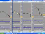
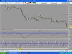
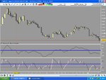
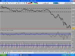
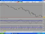
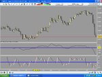
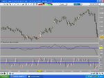
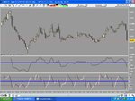
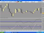
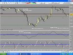
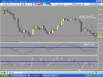
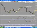
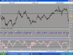
First an overview of time frames.
 
Last edited:
  • Like
Reactions: BSD
Ah! It appears I cannot post any attachments.

Mr Sharky?

Well, until I can post charts the view is that the 60 min plus charts are better. And this is coming from a confirmed scalper.

The longest chart I am using is 8 hours, Although the signals are infrequent. (One signal started at the 1st of this month and is still in place, generating 750 odd of pips at least until the 5th of this month.

When I can post charts again I will continue.
 
Sorry options. I am not commenting on your post. I want to see your charts so I am just trying to help you with attaching a JPG file.

As you reply to a post, hit the "attach" button (paper clip). The following pop-up window should come up:

attachment_window.jpg

Click on the "Browse" button to locate the JPG file you want to attach. Hit the "Upload" button. Then hit the "Close this window" link.

Back on your main browser session, you should see a link inserted below your text box which maps to the JPG file you have just uploaded. Mouse over that link. It should tell you the URL. You will find your attachment's ID number on this board (with the ?attachmentid=xxxxx" tag). Use that number and include it in your text with the "" tags. For example, if the ID is xxxxx, then you should type in:

 
Apparently it is an issue that is affecting not just me, but a few other people. Yet most can still post attachments.

Weird.
 
yeah, i've reported it again in red letters this time
 
Until I can post charts, a little more info.

A few people have been expressing how their trading is not going to plan. Then they offer that the timeframe they use is 5 mins or less.

Not surprisingly they are having problems, 5 min or sub 5 min trading is a very hard nut to crack consistently. It is very very easy to get pulled into trades that 'just' go wrong, and at the end of the day the account balance is the wrong side of where you started from.

I and another trader I chat with during the day have succesfully used sub minute trading by using tick charts. It is done by adhering to rules and not deviating 1% from the rules. There are plenty of losing trades but also plenty of winning ones.

I will not explain any further as this is not the intention of this thread. I only mention it because it is very intense, requires a lot of concentration and is something that not everyone can or would want to do.

So what would be the minimum, comfortable time frame to use?
For my 'normal' trading I don't use indicators. Just the price on itself and pivot points.
But Price itself if followed on too small a timeframe can 'spook' you out of a trade. Is there something simple that keeps you in a trade and doesn't require a major complex mathamatical theorum, or interpretation by the user?

This is where the long above short below theory comes in, on the right timeframe you can be always in the market, racking up the points over time. This is where the big money comes from, but it is no good having a system that gets you into a trade, gives you points and then takes back those points when the exit signal appears.

Cyclical analyisis can help here and it is through various chats with people like Grey1 that led to different experimentation of the indicator I work on from time to time.

Now price is the only thing that indicators can be derived from, regardless of what anyone tries to tell you. Price makes the indicator look good. If price stops so does the indicator. The major problem people have with indicators is the indicator takes over and people look to that first and then trade from the indicator expecting price to follow.

Once I can post charts up again you will see that by using the cycle analyasis with the price, the conclusion I came up with is that 15 mins chart are the smallest time frame to use. Even then it does produce hicups. The hour chart is useful, but best of all is the 8 hour chart. You can go out even further and some of the results are 'wow'. But you can make your own mind up. For general trading I have used the 15, 60, 4hr and 8hr. The idea is to take a posistion on cross of the cycle through a horizontal line. This idea on certain time frames has thrown up other ways to enter and exit trades.

Thursday gave good results in a 'moving' market. Friday on early morning sideways market an entry was good, and where I would normally have closed out of a trade with nice profit, by sticking to the rules and exiting on the cross of the line the trade went from being a plus profit trade to a minus profit trade on a 15 min chart.

The irony of it being that a 'tweek' of the 15 min cycle may have given me a very good cycle to use on a 3 min for scalping. I won't know until live testing on monday. But i won't post those because they would be no good to anyone.

I may even post live trades as the method calls it, but I will say now that the purpose of the thread was to try to find the lowest workable timeframe. The ongoing cycle work is a by product of that. I won't discuss how the cycle is made up, and I won't be offering it for sale for 49.95, If it works well though I will accept offers of upwards 40 million.
If it doesn't work well enough, it goes in the bin and I go back to the drawing board (occasionally).

Your view will be vastly different to mine, that's ok, lets just agree to disagree.
 
This first chart is an overview of the time frames. Going from right to left.
8 hour, 4 hour, 1hour and a 15 minute chart. These are all cable charts (gbp/usd), though that is immaterial really.

You can see by the vertical red line on the 15 min chart where the entry is, and more importantly in which direction to trade. The bottom indicator is an attempt to get inside the cycle of the indicator above it. For people with a bit of knowledge of waves it will make a slightly more sense.

Coincidentally the 15 min chart also shows off Newtron Bombs 15 min breakout strategy pretty nicely as well. The 2 black horizontal lines are the overnight range. You then have the break, the pullback and then the main move.

The whole idea of this cycle analyisis is to short under the blue line and long above. Holding until the line is broken the other way. You can see the idea in better use on the 8 hr chart on the left. The sell move is when the long down candle breaks the blue line, you can also see the candle pullback 3 bars later, which the lower indicator picks up on and gives another signal to short or add to the trade. You'll also see in a minute that the intial signal to short came before the big down bar.
 

Attachments

  • cyclical overview 1.JPG
    cyclical overview 1.JPG
    109.6 KB · Views: 1,601
  • Like
Reactions: GCC
chart 2 shows an entry by the red vertical line on the 60 min for a fairly relaxed trade.
 

Attachments

  • cyclical overview 2.JPG
    cyclical overview 2.JPG
    95.8 KB · Views: 866
The 8 hr chart.

The idea is to show how relaxed it is on longer time frames.
 

Attachments

  • cyclical overview 3.JPG
    cyclical overview 3.JPG
    98 KB · Views: 487
Far out view of the daily. All a bit squiggly down the bottom but by following the break of the trend line by price. You get a good signal.
 

Attachments

  • cyclical overview 4.JPG
    cyclical overview 4.JPG
    102.4 KB · Views: 423
A closer view of the daily. You can see how the move was signalled before the trend line break.
 

Attachments

  • cyclical overview 5.JPG
    cyclical overview 5.JPG
    94 KB · Views: 418
A 30 day bar chart now and you can see that early warning signs were in place by the cycle indicator showing divergence from the price for an up move back in April 2002. Buying and holding then would have meant bundles of pips. Getting in the trade though may have been more trickier.
 

Attachments

  • cyclical overview 6.JPG
    cyclical overview 6.JPG
    95.5 KB · Views: 388
A monthly chart with a signal from May 2002. Little difference in the time frame from month to 30 days, but a big difference in entry.
 

Attachments

  • cyclical overview 7.JPG
    cyclical overview 7.JPG
    97 KB · Views: 317
Quarterly chart. No vertical line showing, but you can see the trades by the cross of the horizontal.
 

Attachments

  • cyclical overview 8.JPG
    cyclical overview 8.JPG
    98.8 KB · Views: 312
Out to a yearly chart and the cycles are easy to see, Does anyone trade from a yearly chart?
 

Attachments

  • cyclical overview 9.JPG
    cyclical overview 9.JPG
    92 KB · Views: 315
Back to that overview chart and trading the next day.

You get buy signals on the lower timeframe charts but the higher still signal sells of course.
 

Attachments

  • cyclical overview 10.JPG
    cyclical overview 10.JPG
    118 KB · Views: 282
Closer view of the 15 min with NB's breakout shown as well.
Pretty self explanatory.
 

Attachments

  • cyclical overview 11.JPG
    cyclical overview 11.JPG
    111.8 KB · Views: 362
The short move on the 8 hr chart was signalled before the big bar.
 

Attachments

  • cyclical overview 12.JPG
    cyclical overview 12.JPG
    98.1 KB · Views: 304
Concluding the time frames. The 1 hour is the best time frame to use, but you still need patience. But this is where the big money comes from. You only need to check the chart once every hour and adjust as and when, once a trade is initiated.

You don't always have to have large stops. And the 1 hour gave less false signals than the 15 min.
The 15 min gave a few hiccups and could have you exiting prematurely. Going to a shorter time frame has you acting like a yo yo and your money is going to the broker.

This last chart is a 1 min from Friday. But look at the 'scrunched up view of the chart. You are going to be up your own backside trying to take signals.

The best trades came from the 8 hr chart, but needed a lot of patience to wait for a trade to appear and then to manage the trade.
 

Attachments

  • cyclical overview 14.JPG
    cyclical overview 14.JPG
    112.2 KB · Views: 300
Last edited:
Top